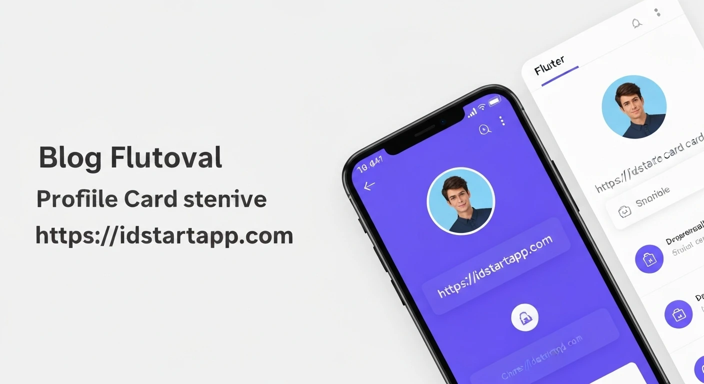

Creating Interactive Profile Card Widgets in Flutter
Profile cards are a fundamental UI component in many modern applications, serving as a concise and visually appealing way to present user information. While a static profile card can display basic details, adding interactivity elevates the user experience, making the UI more engaging and dynamic. In Flutter, building such interactive widgets is straightforward, thanks to its rich set of animation and state management features.
Why Interactive Profile Cards?
Interactivity in UI design goes beyond mere aesthetics. For profile cards, it can:
- Improve Information Hierarchy: Allow users to expand details only when needed, reducing clutter.
- Enhance Engagement: Subtle animations or expanded views draw the user's attention and make the interface feel more responsive.
- Save Screen Real Estate: Display essential information initially and reveal more upon interaction, especially useful on mobile devices.
- Provide a Polished Feel: Smooth transitions and responsive elements contribute to a professional and high-quality application.
Core Components of a Profile Card
A typical profile card includes:
- Profile Picture: Usually a circular image.
- Name: The user's full name.
- Title/Occupation: Their professional role.
- Short Bio/Description: A brief summary.
- Social Media Links: Icons linking to various platforms.
- Call-to-Action (Optional): Buttons like "Follow," "Message," or "View Portfolio."
Setting Up Your Flutter Project
First, ensure you have a Flutter project set up. If not, create a new one:
flutter create interactive_profile_card
cd interactive_profile_card
Now, open lib/main.dart and we'll start building our widget.
Building the Interactive Profile Card Widget
We'll create a ProfileCard widget that expands and collapses a detailed description upon tapping. This will involve using a StatefulWidget to manage the expansion state and an AnimatedSize widget for smooth transitions.
1. Basic Profile Card Structure
Let's begin with the static layout of our profile card. We'll use a Card widget to give it a distinct background and shadow, and a Column to arrange its contents vertically.
import 'package:flutter/material.dart';

void main() {
  runApp(const MyApp());
}

class MyApp extends StatelessWidget {
  const MyApp({Key? key}) : super(key: key);

  @override
  Widget build(BuildContext context) {
    return MaterialApp(
      title: 'Interactive Profile Card',
      theme: ThemeData(
        primarySwatch: Colors.blueGrey,
        visualDensity: VisualDensity.adaptivePlatformDensity,
      ),
      home: const ProfileCardPage(),
    );
  }
}

class ProfileCardPage extends StatelessWidget {
  const ProfileCardPage({Key? key}) : super(key: key);

  @override
  Widget build(BuildContext context) {
    return Scaffold(
      appBar: AppBar(
        title: const Text('My Profile'),
        centerTitle: true,
      ),
      body: Center(
        child: Padding(
          padding: const EdgeInsets.all(16.0),
          child: ProfileCard(
            profileImageUrl: 'https://images.unsplash.com/photo-1535713875002-d1d0cfcb5678?q=80&w=1780&auto=format&fit=crop&ixlib=rb-4.0.3&ixid=M3wxMjA3fDB8MHxwaG90by1wYWdlfHx8fGVufDB8fHx8fA%3D%3D',
            name: 'John Doe',
            title: 'Flutter Developer',
            shortDescription: 'Passionate about building beautiful and functional mobile applications.',
            fullDescription: 'John is a seasoned Flutter developer with over 5 years of experience in mobile app development. He specializes in creating cross-platform solutions that are both performant and aesthetically pleasing. Outside of coding, John enjoys hiking and photography.',
            socialLinks: const [
              Icons.facebook,
              Icons.discord,
              Icons.camera_alt, // Represents Instagram for simplicity
            ],
          ),
        ),
      ),
    );
  }
}

class ProfileCard extends StatefulWidget {
  final String profileImageUrl;
  final String name;
  final String title;
  final String shortDescription;
  final String fullDescription;
  final List socialLinks;

  const ProfileCard({
    Key? key,
    required this.profileImageUrl,
    required this.name,
    required this.title,
    required this.shortDescription,
    required this.fullDescription,
    required this.socialLinks,
  }) : super(key: key);

  @override
  _ProfileCardState createState() => _ProfileCardState();
}

class _ProfileCardState extends State {
  bool _isExpanded = false;

  @override
  Widget build(BuildContext context) {
    return Card(
      elevation: 8,
      shape: RoundedRectangleBorder(borderRadius: BorderRadius.circular(20)),
      child: GestureDetector(
        onTap: () {
          setState(() {
            _isExpanded = !_isExpanded;
          });
        },
        child: Padding(
          padding: const EdgeInsets.all(20.0),
          child: Column(
            mainAxisSize: MainAxisSize.min,
            children: [
              CircleAvatar(
                radius: 50,
                backgroundImage: NetworkImage(widget.profileImageUrl),
              ),
              const SizedBox(height: 16),
              Text(
                widget.name,
                style: const TextStyle(
                  fontSize: 24,
                  fontWeight: FontWeight.bold,
                ),
              ),
              const SizedBox(height: 8),
              Text(
                widget.title,
                style: TextStyle(
                  fontSize: 16,
                  color: Colors.grey[600],
                ),
              ),
              const SizedBox(height: 16),
              // Description section (interactive part)
              AnimatedSize(
                duration: const Duration(milliseconds: 300),
                curve: Curves.easeInOut,
                child: Column(
                  children: [
                    Text(
                      _isExpanded ? widget.fullDescription : widget.shortDescription,
                      textAlign: TextAlign.center,
                      maxLines: _isExpanded ? null : 3, // Unlimited lines when expanded, 3 otherwise
                      overflow: _isExpanded ? TextOverflow.visible : TextOverflow.ellipsis,
                      style: const TextStyle(fontSize: 14),
                    ),
                    if (!_isExpanded) ...[
                      const SizedBox(height: 8),
                      Icon(
                        Icons.keyboard_arrow_down,
                        color: Colors.grey[600],
                      ),
                    ],
                    if (_isExpanded) ...[
                      const SizedBox(height: 8),
                      Icon(
                        Icons.keyboard_arrow_up,
                        color: Colors.grey[600],
                      ),
                    ],
                  ],
                ),
              ),
              const SizedBox(height: 16),
              // Social Links
              Row(
                mainAxisAlignment: MainAxisAlignment.center,
                children: widget.socialLinks.map((iconData) {
                  return Padding(
                    padding: const EdgeInsets.symmetric(horizontal: 8.0),
                    child: Icon(iconData, size: 30, color: Colors.blueGrey),
                  );
                }).toList(),
              ),
            ],
          ),
        ),
      ),
    );
  }
}
Explanation of Key Interactive Elements:
-
_isExpandedState Variable:bool _isExpanded = false;This boolean variable controls whether the description is in its collapsed (
false) or expanded (true) state. -
GestureDetector:GestureDetector( onTap: () { setState(() { _isExpanded = !_isExpanded; }); }, child: Padding(...) )We wrap the entire
Card's content in aGestureDetector. When the user taps anywhere on the card, theonTapcallback is triggered. InsideonTap,setStateis called to toggle the_isExpandedvalue, which rebuilds the widget tree and applies the changes. -
AnimatedSizefor Smooth Transition:AnimatedSize( duration: const Duration(milliseconds: 300), curve: Curves.easeInOut, child: Column(...) )AnimatedSizeis a powerful widget that automatically animates its child's size changes. When the text content inside theColumnchanges fromshortDescriptiontofullDescription(or vice versa),AnimatedSizehandles the smooth height transition over 300 milliseconds with aneaseInOutcurve, providing a professional look. -
Conditional Text and Icons:
Text(
  _isExpanded ? widget.fullDescription : widget.shortDescription,
  textAlign: TextAlign.center,
  maxLines: _isExpanded ? null : 3,
  overflow: _isExpanded ? TextOverflow.visible : TextOverflow.ellipsis,
  style: const TextStyle(fontSize: 14),
),
if (!_isExpanded) ...[
  // Down arrow
],
if (_isExpanded) ...[
  // Up arrow
],
The
Textwidget dynamically displays either theshortDescriptionorfullDescriptionbased on_isExpanded. When collapsed,maxLinesis set to 3 withTextOverflow.ellipsisto truncate the text. When expanded,maxLinesisnull, showing all content. We also conditionally render an "expand" (down arrow) or "collapse" (up arrow) icon to visually indicate the current state and action.
Further Enhancements (Ideas)
You can expand on this basic interactive card with more features:
- Social Link Tap: Make social icons tappable, launching URLs using the
url_launcherpackage. - Animated Icons: Animate the social media icons on tap, for instance, a subtle rotation or scale effect.
- Hero Animations: When navigating to a detailed profile screen, use Hero animations for the profile picture.
- Card Flip Animation: Implement a card flip effect to reveal back-side details on tap.
- Theme Adaptation: Allow the card to adapt to light and dark themes.
Conclusion
Creating interactive profile card widgets in Flutter is an excellent way to enhance user engagement and improve UI aesthetics. By leveraging Flutter's state management and animation capabilities like setState, GestureDetector, and AnimatedSize, developers can build dynamic and responsive interfaces with relatively little effort. This example provides a solid foundation for you to build upon and customize for your specific application needs.


