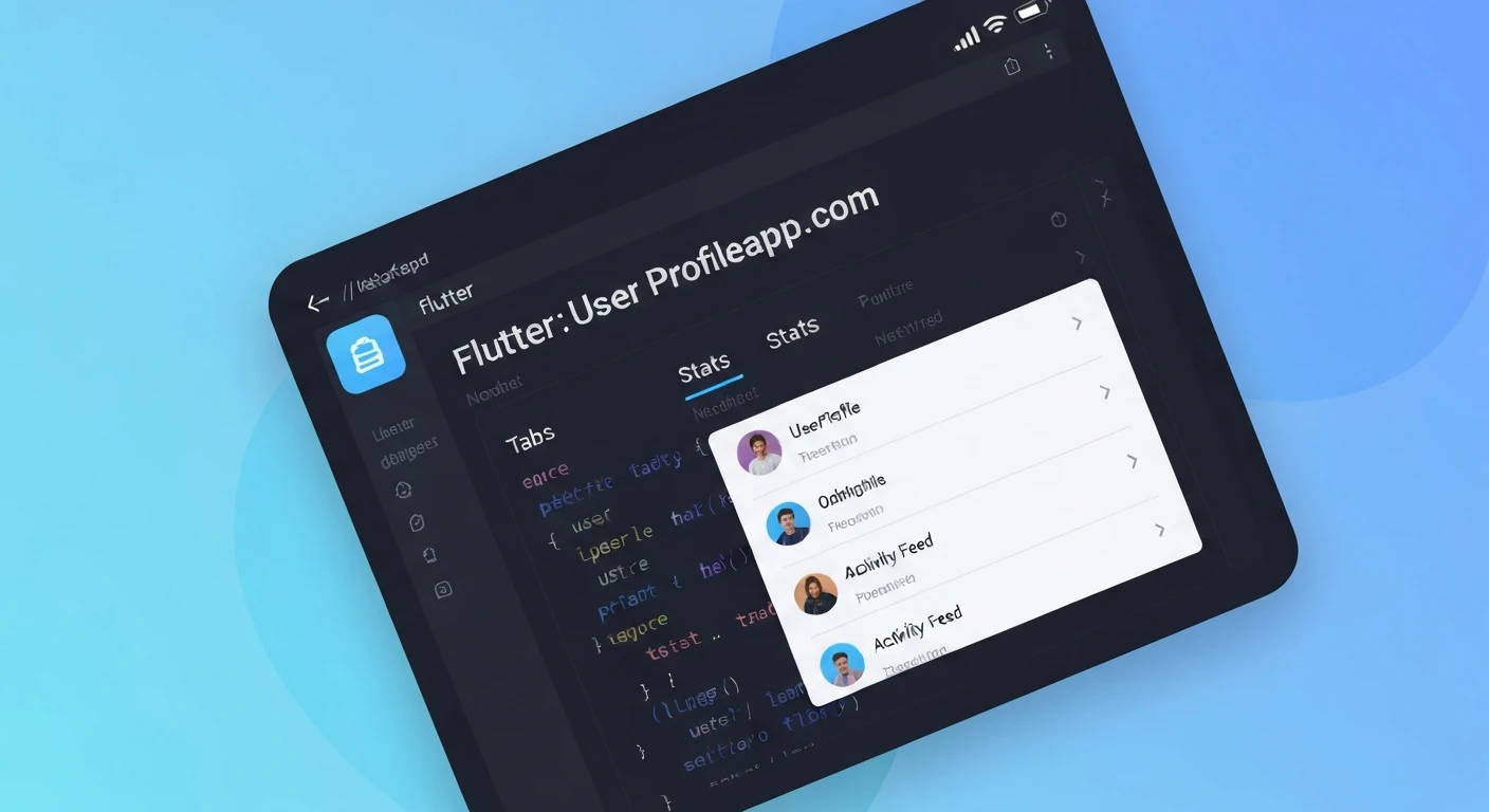

Building a User Profile Widget with Tabs, Stats, and Activity Feed in Flutter
User profile screens are a cornerstone of almost any modern application, providing users with a personalized space to view their details, activities, and connections. A well-designed profile widget not only enhances the user experience but also allows for rich interactions. In Flutter, creating such a complex yet intuitive UI component is straightforward thanks to its declarative nature and extensive widget catalog.
This article will guide you through building a professional user profile widget in Flutter, incorporating essential elements like a profile header, statistical data (posts, followers, following), and a dynamic activity feed, all organized neatly within a tabbed interface.
Core Components of a User Profile Widget
Before diving into the code, let's break down the key components we'll be building:
- Profile Header: Displays the user's avatar, name, and perhaps a short bio.
- Stats Row: Presents numerical data such as the number of posts, followers, and users being followed.
- Tab Bar: Allows navigation between different sections of the profile (e.g., Posts, Activity, About).
- Tab Views: The content displayed for each selected tab.
- Posts/Media Tab: A grid of user-uploaded images or media.
- Activity Feed Tab: A chronological list of recent user actions (likes, comments, new posts).
- About/Details Tab: Additional information about the user.
Setting Up the Data Models
To make our UI dynamic, we'll first define simple data models for a User and an Activity.
// lib/models/user.dart
class User {
  final String id;
  final String name;
  final String username;
  final String avatarUrl;
  final String bio;
  final int postsCount;
  final int followersCount;
  final int followingCount;

  User({
    required this.id,
    required this.name,
    required this.username,
    required this.avatarUrl,
    required this.bio,
    required this.postsCount,
    required this.followersCount,
    required this.followingCount,
  });
}

// lib/models/activity.dart
class Activity {
  final String id;
  final String type; // e.g., 'posted', 'commented', 'liked'
  final String description;
  final String timestamp;
  final String? imageUrl; // Optional image for activity feed

  Activity({
    required this.id,
    required this.type,
    required this.description,
    required this.timestamp,
    this.imageUrl,
  });
}

// Dummy data for demonstration
final User currentUser = User(
  id: 'u1',
  name: 'Jane Doe',
  username: '@janedoe',
  avatarUrl: 'https://via.placeholder.com/150/FF6347/FFFFFF?text=JD',
  bio: 'Flutter enthusiast | UI/UX Designer | Coffee Lover',
  postsCount: 125,
  followersCount: 2345,
  followingCount: 456,
);

final List dummyPosts = [
  'https://via.placeholder.com/150/FF0000/FFFFFF?text=Post1',
  'https://via.placeholder.com/150/00FF00/FFFFFF?text=Post2',
  'https://via.placeholder.com/150/0000FF/FFFFFF?text=Post3',
  'https://via.placeholder.com/150/FFFF00/FFFFFF?text=Post4',
  'https://via.placeholder.com/150/FF00FF/FFFFFF?text=Post5',
  'https://via.placeholder.com/150/00FFFF/FFFFFF?text=Post6',
  'https://via.placeholder.com/150/FFA500/FFFFFF?text=Post7',
  'https://via.placeholder.com/150/800080/FFFFFF?text=Post8',
];

final List dummyActivities = [
  Activity(
    id: 'a1',
    type: 'posted',
    description: 'Jane posted a new photo.',
    timestamp: '2 hours ago',
    imageUrl: 'https://via.placeholder.com/50/FF0000/FFFFFF?text=A1',
  ),
  Activity(
    id: 'a2',
    type: 'commented',
    description: 'Jane commented on John Doe\'s photo.',
    timestamp: '5 hours ago',
  ),
  Activity(
    id: 'a3',
    type: 'liked',
    description: 'Jane liked 3 new posts.',
    timestamp: '1 day ago',
  ),
  Activity(
    id: 'a4',
    type: 'posted',
    description: 'Jane updated her profile picture.',
    timestamp: '2 days ago',
    imageUrl: 'https://via.placeholder.com/50/FF6347/FFFFFF?text=JD',
  ),
  Activity(
    id: 'a5',
    type: 'followed',
    description: 'Jane started following Mary.',
    timestamp: '3 days ago',
  ),
];
Building the User Profile Screen
Our main screen will be a StatefulWidget to manage the tab selection state. We'll use DefaultTabController for easy tab management.
import 'package:flutter/material.dart';
import 'package:your_app_name/models/user.dart'; // Ensure correct path
import 'package:your_app_name/models/activity.dart'; // Ensure correct path

class UserProfileScreen extends StatefulWidget {
  const UserProfileScreen({Key? key}) : super(key: key);

  @override
  State createState() => _UserProfileScreenState();
}

class _UserProfileScreenState extends State {
  final User user = currentUser; // Using our dummy data

  @override
  Widget build(BuildContext context) {
    return Scaffold(
      appBar: AppBar(
        title: const Text('Profile'),
        centerTitle: true,
        backgroundColor: Colors.deepPurple,
      ),
      body: DefaultTabController(
        length: 3, // Number of tabs (Posts, Activity, About)
        child: NestedScrollView(
          headerSliverBuilder: (BuildContext context, bool innerBoxIsScrolled) {
            return <Widget>[
              SliverList(
                delegate: SliverChildListDelegate(
                  [
                    _buildProfileHeader(user),
                    _buildStatsRow(user),
                    const SizedBox(height: 16),
                  ],
                ),
              ),
              SliverPersistentHeader(
                delegate: _SliverAppBarDelegate(
                  TabBar(
                    labelColor: Colors.deepPurple,
                    unselectedLabelColor: Colors.grey,
                    indicatorColor: Colors.deepPurple,
                    tabs: const [
                      Tab(icon: Icon(Icons.grid_on), text: 'Posts'),
                      Tab(icon: Icon(Icons.rss_feed), text: 'Activity'),
                      Tab(icon: Icon(Icons.info_outline), text: 'About'),
                    ],
                  ),
                ),
                pinned: true,
              ),
            ];
          },
          body: TabBarView(
            children: [
              _buildPostsTab(),
              _buildActivityFeedTab(),
              _buildAboutTab(user),
            ],
          ),
        ),
      ),
    );
  }

  // ... (private helper methods will go here)
}

// Custom SliverPersistentHeaderDelegate for the TabBar
class _SliverAppBarDelegate extends SliverPersistentHeaderDelegate {
  _SliverAppBarDelegate(this._tabBar);

  final TabBar _tabBar;

  @override
  double get minExtent => _tabBar.preferredSize.height;
  @override
  double get maxExtent => _tabBar.preferredSize.height;

  @override
  Widget build(
      BuildContext context, double shrinkOffset, bool overlapsContent) {
    return Container(
      color: Theme.of(context).scaffoldBackgroundColor, // Background color for the tab bar
      child: _tabBar,
    );
  }

  @override
  bool shouldRebuild(_SliverAppBarDelegate oldDelegate) {
    return false;
  }
}
1. Building the Profile Header
The profile header will display the user's avatar, name, username, and bio.
  Widget _buildProfileHeader(User user) {
    return Padding(
      padding: const EdgeInsets.all(16.0),
      child: Column(
        children: [
          CircleAvatar(
            radius: 50,
            backgroundImage: NetworkImage(user.avatarUrl),
            backgroundColor: Colors.deepPurple.shade100,
          ),
          const SizedBox(height: 10),
          Text(
            user.name,
            style: const TextStyle(
              fontSize: 22,
              fontWeight: FontWeight.bold,
            ),
          ),
          const SizedBox(height: 4),
          Text(
            user.username,
            style: TextStyle(
              fontSize: 16,
              color: Colors.grey.shade600,
            ),
          ),
          const SizedBox(height: 8),
          Padding(
            padding: const EdgeInsets.symmetric(horizontal: 20.0),
            child: Text(
              user.bio,
              textAlign: TextAlign.center,
              style: const TextStyle(fontSize: 14),
            ),
          ),
          const SizedBox(height: 16),
          Row(
            mainAxisAlignment: MainAxisAlignment.center,
            children: [
              ElevatedButton(
                onPressed: () {
                  // Handle follow action
                },
                style: ElevatedButton.styleFrom(
                  backgroundColor: Colors.deepPurple,
                  foregroundColor: Colors.white,
                  padding: const EdgeInsets.symmetric(horizontal: 30, vertical: 10),
                  shape: RoundedRectangleBorder(
                    borderRadius: BorderRadius.circular(20),
                  ),
                ),
                child: const Text('Follow'),
              ),
              const SizedBox(width: 10),
              OutlinedButton(
                onPressed: () {
                  // Handle message action
                },
                style: OutlinedButton.styleFrom(
                  foregroundColor: Colors.deepPurple,
                  side: const BorderSide(color: Colors.deepPurple),
                  padding: const EdgeInsets.symmetric(horizontal: 30, vertical: 10),
                  shape: RoundedRectangleBorder(
                    borderRadius: BorderRadius.circular(20),
                  ),
                ),
                child: const Text('Message'),
              ),
            ],
          ),
        ],
      ),
    );
  }
2. Building the Stats Row
This section will display the user's post count, follower count, and following count.
  Widget _buildStatsRow(User user) {
    return Row(
      mainAxisAlignment: MainAxisAlignment.spaceEvenly,
      children: [
        _buildStatItem(user.postsCount, 'Posts'),
        _buildStatItem(user.followersCount, 'Followers'),
        _buildStatItem(user.followingCount, 'Following'),
      ],
    );
  }

  Widget _buildStatItem(int count, String label) {
    return Column(
      children: [
        Text(
          count.toString(),
          style: const TextStyle(
            fontSize: 18,
            fontWeight: FontWeight.bold,
          ),
        ),
        Text(
          label,
          style: TextStyle(
            fontSize: 14,
            color: Colors.grey.shade600,
          ),
        ),
      ],
    );
  }
3. Building Tab Views
Now, let's create the content for each tab.
Posts/Media Tab
This tab will display a grid of images, simulating user posts.
  Widget _buildPostsTab() {
    return GridView.builder(
      padding: const EdgeInsets.all(8.0),
      gridDelegate: const SliverGridDelegateWithFixedCrossAxisCount(
        crossAxisCount: 3,
        crossAxisSpacing: 4.0,
        mainAxisSpacing: 4.0,
      ),
      itemCount: dummyPosts.length,
      itemBuilder: (context, index) {
        return Image.network(
          dummyPosts[index],
          fit: BoxFit.cover,
        );
      },
    );
  }
Activity Feed Tab
This tab will show a list of recent activities performed by the user.
  Widget _buildActivityFeedTab() {
    return ListView.builder(
      padding: const EdgeInsets.all(8.0),
      itemCount: dummyActivities.length,
      itemBuilder: (context, index) {
        final activity = dummyActivities[index];
        return Card(
          margin: const EdgeInsets.symmetric(vertical: 6.0),
          elevation: 1,
          child: ListTile(
            leading: activity.imageUrl != null
                ? CircleAvatar(
                    backgroundImage: NetworkImage(activity.imageUrl!),
                    backgroundColor: Colors.deepPurple.shade50,
                  )
                : CircleAvatar(
                    backgroundColor: Colors.deepPurple.shade50,
                    child: Icon(
                      _getActivityIcon(activity.type),
                      color: Colors.deepPurple,
                    ),
                  ),
            title: Text(activity.description),
            subtitle: Text(activity.timestamp),
            trailing: activity.type == 'posted' && activity.imageUrl != null
                ? Image.network(activity.imageUrl!, width: 40, height: 40, fit: BoxFit.cover,)
                : null,
            onTap: () {
              // Handle activity item tap
            },
          ),
        );
      },
    );
  }

  IconData _getActivityIcon(String type) {
    switch (type) {
      case 'posted':
        return Icons.photo;
      case 'commented':
        return Icons.comment;
      case 'liked':
        return Icons.favorite;
      case 'followed':
        return Icons.person_add;
      default:
        return Icons.notifications;
    }
  }
About/Details Tab
This tab can display more detailed information about the user.
  Widget _buildAboutTab(User user) {
    return Padding(
      padding: const EdgeInsets.all(16.0),
      child: Column(
        crossAxisAlignment: CrossAxisAlignment.start,
        children: [
          const Text(
            'Bio',
            style: TextStyle(fontSize: 18, fontWeight: FontWeight.bold),
          ),
          const SizedBox(height: 8),
          Text(
            user.bio,
            style: const TextStyle(fontSize: 16),
          ),
          const Divider(height: 30),
          const Text(
            'Details',
            style: TextStyle(fontSize: 18, fontWeight: FontWeight.bold),
          ),
          const SizedBox(height: 8),
          _buildDetailRow(Icons.email, 'Email', '[email protected]'),
          _buildDetailRow(Icons.location_on, 'Location', 'New York, USA'),
          _buildDetailRow(Icons.cake, 'Joined', 'January 2023'),
        ],
      ),
    );
  }

  Widget _buildDetailRow(IconData icon, String label, String value) {
    return Padding(
      padding: const EdgeInsets.symmetric(vertical: 4.0),
      child: Row(
        children: [
          Icon(icon, size: 20, color: Colors.grey.shade700),
          const SizedBox(width: 10),
          Text(
            '$label: ',
            style: const TextStyle(fontSize: 16, fontWeight: FontWeight.bold),
          ),
          Text(
            value,
            style: const TextStyle(fontSize: 16),
          ),
        ],
      ),
    );
  }
Putting It All Together
With all the helper methods defined within our _UserProfileScreenState, the complete structure of the UserProfileScreen will look as shown in the first code block for the screen, combining the _buildProfileHeader, _buildStatsRow, and the TabBarView with our tab contents.
Ensure that your main.dart file initializes your app with MaterialApp and sets UserProfileScreen as the home widget or within a navigation stack.
import 'package:flutter/material.dart';
import 'package:your_app_name/screens/user_profile_screen.dart'; // Ensure correct path

void main() {
  runApp(const MyApp());
}

class MyApp extends StatelessWidget {
  const MyApp({Key? key}) : super(key: key);

  @override
  Widget build(BuildContext context) {
    return MaterialApp(
      title: 'Flutter Profile Widget',
      theme: ThemeData(
        primarySwatch: Colors.deepPurple,
        visualDensity: VisualDensity.adaptivePlatformDensity,
      ),
      home: const UserProfileScreen(),
    );
  }
}
Conclusion
By following these steps, you've successfully created a comprehensive user profile widget in Flutter featuring a dynamic header, statistical overview, and a tabbed interface for posts, activity feed, and user details. This modular approach, breaking down the UI into smaller, manageable widgets, not only makes the code cleaner but also highly reusable and easier to maintain.
You can further enhance this widget by integrating real-time data fetching, adding animations, implementing pagination for activity feeds or posts, and supporting interactive elements like liking posts or commenting directly from the activity feed. Flutter's flexibility makes it easy to build upon this foundation to create truly engaging user experiences.


