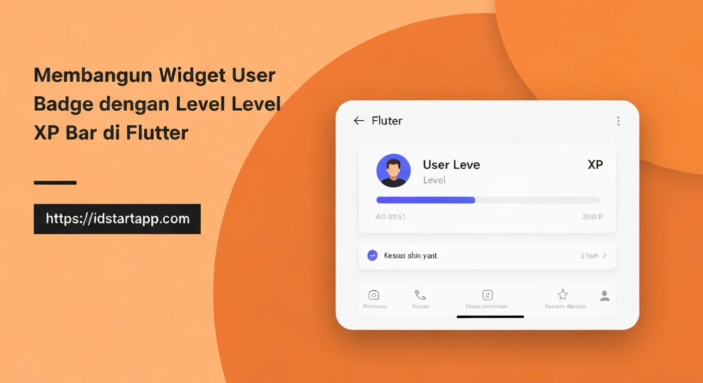

Building a Dynamic User Badge Widget with Level and XP Bar in Flutter
In modern applications, gamification elements play a crucial role in enhancing user engagement and retention. A common and effective gamification feature is the user badge, often accompanied by a level indicator and an experience (XP) bar. This visual representation motivates users by showcasing their progress and achievements within the application. This article will guide you through building a reusable and visually appealing user badge widget in Flutter, complete with a current level display and a custom-drawn XP progress bar.
Understanding the Core Components
Before diving into the implementation, let's identify the fundamental components required for our user badge widget:
- User Data Model: A clear structure to hold the user's current level, current experience points, and the experience points required to reach the next level.
- Level Display: A text element prominently showing the user's current level.
- XP Progress Bar: A visual bar that fills up as the user gains XP, indicating progress towards the next level.
- Overall Layout: A combination of these elements arranged aesthetically.
Step-by-Step Implementation
1. Defining the User Data Model
First, we'll create a simple Dart class to encapsulate the user's badge-related data. This makes our widget highly reusable and easy to integrate with various data sources.
class UserBadgeData {
  final int level;
  final double currentXp; // Current XP accumulated in the current level
  final double xpToNextLevel; // Total XP required to reach the next level from the start of the current level

  UserBadgeData({
    required this.level,
    required this.currentXp,
    required this.xpToNextLevel,
  }) : assert(currentXp >= 0 && currentXp <= xpToNextLevel, 'Current XP must be between 0 and XP to next level.');

  /// Calculates the progress as a double between 0.0 and 1.0
  double get xpProgress => xpToNextLevel > 0 ? currentXp / xpToNextLevel : 0.0;
}
2. Crafting the XP Progress Bar (CustomPainter)
For a unique and fully customizable look, we'll use Flutter's CustomPainter to draw the XP progress bar. This allows us to create rounded corners, custom gradients, and precise control over the bar's appearance.
import 'package:flutter/material.dart';

class XpProgressBarPainter extends CustomPainter {
  final double progress; // A value between 0.0 and 1.0
  final Color backgroundColor;
  final Color progressColor;
  final double borderRadius;

  XpProgressBarPainter({
    required this.progress,
    this.backgroundColor = Colors.grey,
    this.progressColor = Colors.blueAccent,
    this.borderRadius = 8.0,
  }) : assert(progress >= 0.0 && progress <= 1.0, 'Progress must be between 0.0 and 1.0');

  @override
  void paint(Canvas canvas, Size size) {
    final RRect backgroundRRect = RRect.fromRectAndRadius(
      Rect.fromLTWH(0, 0, size.width, size.height),
      Radius.circular(borderRadius),
    );

    // Draw background
    final Paint backgroundPaint = Paint()
      ..color = backgroundColor
      ..style = PaintingStyle.fill;
    canvas.drawRRect(backgroundRRect, backgroundPaint);

    // Draw progress
    if (progress > 0) {
      final double progressWidth = size.width * progress;
      final RRect progressRRect = RRect.fromRectAndRadius(
        Rect.fromLTWH(0, 0, progressWidth, size.height),
        Radius.circular(borderRadius),
      );

      final Paint progressPaint = Paint()
        ..color = progressColor
        ..style = PaintingStyle.fill;
      canvas.drawRRect(progressRRect, progressPaint);
    }
  }

  @override
  bool shouldRepaint(covariant XpProgressBarPainter oldDelegate) {
    return oldDelegate.progress != progress ||
           oldDelegate.backgroundColor != backgroundColor ||
           oldDelegate.progressColor != progressColor ||
           oldDelegate.borderRadius != borderRadius;
  }
}
3. Assembling the User Badge Widget
Now, let's combine our data model, the custom progress bar, and other UI elements into a single, reusable UserBadgeWidget. We'll use a Column and Row widgets to arrange the level and XP bar vertically.
import 'package:flutter/material.dart';
// Assuming user_badge_data.dart and xp_progress_bar_painter.dart are in the same project
// import 'user_badge_data.dart'; // Adjust path as necessary
// import 'xp_progress_bar_painter.dart'; // Adjust path as necessary

class UserBadgeWidget extends StatelessWidget {
  final UserBadgeData badgeData;
  final Color levelTextColor;
  final Color xpBarBackgroundColor;
  final Color xpBarProgressColor;
  final double xpBarHeight;
  final double containerBorderRadius;
  final double padding;
  final Color containerColor;
  final List<BoxShadow>? boxShadow;

  const UserBadgeWidget({
    Key? key,
    required this.badgeData,
    this.levelTextColor = Colors.white,
    this.xpBarBackgroundColor = const Color(0xFF424242), // Dark grey
    this.xpBarProgressColor = Colors.lightBlueAccent,
    this.xpBarHeight = 10.0,
    this.containerBorderRadius = 10.0,
    this.padding = 16.0,
    this.containerColor = const Color(0xFF212121), // Dark background for the badge
    this.boxShadow,
  }) : super(key: key);

  @override
  Widget build(BuildContext context) {
    return Container(
      padding: EdgeInsets.all(padding),
      decoration: BoxDecoration(
        color: containerColor,
        borderRadius: BorderRadius.circular(containerBorderRadius),
        boxShadow: boxShadow ?? [
          BoxShadow(
            color: Colors.black.withOpacity(0.3),
            blurRadius: 8,
            offset: const Offset(0, 4),
          ),
        ],
      ),
      child: Column(
        mainAxisSize: MainAxisSize.min,
        crossAxisAlignment: CrossAxisAlignment.start,
        children: [
          // Level Display
          Text(
            'Level ${badgeData.level}',
            style: TextStyle(
              color: levelTextColor,
              fontSize: 22,
              fontWeight: FontWeight.bold,
              letterSpacing: 1.2,
            ),
          ),
          const SizedBox(height: 8),
          // XP Text (e.g., "150/300 XP")
          Text(
            '${badgeData.currentXp.toInt()}/${badgeData.xpToNextLevel.toInt()} XP',
            style: TextStyle(
              color: levelTextColor.withOpacity(0.7),
              fontSize: 14,
            ),
          ),
          const SizedBox(height: 8),
          // XP Progress Bar
          SizedBox(
            height: xpBarHeight,
            width: double.infinity, // Occupy full available width
            child: CustomPaint(
              painter: XpProgressBarPainter(
                progress: badgeData.xpProgress,
                backgroundColor: xpBarBackgroundColor,
                progressColor: xpBarProgressColor,
                borderRadius: containerBorderRadius / 2, // Slightly smaller radius for the bar
              ),
            ),
          ),
        ],
      ),
    );
  }
}
4. Integrating into Your Application
To use the UserBadgeWidget, simply provide it with an instance of UserBadgeData. You can place it anywhere in your widget tree, for example, within a Scaffold's body.
import 'package:flutter/material.dart';
// Assuming UserBadgeData and UserBadgeWidget are defined in your project
// import 'user_badge_data.dart'; // Adjust path as necessary
// import 'user_badge_widget.dart'; // Adjust path as necessary

void main() {
  runApp(const MyApp());
}

class MyApp extends StatelessWidget {
  const MyApp({Key? key}) : super(key: key);

  @override
  Widget build(BuildContext context) {
    return MaterialApp(
      title: 'User Badge Demo',
      theme: ThemeData(
        primarySwatch: Colors.blue,
        visualDensity: VisualDensity.adaptivePlatformDensity,
      ),
      home: const HomePage(),
    );
  }
}

class HomePage extends StatelessWidget {
  const HomePage({Key? key}) : super(key: key);

  @override
  Widget build(BuildContext context) {
    // Example UserBadgeData
    final UserBadgeData userData = UserBadgeData(
      level: 15,
      currentXp: 180,
      xpToNextLevel: 300,
    );

    return Scaffold(
      appBar: AppBar(
        title: const Text('User Profile'),
        backgroundColor: const Color(0xFF1A1A1A),
      ),
      backgroundColor: const Color(0xFF333333), // Dark background for the page
      body: Center(
        child: Padding(
          padding: const EdgeInsets.all(20.0),
          child: UserBadgeWidget(
            badgeData: userData,
            xpBarProgressColor: Colors.deepOrangeAccent,
            levelTextColor: Colors.amberAccent,
          ),
        ),
      ),
    );
  }
}
Further Enhancements and Considerations:
- Animations: For a more dynamic feel, you can animate the XP bar's progress using
TweenAnimationBuilderorAnimatedBuilderwhen thecurrentXpchanges. This provides a satisfying visual feedback as users gain experience. - Theming and Customization: Extend the widget with more properties to allow customization of font styles, colors, padding, and even different badge shapes or icons. Consider using a `Theme` or `InheritedWidget` for app-wide styling.
- Backend Integration: In a real-world application,
UserBadgeDatawould be fetched from a backend service, often through a state management solution like Provider, BLoC, or Riverpod, to keep the UI synchronized with the user's actual progress. - Responsiveness: Ensure the widget scales well across different screen sizes and orientations by using layout widgets effectively and considering relative sizing where appropriate.
- Avatar/Profile Picture: You could easily integrate a user's avatar or a specific badge icon into the widget's layout to make it more personalized and visually rich.
- Tap Gestures: Add `GestureDetector` to make the badge tappable, potentially showing a detailed progress screen or achievements.
Conclusion:
Building a custom user badge widget with a level and XP bar in Flutter is an excellent way to enhance your application's user experience through gamification. By leveraging Flutter's powerful rendering capabilities with CustomPainter and combining it with thoughtful UI design, you can create engaging and visually appealing components that motivate users and foster a sense of progression. This modular approach ensures your widget is reusable, maintainable, and easily extensible for future features, significantly boosting user engagement in your application.


