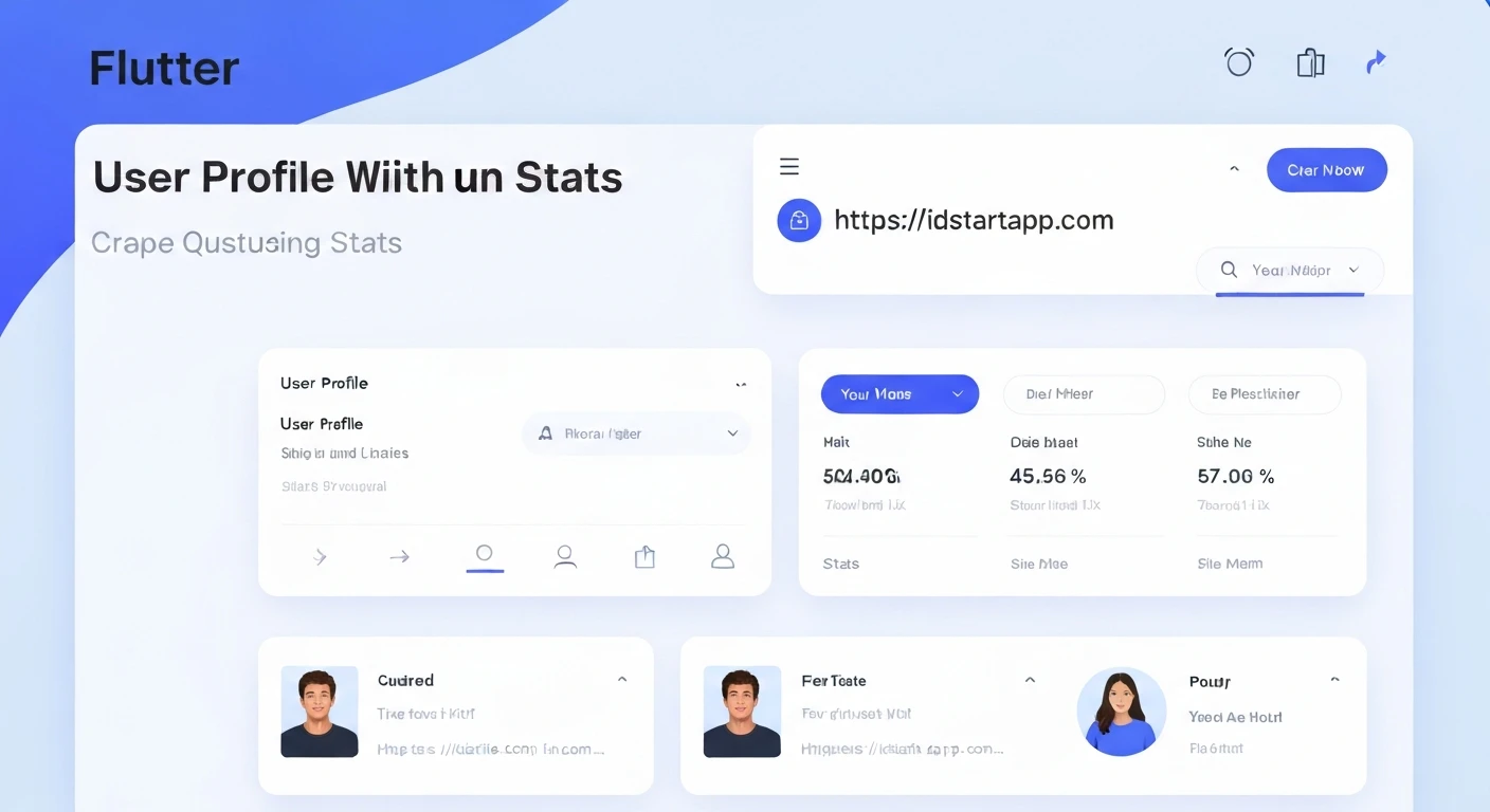

Building a User Profile Widget with Tabs and Stats in Flutter
User profile screens are a fundamental part of almost any modern mobile application. They provide a dedicated space for users to view and manage their information, showcase their activity, and connect with others. A well-designed user profile often includes key statistics and organized content presented through tabs.
This article will guide you through the process of building a dynamic user profile widget in Flutter, featuring a profile header with an avatar, name, and bio, a statistics section displaying metrics like posts, followers, and following, and a tabbed interface for different content categories.
Core Components of a User Profile
Before diving into the code, let's break down the essential components we'll be building:
- Profile Header: This section typically contains the user's avatar image, their name, and a short bio or description. It's the most visually prominent part of the profile.
- Statistics Section: Below the header, a row of key statistics like "Posts," "Followers," and "Following" provides a quick overview of the user's engagement or activity. Each statistic usually consists of a number and a corresponding label.
- Tabbed Content: To manage various types of content (e.g., user's posts, liked items, saved items), a tabbed interface is highly effective. Each tab will display different content when selected.
Flutter Implementation Details
We'll create a single stateful widget, UserProfileScreen, to encapsulate all these elements. This widget will manage the state for the tab controller.
1. Project Setup and Basic Structure
Start by creating a new Flutter project or modifying an existing one. We'll define a simple main.dart to run our UserProfileScreen.
import 'package:flutter/material.dart';

void main() {
  runApp(const MyApp());
}

class MyApp extends StatelessWidget {
  const MyApp({Key? key}) : super(key: key);

  @override
  Widget build(BuildContext context) {
    return MaterialApp(
      title: 'User Profile Demo',
      theme: ThemeData(
        primarySwatch: Colors.blue,
      ),
      home: const UserProfileScreen(),
    );
  }
}

class UserProfileScreen extends StatefulWidget {
  const UserProfileScreen({Key? key}) : super(key: key);

  @override
  State<UserProfileScreen> createState() => _UserProfileScreenState();
}

class _UserProfileScreenState extends State<UserProfileScreen> with SingleTickerProviderStateMixin {
  late TabController _tabController;

  @override
  void initState() {
    super.initState();
    _tabController = TabController(length: 3, vsync: this); // 3 tabs: Posts, Likes, Saved
  }

  @override
  void dispose() {
    _tabController.dispose();
    super.dispose();
  }

  @override
  Widget build(BuildContext context) {
    return Scaffold(
      appBar: AppBar(
        title: const Text('User Profile'),
      ),
      body: Column(
        children: [
          // Profile Header will go here
          // Stats Section will go here
          // TabBar will go here
          // TabBarView will go here
        ],
      ),
    );
  }
}
In the above code:
UserProfileScreenis aStatefulWidgetbecause it needs to manage the state of theTabController._UserProfileScreenStateusesSingleTickerProviderStateMixinto provide aTickerfor theTabController. This is essential for tab animations._tabControlleris initialized ininitStatewith the desired number of tabs and disposed of indispose.- The main layout is a
Scaffoldwith anAppBarand aColumnin itsbodyto stack our profile components vertically.
2. Building the Profile Header
The profile header will consist of a CircleAvatar, the user's name, and a short bio. We'll arrange these using a Row for the avatar and text, then a Column for the name/bio.
// Inside _UserProfileScreenState build method, replace "// Profile Header will go here"
Padding(
  padding: const EdgeInsets.all(16.0),
  child: Column(
    children: [
      Row(
        children: [
          const CircleAvatar(
            radius: 40,
            backgroundImage: NetworkImage('https://via.placeholder.com/150'), // Replace with user's avatar URL
          ),
          const SizedBox(width: 16),
          Expanded(
            child: Column(
              crossAxisAlignment: CrossAxisAlignment.start,
              children: const [
                Text(
                  'John Doe',
                  style: TextStyle(fontSize: 22, fontWeight: FontWeight.bold),
                ),
                SizedBox(height: 4),
                Text(
                  'Flutter developer | Tech enthusiast | Coffee lover',
                  style: TextStyle(fontSize: 14, color: Colors.grey),
                ),
              ],
            ),
          ),
        ],
      ),
      const SizedBox(height: 16),
      // Add a follow button or other actions here if needed
      // ElevatedButton(
      //   onPressed: () {},
      //   child: const Text('Follow'),
      // ),
    ],
  ),
),
3. Implementing the Statistics Section
The statistics section will be a Row of three equally spaced Column widgets, each displaying a number (e.g., 123) and a label (e.g., Posts).
// Inside _UserProfileScreenState build method, replace "// Stats Section will go here"
const Divider(), // A subtle line to separate header from stats
Padding(
  padding: const EdgeInsets.symmetric(vertical: 16.0),
  child: Row(
    mainAxisAlignment: MainAxisAlignment.spaceAround,
    children: [
      _buildStatColumn('Posts', 123),
      _buildStatColumn('Followers', 4567),
      _buildStatColumn('Following', 890),
    ],
  ),
),
const Divider(), // Another divider for separation

// Add this helper method inside _UserProfileScreenState class
Widget _buildStatColumn(String label, int value) {
  return Column(
    children: [
      Text(
        value.toString(),
        style: const TextStyle(fontSize: 20, fontWeight: FontWeight.bold),
      ),
      const SizedBox(height: 4),
      Text(
        label,
        style: const TextStyle(fontSize: 14, color: Colors.grey),
      ),
    ],
  );
}
4. Creating the Tab Bar
The TabBar will be placed directly below the statistics. It requires the _tabController we initialized earlier.
// Inside _UserProfileScreenState build method, replace "// TabBar will go here"
TabBar(
  controller: _tabController,
  labelColor: Theme.of(context).primaryColor,
  unselectedLabelColor: Colors.grey,
  indicatorColor: Theme.of(context).primaryColor,
  tabs: const [
    Tab(icon: Icon(Icons.grid_on), text: 'Posts'),
    Tab(icon: Icon(Icons.favorite_border), text: 'Likes'),
    Tab(icon: Icon(Icons.bookmark_border), text: 'Saved'),
  ],
),
5. Designing Tab Content (TabBarView)
The TabBarView displays the content corresponding to the selected tab. It must be wrapped in an Expanded widget within the Column so it takes up the remaining available space.
// Inside _UserProfileScreenState build method, replace "// TabBarView will go here"
Expanded(
  child: TabBarView(
    controller: _tabController,
    children: const [
      Center(child: Text('Posts Content Goes Here')),
      Center(child: Text('Liked Items Content Goes Here')),
      Center(child: Text('Saved Items Content Goes Here')),
    ],
  ),
),
Full Code Example
Combining all the pieces, here is the complete UserProfileScreen widget:
import 'package:flutter/material.dart';

void main() {
  runApp(const MyApp());
}

class MyApp extends StatelessWidget {
  const MyApp({Key? key}) : super(key: key);

  @override
  Widget build(BuildContext context) {
    return MaterialApp(
      title: 'User Profile Demo',
      theme: ThemeData(
        primarySwatch: Colors.blue,
        visualDensity: VisualDensity.adaptivePlatformDensity,
      ),
      home: const UserProfileScreen(),
    );
  }
}

class UserProfileScreen extends StatefulWidget {
  const UserProfileScreen({Key? key}) : super(key: key);

  @override
  State<UserProfileScreen> createState() => _UserProfileScreenState();
}

class _UserProfileScreenState extends State<UserProfileScreen> with SingleTickerProviderStateMixin {
  late TabController _tabController;

  @override
  void initState() {
    super.initState();
    _tabController = TabController(length: 3, vsync: this); // 3 tabs: Posts, Likes, Saved
  }

  @override
  void dispose() {
    _tabController.dispose();
    super.dispose();
  }

  Widget _buildStatColumn(String label, int value) {
    return Column(
      mainAxisSize: MainAxisSize.min,
      mainAxisAlignment: MainAxisAlignment.center,
      children: [
        Text(
          value.toString(),
          style: const TextStyle(fontSize: 20, fontWeight: FontWeight.bold),
        ),
        const SizedBox(height: 4),
        Text(
          label,
          style: const TextStyle(fontSize: 14, color: Colors.grey),
        ),
      ],
    );
  }

  @override
  Widget build(BuildContext context) {
    return Scaffold(
      appBar: AppBar(
        title: const Text('User Profile'),
        centerTitle: false, // Align title to the left
      ),
      body: Column(
        crossAxisAlignment: CrossAxisAlignment.start,
        children: [
          // Profile Header
          Padding(
            padding: const EdgeInsets.all(16.0),
            child: Row(
              children: [
                const CircleAvatar(
                  radius: 40,
                  backgroundImage: NetworkImage('https://via.placeholder.com/150'), // Example avatar
                  backgroundColor: Colors.grey,
                ),
                const SizedBox(width: 16),
                Expanded(
                  child: Column(
                    crossAxisAlignment: CrossAxisAlignment.start,
                    children: const [
                      Text(
                        'John Doe',
                        style: TextStyle(fontSize: 22, fontWeight: FontWeight.bold),
                      ),
                      SizedBox(height: 4),
                      Text(
                        'Flutter developer | Tech enthusiast | Coffee lover',
                        style: TextStyle(fontSize: 14, color: Colors.grey),
                      ),
                    ],
                  ),
                ),
              ],
            ),
          ),

          // Statistics Section
          const Divider(height: 1), // A subtle line to separate header from stats
          Padding(
            padding: const EdgeInsets.symmetric(vertical: 16.0),
            child: Row(
              mainAxisAlignment: MainAxisAlignment.spaceAround,
              children: [
                _buildStatColumn('Posts', 123),
                _buildStatColumn('Followers', 4567),
                _buildStatColumn('Following', 890),
              ],
            ),
          ),
          const Divider(height: 1), // Another divider for separation

          // TabBar
          TabBar(
            controller: _tabController,
            labelColor: Theme.of(context).primaryColor,
            unselectedLabelColor: Colors.grey,
            indicatorColor: Theme.of(context).primaryColor,
            tabs: const [
              Tab(icon: Icon(Icons.grid_on), text: 'Posts'),
              Tab(icon: Icon(Icons.favorite_border), text: 'Likes'),
              Tab(icon: Icon(Icons.bookmark_border), text: 'Saved'),
            ],
          ),

          // TabBarView
          Expanded(
            child: TabBarView(
              controller: _tabController,
              children: const [
                Center(child: Text('Content for Posts Tab')),
                Center(child: Text('Content for Likes Tab')),
                Center(child: Text('Content for Saved Tab')),
              ],
            ),
          ),
        ],
      ),
    );
  }
}
Conclusion
You have successfully built a foundational user profile widget in Flutter, complete with a distinctive header, a statistics overview, and a dynamic tabbed content area. This structure provides a solid base that can be further enhanced with real user data, dynamic content loading for tabs (e.g., using ListView.builder or GridView.builder for posts), interactive elements, and custom styling to match your application's design language. Experiment with different layouts, animations, and data fetching techniques to make your user profiles truly engaging and functional.


