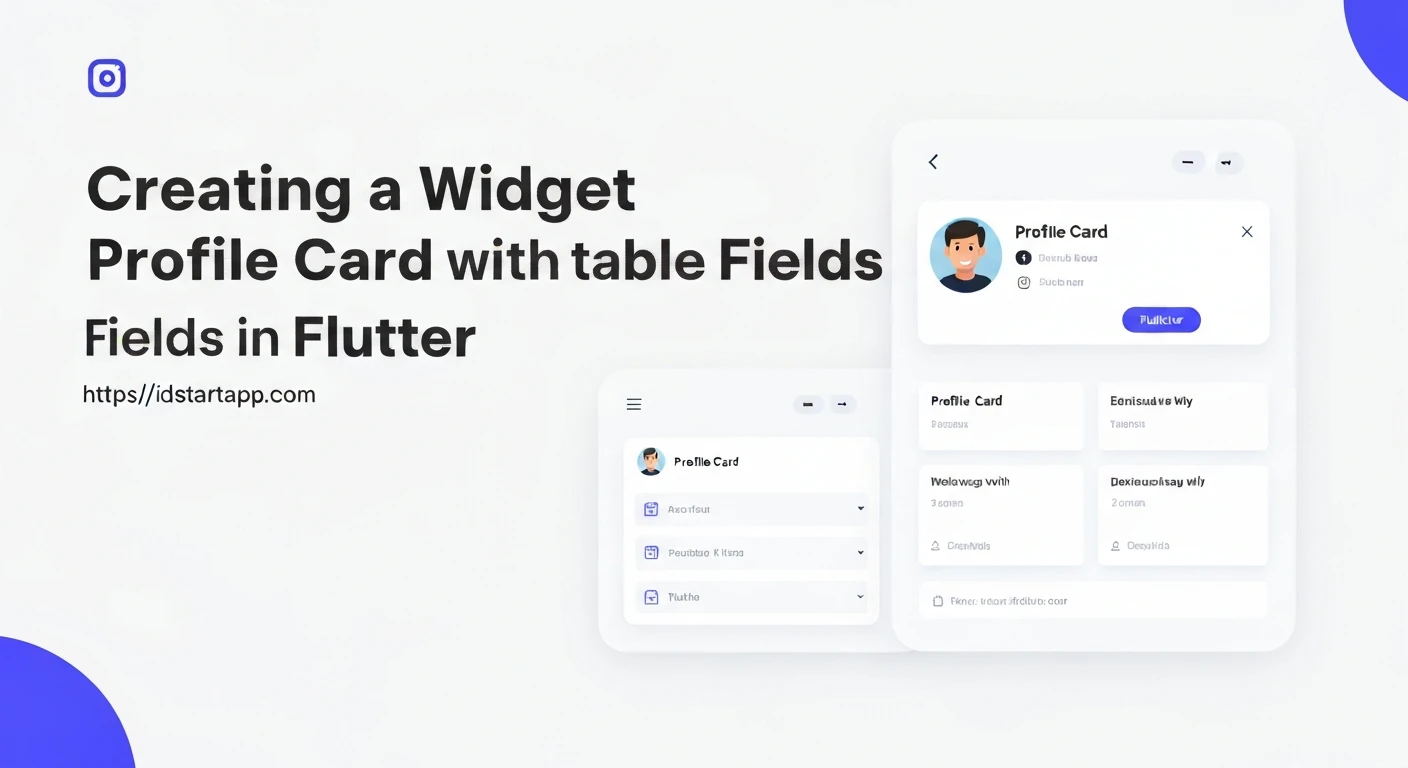

Creating a dynamic and interactive user interface is a cornerstone of modern application development. In Flutter, building a profile card that allows users to view and edit their information seamlessly is a common requirement. This article will guide you through the process of developing a profile card widget with editable fields, leveraging Flutter's powerful state management capabilities.
1. Introduction to Profile Cards with Editable Fields
A profile card typically displays essential user information such as name, email, biography, and a profile picture. Enhancing this with editable fields allows users to update their details directly within the app, providing a much richer and more personalized experience. This is crucial for user settings, account management, and any application requiring user data input and modification.
2. Fundamental Flutter Concepts
Before diving into the code, let's briefly review the core Flutter concepts essential for this task:
StatefulWidget: This is the foundation for widgets that can change their appearance over time in response to user interaction or other events. Our profile card will be aStatefulWidgetbecause its content (the profile data and edit mode) will change.TextEditingController: This controller is used to manage the text being edited in aTextFieldorTextFormField. It allows you to set initial values, read current values, and listen for changes.setState(): A method called within aStatefulWidgetto notify the framework that the internal state of the object has changed, which might require rebuilding the subtree associated with that state.TextFormField: A material design text input field. It's built on top ofTextFieldand integrates additional features like validation and decoration.
3. Building the Basic Profile Card Structure
We'll start by creating a StatefulWidget that holds our profile data and displays it. Initially, this data will be static.
import 'package:flutter/material.dart';

class ProfileCard extends StatefulWidget {
  const ProfileCard({super.key});

  @override
  State createState() => _ProfileCardState();
}

class _ProfileCardState extends State {
  // Initial static profile data
  String _name = 'John Doe';
  String _email = '[email protected]';
  String _bio = 'Passionate Flutter developer and tech enthusiast.';

  @override
  Widget build(BuildContext context) {
    return Card(
      margin: const EdgeInsets.all(16.0),
      child: Padding(
        padding: const EdgeInsets.all(16.0),
        child: Column(
          crossAxisAlignment: CrossAxisAlignment.start,
          children: [
            Center(
              child: CircleAvatar(
                radius: 50,
                backgroundImage: NetworkImage('https://via.placeholder.com/150'), // Placeholder image
              ),
            ),
            const SizedBox(height: 16),
            Text(
              _name,
              style: Theme.of(context).textTheme.headlineSmall,
            ),
            const SizedBox(height: 8),
            Text(
              _email,
              style: Theme.of(context).textTheme.bodyMedium,
            ),
            const SizedBox(height: 16),
            Text(
              _bio,
              style: Theme.of(context).textTheme.bodyLarge,
            ),
          ],
        ),
      ),
    );
  }
}
4. Implementing Editable Fields and Toggle Mode
Now, let's introduce the edit mode. We'll use a boolean variable _isEditing to toggle between displaying Text widgets and TextFormField widgets. We'll also initialize TextEditingControllers to manage the input fields.
First, declare the controllers and the _isEditing state variable:
import 'package:flutter/material.dart';

class ProfileCard extends StatefulWidget {
  const ProfileCard({super.key});

  @override
  State createState() => _ProfileCardState();
}

class _ProfileCardState extends State {
  String _name = 'John Doe';
  String _email = '[email protected]';
  String _bio = 'Passionate Flutter developer and tech enthusiast.';

  bool _isEditing = false; // State to toggle edit mode

  late TextEditingController _nameController;
  late TextEditingController _emailController;
  late TextEditingController _bioController;

  @override
  void initState() {
    super.initState();
    _nameController = TextEditingController(text: _name);
    _emailController = TextEditingController(text: _email);
    _bioController = TextEditingController(text: _bio);
  }

  @override
  void dispose() {
    _nameController.dispose();
    _emailController.dispose();
    _bioController.dispose();
    super.dispose();
  }

  void _toggleEdit() {
    setState(() {
      _isEditing = !_isEditing;
      if (!_isEditing) {
        // If exiting edit mode, save changes
        _name = _nameController.text;
        _email = _emailController.text;
        _bio = _bioController.text;
        // In a real app, you would send this data to a backend or save locally.
        _showSnackBar('Profile updated!');
      } else {
        // If entering edit mode, ensure controllers reflect current state
        _nameController.text = _name;
        _emailController.text = _email;
        _bioController.text = _bio;
      }
    });
  }

  void _showSnackBar(String message) {
    ScaffoldMessenger.of(context).showSnackBar(
      SnackBar(
        content: Text(message),
        duration: const Duration(seconds: 2),
      ),
    );
  }

  @override
  Widget build(BuildContext context) {
    return Scaffold(
      appBar: AppBar(
        title: const Text('Profile Card'),
        actions: [
          IconButton(
            icon: Icon(_isEditing ? Icons.save : Icons.edit),
            onPressed: _toggleEdit,
          ),
        ],
      ),
      body: Center(
        child: Card(
          margin: const EdgeInsets.all(16.0),
          child: Padding(
            padding: const EdgeInsets.all(16.0),
            child: Column(
              mainAxisSize: MainAxisSize.min, // To wrap content height
              crossAxisAlignment: CrossAxisAlignment.start,
              children: [
                Center(
                  child: CircleAvatar(
                    radius: 50,
                    backgroundImage: NetworkImage('https://via.placeholder.com/150'),
                  ),
                ),
                const SizedBox(height: 16),
                _isEditing
                    ? TextFormField(
                        controller: _nameController,
                        decoration: const InputDecoration(
                          labelText: 'Name',
                          border: OutlineInputBorder(),
                        ),
                        style: Theme.of(context).textTheme.headlineSmall,
                      )
                    : Text(
                        _name,
                        style: Theme.of(context).textTheme.headlineSmall,
                      ),
                const SizedBox(height: 8),
                _isEditing
                    ? TextFormField(
                        controller: _emailController,
                        decoration: const InputDecoration(
                          labelText: 'Email',
                          border: OutlineInputBorder(),
                        ),
                        keyboardType: TextInputType.emailAddress,
                        style: Theme.of(context).textTheme.bodyMedium,
                      )
                    : Text(
                        _email,
                        style: Theme.of(context).textTheme.bodyMedium,
                      ),
                const SizedBox(height: 16),
                _isEditing
                    ? TextFormField(
                        controller: _bioController,
                        maxLines: 3,
                        decoration: const InputDecoration(
                          labelText: 'Bio',
                          border: OutlineInputBorder(),
                        ),
                        style: Theme.of(context).textTheme.bodyLarge,
                      )
                    : Text(
                        _bio,
                        style: Theme.of(context).textTheme.bodyLarge,
                      ),
              ],
            ),
          ),
        ),
      ),
    );
  }
}
5. Integrating into a Flutter Application
To see the ProfileCard in action, you need to embed it within a MaterialApp. Here's a basic main.dart file:
import 'package:flutter/material.dart';
import 'profile_card.dart'; // Assuming ProfileCard is in profile_card.dart

void main() {
  runApp(const MyApp());
}

class MyApp extends StatelessWidget {
  const MyApp({super.key});

  @override
  Widget build(BuildContext context) {
    return MaterialApp(
      title: 'Flutter Profile Card',
      theme: ThemeData(
        primarySwatch: Colors.blue,
        visualDensity: VisualDensity.adaptivePlatformDensity,
      ),
      home: const ProfileCard(), // Our ProfileCard widget is the home screen
    );
  }
}
6. Enhancements and Further Considerations
The profile card demonstrated above provides a solid foundation. Here are several ways to enhance it:
- Input Validation: Use the
validatorproperty ofTextFormFieldto ensure inputs like email addresses are valid or fields are not left empty. - Data Persistence: Currently, data changes are lost when the app restarts. Implement data persistence using:
shared_preferencesfor simple key-value storage.- Local databases like SQLite (using
sqflitepackage). - Cloud solutions (Firebase, Supabase, custom backend APIs).
- Profile Picture Upload: Integrate an image picker (e.g.,
image_pickerpackage) to allow users to change their profile picture. - Loading States: When saving data to a backend, show a loading indicator to inform the user that an operation is in progress.
- Error Handling: Gracefully handle network errors or validation failures during data saving.
- Styling and Responsiveness: Further customize the look and feel using themes and ensure the layout adapts well to different screen sizes.
- Separation of Concerns: For larger applications, consider separating the UI logic from the business logic using state management solutions like Provider, BLoC, Riverpod, etc.
Conclusion
You have successfully created a dynamic profile card widget in Flutter with editable fields. By leveraging StatefulWidget, TextEditingController, and conditional rendering, users can now view and modify their profile information seamlessly. This pattern is highly adaptable and forms a crucial component in many interactive Flutter applications, providing a robust foundation for user data management.


