Creating a Recipe Category Grid Widget with Overlay Gradient, Tap Action, and Animation in Flutter
In modern mobile application development, a visually appealing and interactive user interface is paramount for a compelling user experience. For applications like recipe books, e-commerce, or content galleries, presenting categories in an organized yet engaging grid layout can significantly improve navigation and aesthetic appeal. This article details how to construct a sophisticated recipe category grid widget in Flutter, incorporating an elegant overlay gradient, responsive tap actions, and subtle animations for enhanced user interaction.
Introduction
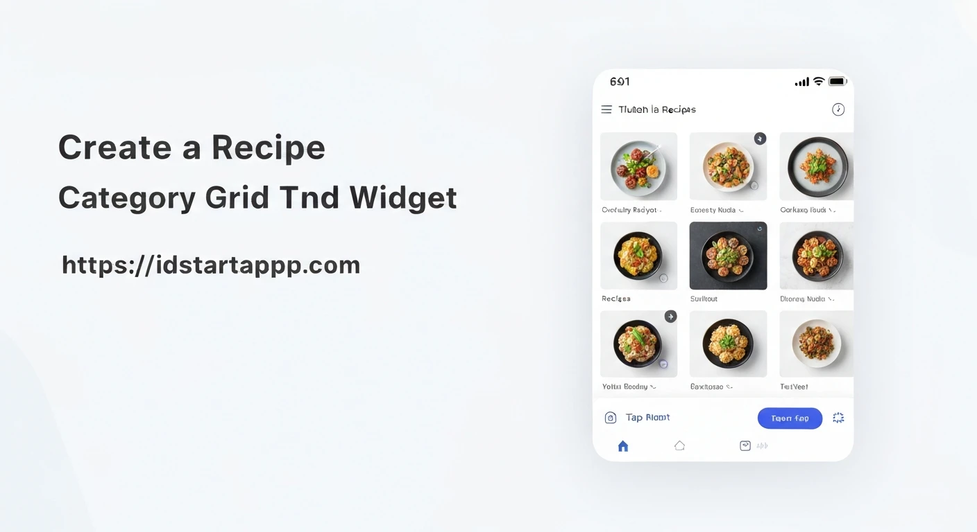
The goal is to create a reusable Flutter widget that displays recipe categories in a grid. Each category item will feature an image, a category name, a gradient overlay for text readability, and interactive elements including a tap action and an animation feedback. This comprehensive approach ensures both functional clarity and a polished visual presentation.
Core Components and Concepts
To achieve our desired widget, we will leverage several key Flutter concepts:
GridView.builder: For efficiently building a scrollable, two-dimensional array of widgets.Stack: To overlay the gradient and text on top of the background image.Container with BoxDecoration and LinearGradient: To create the visual gradient effect.GestureDetector: To detect tap events on each grid item.TweenAnimationBuilder: To implement a smooth scaling animation when an item is tapped.- State Management: For managing the animation state within the widget.
1. Defining the Data Model
First, let's establish a simple data model for our recipe categories.
class RecipeCategory {
  final String id;
  final String name;
  final String imageUrl;

  const RecipeCategory({
    required this.id,
    required this.name,
    required this.imageUrl,
  });
}
This `RecipeCategory` class will hold the necessary information for each item in our grid.
2. The Individual Category Grid Item Widget
This is the core widget that will represent a single recipe category in the grid. It will include the image, gradient, text, tap action, and animation.
import 'package:flutter/material.dart';

class _CategoryGridItem extends StatefulWidget {
  final RecipeCategory category;
  final Function(RecipeCategory category) onTap;

  const _CategoryGridItem({
    Key? key,
    required this.category,
    required this.onTap,
  }) : super(key: key);

  @override
  _CategoryGridItemState createState() => _CategoryGridItemState();
}

class _CategoryGridItemState extends State<_CategoryGridItem> {
  bool _isPressed = false;

  void _onTapDown(TapDownDetails details) {
    setState(() {
      _isPressed = true;
    });
  }

  void _onTapUp(TapUpDetails details) {
    setState(() {
      _isPressed = false;
    });
    widget.onTap(widget.category);
  }

  void _onTapCancel() {
    setState(() {
      _isPressed = false;
    });
  }

  @override
  Widget build(BuildContext context) {
    return GestureDetector(
      onTapDown: _onTapDown,
      onTapUp: _onTapUp,
      onTapCancel: _onTapCancel,
      child: TweenAnimationBuilder(
        tween: Tween(begin: 1.0, end: _isPressed ? 0.95 : 1.0),
        duration: const Duration(milliseconds: 150),
        curve: Curves.easeOutCubic,
        builder: (context, scale, child) {
          return Transform.scale(
            scale: scale,
            child: child,
          );
        },
        child: ClipRRect(
          borderRadius: BorderRadius.circular(10),
          child: Stack(
            children: [
              // Background Image
              Positioned.fill(
                child: Image.network(
                  widget.category.imageUrl,
                  fit: BoxFit.cover,
                  errorBuilder: (context, error, stackTrace) => Container(
                    color: Colors.grey[300],
                    child: const Icon(Icons.broken_image, color: Colors.grey),
                  ),
                  loadingBuilder: (context, child, loadingProgress) {
                    if (loadingProgress == null) return child;
                    return Center(
                      child: CircularProgressIndicator(
                        value: loadingProgress.expectedTotalBytes != null
                            ? loadingProgress.cumulativeBytesLoaded /
                                loadingProgress.expectedTotalBytes!
                            : null,
                      ),
                    );
                  },
                ),
              ),
              // Gradient Overlay
              Positioned.fill(
                child: Container(
                  decoration: BoxDecoration(
                    gradient: LinearGradient(
                      begin: Alignment.topCenter,
                      end: Alignment.bottomCenter,
                      colors: [
                        Colors.transparent,
                        Colors.black.withOpacity(0.7),
                      ],
                      stops: const [0.6, 1.0],
                    ),
                  ),
                ),
              ),
              // Category Name Text
              Positioned(
                bottom: 10,
                left: 10,
                right: 10,
                child: Text(
                  widget.category.name,
                  style: const TextStyle(
                    color: Colors.white,
                    fontSize: 18,
                    fontWeight: FontWeight.bold,
                  ),
                  maxLines: 2,
                  overflow: TextOverflow.ellipsis,
                ),
              ),
            ],
          ),
        ),
      ),
    );
  }
}
Explanation of _CategoryGridItem:
- `_CategoryGridItem` is a `StatefulWidget` to manage the `_isPressed` state for the animation.
- `GestureDetector` wraps the entire item to capture tap down, tap up, and tap cancel events.
- `_onTapDown` sets `_isPressed` to `true`, triggering the animation.
- `_onTapUp` sets `_isPressed` back to `false` and calls the `widget.onTap` callback with the category data.
- `_onTapCancel` handles cases where the tap is interrupted, resetting `_isPressed`.
- `TweenAnimationBuilder` creates a smooth scale animation. When `_isPressed` is true, the `tween` goes from 1.0 to 0.95 (a slight shrink). When `_isPressed` is false, it returns to 1.0.
- `Transform.scale` applies the animated scale value to its child.
- `ClipRRect` with `borderRadius` gives rounded corners to the grid item.
- `Stack` is used to layer elements: the image, the gradient, and the text.
- `Image.network` displays the category image, with `errorBuilder` and `loadingBuilder` for better UX.
- The gradient is a `LinearGradient` from `transparent` to `black.withOpacity(0.7)`, ensuring the text at the bottom is readable.
- `Positioned` widget places the category name text at the bottom of the item.
3. The Recipe Category Grid Widget
Now, we'll create the main widget that arranges these individual items into a grid.
import 'package:flutter/material.dart';
// Make sure to import your RecipeCategory model and _CategoryGridItem

class RecipeCategoryGrid extends StatelessWidget {
  final List categories;
  final Function(RecipeCategory category) onCategoryTap;

  const RecipeCategoryGrid({
    Key? key,
    required this.categories,
    required this.onCategoryTap,
  }) : super(key: key);

  @override
  Widget build(BuildContext context) {
    return GridView.builder(
      padding: const EdgeInsets.all(15),
      gridDelegate: const SliverGridDelegateWithFixedCrossAxisCount(
        crossAxisCount: 2, // Number of columns
        childAspectRatio: 3 / 2, // Aspect ratio of each item
        crossAxisSpacing: 15, // Horizontal spacing
        mainAxisSpacing: 15, // Vertical spacing
      ),
      itemCount: categories.length,
      itemBuilder: (context, index) {
        return _CategoryGridItem(
          category: categories[index],
          onTap: onCategoryTap,
        );
      },
    );
  }
}
Explanation of RecipeCategoryGrid:
- This is a `StatelessWidget` as it only renders the grid based on the provided data.
- `GridView.builder` is used for efficiency. It only builds items that are currently visible on screen.
- `padding` adds spacing around the entire grid.
- `SliverGridDelegateWithFixedCrossAxisCount` defines the grid's structure:
- `crossAxisCount: 2` means two columns will be displayed.
- `childAspectRatio: 3 / 2` sets the width-to-height ratio of each grid item.
- `crossAxisSpacing` and `mainAxisSpacing` control the spacing between items.
- `itemCount` is the total number of categories.
- `itemBuilder` constructs an `_CategoryGridItem` for each category, passing the category data and the tap handler.
4. Integrating into a Flutter Application
Finally, let's see how to use `RecipeCategoryGrid` in a sample Flutter screen.
import 'package:flutter/material.dart';
// Make sure to import your RecipeCategory, _CategoryGridItem, and RecipeCategoryGrid

class HomePage extends StatefulWidget {
  const HomePage({Key? key}) : super(key: key);

  @override
  State createState() => _HomePageState();
}

class _HomePageState extends State {
  final List _dummyCategories = const [
    RecipeCategory(
      id: 'c1',
      name: 'Italian Cuisine',
      imageUrl: 'https://cdn.pixabay.com/photo/2017/09/23/12/40/ravioli-2778810_1280.jpg',
    ),
    RecipeCategory(
      id: 'c2',
      name: 'Asian Delights',
      imageUrl: 'https://cdn.pixabay.com/photo/2016/09/01/17/39/sushi-1636253_1280.jpg',
    ),
    RecipeCategory(
      id: 'c3',
      name: 'Desserts & Sweets',
      imageUrl: 'https://cdn.pixabay.com/photo/2017/01/11/11/34/pancakes-1971168_1280.jpg',
    ),
    RecipeCategory(
      id: 'c4',
      name: 'Healthy Eats',
      imageUrl: 'https://cdn.pixabay.com/photo/2017/05/23/22/33/healthy-food-2338571_1280.jpg',
    ),
    RecipeCategory(
      id: 'c5',
      name: 'Breakfast Ideas',
      imageUrl: 'https://cdn.pixabay.com/photo/2017/03/31/18/19/plate-2192100_1280.jpg',
    ),
    RecipeCategory(
      id: 'c6',
      name: 'Seafood Specials',
      imageUrl: 'https://cdn.pixabay.com/photo/2017/03/10/05/35/seafood-2131975_1280.jpg',
    ),
  ];

  void _handleCategoryTap(RecipeCategory category) {
    ScaffoldMessenger.of(context).showSnackBar(
      SnackBar(
        content: Text('Tapped on ${category.name}!'),
        duration: const Duration(milliseconds: 700),
      ),
    );
    // In a real app, you would navigate to a detailed category screen here
    // Navigator.of(context).push(
    //   MaterialPageRoute(
    //     builder: (ctx) => CategoryDetailScreen(category: category),
    //   ),
    // );
  }

  @override
  Widget build(BuildContext context) {
    return Scaffold(
      appBar: AppBar(
        title: const Text('Recipe Categories'),
        backgroundColor: Theme.of(context).colorScheme.primary,
        foregroundColor: Colors.white,
      ),
      body: RecipeCategoryGrid(
        categories: _dummyCategories,
        onCategoryTap: _handleCategoryTap,
      ),
    );
  }
}

// Don't forget to run your app
void main() {
  runApp(const MyApp());
}

class MyApp extends StatelessWidget {
  const MyApp({super.key});

  @override
  Widget build(BuildContext context) {
    return MaterialApp(
      title: 'Recipe App',
      theme: ThemeData(
        colorScheme: ColorScheme.fromSeed(seedColor: Colors.deepOrange),
        useMaterial3: true,
      ),
      home: const HomePage(),
    );
  }
}
In this example, `HomePage` creates a list of `_dummyCategories` and passes them to the `RecipeCategoryGrid`. The `_handleCategoryTap` function is a placeholder that shows a `SnackBar`, but in a production application, it would typically navigate to a category-specific screen.
Conclusion
By following these steps, you can create a highly interactive and visually appealing recipe category grid widget in Flutter. The combination of `GridView.builder`, `Stack` for layering, `LinearGradient` for readability, `GestureDetector` for tap actions, and `TweenAnimationBuilder` for subtle animations provides a robust and engaging user interface component. This pattern is easily adaptable for other grid-based content displays, making it a valuable addition to any Flutter developer's toolkit.