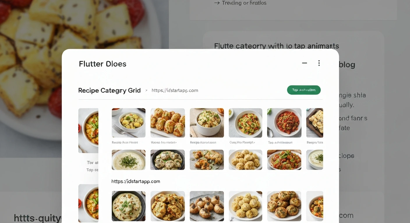

Creating a Recipe Category Grid Widget with Animated Tap Effect in Flutter
Building intuitive and visually appealing user interfaces is crucial for any modern application. In Flutter, we can combine various widgets and animation techniques to create dynamic and engaging components. This article will guide you through the process of developing a "Recipe Category Grid" widget that features a delightful animated tap effect, enhancing user interaction and providing clear visual feedback.
Understanding the Core Components
To achieve our animated category grid, we will leverage several key Flutter widgets and concepts:
GridView.builder: An efficient way to display a scrollable, 2D array of widgets. It's ideal for category grids.GestureDetector: This widget detects various gestures like taps, double taps, long presses, and drag events. We'll use it to capture tap down and tap up events for our animation.AnimationControllerandAnimation: For precise control over animation values, allowing us to create custom scaling effects.Transform.scale: Applies a scaling transformation to its child. Combined with animation, it creates the press effect.AnimatedContainer: A container that automatically animates changes to its properties (like color, decoration, padding) over a given duration. We'll use it for subtle background and border animations.SingleTickerProviderStateMixin: Required byAnimationControllerto prevent unnecessary resource usage when animations are not visible.
1. Defining the Recipe Category Data Model
First, let's establish a simple data model for our recipe categories. This class will hold the category's ID, name, and an icon to represent it visually.
import 'package:flutter/material.dart';

class RecipeCategory {
  final String id;
  final String name;
  final IconData icon;

  const RecipeCategory({
    required this.id,
    required this.name,
    required this.icon,
  });

  // Override equality and hashCode for proper comparison,
  // especially when identifying the selected category.
  @override
  bool operator ==(Object other) =>
      identical(this, other) ||
      other is RecipeCategory && runtimeType == other.runtimeType && id == other.id;

  @override
  int get hashCode => id.hashCode;
}
2. Building the Individual Category Item Widget
Each item in our grid will be a tappable widget that animates when pressed and visually indicates if it's currently selected. We'll create a StatefulWidget for this to manage the tap animation state using an AnimationController.
class CategoryGridItem extends StatefulWidget {
  final RecipeCategory category;
  final bool isSelected;
  final ValueChanged onSelect;

  const CategoryGridItem({
    Key? key,
    required this.category,
    required this.isSelected,
    required this.onSelect,
  }) : super(key: key);

  @override
  _CategoryGridItemState createState() => _CategoryGridItemState();
}

class _CategoryGridItemState extends State
    with SingleTickerProviderStateMixin { // Add SingleTickerProviderStateMixin
  late AnimationController _animationController;
  late Animation _scaleAnimation;

  @override
  void initState() {
    super.initState();
    // Initialize AnimationController for tap down/up animation
    _animationController = AnimationController(
      vsync: this, // 'this' refers to the SingleTickerProviderStateMixin
      duration: const Duration(milliseconds: 150),
      reverseDuration: const Duration(milliseconds: 150),
    );
    // Define the scale animation: 1.0 (normal) to 0.95 (pressed)
    _scaleAnimation = Tween(begin: 1.0, end: 0.95).animate(
      CurvedAnimation(
        parent: _animationController,
        curve: Curves.easeOut,
        reverseCurve: Curves.easeIn,
      ),
    );
  }

  @override
  void dispose() {
    _animationController.dispose(); // Dispose controller to prevent memory leaks
    super.dispose();
  }

  // When the user presses down on the item, animate to the scaled-down state
  void _onTapDown(TapDownDetails details) {
    _animationController.forward();
  }

  // When the user lifts their finger, animate back and trigger selection
  void _onTapUp(TapUpDetails details) {
    _animationController.reverse();
    widget.onSelect(widget.category);
  }

  // If the tap is cancelled (e.g., finger slides off), animate back
  void _onTapCancel() {
    _animationController.reverse();
  }

  @override
  Widget build(BuildContext context) {
    // Define colors based on selection state
    final backgroundColor = widget.isSelected
        ? Colors.deepOrangeAccent.withOpacity(0.8)
        : Colors.white;
    final textColor = widget.isSelected ? Colors.white : Colors.black87;

    return GestureDetector(
      onTapDown: _onTapDown,
      onTapUp: _onTapUp,
      onTapCancel: _onTapCancel,
      child: AnimatedBuilder( // Rebuilds the widget whenever _scaleAnimation changes
        animation: _scaleAnimation,
        builder: (context, child) {
          return Transform.scale(
            scale: _scaleAnimation.value, // Apply the animated scale
            child: AnimatedContainer(
              duration: const Duration(milliseconds: 200),
              curve: Curves.easeIn,
              decoration: BoxDecoration(
                color: backgroundColor, // Animate background color
                borderRadius: BorderRadius.circular(12),
                boxShadow: [
                  BoxShadow(
                    color: Colors.grey.withOpacity(0.2),
                    spreadRadius: 2,
                    blurRadius: 5,
                    offset: const Offset(0, 3),
                  ),
                ],
                // Animate border for selected state
                border: widget.isSelected
                    ? Border.all(color: Colors.deepOrange, width: 2)
                    : null,
              ),
              child: Column(
                mainAxisAlignment: MainAxisAlignment.center,
                children: [
                  Icon(
                    widget.category.icon,
                    size: 40,
                    color: textColor,
                  ),
                  const SizedBox(height: 8),
                  Text(
                    widget.category.name,
                    style: TextStyle(
                      fontSize: 16,
                      fontWeight: FontWeight.bold,
                      color: textColor,
                    ),
                    textAlign: TextAlign.center,
                  ),
                ],
              ),
            ),
          );
        },
      ),
    );
  }
}
3. Constructing the Recipe Category Grid
Now, we'll create a widget that takes a list of RecipeCategory objects and arranges them into a grid using GridView.builder. It will also manage which category is currently selected.
class RecipeCategoryGrid extends StatelessWidget {
  final List categories;
  final RecipeCategory? selectedCategory;
  final ValueChanged onCategorySelected;

  const RecipeCategoryGrid({
    Key? key,
    required this.categories,
    this.selectedCategory,
    required this.onCategorySelected,
  }) : super(key: key);

  @override
  Widget build(BuildContext context) {
    return GridView.builder(
      padding: const EdgeInsets.all(16),
      shrinkWrap: true, // Important if the grid is inside a Column/ListView
      physics: const NeverScrollableScrollPhysics(), // To prevent independent scrolling
      gridDelegate: const SliverGridDelegateWithFixedCrossAxisCount(
        crossAxisCount: 2, // 2 columns in the grid
        crossAxisSpacing: 16, // Spacing between columns
        mainAxisSpacing: 16, // Spacing between rows
        childAspectRatio: 1.2, // Adjust aspect ratio for item sizing
      ),
      itemCount: categories.length,
      itemBuilder: (context, index) {
        final category = categories[index];
        return CategoryGridItem(
          category: category,
          isSelected: category == selectedCategory, // Check if this category is selected
          onSelect: onCategorySelected, // Pass the callback to handle selection
        );
      },
    );
  }
}
4. Integrating into a Main Screen and Managing State
Finally, let's put it all together in a main screen, like a HomeScreen. This widget will be a StatefulWidget to manage the _selectedCategory state, which will then be passed down to the RecipeCategoryGrid.
class HomeScreen extends StatefulWidget {
  const HomeScreen({Key? key}) : super(key: key);

  @override
  _HomeScreenState createState() => _HomeScreenState();
}

class _HomeScreenState extends State {
  RecipeCategory? _selectedCategory; // State variable to hold the currently selected category

  // Mock data for recipe categories
  final List _mockCategories = const [
    RecipeCategory(id: '1', name: 'Breakfast', icon: Icons.free_breakfast),
    RecipeCategory(id: '2', name: 'Lunch', icon: Icons.lunch_dining),
    RecipeCategory(id: '3', name: 'Dinner', icon: Icons.dinner_dining),
    RecipeCategory(id: '4', name: 'Desserts', icon: Icons.cake),
    RecipeCategory(id: '5', name: 'Beverages', icon: Icons.local_drink),
    RecipeCategory(id: '6', name: 'Snacks', icon: Icons.cookie),
  ];

  // Callback function to handle category selection
  void _handleCategorySelection(RecipeCategory category) {
    setState(() {
      _selectedCategory = category; // Update the selected category state
      // In a real application, you might filter a list of recipes,
      // navigate to a new screen, or perform other actions based on the selection.
      print('Selected category: ${category.name}');
    });
  }

  @override
  Widget build(BuildContext context) {
    return Scaffold(
      appBar: AppBar(
        title: const Text('Recipe Categories'),
        backgroundColor: Colors.deepOrange,
        foregroundColor: Colors.white,
      ),
      body: SingleChildScrollView(
        child: Column(
          crossAxisAlignment: CrossAxisAlignment.start,
          children: [
            const Padding(
              padding: EdgeInsets.all(16.0),
              child: Text(
                'Explore Recipes by Category',
                style: TextStyle(
                  fontSize: 22,
                  fontWeight: FontWeight.bold,
                ),
              ),
            ),
            RecipeCategoryGrid(
              categories: _mockCategories,
              selectedCategory: _selectedCategory,
              onCategorySelected: _handleCategorySelection,
            ),
            // Example of how you might use the selected category
            if (_selectedCategory != null)
              Padding(
                padding: const EdgeInsets.all(16.0),
                child: Text(
                  'Currently selected: ${_selectedCategory!.name}',
                  style: const TextStyle(fontSize: 18, fontStyle: FontStyle.italic),
                ),
              ),
          ],
        ),
      ),
    );
  }
}

// Basic main function to run the app
void main() {
  runApp(const MyApp());
}

class MyApp extends StatelessWidget {
  const MyApp({Key? key}) : super(key: key);

  @override
  Widget build(BuildContext context) {
    return MaterialApp(
      title: 'Recipe App',
      theme: ThemeData(
        primarySwatch: Colors.deepOrange,
        visualDensity: VisualDensity.adaptivePlatformDensity,
      ),
      home: const HomeScreen(),
    );
  }
}
Enhancements and Considerations
- More Complex Animations: You could add more intricate animations, such as a ripple effect on tap, a subtle rotation, or a more elaborate border transition using custom painters.
- State Management: For larger applications, managing the
_selectedCategorystate with solutions like Provider, Riverpod, or BLoC can make your code more maintainable and scalable, especially if multiple widgets need access to or need to react to the selected category. - Responsiveness: Adjust
crossAxisCountinSliverGridDelegateWithFixedCrossAxisCountbased on screen width usingMediaQueryto make the grid responsive on different devices. - Accessibility: Ensure that the tap targets are large enough and provide appropriate semantic labels for screen readers.
Conclusion
By combining GridView.builder for layout, GestureDetector for interaction, and AnimationController with Transform.scale and AnimatedContainer for visual feedback, we've successfully created a dynamic and engaging recipe category grid widget in Flutter. This approach provides a solid foundation for building more interactive and visually rich user interfaces in your applications.


