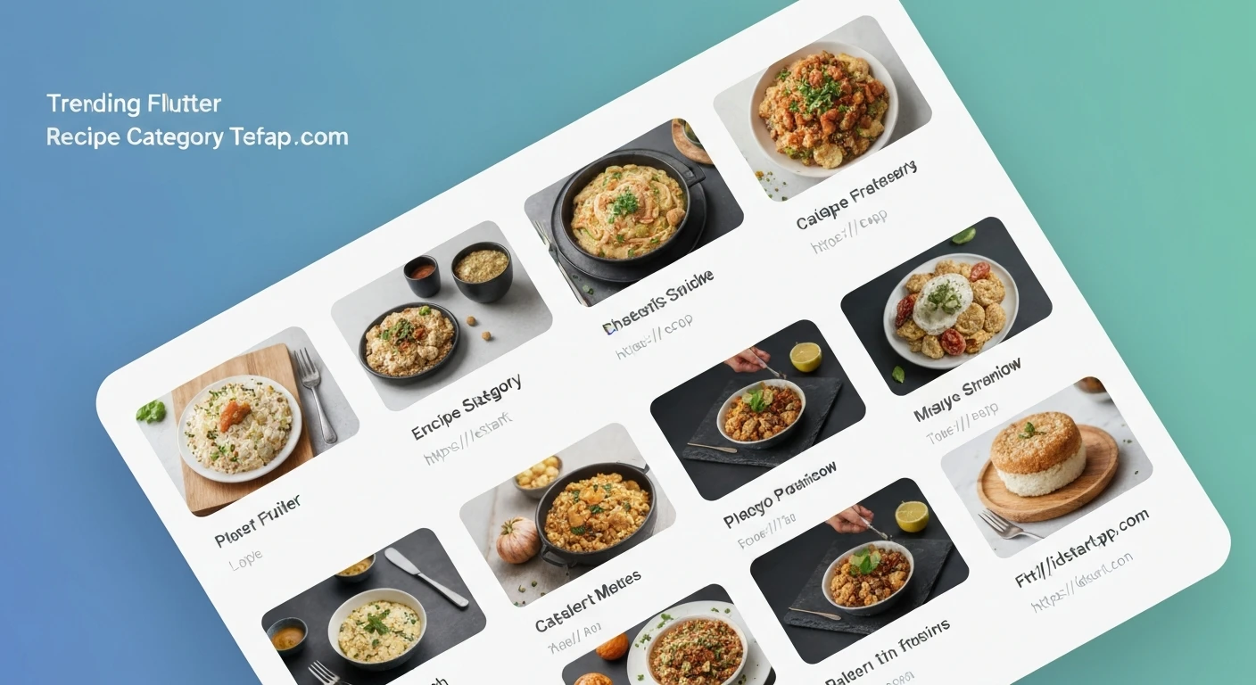

Building a Recipe Category Grid Widget with Animated Tap Effect in Flutter
Creating intuitive and visually appealing user interfaces is paramount in modern mobile application development. For recipe applications, presenting categories in an engaging way can significantly enhance user experience. This article will guide you through building a dynamic recipe category grid widget in Flutter, complete with a delightful animated tap effect, making navigation both functional and fun.
We'll leverage Flutter's powerful widget system, combining GridView.builder for efficient list rendering, GestureDetector for tap interactions, and AnimatedContainer for smooth visual transitions.
Prerequisites
- Basic understanding of Flutter and Dart.
- Flutter SDK installed and configured.
1. Data Model for Recipe Categories
First, let's define a simple data model to represent our recipe categories. Each category will have an ID, a name, and an image asset path.
class RecipeCategory {
  final String id;
  final String name;
  final String imageUrl;

  const RecipeCategory({
    required this.id,
    required this.name,
    required this.imageUrl,
  });
}

// Sample Data
final List<RecipeCategory> dummyCategories = [
  RecipeCategory(id: 'c1', name: 'Italian', imageUrl: 'assets/images/italian.jpg'),
  RecipeCategory(id: 'c2', name: 'Quick & Easy', imageUrl: 'assets/images/quick_easy.jpg'),
  RecipeCategory(id: 'c3', name: 'Hamburgers', imageUrl: 'assets/images/hamburgers.jpg'),
  RecipeCategory(id: 'c4', name: 'German', imageUrl: 'assets/images/german.jpg'),
  RecipeCategory(id: 'c5', name: 'Light & Lovely', imageUrl: 'assets/images/light_lovely.jpg'),
  RecipeCategory(id: 'c6', name: 'Exotic', imageUrl: 'assets/images/exotic.jpg'),
  RecipeCategory(id: 'c7', name: 'Breakfast', imageUrl: 'assets/images/breakfast.jpg'),
  RecipeCategory(id: 'c8', name: 'Asian', imageUrl: 'assets/images/asian.jpg'),
  RecipeCategory(id: 'c9', name: 'French', imageUrl: 'assets/images/french.jpg'),
  RecipeCategory(id: 'c10', name: 'Summer', imageUrl: 'assets/images/summer.jpg'),
];
Remember to add your image assets to the pubspec.yaml file under the assets section and create the corresponding folders and images (e.g., assets/images/italian.jpg). The `pubspec.yaml` should look something like this:
flutter:
  uses-material-design: true
  assets:
    - assets/images/
2. Building the Category Grid Widget
We'll create a StatefulWidget named RecipeCategoryGrid to manage the state of our selected category and render the grid. The parent widget will hold the currently selected index to trigger animations across different items.
import 'package:flutter/material.dart';
// Assuming RecipeCategory model is in a separate file, e.g., 'models/recipe_category.dart'
// If not, ensure the RecipeCategory class and dummyCategories list are accessible.

class RecipeCategoryGrid extends StatefulWidget {
  const RecipeCategoryGrid({Key? key}) : super(key: key);

  @override
  State<RecipeCategoryGrid> createState() => _RecipeCategoryGridState();
}

class _RecipeCategoryGridState extends State<RecipeCategoryGrid> {
  int? _selectedIndex; // Track the index of the currently tapped category

  @override
  Widget build(BuildContext context) {
    return GridView.builder(
      padding: const EdgeInsets.all(15),
      itemCount: dummyCategories.length,
      gridDelegate: const SliverGridDelegateWithMaxCrossAxisExtent(
        maxCrossAxisExtent: 200, // Max width for each item
        childAspectRatio: 3 / 2, // Aspect ratio of each item
        crossAxisSpacing: 20, // Spacing between columns
        mainAxisSpacing: 20, // Spacing between rows
      ),
      itemBuilder: (context, index) {
        final category = dummyCategories[index];
        return RecipeCategoryGridItem(
          category: category,
          isSelected: _selectedIndex == index, // Pass selection state
          onTap: () {
            setState(() {
              // Toggle selection: if already selected, deselect; otherwise, select this one.
              _selectedIndex = _selectedIndex == index ? null : index;
            });
            // You can add navigation logic here, e.g.,
            // Navigator.of(context).push(MaterialPageRoute(
            //   builder: (ctx) => CategoryRecipesScreen(category: category),
            // ));
          },
        );
      },
    );
  }
}
3. Creating the Individual Category Item Widget
Each item in the grid will be represented by a RecipeCategoryGridItem widget. This widget will be responsible for displaying the category's image and name, and crucially, incorporating the animated tap effect.
We'll use an AnimatedContainer which automatically animates changes to its properties over a duration. When isSelected changes, the AnimatedContainer will smoothly transition its properties like scale, border, or shadow, giving a subtle "pop" effect.
class RecipeCategoryGridItem extends StatelessWidget {
  const RecipeCategoryGridItem({
    Key? key,
    required this.category,
    required this.onTap,
    this.isSelected = false,
  }) : super(key: key);

  final RecipeCategory category;
  final VoidCallback onTap;
  final bool isSelected;

  @override
  Widget build(BuildContext context) {
    return GestureDetector(
      onTap: onTap,
      child: AnimatedContainer(
        duration: const Duration(milliseconds: 300), // Animation duration
        curve: Curves.easeInOut, // Animation curve
        decoration: BoxDecoration(
          borderRadius: BorderRadius.circular(15),
          border: isSelected
              ? Border.all(color: Theme.of(context).colorScheme.primary, width: 3)
              : Border.all(color: Colors.transparent, width: 0), // Transparent border when not selected
          boxShadow: isSelected
              ? [
                  BoxShadow(
                    color: Theme.of(context).colorScheme.primary.withOpacity(0.5),
                    spreadRadius: 2,
                    blurRadius: 10,
                    offset: const Offset(0, 3), // Shadow for elevation effect
                  ),
                ]
              : null, // No shadow when not selected
        ),
        child: ClipRRect(
          borderRadius: BorderRadius.circular(12), // Inner border for image
          child: Stack(
            children: [
              // Background Image
              Positioned.fill(
                child: Image.asset(
                  category.imageUrl,
                  fit: BoxFit.cover,
                  errorBuilder: (context, error, stackTrace) =>
                      const Icon(Icons.broken_image, size: 50, color: Colors.grey),
                ),
              ),
              // Gradient Overlay for readability
              Positioned.fill(
                child: DecoratedBox(
                  decoration: BoxDecoration(
                    gradient: LinearGradient(
                      colors: [
                        Colors.black.withOpacity(0.7), // Darker at bottom
                        Colors.black.withOpacity(0.3), // Lighter in middle
                        Colors.transparent,           // Transparent at top
                      ],
                      begin: Alignment.bottomCenter,
                      end: Alignment.topCenter,
                    ),
                  ),
                ),
              ),
              // Category Name
              Positioned(
                bottom: 10,
                left: 10,
                right: 10,
                child: Text(
                  category.name,
                  style: const TextStyle(
                    color: Colors.white,
                    fontSize: 20,
                    fontWeight: FontWeight.bold,
                  ),
                  maxLines: 2,
                  overflow: TextOverflow.ellipsis,
                ),
              ),
            ],
          ),
        ),
      ),
    );
  }
}
In this item widget:
GestureDetectorcaptures tap events and triggers theonTapcallback passed from the parent.AnimatedContainerdynamically changes its border and shadow based on theisSelectedproperty. The animation is handled automatically by Flutter when its properties change over the specifieddurationandcurve.ClipRRectensures the image and gradient stay within the rounded corners defined for the item.Stackis used to overlay the category name and a subtle gradient on top of the background image, ensuring text readability regardless of the image content.
4. Integrating into Your App
To see the widget in action, simply place RecipeCategoryGrid() within your app's main Scaffold body or any other appropriate location.
import 'package:flutter/material.dart';
// Ensure RecipeCategory, dummyCategories, RecipeCategoryGrid,
// and RecipeCategoryGridItem are accessible (e.g., imported or defined in the same file).

void main() {
  runApp(const MyApp());
}

class MyApp extends StatelessWidget {
  const MyApp({Key? key}) : super(key: key);

  @override
  Widget build(BuildContext context) {
    return MaterialApp(
      title: 'Recipe App',
      theme: ThemeData(
        colorScheme: ColorScheme.fromSeed(seedColor: Colors.deepOrange),
        useMaterial3: true,
      ),
      home: Scaffold(
        appBar: AppBar(
          title: const Text('Recipe Categories'),
          backgroundColor: Theme.of(context).colorScheme.primary,
          foregroundColor: Colors.white,
        ),
        body: const RecipeCategoryGrid(), // Our new widget!
      ),
    );
  }
}
Conclusion
By combining GridView.builder for efficient list rendering, GestureDetector for user interaction, and AnimatedContainer for smooth visual feedback, we've successfully created an engaging and interactive recipe category grid in Flutter. This pattern can be adapted for various other grid-based selections, providing a polished and responsive user experience. Experiment with different animation properties, durations, and curves to find the perfect feel for your application!


