

Building a Flutter Recipe Category Grid with Animations
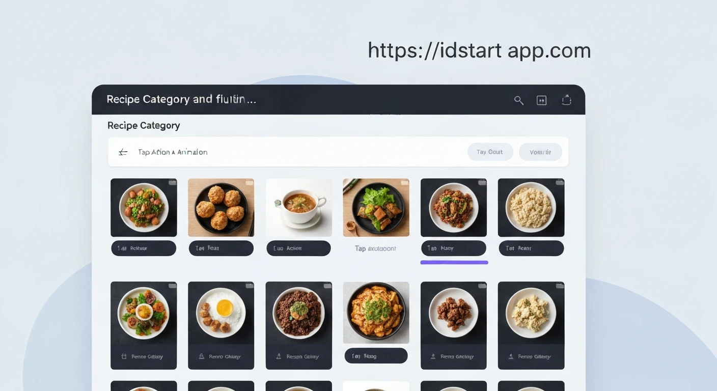
Creating an engaging user interface for a recipe application requires a balance between visual appeal and intuitive navigation. A category grid is a staple feature that allows users to browse diverse cuisines or meal types efficiently. By incorporating gradient overlays, interactive tap actions, and subtle animations, you can transform a static list into a high-quality, professional experience.
In this guide, we will explore how to build a responsive, interactive recipe category grid using Flutter, focusing on performance and clean, maintainable code.
Understanding the UI Requirements
To build a modern recipe grid, we need three primary components:
- A Grid Layout: Using
GridView.builderto handle large datasets efficiently. - Visual Hierarchy: Using a
Stackwidget to layer images, text, and gradient overlays. - Interactivity: Implementing
InkWellfor tap feedback andAnimatedContainerfor state-driven motion.
Setting Up the Grid Layout
GridView.builder is the ideal choice for this task because it generates children lazily, which is essential for memory management when dealing with many categories. We define the grid using SliverGridDelegateWithFixedCrossAxisCount to ensure the layout remains consistent across different screen sizes.
GridView.builder(
  padding: const EdgeInsets.all(16),
  gridDelegate: const SliverGridDelegateWithFixedCrossAxisCount(
    crossAxisCount: 2,
    crossAxisSpacing: 16,
    mainAxisSpacing: 16,
    childAspectRatio: 0.85,
  ),
  itemCount: categories.length,
  itemBuilder: (context, index) => CategoryCard(category: categories[index]),
)
Implementing the Gradient Overlay
Images alone can often make text difficult to read. A gradient overlay provides the necessary contrast while maintaining the aesthetic quality of the photography. We use a BoxDecoration with a LinearGradient inside a Container to achieve this effect.
Stack(
  fit: StackFit.expand,
  children: [
    Image.network(imageUrl, fit: BoxFit.cover),
    Container(
      decoration: BoxDecoration(
        gradient: LinearGradient(
          begin: Alignment.topCenter,
          end: Alignment.bottomCenter,
          colors: [Colors.transparent, Colors.black.withOpacity(0.7)],
        ),
      ),
    ),
  ],
)
Adding Tap Actions and Animations
To make the grid feel alive, we can animate the scale or the container properties when a user interacts with the card. Using AnimatedContainer allows us to change properties like padding, color, or border radius smoothly when a state variable changes.
For the tap action, wrapping the card in an InkWell provides the standard Material Design ripple effect, while an onTap callback allows for navigation to the specific category page.
class CategoryCard extends StatefulWidget {
  final Category category;
  const CategoryCard({required this.category});

  @override
  _CategoryCardState createState() => _CategoryCardState();
}

class _CategoryCardState extends State<CategoryCard> {
  bool _isPressed = false;

  @override
  Widget build(BuildContext context) {
    return GestureDetector(
      onTapDown: (_) => setState(() => _isPressed = true),
      onTapUp: (_) => setState(() => _isPressed = false),
      child: AnimatedScale(
        scale: _isPressed ? 0.95 : 1.0,
        duration: const Duration(milliseconds: 150),
        child: Container(/* ... content ... */),
      ),
    );
  }
}
Best Practices for Flutter Grids
When building complex grids, keep these performance and usability tips in mind:
- Image Caching: Always use
cached_network_imageto avoid flickering and unnecessary network requests as the user scrolls. - Accessibility: Wrap your interactive elements in
Semanticswidgets so that screen readers can identify the category name and the action associated with it. - Aspect Ratio: Use
AspectRatioorchildAspectRatioin your grid delegate to ensure your cards maintain their shape regardless of the device's screen width. - Avoid Over-nesting: While
Stackis powerful, try to minimize the depth of your widget tree to keep the build method efficient.
Conclusion
Building a polished recipe category grid in Flutter is a straightforward process when you leverage the power of the Stack widget for layering and AnimatedContainer for motion. By focusing on smooth transitions and clear visual hierarchy, you create an app that feels responsive and professional. Start by implementing the grid structure, add your gradient overlays for readability, and finish by adding subtle scale animations to enhance the user's interaction.
Frequently Asked Questions
Can I use a staggered grid instead of a fixed one?
Yes, you can use the flutter_staggered_grid_view package, which provides more flexibility for layouts where items have different heights.
How do I handle images that fail to load?
Use the errorWidget builder in the CachedNetworkImage widget to display a placeholder or a default icon if the image URL is broken.
Is it better to use AnimatedContainer or ScaleTransition?
AnimatedContainer is easier for simple property changes, whereas ScaleTransition is more performant for complex animations that require an AnimationController.
How do I optimize the grid for large datasets?
Ensure you are using GridView.builder rather than GridView with children, and consider implementing pagination or infinite scrolling if the list is extremely long.