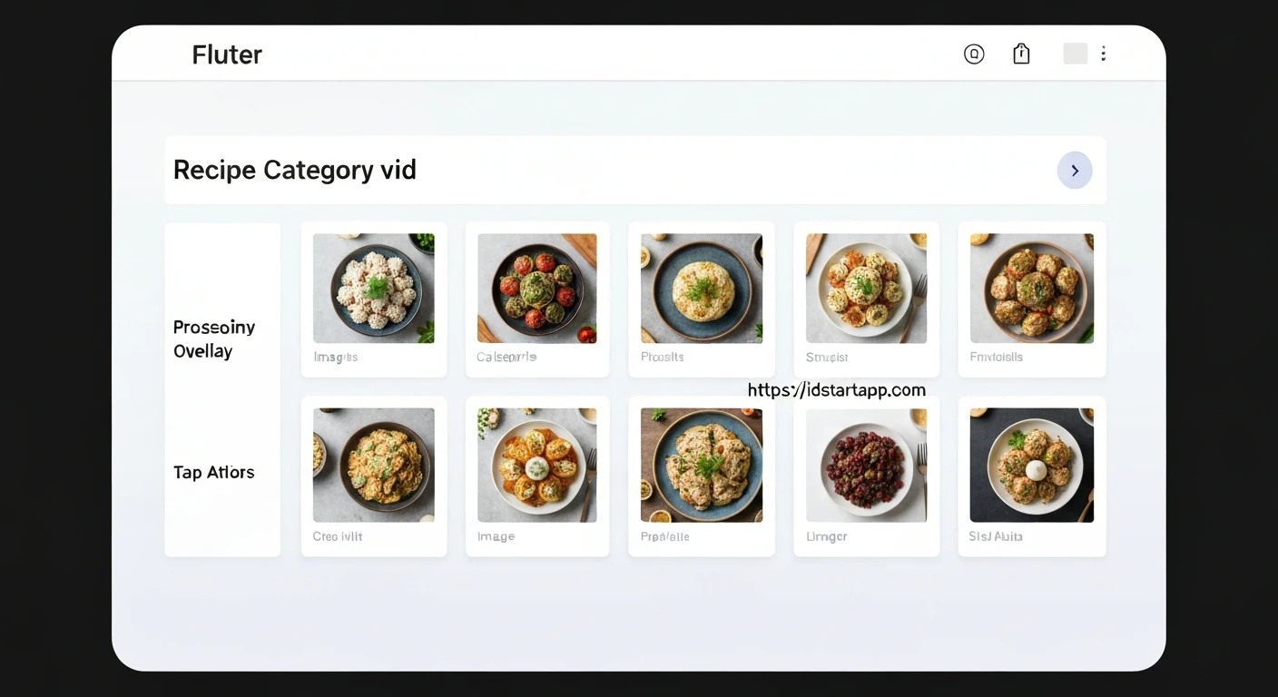

Creating a Dynamic Recipe Category Grid Widget with Image Overlay, Gradient, and Tap Action in Flutter
Flutter's declarative UI framework makes it incredibly powerful for building visually rich and interactive applications. A common pattern in many apps, especially recipe or e-commerce platforms, is a grid of categories, each represented by an image, a title, and an interactive tap action. This article will guide you through creating a sophisticated recipe category grid widget in Flutter, complete with an image overlay, a gradient for enhanced readability, and a customizable tap action.
This widget combines several Flutter concepts to deliver an engaging user experience:
- Image Overlay: To visually represent each category.
- Gradient: A semi-transparent overlay to ensure text readability over diverse background images.
- Text Display: Clearly showing the category name.
- Tap Action: Making each category interactive for navigation or other functionalities.
- Responsive Grid Layout: Adapting to different screen sizes.
1. Defining the Category Data Model
First, let's establish a simple data structure to hold information about each recipe category. This will make it easier to manage and pass data to our widgets.
class Category {
  final String id;
  final String name;
  final String imageUrl;

  const Category({
    required this.id,
    required this.name,
    required this.imageUrl,
  });
}
2. Building the Individual Recipe Category Card
This is the core widget that will display a single category item. It will be responsible for stacking the image, gradient, and text, and handling the tap gesture.
import 'package:flutter/material.dart';
import 'category.dart'; // Assuming category.dart is in the same directory

class RecipeCategoryCard extends StatelessWidget {
  final Category category;
  final VoidCallback onTap;

  const RecipeCategoryCard({
    Key? key,
    required this.category,
    required this.onTap,
  }) : super(key: key);

  @override
  Widget build(BuildContext context) {
    return GestureDetector(
      onTap: onTap,
      child: Card(
        elevation: 4,
        shape: RoundedRectangleBorder(
          borderRadius: BorderRadius.circular(15.0),
        ),
        clipBehavior: Clip.antiAlias, // Ensures content is clipped to rounded corners
        child: Stack(
          fit: StackFit.expand,
          children: [
            // Background Image
            Image.network(
              category.imageUrl,
              fit: BoxFit.cover,
              errorBuilder: (context, error, stackTrace) => Container(
                color: Colors.grey[300],
                child: Icon(Icons.broken_image, size: 50, color: Colors.grey[600]),
              ),
            ),
            // Gradient Overlay
            Container(
              decoration: BoxDecoration(
                gradient: LinearGradient(
                  colors: [
                    Colors.black.withOpacity(0.0), // Start transparent
                    Colors.black.withOpacity(0.7), // End semi-opaque
                  ],
                  begin: Alignment.topCenter,
                  end: Alignment.bottomCenter,
                ),
              ),
            ),
            // Category Name Text
            Align(
              alignment: Alignment.bottomLeft,
              child: Padding(
                padding: const EdgeInsets.all(12.0),
                child: Text(
                  category.name,
                  style: const TextStyle(
                    color: Colors.white,
                    fontSize: 20,
                    fontWeight: FontWeight.bold,
                  ),
                  maxLines: 2,
                  overflow: TextOverflow.ellipsis,
                ),
              ),
            ),
          ],
        ),
      ),
    );
  }
}
In this widget:
- We use a
Cardfor elevation and rounded corners.clipBehavior: Clip.antiAliasensures children respect these corners. - A
Stackwidget allows us to layer elements on top of each other. Image.networkdisplays the category's image, covering the entire card area withBoxFit.cover. AnerrorBuilderprovides a fallback UI.- A
Containerwith aLinearGradientprovides a subtle fade from transparent to a semi-opaque black at the bottom, making the white text stand out. - The
Textwidget, aligned to the bottom-left, displays the category name with bold white text. GestureDetectorwraps the entire card, enabling theonTapcallback when the user touches the card.
3. Creating the Recipe Category Grid
Now, let's assemble multiple RecipeCategoryCard widgets into a responsive grid using GridView.builder.
import 'package:flutter/material.dart';
import 'category.dart'; // Assuming category.dart
import 'recipe_category_card.dart'; // Assuming recipe_category_card.dart

class RecipeCategoryGrid extends StatelessWidget {
  final List categories;
  final Function(Category) onCategoryTap;

  const RecipeCategoryGrid({
    Key? key,
    required this.categories,
    required this.onCategoryTap,
  }) : super(key: key);

  @override
  Widget build(BuildContext context) {
    return GridView.builder(
      padding: const EdgeInsets.all(16.0),
      itemCount: categories.length,
      gridDelegate: const SliverGridDelegateWithFixedCrossAxisCount(
        crossAxisCount: 2, // Number of columns
        crossAxisSpacing: 16.0,
        mainAxisSpacing: 16.0,
        childAspectRatio: 3 / 2, // Width to height ratio of each item
      ),
      itemBuilder: (context, index) {
        final category = categories[index];
        return RecipeCategoryCard(
          category: category,
          onTap: () => onCategoryTap(category),
        );
      },
    );
  }
}
Here's how RecipeCategoryGrid works:
- It takes a
Listand a functiononCategoryTap, which will be triggered when a card is tapped. GridView.builderis efficient for large lists, building items only when they are visible.SliverGridDelegateWithFixedCrossAxisCountcreates a grid with a fixed number of columns (crossAxisCount: 2). You can adjustchildAspectRatioto control the shape of the grid items.- For each category, it instantiates a
RecipeCategoryCard, passing the category data and a callback that invokesonCategoryTapwith the tapped category.
4. Integrating into a Flutter Application
Finally, let's see how to use these widgets within a typical Flutter application structure.
import 'package:flutter/material.dart';
import 'category.dart';
import 'recipe_category_grid.dart';

void main() {
  runApp(const MyApp());
}

class MyApp extends StatelessWidget {
  const MyApp({Key? key}) : super(key: key);

  @override
  Widget build(BuildContext context) {
    return MaterialApp(
      title: 'Recipe App',
      theme: ThemeData(
        primarySwatch: Colors.blueGrey,
        visualDensity: VisualDensity.adaptivePlatformDensity,
      ),
      home: const HomeScreen(),
    );
  }
}

class HomeScreen extends StatefulWidget {
  const HomeScreen({Key? key}) : super(key: key);

  @override
  State createState() => _HomeScreenState();
}

class _HomeScreenState extends State {
  // Sample data for categories
  final List _availableCategories = const [
    Category(
      id: 'c1',
      name: 'Italian',
      imageUrl: 'https://cdn.pixabay.com/photo/2014/10/22/19/52/pasta-498261_1280.jpg',
    ),
    Category(
      id: 'c2',
      name: 'Quick & Easy',
      imageUrl: 'https://cdn.pixabay.com/photo/2017/03/30/08/32/fast-food-2187693_1280.jpg',
    ),
    Category(
      id: 'c3',
      name: 'Hamburgers',
      imageUrl: 'https://cdn.pixabay.com/photo/2016/03/05/19/02/hamburger-1238246_1280.jpg',
    ),
    Category(
      id: 'c4',
      name: 'German',
      imageUrl: 'https://cdn.pixabay.com/photo/2017/09/23/18/14/schnitzel-2779834_1280.jpg',
    ),
    Category(
      id: 'c5',
      name: 'Light & Lovely',
      imageUrl: 'https://cdn.pixabay.com/photo/2017/05/01/05/18/pastry-2274750_1280.jpg',
    ),
    Category(
      id: 'c6',
      name: 'Exotic',
      imageUrl: 'https://cdn.pixabay.com/photo/2018/02/08/04/18/spices-3138806_1280.jpg',
    ),
  ];

  void _selectCategory(Category category) {
    // Implement your navigation or action here
    ScaffoldMessenger.of(context).showSnackBar(
      SnackBar(
        content: Text('Tapped on ${category.name} (${category.id})'),
        duration: const Duration(seconds: 1),
      ),
    );
    // Example: Navigator.of(context).push(MaterialPageRoute(builder: (_) => CategoryRecipesScreen(category: category)));
  }

  @override
  Widget build(BuildContext context) {
    return Scaffold(
      appBar: AppBar(
        title: const Text('Recipe Categories'),
      ),
      body: RecipeCategoryGrid(
        categories: _availableCategories,
        onCategoryTap: _selectCategory,
      ),
    );
  }
}
In this example:
MyAppsets up the basicMaterialApp.HomeScreenis aStatefulWidgetthat holds our sample_availableCategoriesdata.- The
_selectCategoryfunction demonstrates how to handle the tap action, showing a simpleSnackBar. In a real application, you would typically navigate to a new screen displaying recipes for that category. - Finally,
RecipeCategoryGridis placed in thebodyof theScaffold, providing the list of categories and the tap handler.
Conclusion
By combining Flutter's powerful layout widgets like Stack, visual enhancements like LinearGradient and Image.network, and interaction handling with GestureDetector, we've created a versatile and visually appealing recipe category grid. This modular approach allows for easy maintenance and scalability, enabling you to build complex and interactive user interfaces efficiently. You can further enhance this widget by adding animations, search functionality, or dynamic loading of categories from a backend service.


