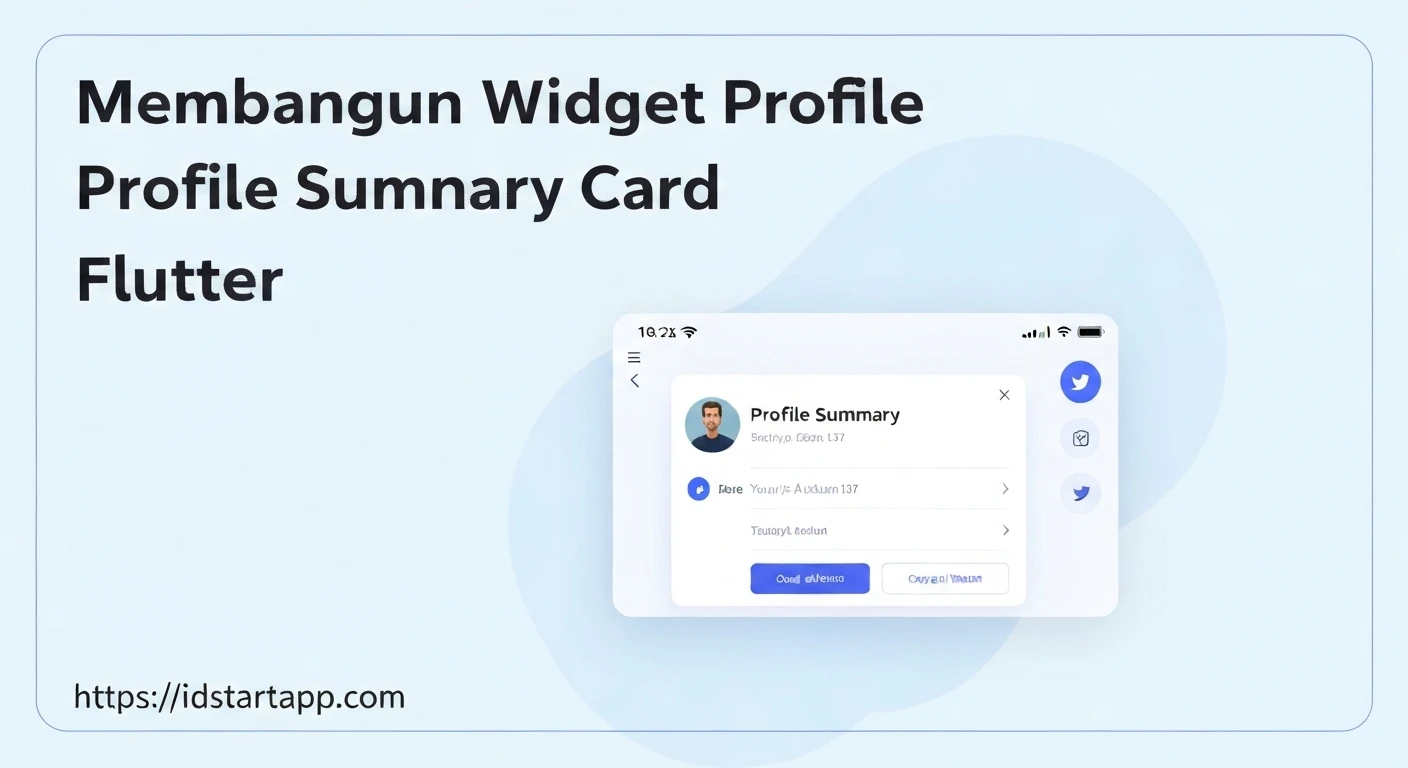

Building a Profile Summary Card Widget in Flutter
Profile summary cards are a ubiquitous UI element in modern applications, providing a concise overview of a user's identity and key statistics. They are essential for social apps, e-commerce platforms, or any application where user profiles are a central feature. In Flutter, creating such a widget is straightforward, leveraging the powerful composition model and rich set of pre-built widgets. This article will guide you through building a customizable profile summary card using Flutter.
Understanding the Core Components
A typical profile summary card includes several key components:
- Avatar/Profile Picture: A circular image representing the user.
- User Name: The user's full name or username.
- Title/Bio: A short description of the user's role, profession, or a brief bio.
- Statistics: Numbers like posts, followers, following, etc.
- Action Buttons (Optional): Buttons for actions like "Follow," "Message," or "Edit Profile."
We'll combine these elements using Flutter's layout widgets like Column, Row, and Card, and apply styling with TextStyle and BoxDecoration.
Setting Up the Basic Card Structure
We'll start by creating a StatelessWidget named ProfileSummaryCard. This widget will encapsulate all the UI logic for our card. We'll use a Card widget for its elevated and rounded appearance, and a Column to arrange our elements vertically.
import 'package:flutter/material.dart';

class ProfileSummaryCard extends StatelessWidget {
  const ProfileSummaryCard({super.key});

  @override
  Widget build(BuildContext context) {
    return Card(
      margin: const EdgeInsets.all(16.0),
      elevation: 4.0,
      shape: RoundedRectangleBorder(
        borderRadius: BorderRadius.circular(12.0),
      ),
      child: Padding(
        padding: const EdgeInsets.all(20.0),
        child: Column(
          mainAxisSize: MainAxisSize.min, // Ensures column takes minimum space
          children: [
            // Avatar will go here
            // User information will go here
            // Optional stats/actions will go here
          ],
        ),
      ),
    );
  }
}
In this initial structure:
Cardprovides the elevated container with rounded corners.marginadds space around the card.Paddingcreates inner spacing for the content.Columnis used for vertical arrangement of widgets.mainAxisSize.minensures the column only takes up as much vertical space as its children need, making the card compact.
Adding the Profile Avatar
The profile avatar is a central visual element. We'll use CircleAvatar, which conveniently handles circular clipping and can display network images.
// Inside the Column's children in ProfileSummaryCard's build method
CircleAvatar(
  radius: 40.0,
  backgroundImage: NetworkImage('https://example.com/profile_pic.jpg'), // Replace with actual image URL
  backgroundColor: Colors.grey.shade200, // Placeholder background color
),
Displaying User Information
Below the avatar, we'll place the user's name and title/bio. These will also be arranged vertically using a Column (or simply placed directly in the main Column for simplicity, using Text widgets).
// Below the CircleAvatar, inside the Column's children
const SizedBox(height: 12.0), // Spacing below avatar
Text(
  'John Doe',
  style: TextStyle(
    fontSize: 22.0,
    fontWeight: FontWeight.bold,
  ),
),
const SizedBox(height: 4.0), // Spacing between name and title
Text(
  'Software Engineer | Flutter Developer',
  textAlign: TextAlign.center,
  style: TextStyle(
    fontSize: 16.0,
    color: Colors.grey.shade600,
  ),
),
Integrating Optional Statistics and Actions
To display statistics like posts, followers, and following, we can use a Row widget. For an action button like "Follow," an ElevatedButton is suitable. We'll also create a helper method to build the individual stat columns for reusability.
// Helper method within the ProfileSummaryCard class
Widget _buildStatColumn(String label, String value) {
  return Column(
    children: [
      Text(
        value,
        style: const TextStyle(
          fontSize: 18.0,
          fontWeight: FontWeight.bold,
        ),
      ),
      const SizedBox(height: 4.0),
      Text(
        label,
        style: TextStyle(
          fontSize: 14.0,
          color: Colors.grey.shade600,
        ),
      ),
    ],
  );
}

// Below user information, inside the Column's children
const SizedBox(height: 16.0), // Spacing above stats
Row(
  mainAxisAlignment: MainAxisAlignment.spaceEvenly,
  children: [
    _buildStatColumn('Posts', '120'),
    _buildStatColumn('Followers', '2.5K'),
    _buildStatColumn('Following', '300'),
  ],
),
const SizedBox(height: 16.0), // Spacing above button
SizedBox( // Use SizedBox to control button width
  width: double.infinity, // Make button take full width
  child: ElevatedButton(
    onPressed: () {
      // Handle follow action
      print('Follow button pressed!');
    },
    style: ElevatedButton.styleFrom(
      backgroundColor: Colors.blueAccent,
      foregroundColor: Colors.white,
      padding: const EdgeInsets.symmetric(vertical: 12),
      shape: RoundedRectangleBorder(
        borderRadius: BorderRadius.circular(8.0),
      ),
    ),
    child: const Text(
      'Follow',
      style: TextStyle(fontSize: 16.0),
    ),
  ),
),
Making the Widget Reusable and Dynamic
To make our ProfileSummaryCard truly useful, we need to pass data dynamically. We'll add properties to the widget constructor.
import 'package:flutter/material.dart';

class ProfileSummaryCard extends StatelessWidget {
  final String imageUrl;
  final String name;
  final String title;
  final int posts;
  final String followers;
  final int following;
  final VoidCallback? onFollowPressed;

  const ProfileSummaryCard({
    super.key,
    required this.imageUrl,
    required this.name,
    required this.title,
    this.posts = 0,
    this.followers = '0',
    this.following = 0,
    this.onFollowPressed,
  });

  @override
  Widget build(BuildContext context) {
    return Card(
      margin: const EdgeInsets.all(16.0),
      elevation: 4.0,
      shape: RoundedRectangleBorder(
        borderRadius: BorderRadius.circular(12.0),
      ),
      child: Padding(
        padding: const EdgeInsets.all(20.0),
        child: Column(
          mainAxisSize: MainAxisSize.min,
          children: [
            CircleAvatar(
              radius: 40.0,
              backgroundImage: NetworkImage(imageUrl),
              backgroundColor: Colors.grey.shade200,
            ),
            const SizedBox(height: 12.0),
            Text(
              name,
              style: const TextStyle(
                fontSize: 22.0,
                fontWeight: FontWeight.bold,
              ),
            ),
            const SizedBox(height: 4.0),
            Text(
              title,
              textAlign: TextAlign.center,
              style: TextStyle(
                fontSize: 16.0,
                color: Colors.grey.shade600,
              ),
            ),
            const SizedBox(height: 16.0),
            Row(
              mainAxisAlignment: MainAxisAlignment.spaceEvenly,
              children: [
                _buildStatColumn('Posts', posts.toString()),
                _buildStatColumn('Followers', followers),
                _buildStatColumn('Following', following.toString()),
              ],
            ),
            if (onFollowPressed != null) ...[
              const SizedBox(height: 16.0),
              SizedBox(
                width: double.infinity,
                child: ElevatedButton(
                  onPressed: onFollowPressed,
                  style: ElevatedButton.styleFrom(
                    backgroundColor: Colors.blueAccent,
                    foregroundColor: Colors.white,
                    padding: const EdgeInsets.symmetric(vertical: 12),
                    shape: RoundedRectangleBorder(
                      borderRadius: BorderRadius.circular(8.0),
                    ),
                  ),
                  child: const Text(
                    'Follow',
                    style: TextStyle(fontSize: 16.0),
                  ),
                ),
              ),
            ],
          ],
        ),
      ),
    );
  }

  Widget _buildStatColumn(String label, String value) {
    return Column(
      children: [
        Text(
          value,
          style: const TextStyle(
            fontSize: 18.0,
            fontWeight: FontWeight.bold,
          ),
        ),
        const SizedBox(height: 4.0),
        Text(
          label,
          style: TextStyle(
            fontSize: 14.0,
            color: Colors.grey.shade600,
          ),
        ),
      ],
    );
  }
}
Using the Profile Summary Card
Now that our ProfileSummaryCard is complete and dynamic, you can easily integrate it into any Flutter screen. Create a new file (e.g., profile_summary_card.dart) for the widget and import it where needed.
import 'package:flutter/material.dart';
import 'profile_summary_card.dart'; // Make sure this path is correct for your project

void main() {
  runApp(const MyApp());
}

class MyApp extends StatelessWidget {
  const MyApp({super.key});

  @override
  Widget build(BuildContext context) {
    return MaterialApp(
      title: 'Profile Card Demo',
      theme: ThemeData(
        primarySwatch: Colors.blue,
      ),
      home: const HomePage(),
    );
  }
}

class HomePage extends StatelessWidget {
  const HomePage({super.key});

  @override
  Widget build(BuildContext context) {
    return Scaffold(
      appBar: AppBar(
        title: const Text('Profile Summary'),
      ),
      body: Center(
        child: ProfileSummaryCard(
          imageUrl: 'https://cdn.pixabay.com/photo/2015/10/05/22/37/blank-profile-picture-973460_960_720.png',
          name: 'Jane Doe',
          title: 'UX Designer | Creative Lead at Tech Solutions',
          posts: 150,
          followers: '10K',
          following: 500,
          onFollowPressed: () {
            // Implement actual follow logic here
            ScaffoldMessenger.of(context).showSnackBar(
              const SnackBar(content: Text('Follow button clicked!')),
            );
          },
        ),
      ),
    );
  }
}
Conclusion
Building a profile summary card in Flutter is an excellent way to practice widget composition, styling, and making reusable components. By breaking down the UI into smaller, manageable widgets and using constructor parameters, you can create flexible and powerful UI elements for your applications. This example provides a solid foundation, which you can further enhance with animations, more complex layouts, or integration with backend data.


