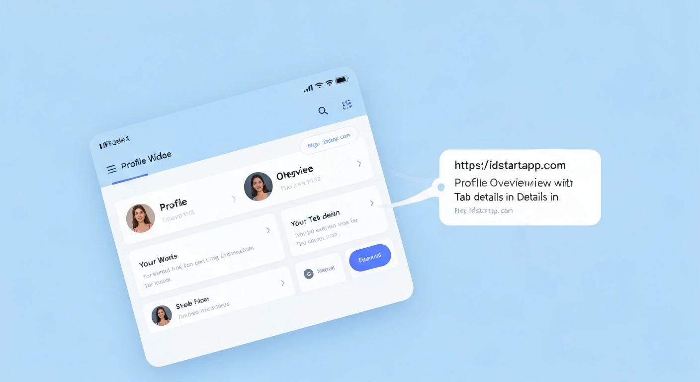

Building a Profile Overview Widget with Detail Tabs in Flutter
A user profile screen is a fundamental component in almost every modern application, providing users with a personalized space to view and manage their information. A common and highly effective design pattern for these screens involves a profile overview section at the top, followed by tabbed navigation to display various categories of detailed information such as posts, settings, or activity logs. This article will guide you through building a robust and professional profile overview widget with detail tabs in Flutter.
Understanding the Core Components
Before diving into the code, let's break down the key components required for our profile overview widget:
- Profile Header: This section typically sits at the top and displays essential user information like an avatar, name, bio, and perhaps some summary statistics (e.g., followers, posts count).
- Tab Navigation (TabBar): A set of horizontally scrollable or fixed tabs that allow users to switch between different views of their profile details.
- Tab Content (TabBarView): The area below the tabs that dynamically changes its content based on the currently selected tab. Each tab will correspond to a specific widget displaying relevant information.
Step-by-Step Implementation
We'll create a modular structure, separating different parts into their own widgets for better maintainability and reusability.
1. Project Setup and Data Model
First, ensure you have a basic Flutter project set up. We'll define a simple User data model to hold the profile information.
lib/models/user.dart
class User {
  final String avatarUrl;
  final String name;
  final String bio;
  final int followers;
  final int following;
  final int posts;

  User({
    required this.avatarUrl,
    required this.name,
    required this.bio,
    this.followers = 0,
    this.following = 0,
    this.posts = 0,
  });
}
2. Creating the Profile Header Widget
This widget will display the user's avatar, name, bio, and some statistics.
lib/widgets/profile_header_widget.dart
import 'package:flutter/material.dart';
import 'package:flutter_app/models/user.dart'; // Adjust import path

class ProfileHeaderWidget extends StatelessWidget {
  final User user;

  const ProfileHeaderWidget({Key? key, required this.user}) : super(key: key);

  @override
  Widget build(BuildContext context) {
    return Container(
      padding: const EdgeInsets.all(16.0),
      child: Column(
        crossAxisAlignment: CrossAxisAlignment.center,
        children: [
          CircleAvatar(
            radius: 50,
            backgroundImage: NetworkImage(user.avatarUrl),
            backgroundColor: Colors.grey[200],
          ),
          const SizedBox(height: 16),
          Text(
            user.name,
            style: const TextStyle(
              fontSize: 24,
              fontWeight: FontWeight.bold,
            ),
          ),
          const SizedBox(height: 8),
          Text(
            user.bio,
            textAlign: TextAlign.center,
            style: TextStyle(
              fontSize: 14,
              color: Colors.grey[600],
            ),
          ),
          const SizedBox(height: 16),
          Row(
            mainAxisAlignment: MainAxisAlignment.spaceAround,
            children: [
              _buildStatColumn("Followers", user.followers),
              _buildStatColumn("Following", user.following),
              _buildStatColumn("Posts", user.posts),
            ],
          ),
        ],
      ),
    );
  }

  Column _buildStatColumn(String label, int count) {
    return Column(
      children: [
        Text(
          count.toString(),
          style: const TextStyle(
            fontSize: 18,
            fontWeight: FontWeight.bold,
          ),
        ),
        Text(
          label,
          style: TextStyle(
            fontSize: 14,
            color: Colors.grey[600],
          ),
        ),
      ],
    );
  }
}
3. Implementing Tab Navigation and Content
We'll use DefaultTabController for easy management of tabs and TabBar with TabBarView for displaying content. Each tab's content will be a simple placeholder widget for now.
lib/widgets/details_tab_widget.dart
import 'package:flutter/material.h';

class DetailsTabWidget extends StatelessWidget {
  const DetailsTabWidget({Key? key}) : super(key: key);

  @override
  Widget build(BuildContext context) {
    return const Center(
      child: Text(
        'User Details Content Here!',
        style: TextStyle(fontSize: 18),
      ),
    );
  }
}
lib/widgets/posts_tab_widget.dart
import 'package:flutter/material.dart';

class PostsTabWidget extends StatelessWidget {
  const PostsTabWidget({Key? key}) : super(key: key);

  @override
  Widget build(BuildContext context) {
    return const Center(
      child: Text(
        'User Posts Content Here!',
        style: TextStyle(fontSize: 18),
      ),
    );
  }
}
lib/widgets/settings_tab_widget.dart
import 'package:flutter/material.dart';

class SettingsTabWidget extends StatelessWidget {
  const SettingsTabWidget({Key? key}) : super(key: key);

  @override
  Widget build(BuildContext context) {
    return const Center(
      child: Text(
        'User Settings Content Here!',
        style: TextStyle(fontSize: 18),
      ),
    );
  }
}
4. Assembling the ProfileOverviewScreen
Now, let's put all the pieces together in our main profile screen. We'll use a NestedScrollView to allow the header to collapse as the user scrolls through the tab content, providing a common and smooth UI experience.
lib/screens/profile_overview_screen.dart
import 'package:flutter/material.dart';
import 'package:flutter_app/models/user.dart'; // Adjust import path
import 'package:flutter_app/widgets/profile_header_widget.dart'; // Adjust import path
import 'package:flutter_app/widgets/details_tab_widget.dart'; // Adjust import path
import 'package:flutter_app/widgets/posts_tab_widget.dart'; // Adjust import path
import 'package:flutter_app/widgets/settings_tab_widget.dart'; // Adjust import path

class ProfileOverviewScreen extends StatefulWidget {
  const ProfileOverviewScreen({Key? key}) : super(key: key);

  @override
  State createState() => _ProfileOverviewScreenState();
}

class _ProfileOverviewScreenState extends State with SingleTickerProviderStateMixin {
  late TabController _tabController;
  final List _tabs = ['Details', 'Posts', 'Settings'];

  // Example User Data
  final User _currentUser = User(
    avatarUrl: 'https://via.placeholder.com/150', // Replace with a real URL
    name: 'Jane Doe',
    bio: 'Flutter enthusiast and mobile developer. Passionate about creating beautiful and functional apps.',
    followers: 1234,
    following: 567,
    posts: 89,
  );

  @override
  void initState() {
    super.initState();
    _tabController = TabController(length: _tabs.length, vsync: this);
  }

  @override
  void dispose() {
    _tabController.dispose();
    super.dispose();
  }

  @override
  Widget build(BuildContext context) {
    return Scaffold(
      body: NestedScrollView(
        headerSliverBuilder: (BuildContext context, bool innerBoxIsScrolled) {
          return [
            SliverAppBar(
              expandedHeight: 280.0, // Height of the expanded header
              floating: false,
              pinned: true,
              flexibleSpace: FlexibleSpaceBar(
                background: ProfileHeaderWidget(user: _currentUser),
              ),
              bottom: TabBar(
                controller: _tabController,
                tabs: _tabs.map((tab) => Tab(text: tab)).toList(),
                indicatorColor: Theme.of(context).colorScheme.secondary,
                labelColor: Theme.of(context).colorScheme.secondary,
                unselectedLabelColor: Colors.grey,
              ),
            ),
          ];
        },
        body: TabBarView(
          controller: _tabController,
          children: const [
            DetailsTabWidget(),
            PostsTabWidget(),
            SettingsTabWidget(),
          ],
        ),
      ),
    );
  }
}
5. Updating main.dart
Finally, set ProfileOverviewScreen as your home widget in main.dart.
lib/main.dart
import 'package:flutter/material.dart';
import 'package:flutter_app/screens/profile_overview_screen.dart'; // Adjust import path

void main() {
  runApp(const MyApp());
}

class MyApp extends StatelessWidget {
  const MyApp({Key? key}) : super(key: key);

  @override
  Widget build(BuildContext context) {
    return MaterialApp(
      title: 'Flutter Profile App',
      theme: ThemeData(
        primarySwatch: Colors.blue,
        visualDensity: VisualDensity.adaptivePlatformDensity,
        colorScheme: ColorScheme.fromSwatch(primarySwatch: Colors.blue).copyWith(secondary: Colors.deepPurpleAccent),
      ),
      home: const ProfileOverviewScreen(),
    );
  }
}
Enhancements and Best Practices
- State Management: For real-world applications, you would typically manage user data using a state management solution like Provider, BLoC, Riverpod, or GetX. Data fetching would occur in a repository or service layer.
- Responsiveness: Consider using
MediaQueryorLayoutBuilderto adapt the layout for different screen sizes and orientations, especially for the profile header. - Animations: Flutter's implicit animations or custom
AnimationControllers can add delightful transitions when switching tabs or loading content. - Error Handling and Loading States: Implement proper error handling for network requests (e.g., fetching user data) and display loading indicators while data is being fetched.
- Custom TabBarView: Instead of simple
Centerwidgets, populate your tab views with dynamic lists (ListView.builder), grids, or forms. - SliverPersistentHeader: For more complex sticky header behaviors, explore
SliverPersistentHeader.
Conclusion
By following these steps, you've successfully built a professional and highly interactive profile overview widget with detailed tabs in Flutter. This modular approach allows for easy customization and scalability, making it a robust solution for displaying user profiles in your applications. Remember to integrate proper state management and error handling for production-ready solutions.


