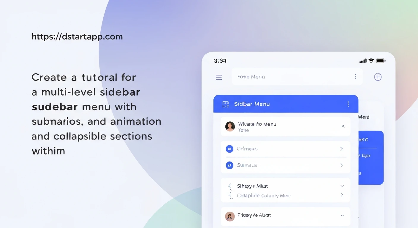

Modern applications often require intuitive navigation, and a multi-level sidebar menu is a powerful component for organizing complex application structures. This article will guide you through creating a sophisticated sidebar menu in Flutter, featuring nested submenus, smooth animation for expansion and collapse, and clear collapsible sections. We'll leverage Flutter's declarative UI and widgets like ExpansionTile to achieve a dynamic and user-friendly navigation experience.
Understanding the Core Components
Before diving into the code, let's understand the key Flutter widgets and concepts we'll utilize:
Drawer: A material design panel that slides in horizontally from the edge of aScaffoldto show navigation links. This is where our sidebar menu will reside.StatefulWidget: Essential for managing the state of our menu, such as which submenu is currently expanded or which item is selected.ListView: To display a scrollable list of menu items, allowing for menus that exceed screen height.ExpansionTile: A built-in Flutter widget that provides a collapsible section with an animated expansion and collapse effect. It's perfect for submenus.ListTile: The standard widget for a single fixed-height row that contains a title, leading/trailing icons, and other content. We'll use this for individual menu items.
1. Defining the Menu Data Structure
To create a multi-level menu, we need a data model that can represent nested items. A simple class with properties for title, icon, and an optional list of children (which are also MenuItems) will work perfectly.
class MenuItem {
  final String title;
  final IconData icon;
  final List<MenuItem>? children;
  final String? route; // Optional: for navigation

  const MenuItem({
    required this.title,
    required this.icon,
    this.children,
    this.route,
  });
}
Here's an example of how you might define your menu data:
final List<MenuItem> _menuItems = [
  const MenuItem(
    title: 'Dashboard',
    icon: Icons.dashboard,
    route: '/dashboard',
  ),
  MenuItem(
    title: 'Products',
    icon: Icons.shopping_cart,
    children: [
      const MenuItem(
        title: 'All Products',
        icon: Icons.list,
        route: '/products/all',
      ),
      const MenuItem(
        title: 'Add New Product',
        icon: Icons.add_box,
        route: '/products/add',
      ),
      MenuItem(
        title: 'Categories',
        icon: Icons.category,
        children: [
          const MenuItem(
            title: 'Electronics',
            icon: Icons.electrical_services,
            route: '/products/categories/electronics',
          ),
          const MenuItem(
            title: 'Apparel',
            icon: Icons.dry_cleaning,
            route: '/products/categories/apparel',
          ),
        ],
      ),
    ],
  ),
  const MenuItem(
    title: 'Orders',
    icon: Icons.receipt,
    route: '/orders',
  ),
  const MenuItem(
    title: 'Settings',
    icon: Icons.settings,
    route: '/settings',
  ),
];
2. Creating the Recursive Menu Item Widget
The core of our multi-level menu will be a recursive widget that can render itself as an ExpansionTile if it has children, or as a ListTile if it's a leaf node. This approach makes the menu highly scalable and easy to manage.
class _SideMenuItem extends StatelessWidget {
  final MenuItem item;
  final int level; // To handle padding for nested items

  const _SideMenuItem({
    required this.item,
    this.level = 0,
  });

  @override
  Widget build(BuildContext context) {
    if (item.children == null || item.children!.isEmpty) {
      // Leaf node: render as a ListTile
      return Padding(
        padding: EdgeInsets.only(left: 16.0 * level),
        child: ListTile(
          leading: Icon(item.icon),
          title: Text(item.title),
          onTap: () {
            // Handle navigation or action for this item
            Navigator.pop(context); // Close the drawer
            if (item.route != null) {
              Navigator.pushNamed(context, item.route!);
            }
          },
        ),
      );
    } else {
      // Parent node: render as an ExpansionTile
      return Padding(
        padding: EdgeInsets.only(left: 16.0 * level),
        child: ExpansionTile(
          leading: Icon(item.icon),
          title: Text(item.title),
          children: item.children!
              .map((child) => _SideMenuItem(item: child, level: level + 1))
              .toList(),
          onExpansionChanged: (bool expanded) {
            // Optional: You can add state management here
            // to remember which tiles are expanded.
          },
        ),
      );
    }
  }
}
In this widget:
- We check if
item.childrenis null or empty. - If it is, we render a standard
ListTile. - If it has children, we render an
ExpansionTile. Thechildrenproperty ofExpansionTileis populated by recursively calling_SideMenuItemfor each child, incrementing thelevelto add appropriate padding. onTapforListTileandonExpansionChangedforExpansionTileprovide hooks for interaction.Paddingis used withlevel * 16.0to visually indent nested menu items, improving readability.
3. Integrating into the Main Sidebar Drawer
Now, let's put our recursive menu into a Drawer widget within a Scaffold.
import 'package:flutter/material.dart';

// Assume MenuItem class and _menuItems list are defined as above
// Assume _SideMenuItem widget is defined as above

class MultiLevelSidebarExample extends StatelessWidget {
  const MultiLevelSidebarExample({super.key});

  @override
  Widget build(BuildContext context) {
    return Scaffold(
      appBar: AppBar(
        title: const Text('Multi-Level Sidebar Menu'),
      ),
      drawer: Drawer(
        child: ListView(
          padding: EdgeInsets.zero, // Remove default ListView padding
          children: <Widget>[
            const DrawerHeader(
              decoration: BoxDecoration(
                color: Colors.blue,
              ),
              child: Text(
                'My App Navigation',
                style: TextStyle(
                  color: Colors.white,
                  fontSize: 24,
                ),
              ),
            ),
            // Render the main menu items recursively
            ..._menuItems
                .map((item) => _SideMenuItem(item: item))
                .toList(),
          ],
        ),
      ),
      body: Center(
        child: Builder(
          builder: (context) {
            return Column(
              mainAxisAlignment: MainAxisAlignment.center,
              children: [
                const Text('Tap the menu icon to open the sidebar'),
                ElevatedButton(
                  onPressed: () {
                    Scaffold.of(context).openDrawer();
                  },
                  child: const Text('Open Menu'),
                ),
              ],
            );
          }
        ),
      ),
    );
  }
}
In the Drawer, we typically start with a DrawerHeader, followed by our menu items. We map our top-level _menuItems to _SideMenuItem widgets. The spread operator (...) is used to insert all generated widgets directly into the ListView's children list.
4. Animation and Collapsible Sections
The beauty of using ExpansionTile is that it comes with built-in animation for its expansion and collapse. When you tap a parent menu item, the submenu smoothly slides open or closed. This provides a professional and intuitive user experience without requiring you to implement complex animation controllers yourself.
The collapsible nature is also handled intrinsically by ExpansionTile. Tapping the tile's header toggles its expanded state, showing or hiding its children.
5. Enhancements and Further Considerations
- Highlighting Selected Items: To visually indicate the currently active page, you can pass the current route or a selected item ID down the widget tree. The
ListTilefor the active item can then have a different background color or text style. - State Management for Expansion: By default,
ExpansionTilemanages its own expanded state. If you want to control it externally (e.g., ensure only one tile is open at a time, or open a specific tile programmatically), you can use aGlobalKey<ExpansionTileState>or integrate a state management solution (like Provider, Riverpod, BLoC) to manage theisExpandedproperty. - Custom Animations: While
ExpansionTileoffers basic animation, you could replace it with custom animations usingAnimatedContainerorSlideTransitionif you need highly specific visual effects. - Accessibility: Ensure your menu items have appropriate semantics for screen readers.
ListTileandExpansionTilegenerally handle this well, but custom widgets might require more attention. - Theming: Use Flutter's theming capabilities to ensure your menu's colors, fonts, and iconography match your application's overall design language.
Conclusion
Building a multi-level sidebar menu in Flutter, complete with submenus, animations, and collapsible sections, is straightforward with the right approach. By leveraging a recursive widget structure and Flutter's powerful ExpansionTile, you can create a highly functional and aesthetically pleasing navigation system that significantly enhances the user experience of your application. This pattern is adaptable and can be extended to fit various complex navigation requirements.


