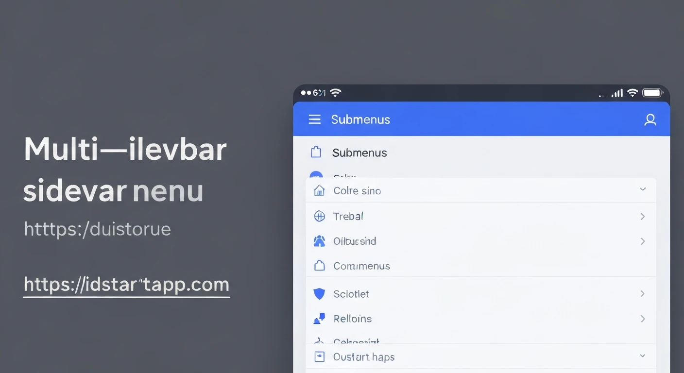

Building a Multi-Level Sidebar Menu Widget with Submenus and Animation in Flutter
A multi-level sidebar menu is a common UI pattern in many applications, providing efficient navigation through a hierarchical structure of pages or features. Building such a widget in Flutter, complete with smooth animations for submenus, can significantly enhance the user experience. This article will guide you through the process of creating a robust and reusable multi-level sidebar menu widget with dynamic submenus and elegant expansion/collapse animations.
Core Concepts
- Hierarchical Data Model: A structured way to represent menu items and their children.
- State Management: Handling the expanded/collapsed state of each submenu.
- Animation Controllers: Orchestrating the visual transitions for expansion, collapse, and icon rotation.
- Recursive Widget Rendering: Efficiently displaying nested submenus.
Step-by-Step Implementation
1. Define the Data Model for Menu Items
First, let's create a simple data class to represent our menu items. Each item can have a title, an optional icon, and a list of children menu items, allowing for arbitrary nesting. An optional `onTap` callback can be added for navigation or other actions when a non-parent item is selected.
import 'package:flutter/material.dart';

class MenuItem {
  final String title;
  final IconData? icon;
  final List<MenuItem> children;
  final VoidCallback? onTap; // Optional: action when item is tapped

  MenuItem({
    required this.title,
    this.icon,
    this.children = const [],
    this.onTap,
  });
}
2. Create the Main Sidebar Menu Widget
This widget will serve as the container for our entire sidebar menu. It typically wraps a `ListView` within a `Drawer` widget. We'll pass a list of top-level `MenuItem`s to it and render them using our custom `MenuItemWidget`.
import 'package:flutter/material.dart';

// Ensure the MenuItem class is defined or imported above this point

class SidebarMenu extends StatelessWidget {
  final List<MenuItem> menuItems;

  const SidebarMenu({Key? key, required this.menuItems}) : super(key: key);

  @override
  Widget build(BuildContext context) {
    return Drawer(
      child: ListView(
        padding: EdgeInsets.zero,
        children: [
          // Optional: Add a DrawerHeader for branding or user info
          const DrawerHeader(
            decoration: BoxDecoration(
              color: Colors.blue,
            ),
            child: Text(
              'App Menu',
              style: TextStyle(
                color: Colors.white,
                fontSize: 24,
              ),
            ),
          ),
          // Map each top-level MenuItem to a MenuItemWidget
          ...menuItems.map((item) => MenuItemWidget(item: item)).toList(),
        ],
      ),
    );
  }
}
3. Implement the `MenuItemWidget` with Animation
This is the core widget responsible for displaying a single menu item, managing its expansion state, and animating its submenu. It will be a `StatefulWidget` because it needs to manage its own internal state (expanded/collapsed) and `AnimationController`s for the visual effects.
import 'package:flutter/material.dart';

// Ensure the MenuItem class is defined or imported above this point

class MenuItemWidget extends StatefulWidget {
  final MenuItem item;
  final int level; // To control padding for nested items and visual hierarchy

  const MenuItemWidget({Key? key, required this.item, this.level = 0}) : super(key: key);

  @override
  _MenuItemWidgetState createState() => _MenuItemWidgetState();
}

class _MenuItemWidgetState extends State<MenuItemWidget> with SingleTickerProviderStateMixin {
  late AnimationController _controller;
  late Animation<double> _animation;
  bool _isExpanded = false;

  @override
  void initState() {
    super.initState();
    _controller = AnimationController(
      vsync: this,
      duration: const Duration(milliseconds: 300), // Animation duration
    );
    // Use a curved animation for a smoother expansion/collapse effect
    _animation = CurvedAnimation(
      parent: _controller,
      curve: Curves.easeOut,
    );
  }

  @override
  void dispose() {
    _controller.dispose();
    super.dispose();
  }

  void _toggleExpanded() {
    setState(() {
      _isExpanded = !_isExpanded;
      if (_isExpanded) {
        _controller.forward(); // Start animation forward
      } else {
        _controller.reverse(); // Start animation backward
      }
    });
  }

  @override
  Widget build(BuildContext context) {
    // Determine horizontal padding based on the nesting level
    final double horizontalPadding = 16.0 + (widget.level * 16.0);

    return Column(
      children: [
        ListTile(
          contentPadding: EdgeInsets.symmetric(horizontal: horizontalPadding),
          leading: widget.item.icon != null
              ? Icon(widget.item.icon, color: Theme.of(context).colorScheme.onSurface.withOpacity(0.7))
              : null,
          title: Text(
            widget.item.title,
            style: TextStyle(
              fontWeight: widget.level == 0 ? FontWeight.bold : FontWeight.normal,
              color: Theme.of(context).colorScheme.onSurface,
            ),
          ),
          trailing: widget.item.children.isNotEmpty
              ? RotationTransition(
                  // Animate the chevron icon rotation
                  turns: Tween(begin: 0.0, end: 0.5).animate(_animation),
                  child: Icon(Icons.expand_more, color: Theme.of(context).colorScheme.onSurface.withOpacity(0.7)),
                )
              : null, // No trailing icon for items without children
          onTap: () {
            if (widget.item.children.isNotEmpty) {
              // If it has children, toggle the submenu expansion
              _toggleExpanded();
            } else {
              // If it's a leaf item, execute its onTap callback
              widget.item.onTap?.call();
              // Optionally, close the drawer after an item is tapped
              Navigator.of(context).pop();
            }
          },
        ),
        if (widget.item.children.isNotEmpty) // Only render submenu if children exist
          SizeTransition(
            // Animates the height of the submenu when expanding/collapsing
            sizeFactor: _animation,
            axisAlignment: 1.0, // Ensures animation starts from the top
            child: Column(
              children: widget.item.children
                  .map((child) => MenuItemWidget(item: child, level: widget.level + 1))
                  .toList(),
            ),
          ),
      ],
    );
  }
}
4. Integrating into a Flutter Application
Finally, let's put all the pieces together in a simple Flutter `MaterialApp`. We'll create a list of sample `MenuItem`s with several levels of nesting and assign it to our `SidebarMenu` widget.
import 'package:flutter/material.dart';

// Ensure the MenuItem, SidebarMenu, and MenuItemWidget classes are defined or imported

void main() {
  runApp(const MyApp());
}

class MyApp extends StatelessWidget {
  const MyApp({Key? key}) : super(key: key);

  @override
  Widget build(BuildContext context) {
    return MaterialApp(
      title: 'Flutter Multi-Level Sidebar',
      theme: ThemeData(
        primarySwatch: Colors.blue,
        // Customize color scheme for light/dark mode if needed
        colorScheme: ColorScheme.fromSwatch(primarySwatch: Colors.blue).copyWith(
          secondary: Colors.amber, // Accent color
          onSurface: Colors.black87, // Default text/icon color on a surface
        ),
      ),
      home: const MyHomePage(),
    );
  }
}

class MyHomePage extends StatelessWidget {
  const MyHomePage({Key? key}) : super(key: key);

  @override
  Widget build(BuildContext context) {
    // Define your hierarchical menu items
    final List<MenuItem> menuItems = [
      MenuItem(
        title: 'Dashboard',
        icon: Icons.dashboard,
        onTap: () {
          debugPrint('Dashboard tapped');
          // Example: Navigate to a Dashboard screen
        },
      ),
      MenuItem(
        title: 'Products',
        icon: Icons.shopping_bag,
        children: [
          MenuItem(
            title: 'All Products',
            icon: Icons.list,
            onTap: () => debugPrint('All Products tapped'),
          ),
          MenuItem(
            title: 'Add Product',
            icon: Icons.add,
            onTap: () => debugPrint('Add Product tapped'),
          ),
          MenuItem(
            title: 'Categories',
            icon: Icons.category,
            children: [
              MenuItem(
                title: 'Electronics',
                onTap: () => debugPrint('Electronics tapped'),
              ),
              MenuItem(
                title: 'Books',
                onTap: () => debugPrint('Books tapped'),
              ),
              MenuItem(
                title: 'Clothing',
                onTap: () => debugPrint('Clothing tapped'),
                children: [ // Example of a third level
                  MenuItem(
                    title: 'Men\'s',
                    onTap: () => debugPrint('Men\'s Clothing tapped'),
                  ),
                  MenuItem(
                    title: 'Women\'s',
                    onTap: () => debugPrint('Women\'s Clothing tapped'),
                  ),
                ],
              ),
            ],
          ),
        ],
      ),
      MenuItem(
        title: 'Users',
        icon: Icons.people,
        children: [
          MenuItem(
            title: 'User List',
            onTap: () => debugPrint('User List tapped'),
          ),
          MenuItem(
            title: 'Roles & Permissions',
            onTap: () => debugPrint('Roles & Permissions tapped'),
          ),
        ],
      ),
      MenuItem(
        title: 'Settings',
        icon: Icons.settings,
        onTap: () {
          debugPrint('Settings tapped');
        },
      ),
      MenuItem(
        title: 'Help & Support',
        icon: Icons.help_outline,
        children: [
          MenuItem(
            title: 'FAQ',
            onTap: () => debugPrint('FAQ tapped'),
          ),
          MenuItem(
            title: 'Contact Us',
            onTap: () => debugPrint('Contact Us tapped'),
          ),
        ],
      ),
    ];

    return Scaffold(
      appBar: AppBar(
        title: const Text('Multi-Level Sidebar Menu'),
      ),
      drawer: SidebarMenu(menuItems: menuItems), // Our custom sidebar menu
      body: const Center(
        child: Text(
          'Tap the menu icon in the app bar to open the sidebar!',
          style: TextStyle(fontSize: 18),
          textAlign: TextAlign.center,
        ),
      ),
    );
  }
}
Conclusion
Building a multi-level sidebar menu with submenus and animations in Flutter involves defining a hierarchical data model, managing widget states, and leveraging Flutter's powerful animation framework. By using `AnimationController`, `RotationTransition` for icon animation, and `SizeTransition` for smooth submenu expansion/collapse, we can create an intuitive and visually appealing navigation experience. This modular approach allows for easy expansion and customization of your menu structure, making your Flutter applications more professional and user-friendly.
Further enhancements could include: highlighting the currently selected item, persisting the expanded state across navigation, customizing animation curves and durations, or implementing more complex custom transitions for a unique UI.


