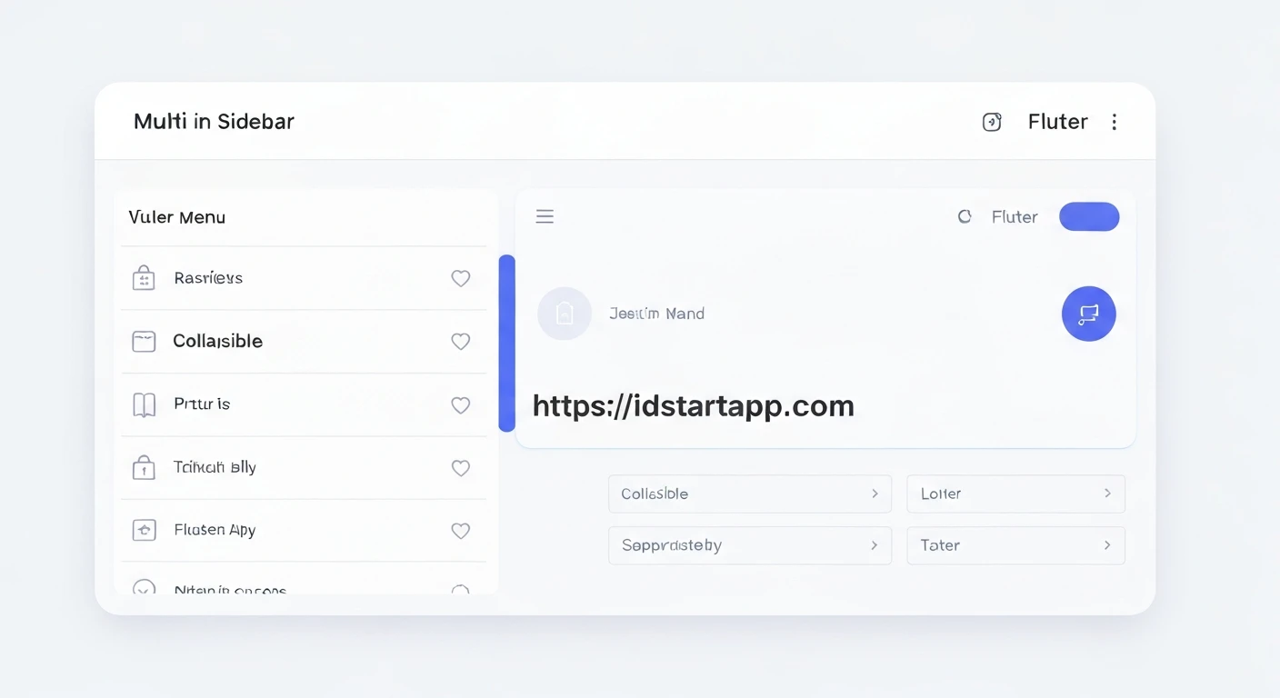

Creating a Multi-Level Collapsible Sidebar Widget in Flutter
A well-structured sidebar is a fundamental component of many modern applications, providing intuitive navigation and an organized user experience. For applications with numerous features or complex hierarchies, a multi-level collapsible sidebar becomes indispensable, allowing users to explore different sections without cluttering the interface.
This article will guide you through building a professional multi-level sidebar widget with collapsible menus in Flutter. We'll leverage Flutter's declarative UI capabilities and built-in widgets to create a highly customizable and interactive navigation drawer.
Understanding the Core Components
Flutter offers several powerful widgets that are perfectly suited for building a multi-level sidebar:
Drawer: This is the primary container for a sidebar. It slides in from the edge of theScaffold.ListView: Essential for making the sidebar scrollable, especially when dealing with many menu items or deep hierarchies.ListTile: Represents a single fixed-height row, commonly used for menu items. It supports leading icons, titles, and tap actions.ExpansionTile: The key widget for creating collapsible sections. It features a header (title and optional icon) and a list of children that are revealed or hidden when the tile is tapped.
Defining Your Menu Data Structure
Before building the UI, it's helpful to define a clear data structure for your menu items. This allows for easy management and dynamic generation of the sidebar.
class MenuItem {
  final String title;
  final IconData? icon;
  final List<MenuItem>? children; // For multi-level nesting
  final String id; // A unique identifier for selection tracking

  MenuItem({required this.title, this.icon, this.children, required this.id});
}
In this MenuItem class:
title: The text displayed for the menu item.icon: An optional icon displayed next to the title.children: A list ofMenuItemobjects, allowing for infinite nesting to create multi-level menus. If this isnullor empty, the item is a leaf node.id: A unique string identifier, useful for tracking the currently selected item and for navigation.
Setting Up the Basic Sidebar Container
The sidebar will typically be placed within a Scaffold's drawer property. Let's set up a basic Flutter application with a Scaffold and a placeholder for our custom sidebar widget.
import 'package:flutter/material.dart';
import 'package:your_app_name/multi_level_sidebar.dart'; // We'll create this file

void main() {
  runApp(MyApp());
}

class MyApp extends StatelessWidget {
  @override
  Widget build(BuildContext context) {
    return MaterialApp(
      title: 'Multi-Level Sidebar Demo',
      theme: ThemeData(
        primarySwatch: Colors.blue,
        visualDensity: VisualDensity.adaptivePlatformDensity,
      ),
      home: MyHomePage(),
    );
  }
}

class MyHomePage extends StatefulWidget {
  @override
  _MyHomePageState createState() => _MyHomePageState();
}

class _MyHomePageState extends State<MyHomePage> {
  String _selectedItem = 'Dashboard'; // Initial selected item

  @override
  Widget build(BuildContext context) {
    return Scaffold(
      appBar: AppBar(
        title: Text('Multi-Level Sidebar Demo'),
      ),
      drawer: MultiLevelSidebar(
        onItemSelected: (item) {
          setState(() {
            _selectedItem = item;
          });
          Navigator.pop(context); // Close the drawer after selection
        },
        selectedItem: _selectedItem,
      ),
      body: Center(
        child: Text(
          'Selected: $_selectedItem',
          style: TextStyle(fontSize: 24, fontWeight: FontWeight.bold),
        ),
      ),
    );
  }
}
In MyHomePage, we manage the _selectedItem state, which is passed to our MultiLevelSidebar widget to highlight the current selection.
Building the Multi-Level Sidebar Widget
Now, let's create the MultiLevelSidebar widget. This widget will take a list of MenuItems and recursively build the sidebar using ListTile and ExpansionTile.
Create a new file, e.g., multi_level_sidebar.dart, and add the following code:
import 'package:flutter/material.dart';

// (Optional) Define your MenuItem class here or import it if in a separate file
class MenuItem {
  final String title;
  final IconData? icon;
  final List<MenuItem>? children;
  final String id;

  MenuItem({required this.title, this.icon, this.children, required this.id});
}

class MultiLevelSidebar extends StatelessWidget {
  final ValueChanged<String> onItemSelected;
  final String selectedItem;

  MultiLevelSidebar({required this.onItemSelected, required this.selectedItem});

  // Example menu data
  final List<MenuItem> _menuItems = [
    MenuItem(
      title: 'Dashboard',
      icon: Icons.dashboard,
      id: 'Dashboard',
    ),
    MenuItem(
      title: 'Products',
      icon: Icons.shopping_bag,
      id: 'Products',
      children: [
        MenuItem(title: 'All Products', id: 'All Products'),
        MenuItem(title: 'Add New Product', id: 'Add New Product'),
        MenuItem(title: 'Categories', id: 'Categories'),
      ],
    ),
    MenuItem(
      title: 'Orders',
      icon: Icons.receipt,
      id: 'Orders',
      children: [
        MenuItem(title: 'All Orders', id: 'All Orders'),
        MenuItem(title: 'Pending Orders', id: 'Pending Orders'),
        MenuItem(
          title: 'Reports',
          id: 'Order Reports',
          children: [ // Level 3 example
            MenuItem(title: 'Daily Report', id: 'Daily Report'),
            MenuItem(title: 'Monthly Report', id: 'Monthly Report'),
          ],
        ),
      ],
    ),
    MenuItem(
      title: 'Users',
      icon: Icons.group,
      id: 'Users',
      children: [
        MenuItem(title: 'Admins', id: 'Admins'),
        MenuItem(title: 'Customers', id: 'Customers'),
      ],
    ),
    MenuItem(
      title: 'Settings',
      icon: Icons.settings,
      id: 'Settings',
    ),
    MenuItem(
      title: 'About Us',
      icon: Icons.info,
      id: 'About Us',
    ),
  ];

  @override
  Widget build(BuildContext context) {
    return Drawer(
      child: ListView(
        padding: EdgeInsets.zero, // Remove default padding
        children: <Widget>[
          DrawerHeader(
            decoration: BoxDecoration(
              color: Theme.of(context).primaryColor,
            ),
            child: Column(
              crossAxisAlignment: CrossAxisAlignment.start,
              mainAxisAlignment: MainAxisAlignment.end,
              children: [
                Text(
                  'Admin Panel',
                  style: TextStyle(
                    color: Colors.white,
                    fontSize: 24,
                    fontWeight: FontWeight.bold,
                  ),
                ),
                SizedBox(height: 8),
                Text(
                  'Version 1.0',
                  style: TextStyle(
                    color: Colors.white70,
                    fontSize: 14,
                  ),
                ),
              ],
            ),
          ),
          ..._buildMenuItems(context, _menuItems), // Recursively build menu items
        ],
      ),
    );
  }

  // Recursive function to build menu items
  List<Widget> _buildMenuItems(BuildContext context, List<MenuItem> items) {
    return items.map((item) {
      if (item.children == null || item.children!.isEmpty) {
        // This is a leaf node (no children), use ListTile
        return ListTile(
          leading: item.icon != null ? Icon(item.icon) : null,
          title: Text(item.title),
          selected: selectedItem == item.id, // Highlight if selected
          onTap: () => onItemSelected(item.id),
        );
      } else {
        // This node has children, use ExpansionTile for collapsing
        return Theme(
          // Override default ExpansionTile divider color
          data: Theme.of(context).copyWith(dividerColor: Colors.transparent),
          child: ExpansionTile(
            leading: item.icon != null ? Icon(item.icon) : null,
            title: Text(item.title),
            // Keep expanded if any child (or the item itself) is selected
            initiallyExpanded: _isParentOfSelectedItem(item, selectedItem),
            children: _buildMenuItems(context, item.children!), // Recursively build children
          ),
        );
      }
    }).toList();
  }

  // Helper function to check if an item or its children contains the selected item
  bool _isParentOfSelectedItem(MenuItem parent, String currentSelectedItem) {
    if (parent.id == currentSelectedItem) {
      return true; // The parent itself is selected
    }
    if (parent.children == null) {
      return false; // No children to check
    }
    for (var child in parent.children!) {
      if (_isParentOfSelectedItem(child, currentSelectedItem)) {
        return true; // A child (or grandchild) is selected
      }
    }
    return false;
  }
}
Explanation of Key Parts:
_menuItemsData: AList<MenuItem>that defines your entire sidebar structure, including nested levels.DrawerHeader: Provides a visually distinct top section for your sidebar, often used for app branding or user info._buildMenuItemsRecursive Function:- This function iterates through a list of
MenuItems. - If a
MenuItemhas nochildren(it's a leaf node), it creates a standardListTile. - If a
MenuItemhaschildren, it creates anExpansionTile, and then recursively calls_buildMenuItemsfor its children to build the nested structure.
- This function iterates through a list of
- Highlighting Selection:
ListTile(selected: selectedItem == item.id): This property highlights theListTilewhen itsidmatches theselectedItempassed to the widget.onTap: () => onItemSelected(item.id): When a leafListTileis tapped, it invokes theonItemSelectedcallback, updating the parent widget's state and closing the drawer.
- Maintaining Expansion State:
ExpansionTile(initiallyExpanded: _isParentOfSelectedItem(item, selectedItem)): This is crucial for a good user experience. If a sub-item (deeply nested or direct child) is selected, its parentExpansionTile(and all its ancestors) will automatically be expanded when the drawer opens._isParentOfSelectedItem: This helper function recursively checks if the givenparentmenu item itself matches thecurrentSelectedItem, or if any of its descendants match.
- Styling
ExpansionTile:Theme.of(context).copyWith(dividerColor: Colors.transparent): This trick is used to remove the subtle horizontal divider thatExpansionTilesometimes adds by default, creating a cleaner look.
Customization and Best Practices
- Icons and Styling: You can customize the
leadingandtrailingwidgets of bothListTileandExpansionTile. Adjust text styles, colors, and padding to match your app's theme. - Navigation: Instead of just passing back an
id, you could pass aroutestring or aWidgetBuilderto directly navigate to different screens usingNavigator.pushNamedorNavigator.push. - Dynamic Menus: For real-world applications, your
_menuItemsdata would likely come from an API, a database, or a configuration file, allowing for dynamic menu generation based on user roles or application state. - Performance: For extremely deep or vast menu trees, consider optimizing list rendering, though
ListViewand Flutter's widget tree reconciliation are generally highly performant. - Accessibility: Ensure proper semantic labels and sufficient tap target sizes for all interactive elements.
Conclusion
By combining Flutter's Drawer, ListView, ListTile, and especially ExpansionTile, you can create a highly functional and aesthetically pleasing multi-level collapsible sidebar. This modular approach, driven by a clear data structure and recursive widget building, provides a robust solution for complex navigation requirements in your Flutter applications. This pattern ensures a clean, organized, and user-friendly interface that can scale with your application's growth.


