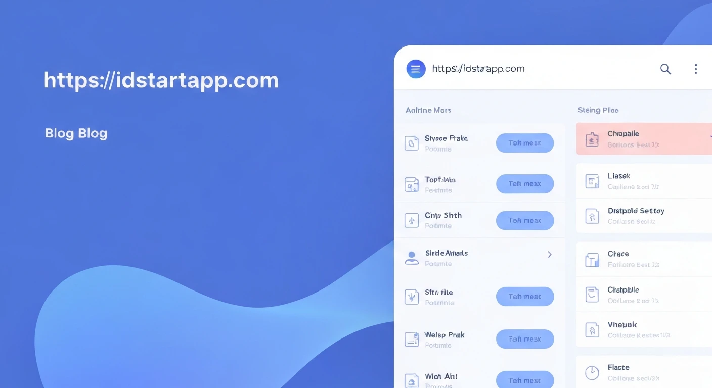

Creating a Multi-Level Sidebar Menu Widget with Submenus, Animation, and Collapsible Sections in Flutter
Modern mobile and web applications often require sophisticated navigation solutions to provide a seamless user experience. A multi-level sidebar menu is a powerful tool for organizing complex application structures, allowing users to intuitively navigate through various sections and subsections. This article will guide you through building a dynamic, multi-level sidebar menu in Flutter, complete with submenus, smooth animations, and collapsible sections.
Understanding the Core Components
To achieve our goal, we'll break down the problem into several manageable parts:
- Data Model: A flexible structure to represent menu items and their children.
- Individual Menu Item Widget: A reusable widget capable of displaying a menu item, handling its expansion/collapse state, and displaying its children recursively.
- Animation: Smooth transitions for expanding and collapsing sections, enhancing user interaction.
- Main Sidebar Menu Widget: A container that takes a list of top-level menu items and renders them.
Step 1: Define the Menu Item Data Structure
First, let's create a simple data model to represent our menu items. Each item will have a title, an optional icon, and a list of children items. We'll also include a unique ID and a callback for when the item is tapped.
class MenuItem {
  final String id;
  final String title;
  final IconData? icon;
  final List<MenuItem> children;
  final VoidCallback? onTap;

  MenuItem({
    required this.id,
    required this.title,
    this.icon,
    this.children = const [],
    this.onTap,
  });
}
Step 2: Create the `SidebarMenuItem` Widget
This will be the most complex widget, responsible for rendering a single menu item. It needs to:
- Display its own title and icon.
- Show an expand/collapse icon if it has children.
- Manage its own expanded state.
- Animate the expansion/collapse of its children.
- Recursively render its children using itself.
We'll use `StatefulWidget` to manage the expanded state, `AnimatedSize` for smooth height transitions, and `RotationTransition` for animating the expand/collapse arrow icon.
import 'package:flutter/material.dart';

// Assuming MenuItem class is defined as above

class SidebarMenuItem extends StatefulWidget {
  final MenuItem item;
  final int level;
  final ValueChanged<String> onItemSelected;

  const SidebarMenuItem({
    Key? key,
    required this.item,
    this.level = 0,
    required this.onItemSelected,
  }) : super(key: key);

  @override
  _SidebarMenuItemState createState() => _SidebarMenuItemState();
}

class _SidebarMenuItemState extends State<SidebarMenuItem> with SingleTickerProviderStateMixin {
  bool _isExpanded = false;
  late AnimationController _controller;
  late Animation<double> _iconTurns;

  @override
  void initState() {
    super.initState();
    _controller = AnimationController(
      vsync: this,
      duration: const Duration(milliseconds: 200),
    );
    _iconTurns = Tween<double>(begin: 0.0, end: 0.5).animate(_controller);
  }

  @override
  void dispose() {
    _controller.dispose();
    super.dispose();
  }

  void _handleTap() {
    if (widget.item.children.isNotEmpty) {
      setState(() {
        _isExpanded = !_isExpanded;
        if (_isExpanded) {
          _controller.forward();
        } else {
          _controller.reverse();
        }
      });
    } else {
      widget.onItemSelected(widget.item.id);
      widget.item.onTap?.call();
    }
  }

  @override
  Widget build(BuildContext context) {
    final bool hasChildren = widget.item.children.isNotEmpty;
    final double paddingLeft = 16.0 + (widget.level * 16.0); // Indentation for submenus

    return Column(
      children: [
        InkWell(
          onTap: _handleTap,
          child: Container(
            padding: EdgeInsets.only(left: paddingLeft, right: 16.0, top: 12.0, bottom: 12.0),
            child: Row(
              children: [
                if (widget.item.icon != null) ...[
                  Icon(widget.item.icon, size: 20.0),
                  const SizedBox(width: 12.0),
                ],
                Expanded(
                  child: Text(
                    widget.item.title,
                    style: TextStyle(
                      fontSize: 16.0 - (widget.level * 0.5), // Slightly smaller font for sub-levels
                      fontWeight: widget.level == 0 ? FontWeight.w500 : FontWeight.normal,
                    ),
                  ),
                ),
                if (hasChildren)
                  RotationTransition(
                    turns: _iconTurns,
                    child: const Icon(Icons.expand_more, size: 20.0),
                  ),
              ],
            ),
          ),
        ),
        if (hasChildren)
          AnimatedSize(
            duration: const Duration(milliseconds: 200),
            curve: Curves.easeInOut,
            child: SizedBox(
              height: _isExpanded ? null : 0.0, // Set height to null when expanded to allow content to dictate height
              child: Column(
                crossAxisAlignment: CrossAxisAlignment.start,
                children: widget.item.children
                    .map((childItem) => SidebarMenuItem(
                          item: childItem,
                          level: widget.level + 1,
                          onItemSelected: widget.onItemSelected,
                        ))
                    .toList(),
              ),
            ),
          ),
      ],
    );
  }
}
Step 3: Create the `SidebarMenu` Widget (Main Container)
This widget will serve as the main container for our sidebar menu. It takes a list of top-level `MenuItem`s and renders them using the `SidebarMenuItem` widget.
import 'package:flutter/material.dart';

// Assuming MenuItem and SidebarMenuItem classes are defined above

class SidebarMenu extends StatelessWidget {
  final List<MenuItem> menuItems;
  final ValueChanged<String> onItemSelected;

  const SidebarMenu({
    Key? key,
    required this.menuItems,
    required this.onItemSelected,
  }) : super(key: key);

  @override
  Widget build(BuildContext context) {
    return Drawer(
      child: ListView(
        padding: EdgeInsets.zero,
        children: [
          const DrawerHeader(
            decoration: BoxDecoration(
              color: Colors.blue,
            ),
            child: Text(
              'App Navigation',
              style: TextStyle(
                color: Colors.white,
                fontSize: 24,
              ),
            ),
          ),
          ...menuItems
              .map(
                (item) => SidebarMenuItem(
                  item: item,
                  onItemSelected: onItemSelected,
                ),
              )
              .toList(),
        ],
      ),
    );
  }
}
Step 4: Integrate into a `Scaffold`
Now, let's put it all together by integrating the `SidebarMenu` into a `Scaffold`'s `Drawer` and providing some sample data.
import 'package:flutter/material.dart';

// Assuming MenuItem, SidebarMenuItem, and SidebarMenu classes are defined above

void main() {
  runApp(const MyApp());
}

class MyApp extends StatelessWidget {
  const MyApp({Key? key}) : super(key: key);

  @override
  Widget build(BuildContext context) {
    return MaterialApp(
      title: 'Flutter Multi-Level Sidebar Menu',
      theme: ThemeData(
        primarySwatch: Colors.blue,
      ),
      home: const MyHomePage(),
    );
  }
}

class MyHomePage extends StatefulWidget {
  const MyHomePage({Key? key}) : super(key: key);

  @override
  State<MyHomePage> createState() => _MyHomePageState();
}

class _MyHomePageState extends State<MyHomePage> {
  String _selectedItemId = 'dashboard';

  List<MenuItem> _buildMenuItems() {
    return [
      MenuItem(
        id: 'dashboard',
        title: 'Dashboard',
        icon: Icons.dashboard,
      ),
      MenuItem(
        id: 'products',
        title: 'Products',
        icon: Icons.shopping_bag,
        children: [
          MenuItem(
            id: 'all_products',
            title: 'All Products',
            icon: Icons.list,
          ),
          MenuItem(
            id: 'add_product',
            title: 'Add Product',
            icon: Icons.add_circle,
          ),
          MenuItem(
            id: 'categories',
            title: 'Categories',
            icon: Icons.category,
            children: [
              MenuItem(
                id: 'main_categories',
                title: 'Main Categories',
                icon: Icons.menu_book,
              ),
              MenuItem(
                id: 'sub_categories',
                title: 'Sub Categories',
                icon: Icons.subdirectory_arrow_right,
              ),
            ],
          ),
        ],
      ),
      MenuItem(
        id: 'orders',
        title: 'Orders',
        icon: Icons.receipt,
        children: [
          MenuItem(
            id: 'pending_orders',
            title: 'Pending Orders',
            icon: Icons.pending_actions,
          ),
          MenuItem(
            id: 'completed_orders',
            title: 'Completed Orders',
            icon: Icons.check_circle,
          ),
        ],
      ),
      MenuItem(
        id: 'settings',
        title: 'Settings',
        icon: Icons.settings,
      ),
    ];
  }

  void _onItemSelected(String id) {
    setState(() {
      _selectedItemId = id;
    });
    Navigator.pop(context); // Close the drawer
    ScaffoldMessenger.of(context).showSnackBar(
      SnackBar(content: Text('Selected Item: $_selectedItemId')),
    );
    // In a real app, you would navigate to a new screen or update content here
  }

  @override
  Widget build(BuildContext context) {
    return Scaffold(
      appBar: AppBar(
        title: const Text('Multi-Level Sidebar Menu Demo'),
      ),
      drawer: SidebarMenu(
        menuItems: _buildMenuItems(),
        onItemSelected: _onItemSelected,
      ),
      body: Center(
        child: Text(
          'Current Selection: $_selectedItemId',
          style: const TextStyle(fontSize: 24),
        ),
      ),
    );
  }
}
Enhancements and Considerations
- Selected Item Highlighting: To highlight the currently selected item, you could pass the `_selectedItemId` down to the `SidebarMenuItem` widgets and conditionally apply a background color or text style.
- Deep Linking/Routing: For complex applications, integrate this menu with Flutter's Navigator 2.0 or a routing package (like GoRouter) to handle deep links and update the UI accordingly.
- Customization: The styling (colors, fonts, padding) can be easily customized through the `ThemeData` or directly within the widgets.
- Accessibility: Ensure proper semantic labels and focus management for users with accessibility needs.
- Performance: For extremely large menus, consider optimizing the `ListView` or using `SliverList` if integrated directly into a custom scroll view.
Conclusion
You have now successfully built a dynamic, multi-level sidebar menu in Flutter, featuring submenus, smooth animations for expansion and collapse, and a clean hierarchical structure. This robust foundation can be adapted and expanded to suit the specific navigation needs of any Flutter application, significantly enhancing the user experience with its intuitive design and animated transitions.


