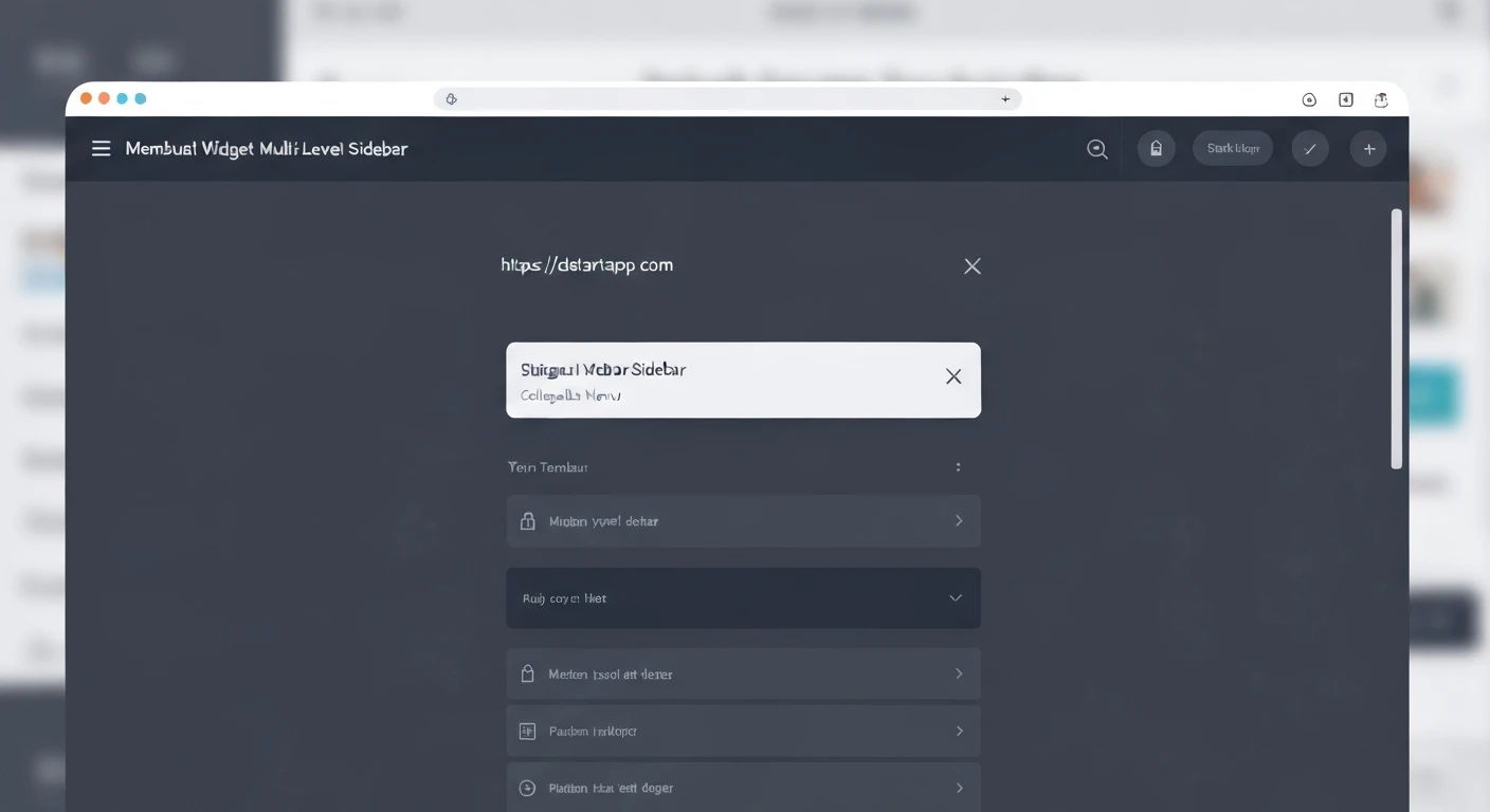
Building Multi-Level Sidebar Widgets with Collapsible Menus in Flutter
A well-structured sidebar navigation is crucial for user experience in many applications, especially those with complex feature sets. Implementing a multi-level sidebar with collapsible menus in Flutter allows developers to create intuitive and organized navigation flows, helping users easily find their way through various sections of the app without cluttering the interface.
This article will guide you through the process of creating such a sidebar, leveraging Flutter's powerful widget tree and state management capabilities. We will build a reusable component that can display an arbitrary number of nested menu levels, complete with icons and tap handlers.
Understanding the Core Concepts
To construct our multi-level collapsible sidebar, we will primarily utilize the following Flutter widgets:
Drawer: This is the primary container for the sidebar, typically presented as a panel sliding in from the side of the screen.ListView: Used within the Drawer to enable scrolling for a long list of menu items.ExpansionTile: The key widget for creating collapsible sections. It provides an easy way to expand and collapse a list of children. When collapsed, it shows a title and an optional leading/trailing widget. When expanded, it reveals its children.ListTile: A single fixed-height row that typically contains text and an optional leading or trailing icon. We will use this for non-collapsible, terminal menu items.- Custom Recursive Widget: To handle arbitrary levels of nesting, we will create a custom widget that can render itself or an
ExpansionTile based on whether it has children, and recursively render its children.
Designing the Menu Data Structure
Before we build the UI, we need a robust data structure to represent our multi-level menu items. A simple class will suffice, allowing each item to have a title, an icon, and a list of child items.
import 'package:flutter/material.dart';
class MenuItem {
final String title;
final IconData icon;
final List
This
MenuItem class is self-referential, allowing us to define an infinitely nested structure. The
onTap callback will be triggered when a terminal item (one without children) is tapped.
Building the Recursive Menu Widget
The heart of our multi-level sidebar is a custom widget that can render a
ListTile for terminal items or an
ExpansionTile for items with children. This widget will recursively call itself to render sub-menus.
We will name this widget
SidebarMenuItem. It will take a
MenuItem object and a
level parameter to manage visual indentation, indicating its depth in the menu hierarchy.
class SidebarMenuItem extends StatelessWidget {
  final MenuItem item;
  final int level; // Used for indentation

  const SidebarMenuItem({
    Key? key,
    required this.item,
    this.level = 0,
  }) : super(key: key);

  @override
  Widget build(BuildContext context) {
    // If the item has no children, render it as a simple ListTile
    if (item.children.isEmpty) {
      return ListTile(
        leading: Padding(
          padding: EdgeInsets.only(left: level * 16.0), // Indent based on level
          child: Icon(item.icon),
        ),
        title: Text(item.title),
        onTap: item.onTap,
      );
    } else {
      // If the item has children, render it as an ExpansionTile
      return ExpansionTile(
        leading: Padding(
          padding: EdgeInsets.only(left: level * 16.0), // Indent based on level
          child: Icon(item.icon),
        ),
        title: Text(item.title),
        children: item.children
            .map((child) => SidebarMenuItem(item: child, level: level + 1)) // Recursively render children
            .toList(),
      );
    }
  }
}
In the
SidebarMenuItem, we dynamically decide whether to render a
ListTile or an
ExpansionTile. For both, we add left padding based on the
level to visually represent the nesting. When rendering children within an
ExpansionTile, we increment the
level for the recursive call, ensuring deeper indentation.
Integrating into a Flutter Application
Now, let's put it all together in a basic Flutter application.
Step 1: Initialize Menu Data
First, define your menu structure using the
MenuItem class. For demonstration, we'll create a few nested items.
List<MenuItem> _menuItems = [
  MenuItem(
    title: 'Dashboard',
    icon: Icons.dashboard,
    onTap: () => print('Dashboard tapped'),
  ),
  MenuItem(
    title: 'Products',
    icon: Icons.shopping_bag,
    children: [
      MenuItem(
        title: 'All Products',
        icon: Icons.list,
        onTap: () => print('All Products tapped'),
      ),
      MenuItem(
        title: 'Add New Product',
        icon: Icons.add_box,
        onTap: () => print('Add New Product tapped'),
      ),
      MenuItem(
        title: 'Categories',
        icon: Icons.category,
        children: [
          MenuItem(
            title: 'Electronics',
            icon: Icons.computer,
            onTap: () => print('Electronics tapped'),
          ),
          MenuItem(
            title: 'Apparel',
            icon: Icons.checkroom,
            onTap: () => print('Apparel tapped'),
          ),
        ],
      ),
    ],
  ),
  MenuItem(
    title: 'Orders',
    icon: Icons.shopping_cart,
    children: [
      MenuItem(
        title: 'Pending Orders',
        icon: Icons.timer,
        onTap: () => print('Pending Orders tapped'),
      ),
      MenuItem(
        title: 'Completed Orders',
        icon: Icons.done_all,
        onTap: () => print('Completed Orders tapped'),
      ),
    ],
  ),
  MenuItem(
    title: 'Settings',
    icon: Icons.settings,
    onTap: () => print('Settings tapped'),
  ),
];
Step 2: Implement the Main App Structure
Set up a basic
Scaffold with an
AppBar and a
Drawer. The
AppBar will typically have a menu icon that opens the
Drawer.
import 'package:flutter/material.dart';

// (Your MenuItem and SidebarMenuItem classes here)

void main() {
  runApp(const MyApp());
}

class MyApp extends StatelessWidget {
  const MyApp({Key? key}) : super(key: key);

  @override
  Widget build(BuildContext context) {
    return MaterialApp(
      title: 'Multi-Level Sidebar Demo',
      theme: ThemeData(
        primarySwatch: Colors.blue,
      ),
      home: const MyHomePage(),
    );
  }
}

class MyHomePage extends StatefulWidget {
  const MyHomePage({Key? key}) : super(key: key);

  @override
  State<MyHomePage> createState() => _MyHomePageState();
}

class _MyHomePageState extends State<MyHomePage> {
  // (Your _menuItems list here)

  @override
  Widget build(BuildContext context) {
    return Scaffold(
      appBar: AppBar(
        title: const Text('Multi-Level Sidebar'),
      ),
      drawer: Drawer(
        child: ListView(
          padding: EdgeInsets.zero,
          children: <Widget>[
            const DrawerHeader(
              decoration: BoxDecoration(
                color: Colors.blue,
              ),
              child: Text(
                'App Navigation',
                style: TextStyle(
                  color: Colors.white,
                  fontSize: 24,
                ),
              ),
            ),
            // Menu items will be added here
          ],
        ),
      ),
      body: const Center(
        child: Text('Welcome to the main content area!'),
      ),
    );
  }
}
Step 3: Populate the Drawer
Finally, map your
_menuItems list to our
SidebarMenuItem widget and add them to the
ListView within the
Drawer.
            // ... inside the Drawer's ListView children ...
            const DrawerHeader(
              // ...
            ),
            // Map the top-level menu items to our custom SidebarMenuItem widget
            ..._menuItems.map((item) => SidebarMenuItem(item: item)).toList(),
          ],
        ),
      ),
      // ...
Complete Example
Here is the full
main.dart file combining all the pieces:
import 'package:flutter/material.dart';

// 1. Menu Data Structure
class MenuItem {
  final String title;
  final IconData icon;
  final List<MenuItem> children;
  final VoidCallback? onTap;

  MenuItem({
    required this.title,
    required this.icon,
    this.children = const [],
    this.onTap,
  });
}

// 2. Recursive Sidebar Menu Item Widget
class SidebarMenuItem extends StatelessWidget {
  final MenuItem item;
  final int level;

  const SidebarMenuItem({
    Key? key,
    required this.item,
    this.level = 0,
  }) : super(key: key);

  @override
  Widget build(BuildContext context) {
    if (item.children.isEmpty) {
      return ListTile(
        leading: Padding(
          padding: EdgeInsets.only(left: level * 16.0),
          child: Icon(item.icon),
        ),
        title: Text(item.title),
        onTap: () {
          // Close the drawer before executing the action
          Navigator.of(context).pop();
          item.onTap?.call();
        },
      );
    } else {
      return ExpansionTile(
        key: PageStorageKey(item.title), // Helps preserve expansion state
        leading: Padding(
          padding: EdgeInsets.only(left: level * 16.0),
          child: Icon(item.icon),
        ),
        title: Text(item.title),
        children: item.children
            .map((child) => SidebarMenuItem(item: child, level: level + 1))
            .toList(),
      );
    }
  }
}

void main() {
  runApp(const MyApp());
}

class MyApp extends StatelessWidget {
  const MyApp({Key? key}) : super(key: key);

  @override
  Widget build(BuildContext context) {
    return MaterialApp(
      title: 'Multi-Level Sidebar Demo',
      theme: ThemeData(
        primarySwatch: Colors.blue,
      ),
      home: const MyHomePage(),
    );
  }
}

class MyHomePage extends StatefulWidget {
  const MyHomePage({Key? key}) : super(key: key);

  @override
  State<MyHomePage> createState() => _MyHomePageState();
}

class _MyHomePageState extends State<MyHomePage> {
  // 3. Initialize Menu Data
  final List<MenuItem> _menuItems = [
    MenuItem(
      title: 'Dashboard',
      icon: Icons.dashboard,
      onTap: () => print('Dashboard tapped'),
    ),
    MenuItem(
      title: 'Products',
      icon: Icons.shopping_bag,
      children: [
        MenuItem(
          title: 'All Products',
          icon: Icons.list,
          onTap: () => print('All Products tapped'),
        ),
        MenuItem(
          title: 'Add New Product',
          icon: Icons.add_box,
          onTap: () => print('Add New Product tapped'),
        ),
        MenuItem(
          title: 'Categories',
          icon: Icons.category,
          children: [
            MenuItem(
              title: 'Electronics',
              icon: Icons.computer,
              onTap: () => print('Electronics tapped'),
            ),
            MenuItem(
              title: 'Apparel',
              icon: Icons.checkroom,
              onTap: () => print('Apparel tapped'),
            ),
            MenuItem(
              title: 'Sub-Categories',
              icon: Icons.subdirectory_arrow_right,
              children: [
                MenuItem(
                  title: 'Smartphones',
                  icon: Icons.phone_android,
                  onTap: () => print('Smartphones tapped'),
                ),
                MenuItem(
                  title: 'Laptops',
                  icon: Icons.laptop,
                  onTap: () => print('Laptops tapped'),
                ),
              ],
            ),
          ],
        ),
      ],
    ),
    MenuItem(
      title: 'Orders',
      icon: Icons.shopping_cart,
      children: [
        MenuItem(
          title: 'Pending Orders',
          icon: Icons.timer,
          onTap: () => print('Pending Orders tapped'),
        ),
        MenuItem(
          title: 'Completed Orders',
          icon: Icons.done_all,
          onTap: () => print('Completed Orders tapped'),
        ),
      ],
    ),
    MenuItem(
      title: 'Settings',
      icon: Icons.settings,
      onTap: () => print('Settings tapped'),
    ),
    MenuItem(
      title: 'Help',
      icon: Icons.help,
      onTap: () => print('Help tapped'),
    ),
  ];

  @override
  Widget build(BuildContext context) {
    return Scaffold(
      appBar: AppBar(
        title: const Text('Multi-Level Sidebar'),
      ),
      drawer: Drawer(
        child: ListView(
          padding: EdgeInsets.zero,
          children: <Widget>[
            const DrawerHeader(
              decoration: BoxDecoration(
                color: Colors.blue,
              ),
              child: Text(
                'App Navigation',
                style: TextStyle(
                  color: Colors.white,
                  fontSize: 24,
                ),
              ),
            ),
            // Render all top-level menu items
            ..._menuItems.map((item) => SidebarMenuItem(item: item)).toList(),
          ],
        ),
      ),
      body: const Center(
        child: Text('Welcome to the main content area!'),
      ),
    );
  }
}
Conclusion
You have successfully built a multi-level sidebar widget with collapsible menus in Flutter. By combining a flexible data structure with a recursive custom widget (
SidebarMenuItem), you can create highly organized and scalable navigation patterns for your applications. The use of
ExpansionTile provides the out-of-the-box collapsible behavior, while
ListTile handles the terminal menu actions.
This approach offers significant flexibility, allowing you to easily add or modify menu items and their nesting levels without significant changes to the UI code. Further enhancements could include custom styling for
ExpansionTile, integrating with a state management solution (like Provider or BLoC) for more complex navigation logic, or dynamically loading menu items from a remote source.