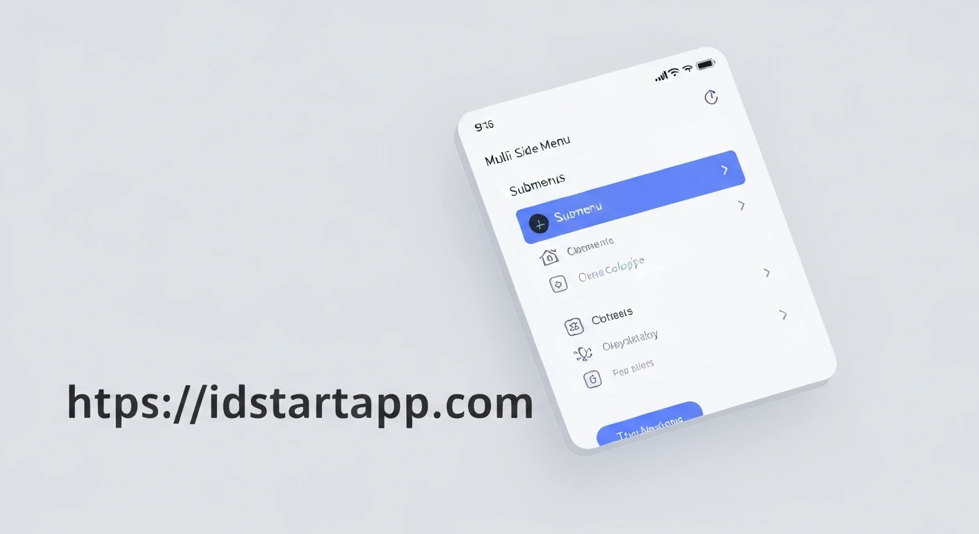

Building a Multi-Level Sidebar Menu Widget with Submenu Collapse in Flutter
In modern application development, intuitive and space-efficient navigation is paramount for a superior user experience. For applications with extensive feature sets, a simple flat menu can quickly become unwieldy. A multi-level sidebar menu with collapsible submenus offers an elegant solution, allowing developers to organize complex navigation hierarchies without overwhelming the user interface.
This article will guide you through the process of creating a reusable multi-level sidebar menu widget in Flutter, complete with the ability to expand and collapse submenus. This approach leverages Flutter's declarative UI and state management capabilities to deliver a flexible and powerful navigation component.
Understanding the Core Requirements
Before diving into the implementation, let's outline the key requirements for our widget:
- Hierarchical Structure: The menu must support arbitrary levels of nesting for menu items.
- Collapsible Submenus: Users should be able to expand and collapse submenus to reveal or hide child items.
- State Management: The expansion state of each submenu needs to be maintained.
- Navigation: Leaf-level menu items should trigger navigation to specific routes.
- Customization: The widget should be flexible enough for basic styling and icon customization.
1. Defining the Menu Item Data Structure
To represent our hierarchical menu data, we'll create a simple Dart class. This class will hold the title, an optional icon, a list of children (for submenus), and an optional route for navigation.
class MenuItem {
final String title;
final IconData? icon;
final List2. The Main Multi-Level Sidebar Menu Widget
Our main widget will be a StatefulWidget, as it needs to manage the expansion state of the submenus. It will take a list of top-level MenuItem objects as input.
import 'package:flutter/material.dart';
// (MenuItem class defined above would go here)
class MultiLevelSidebarMenu extends StatefulWidget {
final List3. Implementing the Recursive Menu Item Builder
The core of the multi-level functionality lies in a recursive helper method, _buildMenuItem. This method will dynamically build ListTile widgets for each menu item, adjusting indentation based on the level and incorporating expand/collapse logic for parent items.
// ... (Inside _MultiLevelSidebarMenuState class)

  Widget _buildMenuItem(MenuItem item, int level) {
    // Determine if this item is currently expanded
    final bool isExpanded = _expandedStates[item.title] ?? false;

    // Determine padding for indentation
    final EdgeInsets padding = EdgeInsets.only(left: level * widget.indentPadding);

    if (item.hasChildren) {
      return Column(
        children: [
          Padding(
            padding: padding,
            child: ListTile(
              title: Text(
                item.title,
                style: TextStyle(color: widget.textColor),
              ),
              leading: item.icon != null ? Icon(item.icon, color: widget.textColor) : null,
              trailing: Icon(
                isExpanded ? Icons.expand_less : Icons.expand_more,
                color: widget.textColor,
              ),
              onTap: () {
                setState(() {
                  _expandedStates[item.title] = !isExpanded;
                });
              },
              selectedColor: widget.selectedTextColor,
              selectedTileColor: widget.selectedItemColor,
              // You might want to add a way to mark a parent as 'selected'
              // depending on the active route of its children.
            ),
          ),
          if (isExpanded)
            Column(
              children: item.children.map((child) => _buildMenuItem(child, level + 1)).toList(),
            ),
        ],
      );
    } else {
      // Leaf node: a simple menu item
      return Padding(
        padding: padding,
        child: ListTile(
          title: Text(
            item.title,
            style: TextStyle(color: widget.textColor),
          ),
          leading: item.icon != null ? Icon(item.icon, color: widget.textColor) : null,
          onTap: () {
            // Handle navigation for leaf items
            if (item.route != null && widget.onItemSelected != null) {
              widget.onItemSelected!(item.route!);
            }
            // Optionally close the drawer if used within a Drawer
            Navigator.of(context).pop();
          },
          selectedColor: widget.selectedTextColor,
          selectedTileColor: widget.selectedItemColor,
          // You might add logic here to highlight the current active route
          // selected: ModalRoute.of(context)?.settings.name == item.route,
        ),
      );
    }
  }
4. Putting It All Together: Complete Example
Now, let's integrate our MultiLevelSidebarMenu into a complete Flutter application, typically within a Drawer of a Scaffold.
import 'package:flutter/material.dart';
// (Place MenuItem and MultiLevelSidebarMenu classes here)
void main() {
runApp(const MyApp());
}
class MyApp extends StatelessWidget {
const MyApp({super.key});
@override
Widget build(BuildContext context) {
return MaterialApp(
title: 'Multi-Level Menu Demo',
theme: ThemeData(
primarySwatch: Colors.blue,
),
home: const MyHomePage(),
routes: {
'/dashboard': (context) => const DetailPage(title: 'Dashboard'),
'/products/all': (context) => const DetailPage(title: 'All Products'),
'/products/category_a': (context) => const DetailPage(title: 'Category A'),
'/products/category_b': (context) => const DetailPage(title: 'Category B'),
'/orders/pending': (context) => const DetailPage(title: 'Pending Orders'),
'/orders/completed': (context) => const DetailPage(title: 'Completed Orders'),
'/settings/profile': (context) => const DetailPage(title: 'Profile Settings'),
'/settings/general': (context) => const DetailPage(title: 'General Settings'),
'/about': (context) => const DetailPage(title: 'About Us'),
},
);
}
}
class MyHomePage extends StatefulWidget {
const MyHomePage({super.key});
@override
State createState() => _MyHomePageState();
}
class _MyHomePageState extends State {
String _currentPage = 'Home';
// Define your menu items
final List Styling and Customization
Our MultiLevelSidebarMenu widget is designed with basic customization options:
backgroundColor: Sets the background color of the entire menu.textColor: Defines the default color for menu item titles and icons.selectedTextColor: Color for text of selected items (requires additional logic to determine selection).selectedItemColor: Background color for selected items.indentPadding: Controls the indentation level for submenus.
Further styling can be achieved by modifying the ListTile properties within the _buildMenuItem method, such as applying specific text styles, dense property, or custom `tileColor` based on the item's state or level.
Conclusion
By following this guide, you've successfully built a flexible and reusable multi-level sidebar menu widget with submenu collapse functionality in Flutter. This component greatly enhances navigation for complex applications by providing an organized and intuitive way for users to access different sections. Remember to consider unique IDs for menu items in production applications to avoid state conflicts if titles are not unique. This foundation can be further extended with animations, more sophisticated state management solutions (like Provider or Bloc), and dynamic loading of menu items from an API.


