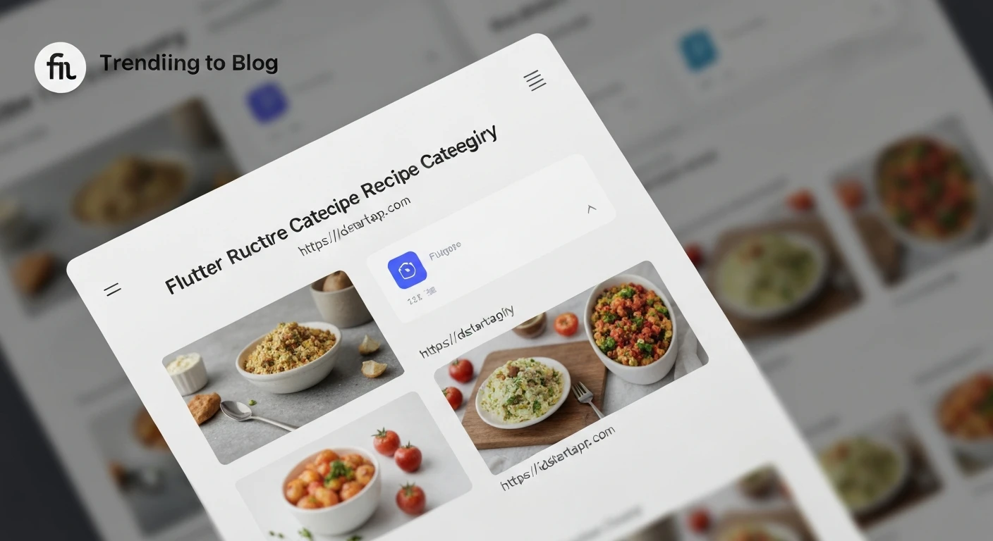

Creating a Recipe Category Grid Widget with Image Overlay in Flutter
In modern mobile applications, user interfaces that are both intuitive and visually appealing are paramount. For recipe apps, displaying categories in an engaging way can significantly enhance the user experience. This article will guide you through building a reusable Flutter widget: a recipe category grid with an image overlay. This design pattern allows you to showcase category images while prominently displaying their names, making navigation delightful and efficient.
Prerequisites:
- Basic understanding of Flutter and Dart.
- Flutter SDK installed.
Core Components of Our Widget:
Our RecipeCategoryGrid widget will be composed of several key elements:
- Data Model: A simple Dart class to define our recipe categories.
- Grid View: Using Flutter's
GridView.builderto efficiently display a scrollable list of items in a 2D array. - Individual Card Item: Each category will be represented by a card, featuring:
- An Image: The background for the category.
- An Overlay: A semi-transparent layer on top of the image to improve text readability.
- Category Name: The text label displayed prominently on the overlay.
- Tap Handling: To allow users to interact with categories.
Step-by-Step Implementation
Step 1: Define the Recipe Category Data Model
First, let's create a simple data model for our RecipeCategory. This class will hold the necessary information for each category, such as its ID, name, and the URL or asset path for its image.
Create a file named lib/models/recipe_category.dart:
class RecipeCategory {
  final String id;
  final String name;
  final String imageUrl;

  const RecipeCategory({
    required this.id,
    required this.name,
    required this.imageUrl,
  });
}

// Sample Data for demonstration
const List<RecipeCategory> sampleCategories = [
  RecipeCategory(
    id: 'c1',
    name: 'Italian',
    imageUrl: 'https://cdn.pixabay.com/photo/2016/11/23/18/00/cuisine-1853550_1280.jpg',
  ),
  RecipeCategory(
    id: 'c2',
    name: 'Quick & Easy',
    imageUrl: 'https://cdn.pixabay.com/photo/2016/06/15/19/09/food-1459693_1280.jpg',
  ),
  RecipeCategory(
    id: 'c3',
    name: 'Hamburgers',
    imageUrl: 'https://cdn.pixabay.com/photo/2014/10/23/18/05/burger-499494_1280.jpg',
  ),
  RecipeCategory(
    id: 'c4',
    name: 'German',
    imageUrl: 'https://cdn.pixabay.com/photo/2018/03/17/14/06/meat-3234909_1280.jpg',
  ),
  RecipeCategory(
    id: 'c5',
    name: 'Light & Lovely',
    imageUrl: 'https://cdn.pixabay.com/photo/2018/04/09/18/26/salad-3304561_1280.jpg',
  ),
  RecipeCategory(
    id: 'c6',
    name: 'Exotic',
    imageUrl: 'https://cdn.pixabay.com/photo/2017/01/05/17/04/food-1956040_1280.jpg',
  ),
  RecipeCategory(
    id: 'c7',
    name: 'Breakfast',
    imageUrl: 'https://cdn.pixabay.com/photo/2017/01/05/17/04/food-1956040_1280.jpg',
  ),
  RecipeCategory(
    id: 'c8',
    name: 'Asian',
    imageUrl: 'https://cdn.pixabay.com/photo/2015/04/08/13/13/food-712665_1280.jpg',
  ),
];
Step 2: Create the Individual Recipe Category Card Widget
Next, we'll build the widget for a single category item. This widget will use a Stack to layer the image, the overlay, and the category name. A GestureDetector will handle taps.
Create a file named lib/widgets/recipe_category_card.dart:
import 'package:flutter/material.dart';
import '../models/recipe_category.dart';

class RecipeCategoryCard extends StatelessWidget {
  final RecipeCategory category;
  final VoidCallback onTap;

  const RecipeCategoryCard({
    Key? key,
    required this.category,
    required this.onTap,
  }) : super(key: key);

  @override
  Widget build(BuildContext context) {
    return GestureDetector(
      onTap: onTap,
      child: Card(
        shape: RoundedRectangleBorder(
          borderRadius: BorderRadius.circular(15),
        ),
        elevation: 5,
        margin: const EdgeInsets.all(8),
        child: ClipRRect(
          borderRadius: BorderRadius.circular(15),
          child: Stack(
            children: [
              // Background Image
              Positioned.fill(
                child: Image.network(
                  category.imageUrl,
                  fit: BoxFit.cover,
                  errorBuilder: (context, error, stackTrace) =>
                      const Center(child: Icon(Icons.broken_image, size: 50)),
                  loadingBuilder: (context, child, loadingProgress) {
                    if (loadingProgress == null) return child;
                    return Center(
                      child: CircularProgressIndicator(
                        value: loadingProgress.expectedTotalBytes != null
                            ? loadingProgress.cumulativeBytesLoaded /
                                loadingProgress.expectedTotalBytes!
                            : null,
                      ),
                    );
                  },
                ),
              ),
              // Semi-transparent Overlay
              Positioned.fill(
                child: Container(
                  decoration: BoxDecoration(
                    gradient: LinearGradient(
                      colors: [
                        Colors.black.withOpacity(0.7),
                        Colors.transparent,
                      ],
                      begin: Alignment.bottomCenter,
                      end: Alignment.topCenter,
                    ),
                  ),
                ),
              ),
              // Category Name
              Align(
                alignment: Alignment.bottomLeft,
                child: Padding(
                  padding: const EdgeInsets.all(12.0),
                  child: Text(
                    category.name,
                    style: const TextStyle(
                      color: Colors.white,
                      fontSize: 20,
                      fontWeight: FontWeight.bold,
                    ),
                    maxLines: 2,
                    overflow: TextOverflow.ellipsis,
                  ),
                ),
              ),
            ],
          ),
        ),
      ),
    );
  }
}
In this widget:
GestureDetectormakes the entire card tappable.CardandClipRRectprovide a nice rounded corner effect with elevation.Stackis crucial for layering the image, overlay, and text.Image.networkloads the category image. We've includedloadingBuilderanderrorBuilderfor better user experience.- The
Containerwith aLinearGradientcreates a subtle overlay effect, making the text more readable, especially towards the bottom where the text is placed. Alignpositions the category name at the bottom-left corner.
Step 3: Build the Recipe Category Grid Widget
Now, let's assemble the individual cards into a GridView.
Create a file named lib/widgets/recipe_category_grid.dart:
import 'package:flutter/material.dart';
import '../models/recipe_category.dart';
import 'recipe_category_card.dart';

class RecipeCategoryGrid extends StatelessWidget {
  final List<RecipeCategory> categories;
  final void Function(RecipeCategory category) onCategorySelected;

  const RecipeCategoryGrid({
    Key? key,
    required this.categories,
    required this.onCategorySelected,
  }) : super(key: key);

  @override
  Widget build(BuildContext context) {
    return GridView.builder(
      padding: const EdgeInsets.all(16),
      itemCount: categories.length,
      gridDelegate: const SliverGridDelegateWithFixedCrossAxisCount(
        crossAxisCount: 2, // 2 columns
        childAspectRatio: 3 / 2, // Aspect ratio of each item
        crossAxisSpacing: 20, // Spacing between columns
        mainAxisSpacing: 20, // Spacing between rows
      ),
      itemBuilder: (context, index) {
        final category = categories[index];
        return RecipeCategoryCard(
          category: category,
          onTap: () => onCategorySelected(category),
        );
      },
    );
  }
}
In this RecipeCategoryGrid widget:
- It takes a list of
RecipeCategoryobjects and a callback function for when a category is selected. GridView.builderis used for efficient rendering.SliverGridDelegateWithFixedCrossAxisCountconfigures the grid to have 2 columns with specified aspect ratio and spacing.- The
itemBuildercreates aRecipeCategoryCardfor each category, passing the category data and theonCategorySelectedcallback.
Step 4: Integrate into Your Main Application
Finally, let's use our new RecipeCategoryGrid in a Scaffold within your main.dart or any other screen.
Modify your lib/main.dart file:
import 'package:flutter/material.dart';
import 'models/recipe_category.dart'; // Import your model
import 'widgets/recipe_category_grid.dart'; // Import your grid widget

void main() {
  runApp(const MyApp());
}

class MyApp extends StatelessWidget {
  const MyApp({Key? key}) : super(key: key);

  @override
  Widget build(BuildContext context) {
    return MaterialApp(
      title: 'Recipe App',
      theme: ThemeData(
        primarySwatch: Colors.deepOrange,
        visualDensity: VisualDensity.adaptivePlatformDensity,
      ),
      home: const MyHomePage(),
    );
  }
}

class MyHomePage extends StatelessWidget {
  const MyHomePage({Key? key}) : super(key: key);

  void _selectCategory(RecipeCategory category) {
    // In a real app, you would navigate to a new screen
    // showing recipes for the selected category.
    print('Selected category: ${category.name} (ID: ${category.id})');
    // Example: Navigator.of(context).push(MaterialPageRoute(builder: (ctx) => CategoryRecipesScreen(category: category)));
  }

  @override
  Widget build(BuildContext context) {
    return Scaffold(
      appBar: AppBar(
        title: const Text('Recipe Categories'),
      ),
      body: RecipeCategoryGrid(
        categories: sampleCategories, // Use your sample data
        onCategorySelected: _selectCategory,
      ),
    );
  }
}
This main.dart sets up a basic Flutter application. The MyHomePage widget uses RecipeCategoryGrid and passes the sampleCategories list. The _selectCategory function is a placeholder for actual navigation, which you would implement based on your app's routing logic.
Conclusion
You have successfully built a visually appealing and interactive recipe category grid widget with an image overlay in Flutter. This component is highly reusable and can be adapted for various categorization needs in your applications. By separating concerns into data models and dedicated widgets, we ensure maintainability and scalability.
Further enhancements could include:
- Fetching categories dynamically from an API.
- Adding custom animations on tap.
- Implementing a search bar for categories.
- More sophisticated error and loading states.
This widget provides a solid foundation for creating engaging category displays in your Flutter recipe applications.


