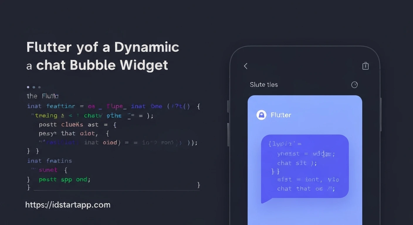

Creating a Dynamic Chat Bubble Widget in Flutter
In modern mobile applications, chat interfaces are ubiquitous, providing a seamless way for users to communicate. A crucial component of any chat UI is the chat bubble – a visually distinct container for messages. While Flutter offers excellent tools for UI development, crafting a truly dynamic chat bubble that adapts its appearance based on sender, message status, and theme requires thoughtful implementation. This article will guide you through building a flexible and reusable dynamic chat bubble widget in Flutter, focusing on custom painting for the distinctive bubble "tail" and intelligent layout for varied alignments.
Core Concepts and Flutter Widgets
Before diving into the code, understanding the foundational Flutter widgets and concepts is key:
- Container: The primary widget for wrapping and styling the message content.
- BoxDecoration: Used with
Containerto apply borders, background colors, and border radii, forming the main bubble shape. - CustomPaint & CustomPainter: Essential for drawing custom shapes, such as the triangular "tail" or "notch" of the chat bubble, providing pixel-perfect control.
- Stack: Allows layering widgets on top of each other. This is crucial for placing the chat bubble's tail precisely over or adjacent to the main message body.
- Align & Positioned: Used within a
Stackto control the exact placement of widgets, enabling dynamic alignment for sender and receiver bubbles.
Step-by-Step Implementation
1. Designing the Basic Chat Bubble Structure
The foundation of our chat bubble will be a Container holding the message text. We'll give it a rounded border and a distinct background color.
import 'package:flutter/material.dart';

class ChatBubble extends StatelessWidget {
  final String message;
  final bool isMe; // True if the message is sent by the current user

  const ChatBubble({Key? key, required this.message, required this.isMe}) : super(key: key);

  @override
  Widget build(BuildContext context) {
    return Align(
      alignment: isMe ? Alignment.centerRight : Alignment.centerLeft,
      child: Container(
        padding: const EdgeInsets.symmetric(horizontal: 12, vertical: 8),
        margin: const EdgeInsets.symmetric(horizontal: 8, vertical: 4),
        constraints: BoxConstraints(maxWidth: MediaQuery.of(context).size.width * 0.75),
        decoration: BoxDecoration(
          color: isMe ? Colors.blueAccent : Colors.grey[300],
          borderRadius: BorderRadius.only(
            topLeft: const Radius.circular(12),
            topRight: const Radius.circular(12),
            bottomLeft: isMe ? const Radius.circular(12) : const Radius.circular(0),
            bottomRight: isMe ? const Radius.circular(0) : const Radius.circular(12),
          ),
        ),
        child: Text(
          message,
          style: TextStyle(
            color: isMe ? Colors.white : Colors.black87,
            fontSize: 15,
          ),
        ),
      ),
    );
  }
}
In this basic version, the borderRadius is conditionally set to create a flat edge on the side where the tail would typically be, but we haven't drawn the tail yet.
2. Crafting the Custom Painter for the Bubble Tail
The distinctive "tail" of a chat bubble is best rendered using CustomPainter. This gives us precise control over its shape and position.
import 'package:flutter/material.dart';

class ChatBubblePainter extends CustomPainter {
  final Color bubbleColor;
  final bool isRtl; // Right-to-left for sender, left-to-right for receiver

  ChatBubblePainter({required this.bubbleColor, required this.isRtl});

  @override
  void paint(Canvas canvas, Size size) {
    final Paint paint = Paint()..color = bubbleColor;
    final Path path = Path();

    // The CustomPaint widget that uses this painter will have a size like (tailSize * 2, tailSize)
    // For example, if tailSize is 10, then size is (20, 10).

    if (isRtl) { // Tail on the right side (for sender)
      path.moveTo(size.width, size.height); // Bottom-right corner of the CustomPaint area
      path.lineTo(size.width - 10, size.height); // Move left along the bottom edge
      path.lineTo(size.width - 18, size.height - 10); // Move up and further left to form the peak
      path.close();
    } else { // Tail on the left side (for receiver)
      path.moveTo(0, size.height); // Bottom-left corner of the CustomPaint area
      path.lineTo(10, size.height); // Move right along the bottom edge
      path.lineTo(18, size.height - 10); // Move up and further right to form the peak
      path.close();
    }
    canvas.drawPath(path, paint);
  }

  @override
  bool shouldRepaint(covariant CustomPainter oldDelegate) {
    // Only repaint if bubbleColor or isRtl changes
    return (oldDelegate as ChatBubblePainter).bubbleColor != bubbleColor ||
           (oldDelegate as ChatBubblePainter).isRtl != isRtl;
  }
}
3. Integrating the Tail into the Bubble Widget
Now, we'll combine the main message Container and our ChatBubblePainter using a Stack. We will also adjust the main bubble's margin to make space for the tail and its borderRadius to fully encapsulate the tail's appearance.
import 'package:flutter/material.dart';

class DynamicChatBubble extends StatelessWidget {
  final String message;
  final bool isMe; // True if the message is sent by the current user
  final Color bubbleColor;
  final Color textColor;
  final double tailSize; // Controls the size of the tail

  const DynamicChatBubble({
    Key? key,
    required this.message,
    required this.isMe,
    this.bubbleColor = Colors.blueAccent, // Default for sender
    this.textColor = Colors.white,
    this.tailSize = 10.0,
  }) : super(key: key);

  @override
  Widget build(BuildContext context) {
    final Color effectiveBubbleColor = isMe ? bubbleColor : Colors.grey[300]!;
    final Color effectiveTextColor = isMe ? textColor : Colors.black87;

    final BorderRadiusGeometry borderRadius = BorderRadius.only(
      topLeft: const Radius.circular(12),
      topRight: const Radius.circular(12),
      bottomLeft: isMe ? const Radius.circular(12) : const Radius.circular(0),
      bottomRight: isMe ? const Radius.circular(0) : const Radius.circular(12),
    );

    return Align(
      alignment: isMe ? Alignment.centerRight : Alignment.centerLeft,
      child: Stack(
        children: [
          Container(
            margin: EdgeInsets.fromLTRB(
              isMe ? 8 : 8 + tailSize, // Adjust margin for tail on left
              4,
              isMe ? 8 + tailSize : 8, // Adjust margin for tail on right
              4,
            ),
            constraints: BoxConstraints(maxWidth: MediaQuery.of(context).size.width * 0.75),
            decoration: BoxDecoration(
              color: effectiveBubbleColor,
              borderRadius: borderRadius,
            ),
            padding: const EdgeInsets.symmetric(horizontal: 12, vertical: 8),
            child: Text(
              message,
              style: TextStyle(
                color: effectiveTextColor,
                fontSize: 15,
              ),
            ),
          ),
          Positioned(
            bottom: 0,
            right: isMe ? 0 : null, // Position for sender
            left: isMe ? null : 0, // Position for receiver
            child: CustomPaint(
              size: Size(tailSize * 2, tailSize), // Width 2x tailSize for the base, height 1x for peak
              painter: ChatBubblePainter(
                bubbleColor: effectiveBubbleColor,
                isRtl: isMe,
              ),
            ),
          ),
        ],
      ),
    );
  }
}
We've updated the DynamicChatBubble to use a Stack. The Positioned widget ensures the CustomPaint (our tail) sits exactly at the bottom-left or bottom-right corner of the bubble, depending on the isMe property. The margin of the main Container is adjusted to prevent the text from overlapping the tail area.
4. Example Usage in a Chat Screen
To see our dynamic chat bubbles in action, integrate them into a simple ListView:
import 'package:flutter/material.dart';
// Assuming DynamicChatBubble and ChatBubblePainter are in the same project
// import 'path/to/dynamic_chat_bubble.dart';

class ChatScreen extends StatefulWidget {
  const ChatScreen({Key? key}) : super(key: key);

  @override
  State<ChatScreen> createState() => _ChatScreenState();
}

class _ChatScreenState extends State<ChatScreen> {
  final List<Map<String, dynamic>> _messages = [
    {'text': 'Hello there!', 'isMe': false},
    {'text': 'Hi! How are you?', 'isMe': true},
    {'text': 'I\'m doing great, thanks! What about you?', 'isMe': false},
    {'text': 'All good here, just building some Flutter widgets!', 'isMe': true},
    {'text': 'Sounds fun! This chat bubble looks neat.', 'isMe': false},
    {'text': 'Indeed, it\'s quite dynamic!', 'isMe': true},
    {'text': 'Can it handle longer messages?', 'isMe': false},
    {'text': 'Absolutely, the constraints automatically handle wrapping long texts within the defined width.', 'isMe': true},
  ];

  @override
  Widget build(BuildContext context) {
    return Scaffold(
      appBar: AppBar(
        title: const Text('Dynamic Chat Bubbles'),
      ),
      body: ListView.builder(
        reverse: true, // Newest messages at the bottom
        itemCount: _messages.length,
        itemBuilder: (context, index) {
          final message = _messages[_messages.length - 1 - index]; // Display in correct order
          return DynamicChatBubble(
            message: message['text'] as String,
            isMe: message['isMe'] as bool,
            bubbleColor: message['isMe'] ? Colors.deepPurpleAccent : Colors.lightBlue, // Custom colors
            textColor: message['isMe'] ? Colors.white : Colors.black87,
            tailSize: 12.0, // Custom tail size
          );
        },
      ),
    );
  }
}
Enhancements and Considerations
- Timestamps and Avatars: Extend the
DynamicChatBubblewidget to accept and display timestamps, user avatars, and read receipts. These can be positioned relative to the message text within theStack. - Message Status Icons: Integrate indicators for message sending, sent, delivered, and read status, often positioned at the bottom corner of the bubble.
- Customization Options: Expose more parameters in the
DynamicChatBubbleconstructor, such as padding, margin, font styles, and tail position, to allow for greater flexibility. - Text Selection: Wrap the
Textwidget withSelectableTextif message selection is desired. - Performance: For very long chat lists, consider using
flutter_chat_bubbleor similar packages that are optimized for performance and offer a wider range of features out-of-the-box. However, understanding the core principles through a custom implementation is invaluable. - Responsiveness: Ensure your layout handles various screen sizes and orientations gracefully. The
constraintson theContainerare a good start.
Conclusion
Building a dynamic chat bubble in Flutter offers a practical exercise in leveraging core layout widgets like Stack, Align, and the powerful CustomPaint. By segmenting the bubble's components – the main body and the distinct tail – and dynamically adjusting their properties based on factors like the sender, you can create a highly flexible and aesthetically pleasing chat interface. This approach not only provides deep customization but also enhances your understanding of Flutter's rendering pipeline, empowering you to create unique and responsive UI elements.


