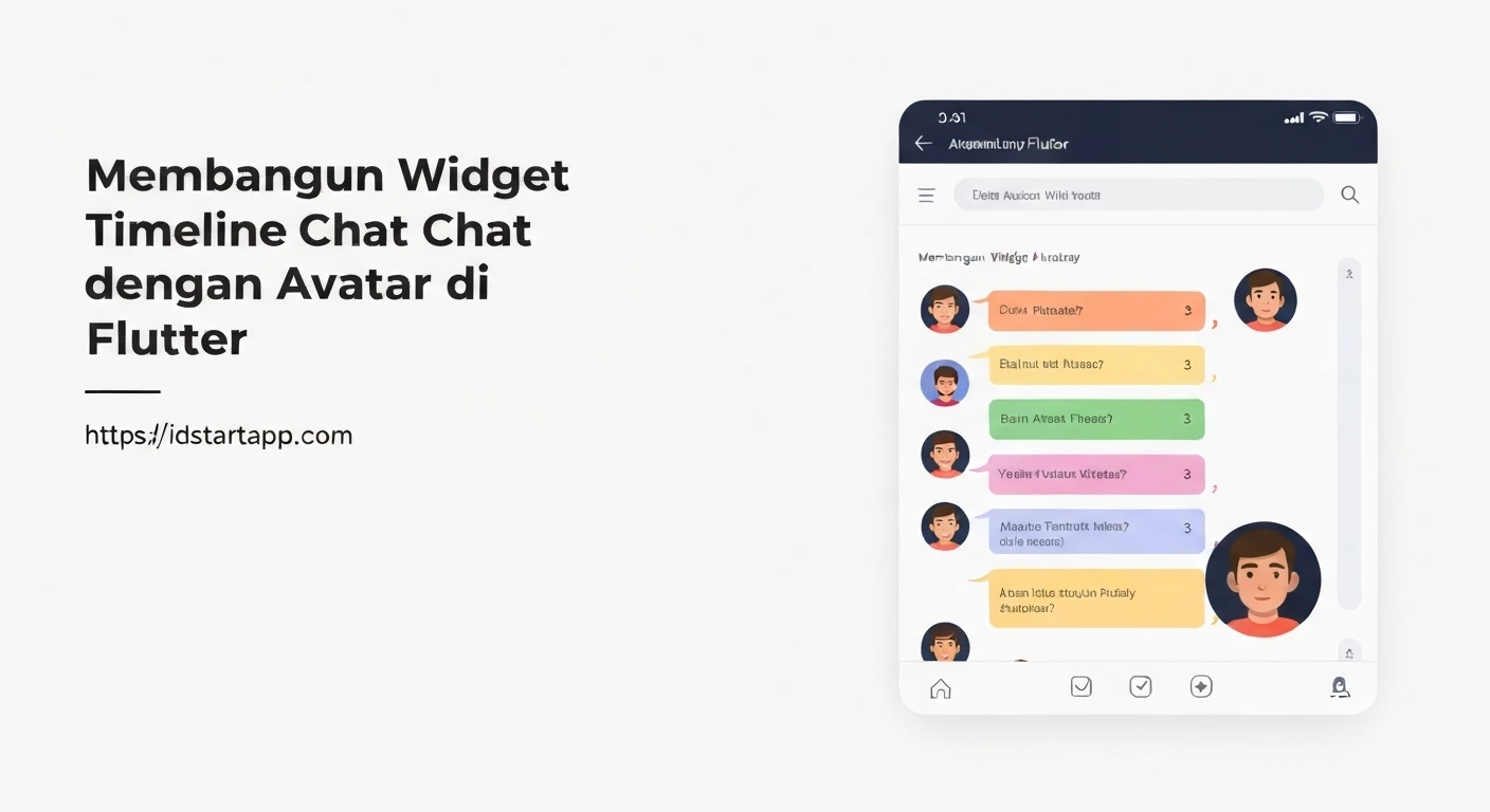

Building an Engaging Chat Timeline Widget with Avatars in Flutter
Chat applications heavily rely on intuitive and visually appealing user interfaces to enhance the communication experience. A crucial component in many chat UIs is the timeline widget, which presents messages chronologically, often accompanied by user avatars to clearly identify the sender. This article will guide you through building a professional and customizable chat timeline widget with avatar support in Flutter.
Understanding the Core Components
To construct our chat timeline, we'll leverage several fundamental Flutter widgets:
ListView.builder: Essential for efficiently rendering a scrollable list of messages, especially when dealing with a potentially large number of items.RowandColumn: For arranging elements horizontally and vertically within each chat bubble.CircleAvatar: The perfect widget for displaying user profile pictures.Align: To position chat bubbles to the left (for incoming messages) or right (for outgoing messages).Container: To style the chat bubbles themselves.
Data Model for Chat Messages
First, let's define a simple data model for our chat messages. This class will hold the sender's name, message content, a flag to determine if the message is from the current user (for alignment purposes), and an avatar URL.
class ChatMessage {
  final String sender;
  final String text;
  final bool isMe; // True if the message is from the current user
  final String? avatarUrl;

  ChatMessage({
    required this.sender,
    required this.text,
    this.isMe = false,
    this.avatarUrl,
  });
}
Creating the Chat Bubble Widget
The _ChatBubble widget will be responsible for rendering a single message, including the avatar, message text, and aligning it based on the isMe property.
import 'package:flutter/material.dart';

class _ChatBubble extends StatelessWidget {
  final ChatMessage message;

  const _ChatBubble({Key? key, required this.message}) : super(key: key);

  @override
  Widget build(BuildContext context) {
    final bool isMe = message.isMe;

    return Align(
      alignment: isMe ? Alignment.centerRight : Alignment.centerLeft,
      child: Padding(
        padding: const EdgeInsets.symmetric(vertical: 4.0, horizontal: 8.0),
        child: Row(
          mainAxisSize: MainAxisSize.min, // To wrap content
          crossAxisAlignment: CrossAxisAlignment.start,
          children: [
            // Avatar (only show on the left for others' messages)
            if (!isMe && message.avatarUrl != null)
              Padding(
                padding: const EdgeInsets.only(right: 8.0),
                child: CircleAvatar(
                  backgroundImage: NetworkImage(message.avatarUrl!),
                  radius: 20,
                ),
              ),
            Flexible(
              child: Container(
                constraints: BoxConstraints(
                  maxWidth: MediaQuery.of(context).size.width * 0.7, // Max width for bubble
                ),
                decoration: BoxDecoration(
                  color: isMe ? Colors.blue[100] : Colors.grey[200],
                  borderRadius: BorderRadius.circular(12.0),
                ),
                padding: const EdgeInsets.all(12.0),
                child: Column(
                  crossAxisAlignment: CrossAxisAlignment.start,
                  children: [
                    if (!isMe)
                      Text(
                        message.sender,
                        style: TextStyle(
                          fontWeight: FontWeight.bold,
                          color: Colors.blueAccent,
                        ),
                      ),
                    Padding(
                      padding: EdgeInsets.only(top: !isMe ? 4.0 : 0.0),
                      child: Text(
                        message.text,
                        style: TextStyle(color: Colors.black87),
                      ),
                    ),
                  ],
                ),
              ),
            ),
            // Avatar (only show on the right for my messages)
            if (isMe && message.avatarUrl != null)
              Padding(
                padding: const EdgeInsets.only(left: 8.0),
                child: CircleAvatar(
                  backgroundImage: NetworkImage(message.avatarUrl!),
                  radius: 20,
                ),
              ),
          ],
        ),
      ),
    );
  }
}
Building the Chat Timeline Widget
Now, we'll create the main ChatTimeline widget, which will take a list of ChatMessage objects and display them using ListView.builder and our _ChatBubble.
import 'package:flutter/material.dart';
// Assuming ChatMessage and _ChatBubble are in the same file or imported

class ChatTimeline extends StatelessWidget {
  final List<ChatMessage> messages;

  const ChatTimeline({Key? key, required this.messages}) : super(key: key);

  @override
  Widget build(BuildContext context) {
    return ListView.builder(
      reverse: true, // To show latest messages at the bottom
      padding: const EdgeInsets.all(8.0),
      itemCount: messages.length,
      itemBuilder: (context, index) {
        // We reverse the list for display, so we need to access messages from the end
        final reversedIndex = messages.length - 1 - index;
        return _ChatBubble(message: messages[reversedIndex]);
      },
    );
  }
}
Integrating into a Sample Application
To see our widget in action, let's integrate it into a simple Flutter application.
import 'package:flutter/material.dart';
// Assuming ChatMessage, _ChatBubble, and ChatTimeline are defined above or imported

void main() {
  runApp(const MyApp());
}

class MyApp extends StatelessWidget {
  const MyApp({Key? key}) : super(key: key);

  @override
  Widget build(BuildContext context) {
    return MaterialApp(
      title: 'Chat Timeline Demo',
      theme: ThemeData(
        primarySwatch: Colors.blue,
      ),
      home: const ChatScreen(),
    );
  }
}

class ChatScreen extends StatefulWidget {
  const ChatScreen({Key? key}) : super(key: key);

  @override
  State<ChatScreen> createState() => _ChatScreenState();
}

class _ChatScreenState extends State<ChatScreen> {
  final List<ChatMessage> _messages = [
    ChatMessage(
      sender: 'Alice',
      text: 'Hey Bob, how are you doing?',
      isMe: false,
      avatarUrl: 'https://i.pravatar.id/150?img=1',
    ),
    ChatMessage(
      sender: 'Bob',
      text: 'I\'m doing great, Alice! Just working on a new Flutter project. How about you?',
      isMe: true,
      avatarUrl: 'https://i.pravatar.id/150?img=68',
    ),
    ChatMessage(
      sender: 'Alice',
      text: 'That sounds exciting! I\'m good, just catching up on some emails.',
      isMe: false,
      avatarUrl: 'https://i.pravatar.id/150?img=1',
    ),
    ChatMessage(
      sender: 'Bob',
      text: 'Awesome! Let me know if you need any help with your Flutter project when you get to it.',
      isMe: true,
      avatarUrl: 'https://i.pravatar.id/150?img=68',
    ),
    ChatMessage(
      sender: 'Alice',
      text: 'Thanks, I appreciate that!',
      isMe: false,
      avatarUrl: 'https://i.pravatar.id/150?img=1',
    ),
    ChatMessage(
      sender: 'System',
      text: 'Alice joined the chat.',
      isMe: false, // System messages are not 'me'
      avatarUrl: null, // No avatar for system messages
    ),
  ];

  @override
  Widget build(BuildContext context) {
    return Scaffold(
      appBar: AppBar(
        title: const Text('Chat Timeline'),
      ),
      body: Column(
        children: [
          Expanded(
            child: ChatTimeline(messages: _messages),
          ),
          // You could add a message input field here
          Padding(
            padding: const EdgeInsets.all(8.0),
            child: Row(
              children: [
                Expanded(
                  child: TextField(
                    decoration: InputDecoration(
                      hintText: 'Type a message...',
                      border: OutlineInputBorder(
                        borderRadius: BorderRadius.circular(20),
                      ),
                      contentPadding: const EdgeInsets.symmetric(horizontal: 16, vertical: 8),
                    ),
                  ),
                ),
                IconButton(
                  icon: const Icon(Icons.send),
                  onPressed: () {
                    // Handle sending message
                  },
                ),
              ],
            ),
          ),
        ],
      ),
    );
  }
}
Enhancements and Considerations
This basic chat timeline provides a solid foundation. Here are several ways you can enhance it:
- Timestamps: Add a
DateTimefield toChatMessageand display it, perhaps subtly, within or below each bubble. - Message Status: Implement indicators for message delivery, read status, or sending failures.
- Different Message Types: Extend
ChatMessageto support images, videos, or documents, and adjust_ChatBubbleto render them appropriately. - Styling Customization: Offer more customization options for bubble colors, text styles, and avatar sizes.
- Performance: For extremely long chat histories, consider pagination or more advanced list optimization techniques, though
ListView.builderis generally efficient. - Timeline Indicator Line: A vertical line connecting messages can visually reinforce the timeline aspect. This usually involves
CustomPaintor a stack of positioned widgets.
Conclusion
Building a chat timeline widget in Flutter, complete with avatar support and message alignment, is straightforward using Flutter's powerful widget composition model. By combining basic widgets like Row, Column, Align, CircleAvatar, and ListView.builder, you can create a highly functional and aesthetically pleasing chat interface. This foundation can be further extended to include more complex features, providing a rich user experience for your chat applications.


