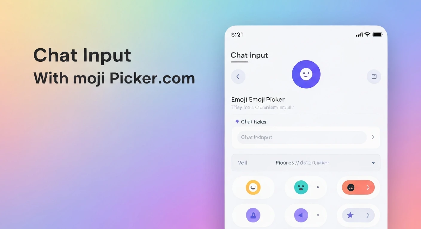

Building a Chat Input Widget with Emoji Picker in Flutter
Modern chat applications are incomplete without an intuitive and feature-rich input field. A key component of this is the ability to easily insert emojis, enhancing user expression and engagement. In this article, we'll walk through creating a sophisticated chat input widget in Flutter, complete with a text field, a send button, and an integrated emoji picker.
Prerequisites
- Basic understanding of Flutter and Dart.
- Flutter SDK installed.
Step 1: Project Setup and Dependencies
First, create a new Flutter project or open an existing one. We'll need a package for the emoji picker. A popular and well-maintained choice is emoji_picker_flutter. Add it to your pubspec.yaml file:
dependencies:
  flutter:
    sdk: flutter
  emoji_picker_flutter: ^2.1.1 # Use the latest version
After adding the dependency, run flutter pub get to fetch the package.
Step 2: Basic Chat Input Field Structure
Let's start by building the foundation of our chat input widget. We'll use a StatefulWidget to manage the input text, focus, and the visibility of the emoji picker.
import 'package:flutter/material.dart';
import 'package:emoji_picker_flutter/emoji_picker_flutter.dart'; // Import emoji picker

class ChatInputWidget extends StatefulWidget {
  final Function(String) onSendMessage;

  const ChatInputWidget({Key? key, required this.onSendMessage}) : super(key: key);

  @override
  _ChatInputWidgetState createState() => _ChatInputWidgetState();
}

class _ChatInputWidgetState extends State {
  final TextEditingController _controller = TextEditingController();
  final FocusNode _focusNode = FocusNode();
  bool _isEmojiPickerVisible = false;

  @override
  void dispose() {
    _controller.dispose();
    _focusNode.dispose();
    super.dispose();
  }

  void _sendMessage() {
    if (_controller.text.isNotEmpty) {
      widget.onSendMessage(_controller.text);
      _controller.clear();
    }
  }

  void _toggleEmojiPicker() {
    setState(() {
      _isEmojiPickerVisible = !_isEmojiPickerVisible;
      if (_isEmojiPickerVisible) {
        _focusNode.unfocus(); // Hide keyboard when emoji picker is shown
      } else {
        _focusNode.requestFocus(); // Show keyboard when emoji picker is hidden
      }
    });
  }

  @override
  Widget build(BuildContext context) {
    return Column(
      children: [
        Row(
          children: [
            IconButton(
              icon: Icon(
                _isEmojiPickerVisible ? Icons.keyboard : Icons.emoji_emotions,
              ),
              onPressed: _toggleEmojiPicker,
            ),
            Expanded(
              child: TextField(
                controller: _controller,
                focusNode: _focusNode,
                maxLines: null, // Allows multiline input
                keyboardType: TextInputType.multiline,
                decoration: InputDecoration(
                  hintText: 'Type a message...',
                  border: OutlineInputBorder(
                    borderRadius: BorderRadius.circular(25.0),
                    borderSide: BorderSide.none,
                  ),
                  filled: true,
                  contentPadding: EdgeInsets.symmetric(horizontal: 20, vertical: 10),
                ),
                onChanged: (text) {
                  // You can add typing indicators or other logic here
                },
                onTap: () {
                  if (_isEmojiPickerVisible) {
                    setState(() {
                      _isEmojiPickerVisible = false; // Hide emoji picker when typing
                    });
                  }
                },
              ),
            ),
            IconButton(
              icon: Icon(Icons.send),
              onPressed: _sendMessage,
            ),
          ],
        ),
        if (_isEmojiPickerVisible)
          SizedBox(
            height: 250, // Adjust height as needed
            child: EmojiPicker(
              textEditingController: _controller,
              config: Config(
                columns: 7,
                emojiSizeMax: 32.0, // Adjust size as needed
                verticalSpacing: 0,
                horizontalSpacing: 0,
                gridPadding: EdgeInsets.zero,
                initCategory: Category.RECENT,
                bgColor: Color(0xFFF2F2F2),
                indicatorColor: Colors.blue,
                iconColor: Colors.grey,
                iconColorSelected: Colors.blue,
                progressIndicatorColor: Colors.blue,
                backspaceColor: Colors.blue,
                skinToneDialogBgColor: Colors.white,
                skinToneIndicatorColor: Colors.grey,
                enableSkinTonePicker: true,
                showRecentsTab: true,
                recentsLimit: 28,
                noRecents: const Text(
                  'No Recents',
                  textAlign: TextAlign.center,
                  style: TextStyle(fontSize: 20, color: Colors.black26),
                ),
                tabIndicatorAnimDuration: kTabScrollDuration,
                categoryIcons: const CategoryIcons(),
                buttonMode: ButtonMode.MATERIAL, // or ButtonMode.CUPERTINO
              ),
            ),
          ),
      ],
    );
  }
}
Explanation of the Code
Let's break down the key parts of the implementation:
_controller(TextEditingController): Manages the text input in theTextField._focusNode(FocusNode): Controls the focus of theTextField. We use it to programmatically hide the keyboard when the emoji picker is shown and vice-versa._isEmojiPickerVisible(bool): A state variable to toggle the visibility of the emoji picker._sendMessage(): A simple method to handle sending the message (e.g., passing it to a parent widget viaonSendMessagecallback)._toggleEmojiPicker(): This crucial method switches between showing the keyboard and showing the emoji picker. When the emoji picker is to be shown,_focusNode.unfocus()is called to dismiss the keyboard. When the emoji picker is to be hidden,_focusNode.requestFocus()is called to bring the keyboard back.TextField: The main input area. It's configured to be multiline (maxLines: null,keyboardType: TextInputType.multiline) and has a tap handler to hide the emoji picker if it's visible when the user taps into the text field.- Emoji Toggle Button: An
IconButtonwhose icon changes based on whether the emoji picker is visible (Icons.keyboard) or hidden (Icons.emoji_emotions). ItsonPressedcalls_toggleEmojiPicker. - Send Button: Another
IconButtonto trigger the message sending. EmojiPickerWidget: This widget from theemoji_picker_flutterpackage is conditionally rendered based on_isEmojiPickerVisible.textEditingController: _controller: Connects the emoji picker directly to ourTextField's controller, so selected emojis are automatically inserted at the current cursor position.config: Allows extensive customization of the emoji picker's appearance and behavior, such as column count, emoji size, background color, and more.
Usage
To use this ChatInputWidget in your application, simply place it where you need a chat input, for example, at the bottom of a Scaffold:
import 'package:flutter/material.dart';
import 'chat_input_widget.dart'; // Assuming you saved the widget in 'chat_input_widget.dart'

class ChatScreen extends StatefulWidget {
  const ChatScreen({Key? key}) : super(key: key);

  @override
  State createState() => _ChatScreenState();
}

class _ChatScreenState extends State {
  List messages = [];

  void _addMessage(String message) {
    setState(() {
      messages.add(message);
    });
    // In a real app, you would send this message to a backend
    print("Sending message: $message");
  }

  @override
  Widget build(BuildContext context) {
    return Scaffold(
      appBar: AppBar(title: Text('Flutter Chat')),
      body: Column(
        children: [
          Expanded(
            child: ListView.builder(
              reverse: true, // Newest messages at the bottom
              itemCount: messages.length,
              itemBuilder: (context, index) {
                return Align(
                  alignment: Alignment.centerRight, // Example: right align user messages
                  child: Card(
                    margin: EdgeInsets.all(8),
                    child: Padding(
                      padding: const EdgeInsets.all(12.0),
                      child: Text(messages[messages.length - 1 - index]),
                    ),
                  ),
                );
              },
            ),
          ),
          Divider(height: 1),
          ChatInputWidget(onSendMessage: _addMessage),
        ],
      ),
    );
  }
}
Conclusion
By following these steps, you've successfully created a robust and interactive chat input widget with an integrated emoji picker in Flutter. This enhances the user experience significantly, allowing for more expressive communication. Remember to customize the styling and behavior of both the TextField and the EmojiPicker to match your application's design language.


