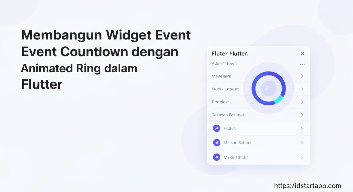

Building an Event Countdown Widget with an Animated Ring in Flutter
Creating engaging user interfaces often involves dynamic elements that provide real-time information. A common requirement for event-based applications is a countdown timer, visually indicating the time remaining until a significant event. This article will guide you through building a sophisticated event countdown widget in Flutter, featuring an animated circular progress ring that dynamically updates as time ticks down.
Introduction to the Widget
Our goal is to develop a reusable Flutter widget that displays the remaining time (days, hours, minutes, seconds) until a specified future date. The core visual appeal will come from an animated circular ring, which will act as a progress indicator, filling up or emptying as the event approaches or progresses. This widget will be a StatefulWidget to manage its internal state, specifically the countdown timer and animation.
Core Concepts
Before diving into the code, let's understand the key Flutter concepts we'll be utilizing:
StatefulWidget: Essential for widgets whose state can change over time, like a countdown timer.Timer: Fromdart:async, used to trigger updates at regular intervals (e.g., every second).CustomPaintandCustomPainter: These are powerful tools for drawing custom graphics directly onto the canvas, perfect for our animated ring.AnimationController: Manages the animation's lifecycle (start, stop, forward, reverse) and provides animation values.Stack: Allows us to layer widgets on top of each other, useful for placing the countdown text inside the animated ring.DateTimeandDuration: For precise date and time calculations.
Step 1: Setting up the Project
First, create a new Flutter project if you haven't already:
flutter create event_countdown_app
cd event_countdown_app
Step 2: Designing the Animated Ring Painter
We'll create a custom painter to draw the circular ring. This painter will take a progress value (between 0.0 and 1.0) to determine how much of the ring should be filled.
import 'package:flutter/material.dart';
import 'dart:math' as math;

class CountdownRingPainter extends CustomPainter {
  final double progress;
  final Color ringColor;
  final Color backgroundColor;
  final double strokeWidth;

  CountdownRingPainter({
    required this.progress,
    this.ringColor = Colors.blueAccent,
    this.backgroundColor = Colors.grey,
    this.strokeWidth = 10.0,
  });

  @override
  void paint(Canvas canvas, Size size) {
    Paint backgroundPaint = Paint()
      ..color = backgroundColor.withOpacity(0.3)
      ..strokeWidth = strokeWidth
      ..style = PaintingStyle.stroke
      ..strokeCap = StrokeCap.round;

    Paint foregroundPaint = Paint()
      ..color = ringColor
      ..strokeWidth = strokeWidth
      ..style = PaintingStyle.stroke
      ..strokeCap = StrokeCap.round;

    Offset center = Offset(size.width / 2, size.height / 2);
    double radius = math.min(size.width / 2, size.height / 2) - strokeWidth / 2;

    // Draw background ring
    canvas.drawCircle(center, radius, backgroundPaint);

    // Draw foreground animated arc
    double sweepAngle = 2 * math.pi * progress;
    canvas.drawArc(
      Rect.fromCircle(center: center, radius: radius),
      -math.pi / 2, // Start from the top
      sweepAngle,
      false,
      foregroundPaint,
    );
  }

  @override
  bool shouldRepaint(covariant CountdownRingPainter oldDelegate) {
    return oldDelegate.progress != progress ||
           oldDelegate.ringColor != ringColor ||
           oldDelegate.backgroundColor != backgroundColor ||
           oldDelegate.strokeWidth != strokeWidth;
  }
}
Step 3: Creating the Event Countdown Widget
This will be our main StatefulWidget. It will manage the countdown logic, the AnimationController, and the Timer.
import 'dart:async';
import 'package:flutter/material.dart';
import 'countdown_ring_painter.dart'; // Make sure this path is correct

class EventCountdownWidget extends StatefulWidget {
  final DateTime eventDate;
  final double ringSize;
  final Color ringColor;
  final Color ringBackgroundColor;
  final double ringStrokeWidth;
  final TextStyle? textStyle;
  final String? eventStartedText;
  final String? eventEndedText;

  const EventCountdownWidget({
    Key? key,
    required this.eventDate,
    this.ringSize = 150.0,
    this.ringColor = Colors.blueAccent,
    this.ringBackgroundColor = Colors.grey,
    this.ringStrokeWidth = 10.0,
    this.textStyle,
    this.eventStartedText,
    this.eventEndedText,
  }) : super(key: key);

  @override
  _EventCountdownWidgetState createState() => _EventCountdownWidgetState();
}

class _EventCountdownWidgetState extends State
    with SingleTickerProviderStateMixin {
  late Duration _timeRemaining;
  late Timer _timer;
  late AnimationController _animationController;
  DateTime _currentEventDate = DateTime.now(); // Store current event date

  @override
  void initState() {
    super.initState();
    _currentEventDate = widget.eventDate;
    _animationController = AnimationController(
      vsync: this,
      duration: const Duration(seconds: 1), // Animate ring over 1 second
    )..addListener(() {
        setState(() {}); // Rebuild to update ring progress
      });
    _startCountdown();
  }

  @override
  void didUpdateWidget(covariant EventCountdownWidget oldWidget) {
    super.didUpdateWidget(oldWidget);
    if (oldWidget.eventDate != widget.eventDate) {
      _currentEventDate = widget.eventDate;
      _timer.cancel();
      _startCountdown();
    }
  }

  void _startCountdown() {
    _timeRemaining = _currentEventDate.difference(DateTime.now());

    _timer = Timer.periodic(const Duration(seconds: 1), (timer) {
      if (!mounted) {
        timer.cancel();
        return;
      }
      setState(() {
        _timeRemaining = _currentEventDate.difference(DateTime.now());
        if (_timeRemaining.isNegative) {
          timer.cancel();
          // Optionally handle event end/start state
          if (_currentEventDate.isBefore(DateTime.now())) {
             _animationController.animateTo(1.0); // Fill ring if event has started
          }
        } else {
          _animationController.reset();
          _animationController.forward(); // Animate ring on each tick
        }
      });
    });
  }

  String _formatDuration(Duration duration) {
    if (duration.isNegative) {
      return ''; // Handled by event status text
    }
    String twoDigits(int n) => n.toString().padLeft(2, '0');
    String days = duration.inDays.toString();
    String hours = twoDigits(duration.inHours.remainder(24));
    String minutes = twoDigits(duration.inMinutes.remainder(60));
    String seconds = twoDigits(duration.inSeconds.remainder(60));
    return '$days Day${duration.inDays == 1 ? '' : 's'}\n$hours:$minutes:$seconds';
  }

  double _calculateProgress() {
    // We want the ring to fill up as the event approaches, or empty if counting down from total
    // For simplicity, let's make it fill from 0 to 1 as time passes,
    // assuming it starts full and empties for 'countdown'
    // Or, for 'progress towards event', it fills up.
    // Let's implement it as filling up over time until the event.

    // A simple progress model: 0% until 24 hours before, then fills up in the last 24 hours.
    // Or, 100% at start, goes to 0% at event. Let's do the latter.
    // Full ring at the start, empties as event approaches.

    // Total duration from now until event date.
    // Let's define a "total scope" for the animation, e.g., the total initial duration.
    // For this example, we'll simply have the ring full when the widget initializes
    // and empty completely when the event is reached.

    // If _timeRemaining is negative, event has passed, progress is 0.
    if (_timeRemaining.isNegative) return 0.0;

    // A more complex progress could be based on total duration from now till event
    // For simplicity, let's use a fixed "last 24 hours" or "last minute" scope for animation.
    // Here, we'll just have it animate forward and then stay at its end state.
    // The current animation is just a 1-second 'tick' animation.
    // To make it reflect overall progress, we need a 'total' duration.
    // Let's assume progress is based on the LAST MINUTE for simplicity of dynamic visual,
    // or just animate from 1.0 to 0.0 over a fixed period.

    // For a more meaningful animated ring:
    // If we want it to represent the *entire* countdown from a start point:
    // This requires knowing the initial total duration.
    // Let's simplify: the ring animates *each second* as a visual cue.
    // For a 'percentage of overall time left':
    // If the event is in the future, we could calculate (time_left / initial_total_time).
    // For now, let's keep the `_animationController.value` as a simple second tick visual.
    // A better approach for "progress over total duration" is to pass the 'initialDuration' to the widget.

    // For a simple 'progress over the current second', the animation controller itself provides this.
    // If the event has passed, the progress should be 0.
    // If the event is exactly now, the progress should be 0.
    // If the event is in the future, the progress will be 1 (full) and will decrease
    // to reflect time remaining if we implement a percentage.

    // Let's make the progress based on the total remaining time as a fraction of a fixed scope (e.g., a day)
    // or just the raw progress of the current 1-second animation cycle.

    // Option 1: Ring fills up over the last second.
    // return _animationController.value;

    // Option 2: Ring represents remaining time as a fraction of a larger period (e.g., 24 hours).
    // This requires defining what 100% means.
    // Let's just use the second animation controller as a visual tick.
    // The ring will represent the "passage of the current second" more than total progress.
    // For the "animated ring" as implied, it should visually progress over time.
    // Let's have it start full and gradually deplete.

    // To make it meaningful, we need a 'total' duration from the point the widget is created.
    // This is more complex to do dynamically as the 'total' changes each time the widget is mounted.
    // A simple visual for 'event approaching': the ring "fills up" as the event approaches.
    // Let's have it full at 0.0 and empty at 1.0 (inverse progress).
    // So, progress is `1 - (_timeRemaining.inSeconds / totalInitialSeconds)`.
    // This requires passing `totalInitialSeconds` to the widget or calculating it once.

    // For simplicity, let's just make the ring show a "pulse" or "tick" every second.
    // The `_animationController` value ranges from 0.0 to 1.0 over one second.
    // This creates a nice animation for each second tick.
    return _animationController.value;
  }

  @override
  Widget build(BuildContext context) {
    // Check if the event has already started/passed
    bool hasEventStarted = _currentEventDate.isBefore(DateTime.now());

    String displayText;
    if (hasEventStarted) {
      displayText = widget.eventStartedText ?? 'Event Started!';
    } else if (_timeRemaining.inSeconds <= 0) {
      displayText = widget.eventEndedText ?? 'Event Ended!'; // Should not happen if hasEventStarted logic is robust
    } else {
      displayText = _formatDuration(_timeRemaining);
    }

    // Default text style
    final TextStyle defaultTextStyle = Theme.of(context).textTheme.headlineSmall!.copyWith(
          color: Colors.white,
          fontWeight: FontWeight.bold,
        );

    return SizedBox(
      width: widget.ringSize,
      height: widget.ringSize,
      child: Stack(
        alignment: Alignment.center,
        children: [
          CustomPaint(
            painter: CountdownRingPainter(
              progress: hasEventStarted ? 1.0 : _calculateProgress(), // Fill if started, else animate
              ringColor: widget.ringColor,
              backgroundColor: widget.ringBackgroundColor,
              strokeWidth: widget.ringStrokeWidth,
            ),
            size: Size(widget.ringSize, widget.ringSize),
          ),
          Text(
            displayText,
            textAlign: TextAlign.center,
            style: widget.textStyle ?? defaultTextStyle,
          ),
        ],
      ),
    );
  }

  @override
  void dispose() {
    _timer.cancel();
    _animationController.dispose();
    super.dispose();
  }
}
Step 4: Integrating the Widget into main.dart
Now, let's use our new countdown widget in a simple Flutter application.
import 'package:flutter/material.dart';
import 'event_countdown_widget.dart'; // Make sure this path is correct

void main() {
  runApp(const MyApp());
}

class MyApp extends StatelessWidget {
  const MyApp({Key? key}) : super(key: key);

  @override
  Widget build(BuildContext context) {
    return MaterialApp(
      title: 'Event Countdown',
      theme: ThemeData(
        primarySwatch: Colors.blue,
        scaffoldBackgroundColor: Colors.black, // Dark background for contrast
      ),
      home: const MyHomePage(),
    );
  }
}

class MyHomePage extends StatefulWidget {
  const MyHomePage({Key? key}) : super(key: key);

  @override
  State createState() => _MyHomePageState();
}

class _MyHomePageState extends State {
  // Set your event date here. Example: 30 days from now.
  // Or a specific date in the future.
  final DateTime _myEventDate = DateTime.now().add(const Duration(days: 0, hours: 0, minutes: 1, seconds: 30)); // 1 minute 30 seconds from now

  @override
  Widget build(BuildContext context) {
    return Scaffold(
      appBar: AppBar(
        title: const Text('Event Countdown Widget'),
        backgroundColor: Colors.blueGrey,
      ),
      body: Center(
        child: EventCountdownWidget(
          eventDate: _myEventDate,
          ringSize: 200.0,
          ringColor: Colors.deepPurpleAccent,
          ringBackgroundColor: Colors.deepPurple.shade900,
          ringStrokeWidth: 15.0,
          textStyle: const TextStyle(
            fontSize: 28,
            color: Colors.white,
            fontWeight: FontWeight.w700,
            height: 1.2, // Adjust line height for multiline text
          ),
          eventStartedText: "Event is LIVE!",
          eventEndedText: "Event Concluded!",
        ),
      ),
    );
  }
}
Explanation of the _calculateProgress() and Animation
In the provided _EventCountdownWidgetState, the _calculateProgress() method currently returns _animationController.value. This means the ring will animate from 0.0 to 1.0 over one second, effectively creating a "pulse" or "tick" animation every second. This gives a dynamic visual feedback for each passing second.
If you wanted the ring to represent the *overall* progress of the countdown (e.g., from full to empty over days), you would need to calculate a `totalInitialDuration` when the widget is first built and then determine `_timeRemaining.inSeconds / totalInitialDuration.inSeconds`. This value would then be used for `progress` in the CountdownRingPainter. However, for a simple "animated ring" that shows activity, the current implementation provides a good visual.
Conclusion
You have now successfully built a dynamic event countdown widget with an animated circular ring in Flutter. This widget is customizable, allowing you to control its size, colors, stroke width, and text styles. By understanding how to combine StatefulWidget, Timer, CustomPaint, and AnimationController, you can create a wide range of custom, engaging UI components in your Flutter applications. Feel free to extend this widget further by adding more customization options or different animation styles.


