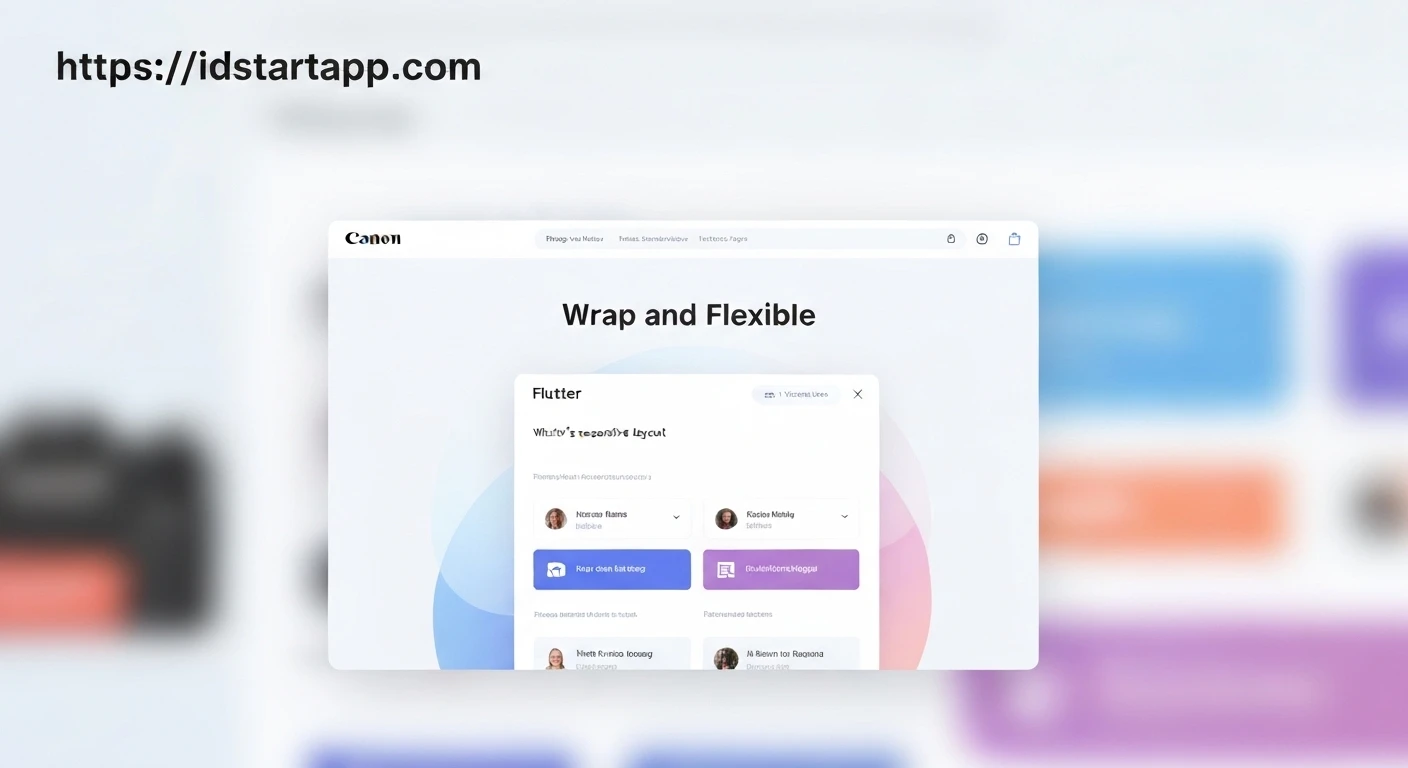

Responsive Flutter Layouts: Mastering Wrap & Flexible Widgets
Developing applications for a diverse range of devices and screen sizes presents a fundamental challenge: ensuring the user interface remains intuitive and visually appealing, regardless of the display dimensions. In Flutter, achieving truly responsive layouts is crucial for a consistent user experience. While widgets like Row and Column are foundational, they often require supplementation to handle content overflow gracefully. This article explores two powerful Flutter widgets, Wrap and Flexible, and demonstrates how they can be combined to create highly adaptable and responsive UIs.
The Challenge of Fixed Layouts
By default, Row and Column widgets attempt to lay out their children in a single line or column. If the children's combined size exceeds the available space, Flutter will throw an overflow error (the dreaded "yellow and black stripes"). While widgets like Expanded can help children fill remaining space, they don't inherently handle dynamic wrapping of content when space runs out. This is where Wrap and Flexible shine, offering solutions for content flow and space distribution.
Introducing the Wrap Widget
The Wrap widget is a game-changer for layouts where content needs to flow onto the next line or column when space is exhausted, similar to how text wraps in a paragraph. Instead of throwing an overflow error, Wrap automatically positions its children in subsequent "runs." This behavior makes it ideal for displaying collections of items (like tags, chips, or small buttons) that should adjust dynamically to available screen width.
Key properties of Wrap include:
direction: Determines the primary axis for children layout (Axis.horizontalby default).alignment: How children are aligned along the main axis of each run.spacing: Horizontal space between children along the main axis.runAlignment: How runs are aligned along the cross axis.runSpacing: Vertical space between runs along the cross axis.
Here's an example of using Wrap:
import 'package:flutter/material.dart';

void main() {
  runApp(const MyApp());
}

class MyApp extends StatelessWidget {
  const MyApp({super.key});

  @override
  Widget build(BuildContext context) {
    return MaterialApp(
      home: Scaffold(
        appBar: AppBar(title: const Text('Wrap Widget Example')),
        body: Center(
          child: Padding(
            padding: const EdgeInsets.all(16.0),
            child: Wrap(
              spacing: 8.0, // Space between children
              runSpacing: 8.0, // Space between runs
              alignment: WrapAlignment.center,
              children: List.generate(
                10,
                (index) => Chip(
                  label: Text('Item ${index + 1}'),
                  avatar: const CircleAvatar(
                    backgroundColor: Colors.blue,
                    child: Text('A'),
                  ),
                ),
              ),
            ),
          ),
        ),
      ),
    );
  }
}
In this example, the Chip widgets will automatically wrap to the next line when the available horizontal space in the Wrap widget is insufficient, ensuring no overflow errors and a fluid layout.
Leveraging the Flexible Widget
The Flexible widget provides a powerful way to control how a child widget fills the available space within a Row or Column. Unlike Expanded (which is essentially a Flexible with fit: FlexFit.tight), Flexible allows for both tight and loose fitting, giving you more granular control over a widget's size. It prevents overflow by making its child flexible, allowing it to shrink or grow within constraints.
Key properties of Flexible include:
flex: An integer that determines the proportion of available space a child should occupy. If multipleFlexiblewidgets are used, space is distributed proportionally based on theirflexvalues. Defaults to 1.fit: Determines how the child should fill the available space.FlexFit.tight: The child is forced to fill the available space. (Equivalent toExpanded).FlexFit.loose: The child can be smaller than the available space but not larger. It takes only the space it needs, up to the maximum available.
Here's an example of using Flexible within a Row:
import 'package:flutter/material.dart';

void main() {
  runApp(const MyApp());
}

class MyApp extends StatelessWidget {
  const MyApp({super.key});

  @override
  Widget build(BuildContext context) {
    return MaterialApp(
      home: Scaffold(
        appBar: AppBar(title: const Text('Flexible Widget Example')),
        body: Center(
          child: Padding(
            padding: const EdgeInsets.all(16.0),
            child: Row(
              children: [
                Container(
                  color: Colors.red,
                  height: 50,
                  width: 80, // Fixed width
                ),
                Flexible(
                  flex: 2,
                  fit: FlexFit.loose, // Can be smaller than available space
                  child: Container(
                    color: Colors.green,
                    height: 50,
                    child: const Text('Flexible Loose (flex 2) - This text might wrap if too long.', style: TextStyle(color: Colors.white)),
                  ),
                ),
                Flexible(
                  flex: 1,
                  fit: FlexFit.tight, // Must fill available space
                  child: Container(
                    color: Colors.blue,
                    height: 50,
                    child: const Text('Flexible Tight (flex 1)', style: TextStyle(color: Colors.white)),
                  ),
                ),
              ],
            ),
          ),
        ),
      ),
    );
  }
}
In this example, the green container will attempt to take up twice as much available space as the blue container, but the FlexFit.loose property means it won't be forced to expand beyond its intrinsic content size if it doesn't need to. The blue container, with FlexFit.tight, will always fill its allocated space.
Combining Wrap and Flexible for Advanced Responsiveness
The true power of responsive design often lies in combining these widgets. While Wrap handles the flow of items onto new lines, Flexible (or Expanded) can be used *inside* each item within the Wrap, or even to control how the Wrap itself behaves within a larger layout. This allows for items that not only wrap but also adapt their internal sizing based on the space given to them in their "run."
Consider a scenario where you have a list of cards, and each card should expand to fill available width in its row, but also wrap to the next line if there isn't enough space for multiple cards side-by-side.
import 'package:flutter/material.dart';

void main() {
  runApp(const MyApp());
}

class MyApp extends StatelessWidget {
  const MyApp({super.key});

  @override
  Widget build(BuildContext context) {
    return MaterialApp(
      home: Scaffold(
        appBar: AppBar(title: const Text('Wrap & Flexible Combination')),
        body: Padding(
          padding: const EdgeInsets.all(16.0),
          child: Wrap(
            spacing: 16.0, // Horizontal space between cards
            runSpacing: 16.0, // Vertical space between rows of cards
            alignment: WrapAlignment.start,
            children: List.generate(
              5,
              (index) => Container(
                constraints: const BoxConstraints(minWidth: 150, maxWidth: 300), // Min/Max width for the card itself
                child: Flexible(
                  fit: FlexFit.loose, // Allow the card to be smaller than maxWidth if needed
                  child: Card(
                    elevation: 4,
                    child: Padding(
                      padding: const EdgeInsets.all(16.0),
                      child: Column(
                        mainAxisSize: MainAxisSize.min,
                        crossAxisAlignment: CrossAxisAlignment.start,
                        children: [
                          Text(
                            'Card Title ${index + 1}',
                            style: Theme.of(context).textTheme.headlineSmall,
                          ),
                          const SizedBox(height: 8),
                          Text(
                            'This is some descriptive text for card ${index + 1}. It demonstrates how content inside can adapt.',
                          ),
                          const SizedBox(height: 8),
                          Align(
                            alignment: Alignment.bottomRight,
                            child: ElevatedButton(
                              onPressed: () {},
                              child: const Text('View'),
                            ),
                          ),
                        ],
                      ),
                    ),
                  ),
                ),
              ),
            ),
          ),
        ),
      ),
    );
  }
}
In this example, each card is wrapped in a Container with BoxConstraints to define its allowed width range. The Flexible widget within this container (though it's effectively a single child here, demonstrating how you might use it if the card had internal flex children) ensures the card content adapts. The Wrap handles placing these cards next to each other, wrapping them to a new line when horizontal space is limited. This setup ensures that cards are never cut off and dynamically arrange themselves to best fit the screen.
Best Practices and Tips
- Combine with
MediaQuery: For more complex responsive layouts, useMediaQuery.of(context).sizeto get the screen dimensions and apply different layouts or widget properties based on breakpoints (e.g., if width > 600, use aRow; otherwise, use aColumnor aWrap). - Test Across Devices: Always test your layouts on various screen sizes and orientations to catch unexpected behaviors. The Flutter DevTools layout inspector is invaluable here.
- Understand
Expandedvs.Flexible: Remember thatExpandedis just aFlexiblewithfit: FlexFit.tight. UseExpandedwhen you absolutely want a child to fill all available space along the main axis; useFlexiblewithFlexFit.loosewhen the child should only take the space it needs, up to the maximum available. - Avoid Deep Nesting: While powerful, over-nesting responsive widgets can lead to complex layout trees that are hard to debug. Keep your widget hierarchy as flat as possible.
Conclusion
Wrap and Flexible (along with its sibling Expanded) are indispensable tools in the Flutter developer's arsenal for building responsive UIs. By understanding their individual strengths and how they can be effectively combined, you can create dynamic layouts that gracefully adapt to any screen size, providing an optimal user experience across all devices. Embrace these widgets to move beyond static designs and unlock the full potential of Flutter's declarative UI framework.


