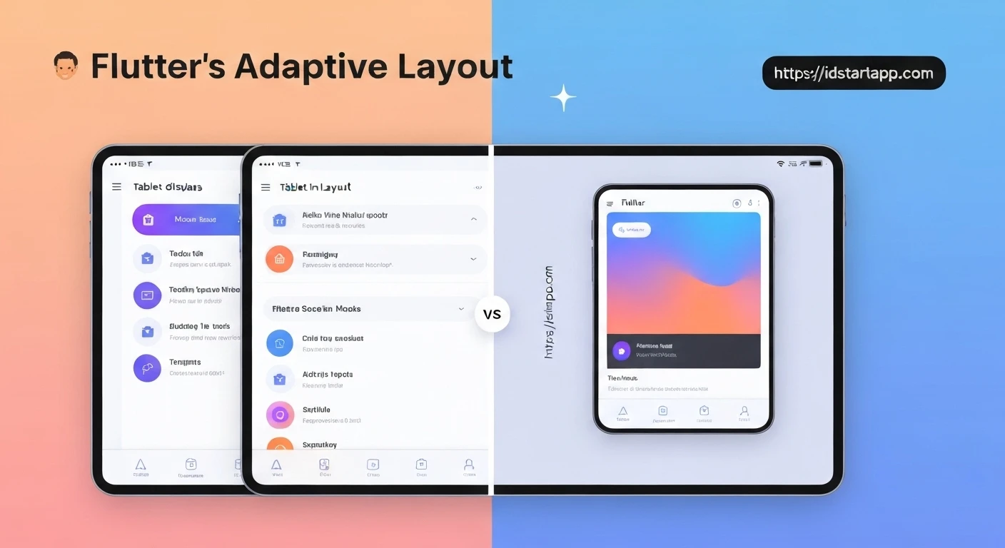

Flutter Adaptive Layout: Tailoring Experiences for Tablet and Mobile
In today's diverse digital landscape, users access applications across a multitude of devices, each boasting unique screen sizes, aspect ratios, and interaction paradigms. From compact smartphones to expansive tablets, providing a consistent yet optimized user experience (UX) is paramount. Flutter, Google's UI toolkit, empowers developers to build natively compiled applications for mobile, web, and desktop from a single codebase. A crucial aspect of this cross-platform capability is adaptive layout design, especially when distinguishing between mobile and tablet interfaces.
The Imperative for Adaptive Design
While a "one size fits all" approach might seem appealing, it often leads to compromises in user experience. Tablets, with their larger screen real estate, encourage more complex layouts, simultaneous information display (like master-detail views), and a desktop-like interaction. Mobile devices, conversely, demand streamlined interfaces, single-column layouts, and touch-optimized components due to limited space and on-the-go usage patterns.
Ignoring these differences can result in:
- Wasted Space: Mobile-first designs scaled up to tablets leave vast empty areas.
- Cluttered Interfaces: Tablet-first designs squeezed onto mobiles become unusable.
- Suboptimal Interactions: Features designed for touch on mobile might not feel natural with a stylus or keyboard on a tablet, and vice-versa.
- Reduced Productivity: Users struggle to find information or complete tasks efficiently.
Core Flutter Tools for Adaptive Layout
Flutter provides several powerful widgets and APIs to help developers create dynamic layouts that adapt to their environment:
MediaQuery: This widget provides information about the size and orientation of the media (e.g., the current device screen). You can access properties likeMediaQuery.of(context).size.width,.height, and.orientationto make layout decisions. It's ideal for global screen information.LayoutBuilder: UnlikeMediaQuerywhich gives global screen dimensions,LayoutBuilderprovides the size constraints of its parent widget. This is incredibly useful for making local adaptations within a specific part of the UI, allowing widgets to fill available space or change their appearance based on their immediate container's dimensions.OrientationBuilder: A specialized widget that rebuilds its child whenever the device's orientation changes. WhileMediaQuerycan also provide orientation,OrientationBuilderoffers a more direct and often cleaner way to react specifically to portrait/landscape transitions.
Strategies for Effective Adaptive Layout
Implementing adaptive layouts in Flutter involves a combination of these tools and thoughtful design patterns:
- Conditional Rendering: The most straightforward approach is to render entirely different sets of widgets based on device characteristics (e.g., screen width).
- Responsive Grids and Columns: Utilize
Row,Column,Expanded, andFlexiblewidgets to dynamically arrange children within available space. For example, a single column on mobile might become a two or three-column grid on a tablet. - Master-Detail Flow: A common pattern for tablets where a list (master) occupies a portion of the screen, and selecting an item displays its details in an adjacent pane. On mobile, this often translates to two separate screens (list view navigating to detail view).
- Custom Breakpoints: Define specific width thresholds (e.g., 600dp for "tablet mode") to consistently apply layout changes across your application.
Practical Examples
1. Detecting Device Type (Mobile vs. Tablet)
A common approach is to define a breakpoint, often around 600dp, to distinguish between mobile and tablet layouts. This uses MediaQuery.
bool isTablet(BuildContext context) {
  final double shortestSide = MediaQuery.of(context).size.shortestSide;
  return shortestSide >= 600; // Common breakpoint for tablets
}

// In a widget's build method:
@override
Widget build(BuildContext context) {
  if (isTablet(context)) {
    return _buildTabletLayout();
  } else {
    return _buildMobileLayout();
  }
}

Widget _buildMobileLayout() {
  return Scaffold(
    appBar: AppBar(title: Text('Mobile App')),
    body: Center(child: Text('Single Column Content')),
  );
}

Widget _buildTabletLayout() {
  return Scaffold(
    appBar: AppBar(title: Text('Tablet App')),
    body: Row(
      children: [
        Expanded(
          flex: 1,
          child: Container(color: Colors.lightBlue, child: Center(child: Text('Navigation Pane'))),
        ),
        Expanded(
          flex: 3,
          child: Container(color: Colors.white, child: Center(child: Text('Main Content Area'))),
        ),
      ],
    ),
  );
}
2. Using LayoutBuilder for a Two-Pane Layout
LayoutBuilder is excellent for adapting parts of your UI based on the immediate space available to them, facilitating patterns like master-detail views.
class MasterDetailLayout extends StatelessWidget {
  @override
  Widget build(BuildContext context) {
    return Scaffold(
      appBar: AppBar(title: Text('Adaptive Master-Detail')),
      body: LayoutBuilder(
        builder: (context, constraints) {
          if (constraints.maxWidth > 600) {
            // Tablet-like layout: Two panes side-by-side
            return Row(
              children: [
                Expanded(
                  flex: 1,
                  child: ListView(
                    children: List.generate(10, (index) => ListTile(title: Text('Item $index'))),
                  ),
                ),
                Expanded(
                  flex: 2,
                  child: Container(
                    color: Colors.grey[200],
                    child: Center(child: Text('Detail View for Selected Item')),
                  ),
                ),
              ],
            );
          } else {
            // Mobile-like layout: Single pane, detail view on new screen
            return ListView(
              children: List.generate(10, (index) {
                return ListTile(
                  title: Text('Item $index'),
                  onTap: () {
                    // Navigate to detail screen on mobile
                    Navigator.push(context, MaterialPageRoute(builder: (context) => DetailScreen(item: 'Item $index')));
                  },
                );
              }),
            );
          }
        },
      ),
    );
  }
}

class DetailScreen extends StatelessWidget {
  final String item;

  DetailScreen({required this.item});

  @override
  Widget build(BuildContext context) {
    return Scaffold(
      appBar: AppBar(title: Text('Detail for $item')),
      body: Center(child: Text('Content for $item')),
    );
  }
}
3. Adapting to Orientation Changes with OrientationBuilder
class OrientationExample extends StatelessWidget {
  @override
  Widget build(BuildContext context) {
    return Scaffold(
      appBar: AppBar(title: Text('Orientation Demo')),
      body: OrientationBuilder(
        builder: (context, orientation) {
          return Center(
            child: orientation == Orientation.portrait
                ? Column(
                    mainAxisAlignment: MainAxisAlignment.center,
                    children: [
                      Icon(Icons.phone_android, size: 100),
                      Text('Portrait Mode', style: TextStyle(fontSize: 24)),
                    ],
                  )
                : Row(
                    mainAxisAlignment: MainAxisAlignment.center,
                    children: [
                      Icon(Icons.tablet_android, size: 100),
                      Text('Landscape Mode', style: TextStyle(fontSize: 24)),
                    ],
                  ),
          );
        },
      ),
    );
  }
}
Best Practices for Adaptive Layouts
- Define Clear Breakpoints: Establish consistent width breakpoints across your application (e.g., 600dp, 900dp) to trigger layout changes.
- Start Mobile-First: Design for the smallest screen and then progressively enhance for larger screens. This forces you to prioritize content and simplifies the initial design.
- Leverage Flexible Widgets: Utilize
ExpandedandFlexiblewithinRowandColumnto allow widgets to grow and shrink gracefully. - Test Extensively: Use Flutter's debugging tools to simulate various device sizes and orientations. Test on actual devices if possible.
- Consider Input Methods: Tablets often support keyboards and mice. Ensure your adaptive design accounts for these alternative input methods where relevant.
- Prioritize Content: Always ensure the most important content is easily accessible and readable, regardless of screen size.
Conclusion
Flutter's robust widget system and declarative UI approach make it an excellent choice for developing applications with adaptive layouts. By strategically employing MediaQuery, LayoutBuilder, and OrientationBuilder, developers can craft experiences that seamlessly transition between mobile and tablet form factors, offering users an intuitive and optimized interface on any device. Embracing adaptive design is not just about making an app fit; it's about making it shine, enhancing usability, and delivering a truly native feel across the diverse ecosystem of modern devices.


