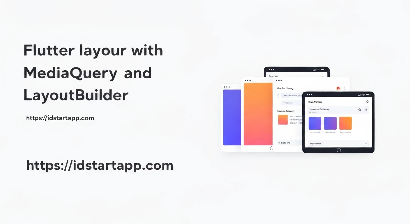

Mastering Responsive Flutter Layouts with MediaQuery and LayoutBuilder
Developing applications for a multitude of devices with varying screen sizes, resolutions, and orientations is a fundamental challenge in modern UI development. In Flutter, achieving truly responsive layouts is crucial for delivering a consistent and optimal user experience across smartphones, tablets, and even desktop or web platforms. This article delves into two powerful Flutter widgets—MediaQuery and LayoutBuilder—that are indispensable tools for building adaptable and dynamic UIs.
Understanding Responsive Design in Flutter
Responsive design in Flutter means your UI should automatically adjust and reorganize itself based on the available screen real estate. This is not just about scaling elements but about intelligently changing layouts, hiding/showing certain widgets, or altering the density of information to best fit the context. Without a responsive strategy, your app might look excellent on one device but appear cramped, stretched, or poorly organized on another.
MediaQuery: The Global Context Provider
MediaQuery is a powerful inherited widget that provides global information about the device and the display environment. It's typically obtained via MediaQuery.of(context) and gives you access to crucial data like screen size, pixel density, text scale factor, device orientation, and more.
The information provided by MediaQuery is derived from the nearest MediaQuery ancestor. Since Flutter's MaterialApp or CupertinoApp widgets typically include a MediaQuery at the root, you can access global device information from almost anywhere in your widget tree.
Practical Usage of MediaQuery
You can use MediaQuery to make global decisions about your layout, such as setting breakpoints for different screen widths or adjusting font sizes and padding dynamically.
import 'package:flutter/material.dart';

class HomeScreen extends StatelessWidget {
  @override
  Widget build(BuildContext context) {
    final mediaQueryData = MediaQuery.of(context);
    final screenWidth = mediaQueryData.size.width;
    final screenHeight = mediaQueryData.size.height;
    final isPortrait = mediaQueryData.orientation == Orientation.portrait;

    return Scaffold(
      appBar: AppBar(
        title: Text('Responsive with MediaQuery'),
      ),
      body: Center(
        child: Column(
          mainAxisAlignment: MainAxisAlignment.center,
          children: [
            Text(
              'Screen Width: ${screenWidth.toStringAsFixed(2)}',
              style: TextStyle(fontSize: screenWidth * 0.05), // Font size scales with width
            ),
            Text(
              'Screen Height: ${screenHeight.toStringAsFixed(2)}',
              style: TextStyle(fontSize: screenHeight * 0.03),
            ),
            Padding(
              padding: EdgeInsets.all(screenWidth * 0.04), // Padding scales with width
              child: Text(
                isPortrait ? 'Device is in Portrait' : 'Device is in Landscape',
                style: TextStyle(fontSize: 20),
              ),
            ),
            SizedBox(height: 20),
            Container(
              width: screenWidth * 0.8, // 80% of screen width
              height: isPortrait ? screenHeight * 0.2 : screenHeight * 0.4, // Different height based on orientation
              color: Colors.blueAccent,
              child: Center(
                child: Text(
                  'Dynamic Container',
                  style: TextStyle(color: Colors.white, fontSize: 22),
                ),
              ),
            ),
          ],
        ),
      ),
    );
  }
}
In this example, we adjust font sizes, padding, and container dimensions based on the screen width, height, and orientation. This allows the UI elements to scale proportionally with the device's display.
LayoutBuilder: The Parent Widget's Constraints
While MediaQuery provides information about the *entire screen*, LayoutBuilder provides information about the *available space within its direct parent*. It's a widget that builds a widget tree based on the incoming constraints from its parent. This is incredibly useful when you need to make layout decisions specific to a particular section of your UI, rather than the whole screen.
LayoutBuilder passes a BoxConstraints object to its builder function, which includes minWidth, maxWidth, minHeight, and maxHeight. These constraints dictate the size range within which the LayoutBuilder's child can be rendered.
Practical Usage of LayoutBuilder
LayoutBuilder shines when you want to create a responsive layout for a widget that might appear in different contexts (e.g., a sidebar, a main content area, or a list item) where its parent provides varying amounts of space.
import 'package:flutter/material.dart';

class MyResponsiveWidget extends StatelessWidget {
  @override
  Widget build(BuildContext context) {
    return Scaffold(
      appBar: AppBar(
        title: Text('Responsive with LayoutBuilder'),
      ),
      body: Center(
        child: Container(
          color: Colors.grey[200],
          width: MediaQuery.of(context).size.width * 0.9, // Parent container takes 90% of screen width
          height: 300,
          child: LayoutBuilder(
            builder: (BuildContext context, BoxConstraints constraints) {
              // Access constraints from the parent Container
              if (constraints.maxWidth > 600) {
                // For wider spaces, display a two-column layout
                return Row(
                  mainAxisAlignment: MainAxisAlignment.spaceAround,
                  children: [
                    Container(
                      width: constraints.maxWidth / 2 - 20, // Half width minus padding
                      color: Colors.teal,
                      child: Center(
                        child: Text(
                          'Wide Layout - Left',
                          style: TextStyle(color: Colors.white, fontSize: 20),
                        ),
                      ),
                    ),
                    Container(
                      width: constraints.maxWidth / 2 - 20,
                      color: Colors.orange,
                      child: Center(
                        child: Text(
                          'Wide Layout - Right',
                          style: TextStyle(color: Colors.white, fontSize: 20),
                        ),
                      ),
                    ),
                  ],
                );
              } else {
                // For narrower spaces, display a single-column layout
                return Column(
                  mainAxisAlignment: MainAxisAlignment.spaceAround,
                  children: [
                    Container(
                      height: constraints.maxHeight / 2 - 20,
                      width: constraints.maxWidth * 0.9,
                      color: Colors.teal,
                      child: Center(
                        child: Text(
                          'Narrow Layout - Top',
                          style: TextStyle(color: Colors.white, fontSize: 18),
                        ),
                      ),
                    ),
                    Container(
                      height: constraints.maxHeight / 2 - 20,
                      width: constraints.maxWidth * 0.9,
                      color: Colors.orange,
                      child: Center(
                        child: Text(
                          'Narrow Layout - Bottom',
                          style: TextStyle(color: Colors.white, fontSize: 18),
                        ),
                      ),
                    ),
                  ],
                );
              }
            },
          ),
        ),
      ),
    );
  }
}
In this example, the LayoutBuilder dynamically changes its child from a Row to a Column based on the maxWidth provided by its immediate parent Container. This allows the inner layout to adapt without needing to know the entire screen size.
Combining MediaQuery and LayoutBuilder for Advanced Responsiveness
The true power of responsive design in Flutter often comes from combining MediaQuery and LayoutBuilder.
MediaQuery helps establish overall breakpoints for the application (e.g., distinguishing between phone, tablet, or desktop layouts), while LayoutBuilder refines the layout within specific sections based on locally available space.
import 'package:flutter/material.dart';

class CombinedResponsiveLayout extends StatelessWidget {
  @override
  Widget build(BuildContext context) {
    final screenWidth = MediaQuery.of(context).size.width;
    final bool isLargeScreen = screenWidth > 800; // Global breakpoint for large screens

    return Scaffold(
      appBar: AppBar(
        title: Text('MediaQuery and LayoutBuilder Combined'),
      ),
      body: Row(
        children: [
          // A sidebar that might be present on large screens
          if (isLargeScreen)
            Container(
              width: 200,
              color: Colors.blueGrey[100],
              child: Center(child: Text('Sidebar', style: TextStyle(fontSize: 20))),
            ),
          // Main content area, which uses LayoutBuilder for internal responsiveness
          Expanded(
            child: Padding(
              padding: const EdgeInsets.all(16.0),
              child: LayoutBuilder(
                builder: (BuildContext context, BoxConstraints constraints) {
                  // Local breakpoint based on the available width for the main content
                  if (constraints.maxWidth > 500) {
                    return Row(
                      children: [
                        Expanded(
                          child: Container(
                            margin: EdgeInsets.all(8),
                            color: Colors.greenAccent,
                            height: 200,
                            child: Center(child: Text('Main Content 1', style: TextStyle(fontSize: 18))),
                          ),
                        ),
                        Expanded(
                          child: Container(
                            margin: EdgeInsets.all(8),
                            color: Colors.purpleAccent,
                            height: 200,
                            child: Center(child: Text('Main Content 2', style: TextStyle(fontSize: 18))),
                          ),
                        ),
                      ],
                    );
                  } else {
                    return Column(
                      children: [
                        Container(
                          margin: EdgeInsets.all(8),
                          color: Colors.greenAccent,
                          height: 150,
                          width: double.infinity,
                          child: Center(child: Text('Main Content 1 (stacked)', style: TextStyle(fontSize: 16))),
                        ),
                        Container(
                          margin: EdgeInsets.all(8),
                          color: Colors.purpleAccent,
                          height: 150,
                          width: double.infinity,
                          child: Center(child: Text('Main Content 2 (stacked)', style: TextStyle(fontSize: 16))),
                        ),
                      ],
                    );
                  }
                },
              ),
            ),
          ),
        ],
      ),
    );
  }
}
In this comprehensive example, MediaQuery determines if a sidebar should be displayed at all (based on isLargeScreen). Then, the main content area, occupying the remaining space, uses LayoutBuilder to decide whether its internal elements should be arranged in a Row or a Column, based on the specific width it has available.
Best Practices for Responsive Layouts
- Define Breakpoints: Establish clear screen width breakpoints (e.g., small, medium, large) to guide your responsive logic.
- Use Flexible and Expanded: These widgets are essential for distributing space among children in a
RoworColumnefficiently. - Avoid Hardcoded Values: Minimize the use of fixed widths and heights. Instead, leverage percentages (calculated from
MediaQueryorLayoutBuilder) or flexible sizing. - Test on Various Devices: Emulate or test your app on a range of devices (different sizes, aspect ratios, orientations) to ensure consistency.
- Consider Text Scaling: Be mindful of
MediaQueryData.textScaleFactor, especially for users with accessibility needs. - Orientation Changes: Handle device orientation changes gracefully, often by adjusting layouts based on
MediaQueryData.orientation.
Conclusion
MediaQuery and LayoutBuilder are cornerstone widgets for building responsive Flutter applications. While MediaQuery provides a global overview of the device and screen, LayoutBuilder offers localized control over a widget's available space. By understanding and effectively combining these two tools, developers can create adaptive, elegant, and user-friendly interfaces that look great on any screen, ensuring a high-quality experience for all users.


