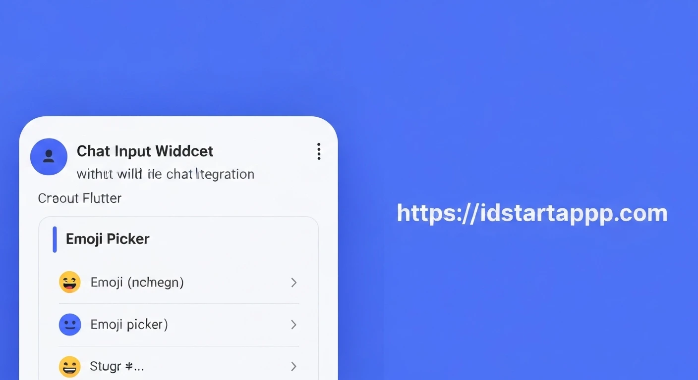

Building a Chat Input Widget with an Emoji Picker in Flutter
Modern chat applications are defined by more than just text; they offer rich communication experiences that include media, stickers, and, crucially, emojis. Emojis have become an integral part of digital conversations, allowing users to express emotions and nuances that text alone often misses. In this article, we will guide you through building a professional chat input widget in Flutter, complete with a functional emoji picker, ensuring a seamless and intuitive user experience.
1. Project Setup and Dependencies
First, create a new Flutter project or open an existing one. To implement the emoji picker, we'll leverage the popular emoji_picker_flutter package. This package provides a highly customizable and efficient emoji picker widget. Add it to your pubspec.yaml file:
dependencies:
  flutter:
    sdk: flutter
  emoji_picker_flutter: ^2.0.0 # Use the latest version
  # Add other dependencies if needed
After adding the dependency, run flutter pub get to fetch the package.
2. Structuring the Chat Input Widget
We'll create a StatefulWidget to manage the state of our text input, emoji picker visibility, and focus. The basic layout will consist of a TextField for user input and an IconButton to toggle the emoji picker.
import 'package:flutter/material.dart';
import 'package:emoji_picker_flutter/emoji_picker_flutter.dart';

class ChatInputWidget extends StatefulWidget {
  final Function(String) onSendMessage;

  const ChatInputWidget({Key? key, required this.onSendMessage}) : super(key: key);

  @override
  State createState() => _ChatInputWidgetState();
}

class _ChatInputWidgetState extends State {
  final TextEditingController _controller = TextEditingController();
  final FocusNode _focusNode = FocusNode();
  bool _showEmojiPicker = false;

  @override
  void initState() {
    super.initState();
    _focusNode.addListener(() {
      if (_focusNode.hasFocus) {
        setState(() {
          _showEmojiPicker = false; // Hide emoji picker when keyboard is focused
        });
      }
    });
  }

  @override
  void dispose() {
    _controller.dispose();
    _focusNode.dispose();
    super.dispose();
  }

  void _sendMessage() {
    if (_controller.text.trim().isNotEmpty) {
      widget.onSendMessage(_controller.text.trim());
      _controller.clear();
      // Optionally hide emoji picker after sending
      // setState(() {
      //   _showEmojiPicker = false;
      //   _focusNode.unfocus();
      // });
    }
  }

  void _toggleEmojiPicker() {
    setState(() {
      _showEmojiPicker = !_showEmojiPicker;
      if (_showEmojiPicker) {
        _focusNode.unfocus(); // Hide keyboard when showing emoji picker
      } else {
        _focusNode.requestFocus(); // Show keyboard when hiding emoji picker
      }
    });
  }

  @override
  Widget build(BuildContext context) {
    return Column(
      children: [
        Row(
          children: [
            IconButton(
              icon: Icon(
                _showEmojiPicker ? Icons.keyboard : Icons.sentiment_satisfied_alt,
              ),
              onPressed: _toggleEmojiPicker,
            ),
            Expanded(
              child: TextField(
                controller: _controller,
                focusNode: _focusNode,
                decoration: const InputDecoration(
                  hintText: "Type a message...",
                  border: InputBorder.none,
                  contentPadding: EdgeInsets.symmetric(horizontal: 10),
                ),
                onSubmitted: (_) => _sendMessage(),
                textInputAction: TextInputAction.send,
              ),
            ),
            IconButton(
              icon: const Icon(Icons.send),
              onPressed: _sendMessage,
            ),
          ],
        ),
        if (_showEmojiPicker)
          SizedBox(
            height: 250, // Adjust height as needed
            child: EmojiPicker(
              textEditingController: _controller,
              onEmojiSelected: (Category? category, Emoji emoji) {
                // This callback is triggered when an emoji is selected from the picker.
                // The EmojiPicker widget handles inserting the emoji into the TextEditingController directly.
                // You only need custom logic here if you want to perform additional actions
                // beyond simple insertion (e.g., immediate sending, or analytics).
              },
              config: Config(
                columns: 7,
                emojiSizeMax: 32.0, // Adjust according to your needs
                verticalSpacing: 0,
                horizontalSpacing: 0,
                gridPadding: EdgeInsets.zero,
                initCategory: Category.RECENT,
                bgColor: const Color(0xFFF2F2F2),
                indicatorColor: Colors.blue,
                iconColor: Colors.grey,
                iconColorSelected: Colors.blue,
                backspaceColor: Colors.blue,
                skinToneDialogBgColor: Colors.white,
                skinToneIndicatorColor: Colors.grey,
                enableSkinTones: true,
                recentTabBehavior: RecentTabBehavior.POPULAR,
                recentsLimit: 28,
                noRecents: const Text(
                  'No Recents',
                  textAlign: TextAlign.center,
                  style: TextStyle(fontSize: 20, color: Colors.black26),
                ),
                loadingIndicator: const SizedBox.shrink(),
                tabIndicatorAnimDuration: kTabScrollDuration,
                categoryIcons: const CategoryIcons(),
                buttonMode: ButtonMode.MATERIAL, // iOS or MATERIAL
              ),
            ),
          ),
      ],
    );
  }
}
3. Implementing the Emoji Picker Logic
The _toggleEmojiPicker method is responsible for switching between the keyboard and the emoji picker. When the emoji picker is shown, we unfocus the TextField to hide the keyboard. Conversely, when the emoji picker is hidden, we request focus on the TextField to bring up the keyboard. The _focusNode.addListener also ensures that if the user manually brings up the keyboard (e.g., by tapping the TextField), the emoji picker automatically hides.
The EmojiPicker widget itself is conditionally rendered based on the _showEmojiPicker state variable. It takes the textEditingController directly, which simplifies inserting emojis as the package handles this automatically.
4. Integrating Emojis into the TextField
With emoji_picker_flutter, the integration is quite straightforward. When you provide the textEditingController to the EmojiPicker widget, it automatically inserts the selected emoji at the current cursor position in the TextField. If the TextField is not focused, it will insert at the end. The onEmojiSelected callback can be used if you need to perform additional actions upon emoji selection, such as logging or immediately sending the message if it contains only one emoji.
5. Handling Message Sending
The _sendMessage method is called when the user taps the send button or presses the "Send" action on the keyboard. It retrieves the text from the _controller, passes it to the onSendMessage callback (which would typically send the message to your chat service), and then clears the input field.
  void _sendMessage() {
    if (_controller.text.trim().isNotEmpty) {
      widget.onSendMessage(_controller.text.trim());
      _controller.clear();
      // Optionally hide emoji picker after sending
      // setState(() {
      //   _showEmojiPicker = false;
      //   _focusNode.unfocus();
      // });
    }
  }
6. Usage Example
To use the ChatInputWidget, simply place it within your chat screen's widget tree, typically at the bottom.
import 'package:flutter/material.dart';
import 'package:your_app_name/chat_input_widget.dart'; // Adjust path based on your project structure

class ChatScreen extends StatelessWidget {
  const ChatScreen({Key? key}) : super(key: key);

  void _handleSendMessage(String message) {
    print("Message sent: $message");
    // Implement your message sending logic here (e.g., send to API, add to list)
  }

  @override
  Widget build(BuildContext context) {
    return Scaffold(
      appBar: AppBar(
        title: const Text("Flutter Chat"),
      ),
      body: Column(
        children: [
          // Your chat message list goes here
          Expanded(
            child: Container(
              color: Colors.grey[200],
              child: const Center(child: Text("Chat messages will appear here.")),
            ),
          ),
          // The chat input widget at the bottom
          Container(
            padding: const EdgeInsets.symmetric(horizontal: 8, vertical: 4),
            color: Colors.white,
            child: ChatInputWidget(
              onSendMessage: _handleSendMessage,
            ),
          ),
        ],
      ),
    );
  }
}
Conclusion
Building a robust chat input with an integrated emoji picker in Flutter significantly enhances the user experience of any messaging application. By leveraging the emoji_picker_flutter package and carefully managing widget states and keyboard visibility, you can create a professional and highly interactive chat interface. This setup provides a solid foundation that can be further extended with features like GIF support, file attachments, and more.


