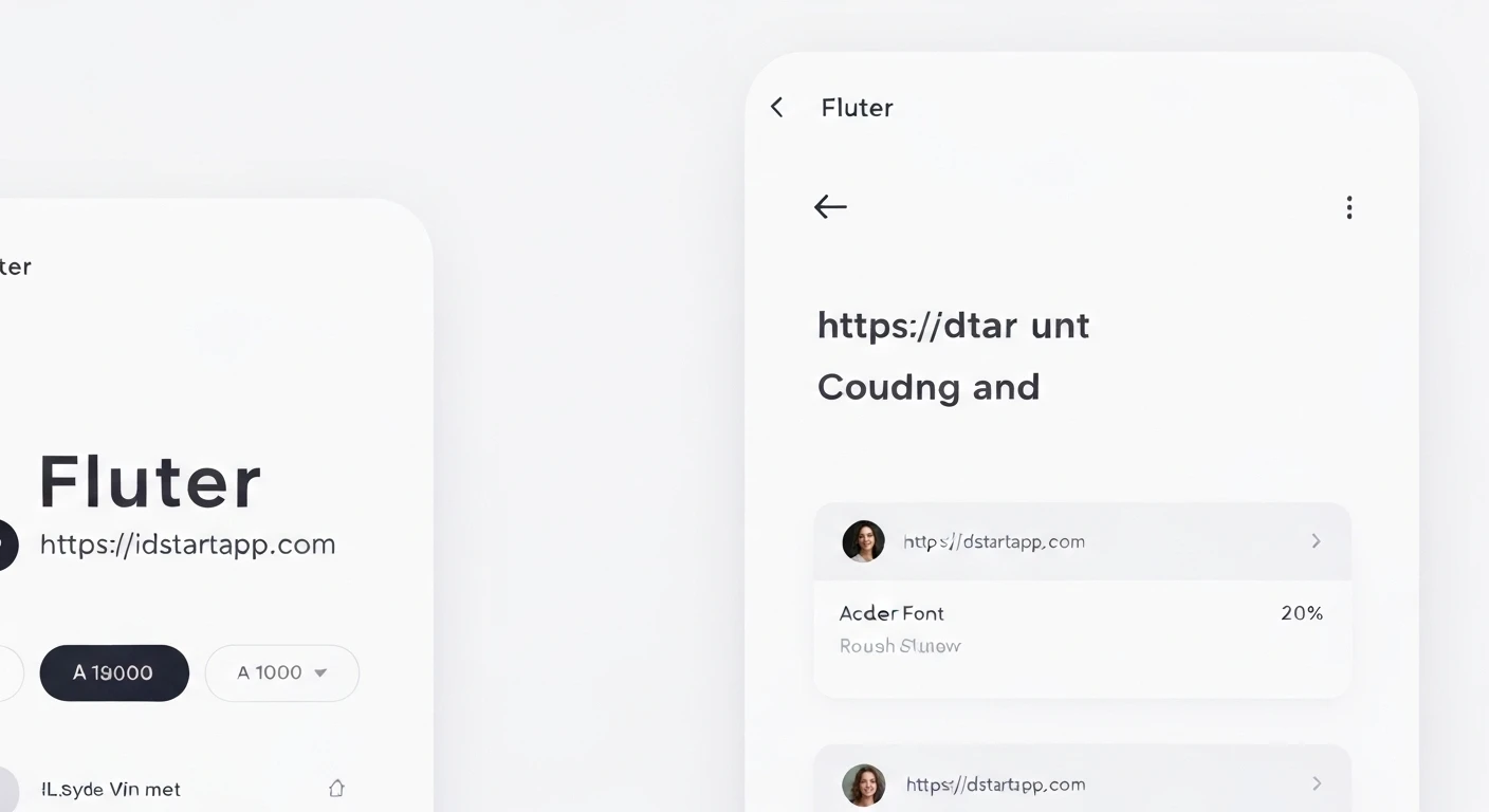

Flutter Themes: Custom Font & Color Scheme
The visual identity of an application is paramount for user experience and brand recognition. Flutter, Google's UI toolkit for building natively compiled applications for mobile, web, and desktop from a single codebase, offers a powerful and flexible theming system that allows developers to define a consistent look and feel across their entire app. This article will delve into customizing Flutter themes, specifically focusing on integrating custom fonts and defining bespoke color schemes.
The Importance of Theming
Theming in Flutter isn't just about aesthetics; it's about consistency, maintainability, and accessibility. A well-defined theme ensures that all widgets adhere to a predetermined design language, reducing the effort required to style individual components and making future design changes much simpler. By abstracting design properties into a central theme, developers can maintain a clean, readable codebase and easily switch between different themes (e.g., light and dark mode).
Custom Fonts in Flutter
While Flutter provides a default font, Roboto, and allows access to system fonts, many applications require a unique typographic identity. Integrating custom fonts is a straightforward process.
1. Adding Font Files to Your Project
First, place your font files (e.g., .ttf, .otf) into a dedicated folder within your project, typically assets/fonts/.
2. Declaring Fonts in pubspec.yaml
Next, you must declare these fonts in your pubspec.yaml file under the flutter section. This tells Flutter to bundle these fonts with your application.
flutter:
  uses-material-design: true

  assets:
    - assets/images/

  fonts:
    - family: CustomFont
      fonts:
        - asset: assets/fonts/CustomFont-Regular.ttf
        - asset: assets/fonts/CustomFont-Bold.ttf
          weight: 700
    - family: AnotherFont
      fonts:
        - asset: assets/fonts/AnotherFont-Medium.ttf
          weight: 500
After modifying pubspec.yaml, run flutter pub get to ensure the changes are picked up.
3. Using Custom Fonts
You can use your custom font directly in TextStyle or, more powerfully, define it as part of your application's theme.
Direct Usage:
Text(
  'Hello Custom Font!',
  style: TextStyle(
    fontFamily: 'CustomFont',
    fontSize: 24,
    fontWeight: FontWeight.bold,
  ),
),
Theming with Custom Fonts:
To apply a custom font globally, set it as the fontFamily in your ThemeData's textTheme or fontFamily property.
MaterialApp(
  theme: ThemeData(
    fontFamily: 'CustomFont', // Applies to most text widgets by default
    textTheme: TextTheme(
      headlineLarge: TextStyle(fontFamily: 'AnotherFont', fontSize: 32, fontWeight: FontWeight.w500),
      bodyMedium: TextStyle(fontFamily: 'CustomFont', fontSize: 16),
    ),
  ),
  home: MyHomePage(),
);
Custom Color Schemes in Flutter
A well-defined color scheme is crucial for visual hierarchy, usability, and brand consistency. Flutter's theming system, especially with Material 3, heavily relies on ColorScheme.
Understanding ColorScheme
ColorScheme is a set of 29 predefined colors that represent various semantic roles in a UI, such as primary, secondary, tertiary, surface, error, and their on-color counterparts (e.g., onPrimary). This semantic approach makes it easier to create accessible and coherent designs, as colors are chosen based on their purpose rather than arbitrary values.
Defining a Custom ColorScheme
You can create a ColorScheme by providing your brand's colors. Flutter's ColorScheme.fromSeed() constructor is a convenient way to generate a full color scheme based on a single "seed" color, though you can also manually define each color.
Using ColorScheme.fromSeed():
final ColorScheme myColorScheme = ColorScheme.fromSeed(
  seedColor: Color(0xFF6200EE), // Your primary brand color
  brightness: Brightness.light,
  // You can override specific colors here if needed
  primary: Color(0xFF6200EE),
  secondary: Color(0xFF03DAC6),
);
Manually Defining ColorScheme:
For more granular control, you can define each color property directly:
final ColorScheme customDarkColorScheme = ColorScheme(
  brightness: Brightness.dark,
  primary: Color(0xFFBB86FC),
  onPrimary: Colors.black,
  primaryContainer: Color(0xFF3700B3),
  onPrimaryContainer: Colors.white,
  secondary: Color(0xFF03DAC6),
  onSecondary: Colors.black,
  secondaryContainer: Color(0xFF018786),
  onSecondaryContainer: Colors.black,
  tertiary: Color(0xFF33B5E5),
  onTertiary: Colors.black,
  tertiaryContainer: Color(0xFF0099CC),
  onTertiaryContainer: Colors.black,
  error: Color(0xFFCF6679),
  onError: Colors.black,
  errorContainer: Color(0xFFB00020),
  onErrorContainer: Colors.white,
  background: Color(0xFF121212),
  onBackground: Colors.white,
  surface: Color(0xFF121212),
  onSurface: Colors.white,
  surfaceVariant: Color(0xFF424242),
  onSurfaceVariant: Colors.white,
  outline: Color(0xFF888888),
  shadow: Colors.black,
  inverseSurface: Colors.white,
  onInverseSurface: Colors.black,
  inversePrimary: Color(0xFF6200EE),
);
Applying ColorScheme to ThemeData
Once you have your ColorScheme, integrate it into your ThemeData. This makes the colors available throughout your app via Theme.of(context).colorScheme.
MaterialApp(
  theme: ThemeData(
    useMaterial3: true, // Enable Material 3 features
    colorScheme: myColorScheme,
    // Other theme properties
  ),
  darkTheme: ThemeData(
    useMaterial3: true,
    colorScheme: customDarkColorScheme,
  ),
  home: MyHomePage(),
);
Using Themed Colors in Widgets
Always access colors through Theme.of(context).colorScheme to ensure your widgets respond to the active theme.
class MyButton extends StatelessWidget {
  @override
  Widget build(BuildContext context) {
    return ElevatedButton(
      style: ElevatedButton.styleFrom(
        backgroundColor: Theme.of(context).colorScheme.primary,
        foregroundColor: Theme.of(context).colorScheme.onPrimary,
      ),
      onPressed: () {},
      child: Text('Themed Button'),
    );
  }
}
Putting It All Together: A Comprehensive Theme
Combining custom fonts and color schemes within a single ThemeData object provides a holistic and maintainable theme for your application.
// Define your custom font family name as declared in pubspec.yaml
const String _kCustomFontFamily = 'CustomFont';

// Define your light color scheme
final ColorScheme _lightColorScheme = ColorScheme.fromSeed(
  seedColor: Color(0xFF4CAF50), // A shade of green
  brightness: Brightness.light,
  primary: Color(0xFF4CAF50),
  onPrimary: Colors.white,
  secondary: Color(0xFFFFC107), // A shade of amber
  onSecondary: Colors.black,
  surface: Colors.white,
  onSurface: Colors.black,
);

// Define your dark color scheme
final ColorScheme _darkColorScheme = ColorScheme.fromSeed(
  seedColor: Color(0xFF388E3C), // A darker shade of green
  brightness: Brightness.dark,
  primary: Color(0xFF388E3C),
  onPrimary: Colors.white,
  secondary: Color(0xFFFFB300), // A darker shade of amber
  onSecondary: Colors.black,
  surface: Color(0xFF121212),
  onSurface: Colors.white,
);

// Define the light theme
final ThemeData lightTheme = ThemeData(
  useMaterial3: true,
  fontFamily: _kCustomFontFamily,
  colorScheme: _lightColorScheme,
  appBarTheme: AppBarTheme(
    backgroundColor: _lightColorScheme.primary,
    foregroundColor: _lightColorScheme.onPrimary,
    titleTextStyle: TextStyle(
      fontFamily: _kCustomFontFamily,
      fontSize: 20,
      fontWeight: FontWeight.bold,
    ),
  ),
  textTheme: TextTheme(
    displayLarge: TextStyle(fontSize: 57, fontWeight: FontWeight.w400, fontFamily: _kCustomFontFamily),
    headlineLarge: TextStyle(fontSize: 32, fontWeight: FontWeight.w400, fontFamily: _kCustomFontFamily),
    bodyMedium: TextStyle(fontSize: 16, fontWeight: FontWeight.w400, fontFamily: _kCustomFontFamily),
  ),
  elevatedButtonTheme: ElevatedButtonThemeData(
    style: ElevatedButton.styleFrom(
      backgroundColor: _lightColorScheme.secondary,
      foregroundColor: _lightColorScheme.onSecondary,
      textStyle: TextStyle(
        fontFamily: _kCustomFontFamily,
        fontWeight: FontWeight.bold,
      ),
    ),
  ),
);

// Define the dark theme
final ThemeData darkTheme = ThemeData(
  useMaterial3: true,
  fontFamily: _kCustomFontFamily,
  colorScheme: _darkColorScheme,
  appBarTheme: AppBarTheme(
    backgroundColor: _darkColorScheme.primary,
    foregroundColor: _darkColorScheme.onPrimary,
    titleTextStyle: TextStyle(
      fontFamily: _kCustomFontFamily,
      fontSize: 20,
      fontWeight: FontWeight.bold,
    ),
  ),
  textTheme: TextTheme(
    displayLarge: TextStyle(fontSize: 57, fontWeight: FontWeight.w400, fontFamily: _kCustomFontFamily),
    headlineLarge: TextStyle(fontSize: 32, fontWeight: FontWeight.w400, fontFamily: _kCustomFontFamily),
    bodyMedium: TextStyle(fontSize: 16, fontWeight: FontWeight.w400, fontFamily: _kCustomFontFamily),
  ),
  elevatedButtonTheme: ElevatedButtonThemeData(
    style: ElevatedButton.styleFrom(
      backgroundColor: _darkColorScheme.secondary,
      foregroundColor: _darkColorScheme.onSecondary,
      textStyle: TextStyle(
        fontFamily: _kCustomFontFamily,
        fontWeight: FontWeight.bold,
      ),
    ),
  ),
);

// In your MaterialApp
class MyApp extends StatelessWidget {
  @override
  Widget build(BuildContext context) {
    return MaterialApp(
      title: 'Themed App',
      theme: lightTheme,
      darkTheme: darkTheme, // Provide a dark theme
      themeMode: ThemeMode.system, // Or ThemeMode.light, ThemeMode.dark
      home: MyHomePage(),
    );
  }
}
Conclusion
Flutter's robust theming capabilities empower developers to craft visually stunning and highly consistent applications. By mastering the integration of custom fonts and the strategic definition of color schemes using ColorScheme, you can ensure your application not only looks professional but also provides a superior and cohesive user experience. Embracing Flutter's theming system leads to more maintainable code, easier design updates, and a stronger brand identity.


