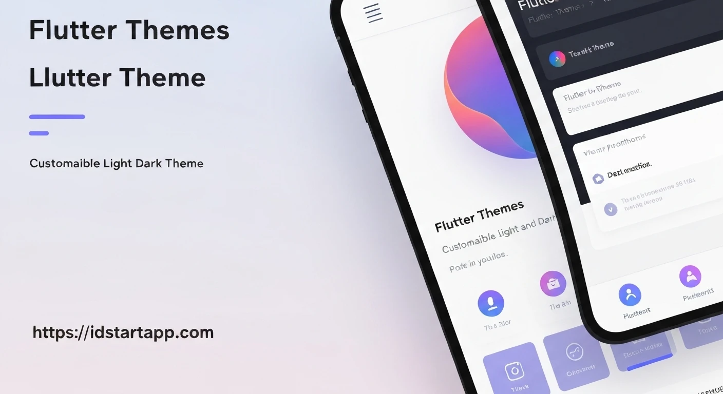

Flutter Themes: Custom Light and Dark Themes
Flutter offers a robust theming system that allows developers to define the visual characteristics of their applications comprehensively. Implementing custom light and dark themes is not just a stylistic choice but a crucial aspect of modern app development, enhancing user experience, accessibility, and personalization.
Understanding Flutter Theming
At the core of Flutter's theming system is the ThemeData class. An instance of ThemeData defines the colors, typography, and other visual properties for an entire Flutter application. When you wrap your application with MaterialApp, you can provide a ThemeData object to its theme property, which then propagates down the widget tree through an InheritedWidget called Theme. This allows any widget in your app to access the current theme data using Theme.of(context).
Why Custom Light and Dark Themes?
The adoption of dark themes has surged, driven by several compelling reasons:
- User Preference: Many users prefer dark interfaces, especially in low-light environments, for reduced eye strain.
- Battery Saving: For devices with OLED screens, dark themes can significantly reduce power consumption as black pixels are turned off.
- Accessibility: Providing both light and dark options caters to a broader range of visual needs and preferences.
- Brand Consistency: Custom themes allow applications to align perfectly with brand guidelines, regardless of the user's preferred theme mode.
Implementing a Basic Light Theme
Flutter provides convenience constructors like ThemeData.light() and ThemeData.dark(), which offer a sensible starting point for light and dark themes, respectively. You can then customize these defaults to match your application's design.
Here’s how to define a custom light theme:
import 'package:flutter/material.dart';

final ThemeData lightTheme = ThemeData(
  brightness: Brightness.light,
  primaryColor: Colors.blue,
  hintColor: Colors.cyan,
  scaffoldBackgroundColor: Colors.white,
  appBarTheme: AppBarTheme(
    color: Colors.blue,
    foregroundColor: Colors.white,
  ),
  textTheme: TextTheme(
    headlineLarge: TextStyle(color: Colors.black87, fontSize: 32),
    bodyMedium: TextStyle(color: Colors.black54),
  ),
  buttonTheme: ButtonThemeData(
    buttonColor: Colors.blue,
    textTheme: ButtonTextTheme.primary,
  ),
  colorScheme: ColorScheme.fromSeed(
    seedColor: Colors.blue,
    brightness: Brightness.light,
  ),
);
Creating a Dark Theme
Similarly, a dark theme can be defined, often leveraging ThemeData.dark() as a base and adjusting colors for better contrast and readability in a dark context.
import 'package:flutter/material.dart';

final ThemeData darkTheme = ThemeData(
  brightness: Brightness.dark,
  primaryColor: Colors.indigo,
  hintColor: Colors.tealAccent,
  scaffoldBackgroundColor: Colors.grey[900],
  appBarTheme: AppBarTheme(
    color: Colors.indigo,
    foregroundColor: Colors.white,
  ),
  textTheme: TextTheme(
    headlineLarge: TextStyle(color: Colors.white70, fontSize: 32),
    bodyMedium: TextStyle(color: Colors.white60),
  ),
  buttonTheme: ButtonThemeData(
    buttonColor: Colors.indigo,
    textTheme: ButtonTextTheme.primary,
  ),
  colorScheme: ColorScheme.fromSeed(
    seedColor: Colors.indigo,
    brightness: Brightness.dark,
  ),
);
Switching Between Themes Dynamically
To allow users to switch between themes, MaterialApp provides three key properties: theme, darkTheme, and themeMode.
theme: The default light theme.darkTheme: The theme to use when the system or user preferences indicate a dark theme.themeMode: Determines which theme (light, dark, or system) is currently active. Its values areThemeMode.light,ThemeMode.dark, andThemeMode.system.
Here's an example of how to implement theme switching using a simple StatefulWidget and Provider for state management (you'll need to add the provider package to your pubspec.yaml).
First, define a ThemeNotifier to manage the ThemeMode:
import 'package:flutter/material.dart';

enum AppThemeMode { light, dark, system }

class ThemeNotifier extends ChangeNotifier {
  ThemeMode _themeMode = ThemeMode.system;

  ThemeMode get themeMode => _themeMode;

  void setThemeMode(AppThemeMode mode) {
    switch (mode) {
      case AppThemeMode.light:
        _themeMode = ThemeMode.light;
        break;
      case AppThemeMode.dark:
        _themeMode = ThemeMode.dark;
        break;
      case AppThemeMode.system:
        _themeMode = ThemeMode.system;
        break;
    }
    notifyListeners();
  }
}
Then, integrate it into your MaterialApp and provide a UI to switch themes:
import 'package:flutter/material.dart';
import 'package:provider/provider.dart'; // Add provider to your pubspec.yaml

// Assume lightTheme and darkTheme are defined as above
// For example, if they are in a separate file like 'themes.dart', you'd import it:
// import 'themes.dart';

void main() {
  runApp(
    ChangeNotifierProvider(
      create: (_) => ThemeNotifier(),
      child: MyApp(),
    ),
  );
}

class MyApp extends StatelessWidget {
  @override
  Widget build(BuildContext context) {
    final themeNotifier = Provider.of(context);

    return MaterialApp(
      title: 'Flutter Custom Themes',
      theme: lightTheme, // Our custom light theme
      darkTheme: darkTheme, // Our custom dark theme
      themeMode: themeNotifier.themeMode, // Controlled by ThemeNotifier
      home: ThemeSwitcherScreen(),
    );
  }
}

class ThemeSwitcherScreen extends StatelessWidget {
  @override
  Widget build(BuildContext context) {
    final themeNotifier = Provider.of(context, listen: false);

    return Scaffold(
      appBar: AppBar(
        title: Text('Custom Themes'),
      ),
      body: Center(
        child: Column(
          mainAxisAlignment: MainAxisAlignment.center,
          children: [
            Text(
              'Hello Flutter Theming!',
              style: Theme.of(context).textTheme.headlineLarge,
            ),
            SizedBox(height: 20),
            ElevatedButton(
              onPressed: () => themeNotifier.setThemeMode(AppThemeMode.light),
              child: Text('Set Light Theme'),
            ),
            SizedBox(height: 10),
            ElevatedButton(
              onPressed: () => themeNotifier.setThemeMode(AppThemeMode.dark),
              child: Text('Set Dark Theme'),
            ),
            SizedBox(height: 10),
            ElevatedButton(
              onPressed: () => themeNotifier.setThemeMode(AppThemeMode.system),
              child: Text('Set System Theme'),
            ),
          ],
        ),
      ),
    );
  }
}
Advanced Theming and Customization
Flutter's theming capabilities extend beyond basic color and text adjustments:
ColorScheme: Modern Flutter apps often rely heavily onColorSchemefor defining a coherent palette. It provides semantic colors likeprimary,secondary,surface,background, and their "on" variants (e.g.,onPrimary).ThemeExtension: For highly custom properties not covered byThemeData(e.g., custom brand colors, specific widget styles), you can useThemeExtensionto add custom data to your theme.- Widget-Specific Theming: Many widgets have their own theme classes (e.g.,
CardTheme,DialogTheme) withinThemeData, allowing granular control over their appearance. - Platform Overrides: You can apply different themes or styles based on the platform (iOS vs. Android) using
ThemeData.platformor conditional logic.
Conclusion
Implementing custom light and dark themes in Flutter is a straightforward yet powerful way to elevate your application's user experience and design. By leveraging ThemeData, MaterialApp's theme properties, and state management, you can create a dynamic and visually appealing application that caters to diverse user preferences and accessibility needs. Mastering Flutter's theming system is key to building truly polished and professional mobile applications.


