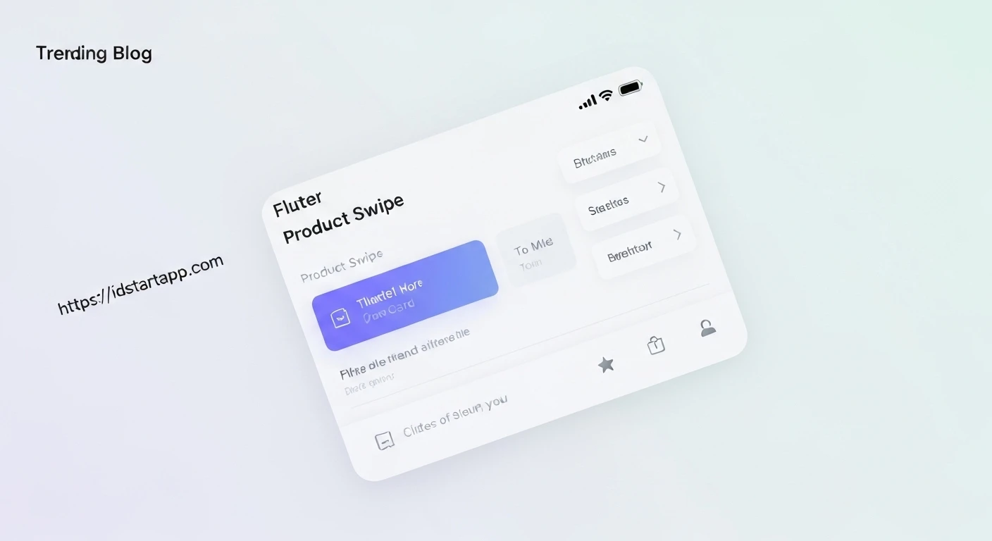

Creating a Product Card Swipe Widget in Flutter
Creating interactive and engaging user interfaces is crucial for modern mobile applications. A common UI pattern, particularly in e-commerce, social discovery, or educational apps, is the "product card swipe" gesture. This allows users to quickly browse through items, making a decision (like "like" or "discard") with a simple swipe.
This article will guide you through building a dynamic product card swipe widget in Flutter. We'll cover everything from structuring the product data to implementing the intricate gesture detection and animation, resulting in a smooth and intuitive user experience.
Prerequisites
Before diving into the implementation, ensure you have a basic understanding of Flutter widgets, state management (StatefulWidget), and core concepts like Stack, Positioned, GestureDetector, and AnimationController.
1. Setting Up the Product Model
First, let's define a simple data model for our products. This class will hold the essential information for each card.
class Product {
  final String id;
  final String name;
  final String imageUrl;
  final String description;
  final double price;

  Product({
    required this.id,
    required this.name,
    required this.imageUrl,
    required this.description,
    required this.price,
  });
}
2. Designing the Basic Product Card
Next, we'll create a stateless widget that represents the visual layout of a single product card. This keeps the presentation separate from the swipe logic.
import 'package:flutter/material.dart';

class ProductCard extends StatelessWidget {
  final Product product;

  const ProductCard({Key? key, required this.product}) : super(key: key);

  @override
  Widget build(BuildContext context) {
    return Card(
      elevation: 8.0,
      shape: RoundedRectangleBorder(borderRadius: BorderRadius.circular(16.0)),
      child: ClipRRect(
        borderRadius: BorderRadius.circular(16.0),
        child: Container(
          decoration: BoxDecoration(
            color: Colors.white,
            boxShadow: [
              BoxShadow(
                color: Colors.grey.withOpacity(0.3),
                spreadRadius: 2,
                blurRadius: 7,
                offset: const Offset(0, 3),
              ),
            ],
          ),
          child: Column(
            crossAxisAlignment: CrossAxisAlignment.start,
            children: [
              Expanded(
                child: Image.network(
                  product.imageUrl,
                  fit: BoxFit.cover,
                  width: double.infinity,
                  errorBuilder: (context, error, stackTrace) => const Center(
                    child: Icon(Icons.broken_image, size: 80, color: Colors.grey),
                  ),
                ),
              ),
              Padding(
                padding: const EdgeInsets.all(16.0),
                child: Column(
                  crossAxisAlignment: CrossAxisAlignment.start,
                  children: [
                    Text(
                      product.name,
                      style: const TextStyle(
                        fontSize: 24.0,
                        fontWeight: FontWeight.bold,
                      ),
                    ),
                    const SizedBox(height: 8.0),
                    Text(
                      '\$${product.price.toStringAsFixed(2)}',
                      style: TextStyle(
                        fontSize: 20.0,
                        fontWeight: FontWeight.w600,
                        color: Colors.green[700],
                      ),
                    ),
                    const SizedBox(height: 8.0),
                    Text(
                      product.description,
                      style: const TextStyle(fontSize: 16.0, color: Colors.grey),
                      maxLines: 2,
                      overflow: TextOverflow.ellipsis,
                    ),
                  ],
                ),
              ),
            ],
          ),
        ),
      ),
    );
  }
}
3. Implementing the Swipeable Card Logic
This is where the core interaction magic happens. We'll create a SwipeableCard widget that takes a ProductCard as its child and manages its position and rotation based on user gestures.
Key components:
AnimationController: To control the animation when the user releases the card (snapping back or swiping off).GestureDetector: To detect drag gestures (onPanStart,onPanUpdate,onPanEnd).Transform.translateandTransform.rotate: To dynamically position and rotate the card during the drag.TickerProviderStateMixin: Required for usingAnimationControllerwithin aStatefulWidget.
import 'package:flutter/material.dart';

// Assuming Product and ProductCard are defined in their respective files
// import 'product_model.dart';
// import 'product_card.dart';

class SwipeableCard extends StatefulWidget {
  final Widget cardChild;
  final Function(bool isSwipedRight) onCardDismissed; // Callback for parent
  final bool isTopCard; // To indicate if this is the active card

  const SwipeableCard({
    Key? key,
    required this.cardChild,
    required this.onCardDismissed,
    this.isTopCard = false,
  }) : super(key: key);

  @override
  State<SwipeableCard> createState() => _SwipeableCardState();
}

class _SwipeableCardState extends State<SwipeableCard> with TickerProviderStateMixin {
  late AnimationController _controller;
  late Animation _swipeAnimation;

  Offset _cardOffset = Offset.zero;
  double _cardAngle = 0.0;
  Offset _panStartPoint = Offset.zero;

  static const double _dismissThreshold = 150.0; // Distance to swipe before dismissing

  @override
  void initState() {
    super.initState();
    _controller = AnimationController(
      vsync: this,
      duration: const Duration(milliseconds: 300),
    )..addListener(() {
        setState(() {
          _cardOffset = _swipeAnimation.value;
          // Calculate angle based on x-offset for reset animation
          _cardAngle = _cardOffset.dx * 0.0008;
        });
      });
  }

  @override
  void dispose() {
    _controller.dispose();
    super.dispose();
  }

  void _onPanStart(DragStartDetails details) {
    if (!widget.isTopCard) return; // Only allow interaction with the top card
    _panStartPoint = details.globalPosition;
    _controller.stop(); // Stop any ongoing animation
  }

  void _onPanUpdate(DragUpdateDetails details) {
    if (!widget.isTopCard) return;
    setState(() {
      _cardOffset += details.delta;
      _cardAngle = _cardOffset.dx * 0.0008; // Adjust rotation sensitivity
    });
  }

  void _onPanEnd(DragEndDetails details) {
    if (!widget.isTopCard) return;

    final double screenWidth = MediaQuery.of(context).size.width;
    final double cardCenterX = screenWidth / 2 + _cardOffset.dx;

    // Determine if the card should be dismissed
    if (cardCenterX < screenWidth / 2 - _dismissThreshold || // Swiped left
        cardCenterX > screenWidth / 2 + _dismissThreshold) { // Swiped right

      bool isSwipedRight = cardCenterX > screenWidth / 2;

      _swipeAnimation = Tween(
        begin: _cardOffset,
        end: Offset(isSwipedRight ? screenWidth : -screenWidth, _cardOffset.dy),
      ).animate(_controller);

      _controller.forward().then((_) {
        widget.onCardDismissed(isSwipedRight);
      });
    } else {
      // Snap back to original position
      _swipeAnimation = Tween(
        begin: _cardOffset,
        end: Offset.zero,
      ).animate(_controller);
      _controller.forward().then((_) {
        setState(() {
          _cardOffset = Offset.zero;
          _cardAngle = 0.0;
        });
      });
    }
  }

  @override
  Widget build(BuildContext context) {
    return GestureDetector(
      onPanStart: _onPanStart,
      onPanUpdate: _onPanUpdate,
      onPanEnd: _onPanEnd,
      child: Transform.translate(
        offset: _cardOffset,
        child: Transform.rotate(
          angle: _cardAngle,
          child: widget.cardChild,
        ),
      ),
    );
  }
}
4. Managing a Stack of Swipeable Cards
To create the full product card swipe experience, we need a widget that manages a list of products, displays them in a stack, and handles the logic for when a card is dismissed. We'll use the Stack widget for layering and Positioned for slight offsets to give a depth effect.
import 'package:flutter/material.dart';
import 'dart:math';

// Make sure Product and ProductCard are accessible
// import 'product_model.dart';
// import 'product_card.dart';
// import 'swipeable_card.dart';

class ProductSwipeDeck extends StatefulWidget {
  final List products;

  const ProductSwipeDeck({Key? key, required this.products}) : super(key: key);

  @override
  State<ProductSwipeDeck> createState() => _ProductSwipeDeckState();
}

class _ProductSwipeDeckState extends State<ProductSwipeDeck> {
  late List _currentProducts;

  @override
  void initState() {
    super.initState();
    _currentProducts = List.from(widget.products);
  }

  void _onCardDismissed(bool isSwipedRight) {
    setState(() {
      if (_currentProducts.isNotEmpty) {
        final Product dismissedProduct = _currentProducts.removeAt(0);
        print('Card dismissed: ${dismissedProduct.name} - Swiped Right: $isSwipedRight');
        // Optionally, add the dismissed card to the end to loop, or fetch new data
        // _currentProducts.add(dismissedProduct);
      }
    });
  }

  @override
  Widget build(BuildContext context) {
    return _currentProducts.isEmpty
        ? Center(
            child: Column(
              mainAxisAlignment: MainAxisAlignment.center,
              children: [
                const Text(
                  'No more products!',
                  style: TextStyle(fontSize: 24, fontWeight: FontWeight.bold),
                ),
                const SizedBox(height: 16),
                ElevatedButton(
                  onPressed: () {
                    // Reset or fetch more products
                    setState(() {
                      _currentProducts = List.from(widget.products); // For demo, just reset
                    });
                  },
                  child: const Text('Refresh Products'),
                ),
              ],
            ),
          )
        : Stack(
            alignment: Alignment.center,
            children: _currentProducts.asMap().entries.map((entry) {
              int index = entry.key;
              Product product = entry.value;

              bool isTopCard = index == 0;

              // Apply slight scale and offset for cards behind the top one
              double scale = pow(0.9, index).toDouble();
              double translateY = (index * 10).toDouble(); // Offset in Y-direction

              return Positioned(
                top: translateY,
                child: Transform.scale(
                  scale: scale,
                  child: SizedBox(
                    width: MediaQuery.of(context).size.width * 0.85,
                    height: MediaQuery.of(context).size.height * 0.7,
                    child: SwipeableCard(
                      cardChild: ProductCard(product: product),
                      onCardDismissed: _onCardDismissed,
                      isTopCard: isTopCard,
                    ),
                  ),
                ),
              );
            }).toList().reversed.toList(), // Reverse to put index 0 at the top
          );
  }
}
5. Integrating into a Main App
Finally, let's put it all together in a basic Flutter application. We'll create some dummy product data and display our ProductSwipeDeck.
import 'package:flutter/material.dart';

// Import your custom widgets and models
// import 'product_model.dart';
// import 'product_card.dart';
// import 'swipeable_card.dart';
// import 'product_swipe_deck.dart';

void main() {
  runApp(const MyApp());
}

class MyApp extends StatelessWidget {
  const MyApp({Key? key}) : super(key: key);

  @override
  Widget build(BuildContext context) {
    return MaterialApp(
      title: 'Product Swipe Demo',
      debugShowCheckedModeBanner: false,
      theme: ThemeData(
        primarySwatch: Colors.blue,
        visualDensity: VisualDensity.adaptivePlatformDensity,
      ),
      home: const ProductSwipeScreen(),
    );
  }
}

class ProductSwipeScreen extends StatefulWidget {
  const ProductSwipeScreen({Key? key}) : super(key: key);

  @override
  State<ProductSwipeScreen> createState() => _ProductSwipeScreenState();
}

class _ProductSwipeScreenState extends State<ProductSwipeScreen> {
  final List<Product> _products = [
    Product(
      id: '1',
      name: 'Modern Smartwatch',
      imageUrl: 'https://images.unsplash.com/photo-1546868871-7041f2a55e12?crop=entropy&cs=tinysrgb&fit=max&fm=jpg&ixid=MnwxfDB8MXxyYW5kb218MHx8c21hcnR3YXRjaHx8fHx8fDE2ODk3NjI2MjI&ixlib=rb-4.0.3&q=80&w=1080',
      description: 'Stay connected and track your fitness with this sleek smartwatch.',
      price: 199.99,
    ),
    Product(
      id: '2',
      name: 'Wireless Bluetooth Headphones',
      imageUrl: 'https://images.unsplash.com/photo-1505740420928-5e560c06a261?crop=entropy&cs=tinysrgb&fit=max&fm=jpg&ixid=MnwxfDB8MXxyYW5kb218MHx8aGVhZHBob25lc3x8fHx8fDE2ODk3NjI2MjI&ixlib=rb-4.0.3&q=80&w=1080',
      description: 'Immersive sound and comfortable design for your daily audio needs.',
      price: 89.99,
    ),
    Product(
      id: '3',
      name: 'High-Performance Laptop',
      imageUrl: 'https://images.unsplash.com/photo-1541807050-48097034c38d?crop=entropy&cs=tinysrgb&fit=max&fm=jpg&ixid=MnwxfDB8MXxyYW5kb218MHx8bGFwdG9wfHwwfHx8fDE2ODk3NjI2MjI&ixlib=rb-4.0.3&q=80&w=1080',
      description: 'Boost your productivity with this powerful and portable laptop.',
      price: 1200.00,
    ),
    Product(
      id: '4',
      name: 'Compact Digital Camera',
      imageUrl: 'https://images.unsplash.com/photo-1520390138845-fd2b27a7c870?crop=entropy&cs=tinysrgb&fit=max&fm=jpg&ixid=MnwxfDB8MXxyYW5kb218MHx8Y2FtZXJhfHwwfHx8fDE2ODk3NjI2MjI&ixlib=rb-4.0.3&q=80&w=1080',
      description: 'Capture stunning photos and videos with ease.',
      price: 499.99,
    ),
    Product(
      id: '5',
      name: 'Ergonomic Office Chair',
      imageUrl: 'https://images.unsplash.com/photo-1596707328678-b118742b2e8a?crop=entropy&cs=tinysrgb&fit=max&fm=jpg&ixid=MnwxfDB8MXxyYW5kb218MHx8b2ZmaWNlX2NoYWlyfHx8fHx8MTY4OTc2MjYyMg&ixlib=rb-4.0.3&q=80&w=1080',
      description: 'Work in comfort and style with this adjustable office chair.',
      price: 250.00,
    ),
  ];

  @override
  Widget build(BuildContext context) {
    return Scaffold(
      appBar: AppBar(
        title: const Text('Swipe Products'),
        centerTitle: true,
      ),
      body: Padding(
        padding: const EdgeInsets.all(16.0),
        child: ProductSwipeDeck(products: _products),
      ),
    );
  }
}
Conclusion
You've successfully built a sophisticated product card swipe widget in Flutter! By combining GestureDetector for interactive dragging, AnimationController for smooth transitions, and Stack for layering multiple cards, we've created a highly engaging and intuitive UI component.
This implementation provides a solid foundation. You can further enhance it by:
- Adding visual feedback during a swipe (e.g., "LIKE" or "DISLIKE" badges appearing).
- Implementing a callback for the parent when a card is swiped to trigger actions (e.g., adding to cart, saving to favorites).
- Optimizing performance for a very large number of cards (e.g., only rendering the top few cards).
- Adding more complex animation curves or spring physics for a more natural feel.
- Integrating with a backend to fetch and manage product data dynamically.
Experiment with the values and properties to fine-tune the swipe behavior and create a unique experience for your users.


