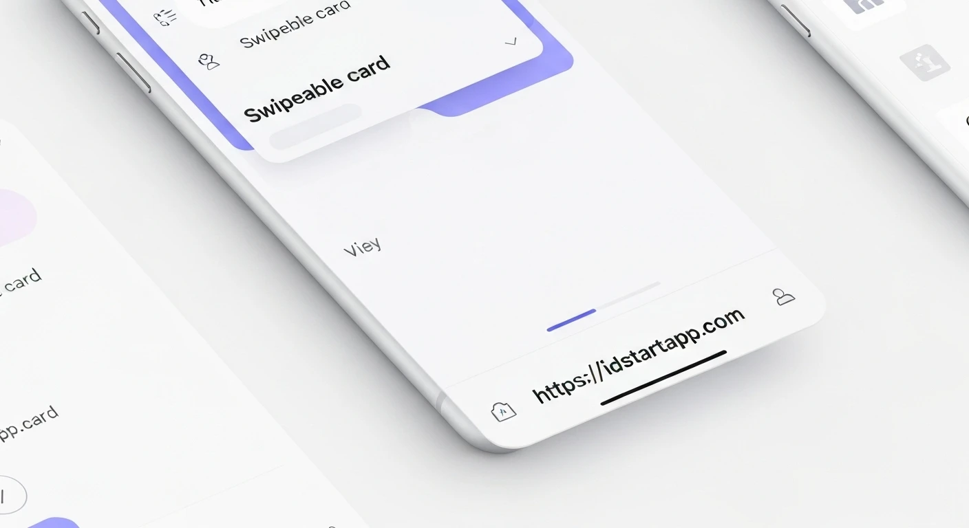

Building Swipeable Cards in Flutter
Swipeable cards have become a ubiquitous UI pattern, offering an intuitive and engaging way for users to interact with content. From task management applications where items can be swiped to complete or delete, to "like/dislike" interfaces popularized by dating apps, their utility spans a wide range of applications. In Flutter, creating such an experience is remarkably straightforward, leveraging the framework's powerful widget system and animation capabilities. This article will guide you through implementing swipeable cards using Flutter, focusing primarily on the highly effective Dismissible widget.
Understanding the Core Concept: The Dismissible Widget
For scenarios where you want to allow users to "swipe away" an item, either to remove it, archive it, or trigger a specific action, Flutter's Dismissible widget is the perfect tool. It simplifies the process by handling the gestures, animations, and providing callbacks for when an item is dismissed.
Key properties of the Dismissible widget include:
key: A unique key is absolutely crucial forDismissibleto correctly identify and manage its state within a list.child: The widget that the user can swipe.background: The widget displayed behind the child when it's swiped in the primary direction (typically right or down).secondaryBackground: The widget displayed behind the child when it's swiped in the secondary direction (typically left or up).onDismissed: A callback function triggered when the child has been completely swiped away. This is where you'll typically remove the item from your data model.direction: Specifies the allowed swipe directions (e.g.,DismissDirection.endToStart,DismissDirection.startToEnd,DismissDirection.horizontal,DismissDirection.vertical).
Step-by-Step Implementation
Let's create a simple Flutter application that displays a list of cards, each of which can be swiped away to reveal an action.
1. Project Setup
Start by creating a new Flutter project:
flutter create swipeable_cards_app
cd swipeable_cards_app
Replace the content of lib/main.dart with the following basic structure:
import 'package:flutter/material.dart';

void main() {
  runApp(const MyApp());
}

class MyApp extends StatelessWidget {
  const MyApp({super.key});

  @override
  Widget build(BuildContext context) {
    return MaterialApp(
      title: 'Swipeable Cards',
      theme: ThemeData(
        primarySwatch: Colors.blue,
        useMaterial3: true,
      ),
      home: const SwipeableCardsScreen(),
    );
  }
}

class SwipeableCardsScreen extends StatefulWidget {
  const SwipeableCardsScreen({super.key});

  @override
  State createState() => _SwipeableCardsScreenState();
}

class _SwipeableCardsScreenState extends State {
  // We'll manage our list of items here
  List items = List.generate(10, (i) => 'Item ${i + 1}');

  @override
  Widget build(BuildContext context) {
    return Scaffold(
      appBar: AppBar(
        title: const Text('Swipeable Cards'),
      ),
      body: ListView.builder(
        itemCount: items.length,
        itemBuilder: (context, index) {
          final item = items[index];
          // Dismissible widget will be placed here
          return const SizedBox.shrink(); // Placeholder for now
        },
      ),
    );
  }
}
2. Integrating the Dismissible Widget
Now, let's wrap each list item with a Dismissible widget inside our ListView.builder. We'll also define the background widgets that appear during the swipe.
import 'package:flutter/material.dart';

void main() {
  runApp(const MyApp());
}

class MyApp extends StatelessWidget {
  const MyApp({super.key});

  @override
  Widget build(BuildContext context) {
    return MaterialApp(
      title: 'Swipeable Cards',
      theme: ThemeData(
        primarySwatch: Colors.blue,
        useMaterial3: true,
      ),
      home: const SwipeableCardsScreen(),
    );
  }
}

class SwipeableCardsScreen extends StatefulWidget {
  const SwipeableCardsScreen({super.key});

  @override
  State createState() => _SwipeableCardsScreenState();
}

class _SwipeableCardsScreenState extends State {
  List items = List.generate(10, (i) => 'Item ${i + 1}');

  @override
  Widget build(BuildContext context) {
    return Scaffold(
      appBar: AppBar(
        title: const Text('Swipeable Cards'),
      ),
      body: ListView.builder(
        itemCount: items.length,
        itemBuilder: (context, index) {
          final item = items[index];
          return Dismissible(
            key: Key(item), // Unique key for each item
            direction: DismissDirection.horizontal, // Allow swiping both ways
            background: Container(
              color: Colors.green,
              alignment: Alignment.centerLeft,
              padding: const EdgeInsets.symmetric(horizontal: 20),
              child: const Icon(Icons.check, color: Colors.white),
            ),
            secondaryBackground: Container(
              color: Colors.red,
              alignment: Alignment.centerRight,
              padding: const EdgeInsets.symmetric(horizontal: 20),
              child: const Icon(Icons.delete, color: Colors.white),
            ),
            onDismissed: (direction) {
              // IMPORTANT: Remove the item from your data source
              setState(() {
                items.removeAt(index);
              });

              ScaffoldMessenger.of(context).showSnackBar(
                SnackBar(
                  content: Text(
                    '$item ${direction == DismissDirection.startToEnd ? "completed" : "deleted"}',
                  ),
                  action: SnackBarAction(
                    label: 'UNDO',
                    onPressed: () {
                      // Implement robust undo logic if needed
                      // For a simple demo, we re-insert the item.
                      // In a real app, you'd want to store the item and its original index.
                      setState(() {
                        items.insert(index, item);
                      });
                    },
                  ),
                ),
              );
            },
            child: Card(
              margin: const EdgeInsets.symmetric(vertical: 4, horizontal: 8),
              child: ListTile(
                title: Text(item),
                subtitle: const Text('Swipe me left or right!'),
                contentPadding: const EdgeInsets.symmetric(horizontal: 16, vertical: 8),
              ),
            ),
          );
        },
      ),
    );
  }
}
Explanation of the Code:
List: This list holds our data. When an item is dismissed, we remove it from this list.items Key(item): EveryDismissiblewidget requires a unique key. UsingKey(item)is a common and effective way if your item identifiers are unique strings.direction: DismissDirection.horizontal: This allows the user to swipe the card either from left to right or from right to left.backgroundandsecondaryBackground: These widgets are displayed underneath the card as it's being swiped. We've set a green background with a check icon for swiping right (DismissDirection.startToEnd) and a red background with a delete icon for swiping left (DismissDirection.endToStart).onDismissed: This callback is invoked when the swipe animation completes and the card is no longer visible.- Inside
setState(() { items.removeAt(index); });, we update our data model. This call is crucial as it rebuilds theListView.builderand effectively removes the card from the UI. - A
SnackBaris shown to provide feedback to the user and also demonstrate a simple "UNDO" action. Note that a robust undo would require more complex state management, typically involving storing the removed item and its original index temporarily.
- Inside
child: Card(...): This is the actual UI of our card that the user interacts with.
Further Enhancements and Considerations
- Custom Animations & Stacking: For more complex swiping behaviors (e.g., a Tinder-like stack of cards where the top card can be swiped to reveal the one beneath, with custom rotation or scaling), you might use
GestureDetectorcombined withAnimatedPositionedorTransform.translatefor finer control over the animation and card stacking. - Confirmation Dialogs: For destructive actions (like permanent deletion), you might want to show a confirmation dialog before permanently removing the item. This can be integrated into the
onDismissedcallback before callingsetState. - Drag Thresholds: The
Dismissiblewidget offers properties likedismissThresholdsto customize how far a user must swipe before the card is considered dismissed for a given direction. - Accessibility: Ensure your swipe actions are clearly indicated and alternative actions (e.g., a context menu on long press) are provided for users who might not be able to perform swipe gestures or prefer other interaction methods.
Conclusion
Flutter's Dismissible widget provides a powerful and easy-to-use solution for implementing swipeable cards, handling much of the underlying gesture detection and animation boilerplate. By understanding its key properties and integrating it correctly with your application's state management, you can quickly build highly interactive and engaging user interfaces. Whether for simple list item dismissals or more dynamic interactive elements, swipeable cards add a layer of dynamism that users appreciate.


