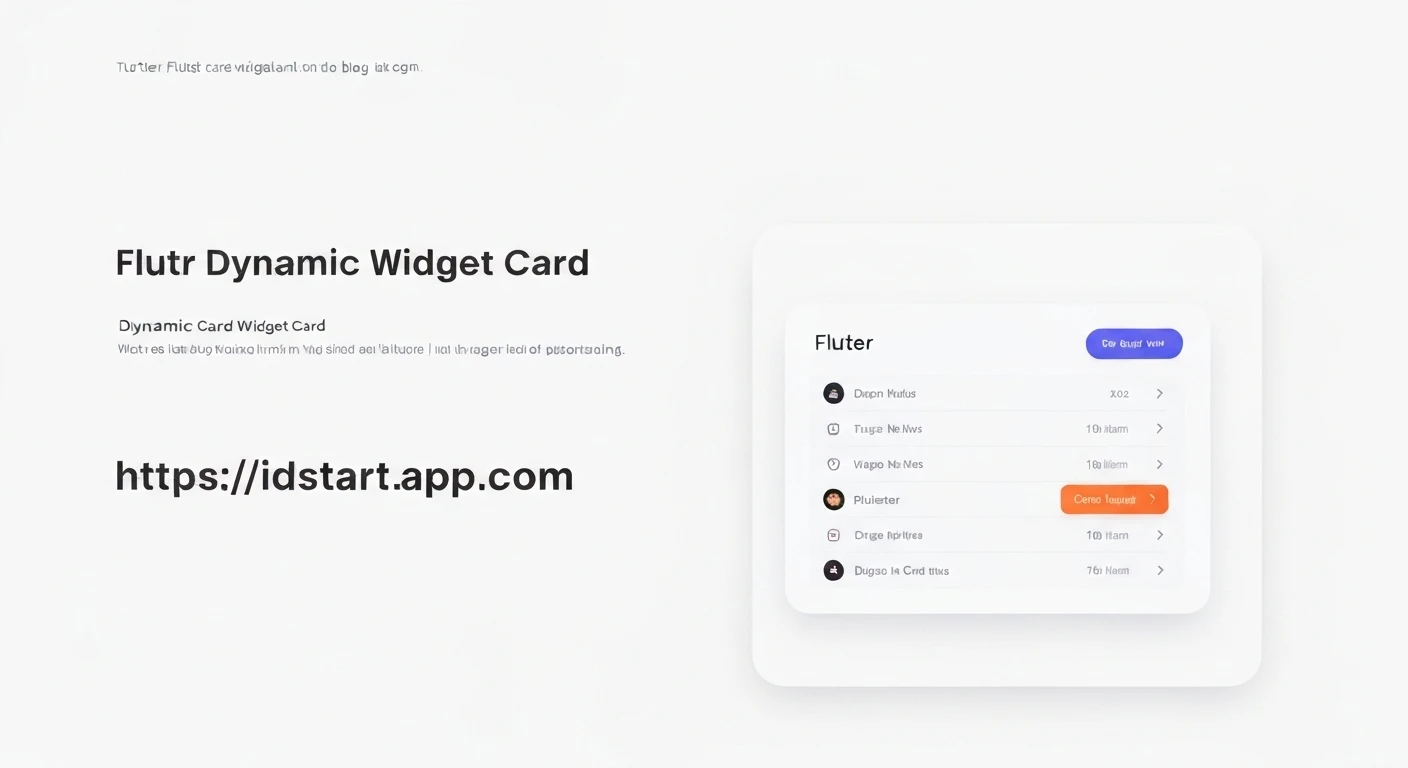

Creating Dynamic Card Widgets in Flutter
Card widgets are a fundamental UI component in modern mobile applications, used to display content in a clear, concise, and aesthetically pleasing manner. In Flutter, creating a single Card is straightforward. However, the real power comes from dynamically generating a list of cards based on varying data. This article will guide you through the process of building dynamic card widgets in Flutter, allowing your application to display flexible and data-driven UIs.
Prerequisites
To follow along with this tutorial, you should have a basic understanding of Flutter development, including widgets, state management (even if minimal), and Dart programming.
Understanding the Core Concept
The key to dynamic UI in Flutter is leveraging widgets that build their children on demand, such as ListView.builder or GridView.builder. Instead of creating each card manually, we define a single card template and then provide a list of data. Flutter then efficiently builds a card for each item in the data list, only rendering what's visible on screen.
Defining a Data Model
Before we build our cards, let's define a simple Dart class to represent the data each card will display. For example, a card might represent an item with a title, description, and an image URL.
class Item {
  final String title;
  final String description;
  final String imageUrl;

  Item({required this.title, required this.description, required this.imageUrl});
}
Creating a Custom Card Widget
It's good practice to encapsulate the design of your card into its own custom widget. This makes your code more organized and reusable. Let's create a CustomItemCard widget that takes an Item object as input.
import 'package:flutter/material.dart';

// Assuming Item class is defined as above

class CustomItemCard extends StatelessWidget {
  final Item item;
  final VoidCallback? onTap; // Optional tap handler

  const CustomItemCard({Key? key, required this.item, this.onTap}) : super(key: key);

  @override
  Widget build(BuildContext context) {
    return Card(
      margin: const EdgeInsets.symmetric(horizontal: 16.0, vertical: 8.0),
      elevation: 4.0,
      shape: RoundedRectangleBorder(borderRadius: BorderRadius.circular(12.0)),
      child: InkWell( // Use InkWell for tap effects
        onTap: onTap,
        borderRadius: BorderRadius.circular(12.0),
        child: Padding(
          padding: const EdgeInsets.all(16.0),
          child: Column(
            crossAxisAlignment: CrossAxisAlignment.start,
            children: [
              // Display image if available
              if (item.imageUrl.isNotEmpty)
                ClipRRect(
                  borderRadius: BorderRadius.circular(8.0),
                  child: Image.network(
                    item.imageUrl,
                    height: 150,
                    width: double.infinity,
                    fit: BoxFit.cover,
                    errorBuilder: (context, error, stackTrace) => Container(
                      height: 150,
                      color: Colors.grey[200],
                      child: const Center(child: Icon(Icons.broken_image)),
                    ),
                  ),
                ),
              if (item.imageUrl.isNotEmpty) const SizedBox(height: 12.0),
              Text(
                item.title,
                style: const TextStyle(
                  fontSize: 20.0,
                  fontWeight: FontWeight.bold,
                ),
              ),
              const SizedBox(height: 8.0),
              Text(
                item.description,
                style: TextStyle(
                  fontSize: 16.0,
                  color: Colors.grey[700],
                ),
                maxLines: 2,
                overflow: TextOverflow.ellipsis,
              ),
            ],
          ),
        ),
      ),
    );
  }
}
Building the Dynamic Card List
Now, let's put it all together. We'll create a StatefulWidget (or StatelessWidget if the data is static) that holds a list of Item objects and uses ListView.builder to render our CustomItemCard widgets.
import 'package:flutter/material.dart';
// Import CustomItemCard and Item classes from their respective files if separate
class DynamicCardScreen extends StatefulWidget {
const DynamicCardScreen({Key? key}) : super(key: key);
@override
State createState() => _DynamicCardScreenState();
}
class _DynamicCardScreenState extends State {
// Sample data for our cards
final List- _items = [
Item(
title: 'Flutter Widget Basics',
description: 'Learn the fundamental widgets like Container, Row, Column, and Text.',
imageUrl: 'https://via.placeholder.com/600x400/0000FF/FFFFFF?text=Flutter+Widgets',
),
Item(
title: 'State Management in Flutter',
description: 'Explore various state management solutions like Provider, BLoC, and Riverpod.',
imageUrl: 'https://via.placeholder.com/600x400/FF0000/FFFFFF?text=State+Management',
),
Item(
title: 'Flutter Animations',
description: 'Dive into explicit and implicit animations to create beautiful UIs.',
imageUrl: 'https://via.placeholder.com/600x400/00FF00/FFFFFF?text=Animations',
),
Item(
title: 'Networking with Flutter',
description: 'How to make API calls using http package or Dio.',
imageUrl: 'https://via.placeholder.com/600x400/FFFF00/000000?text=Networking',
),
Item(
title: 'Database Integration',
description: 'Integrate local databases like SQLite or remote services like Firebase.',
imageUrl: 'https://via.placeholder.com/600x400/800080/FFFFFF?text=Database',
),
];
@override
Widget build(BuildContext context) {
return Scaffold(
appBar: AppBar(
title: const Text('Dynamic Cards'),
),
body: ListView.builder(
itemCount: _items.length,
itemBuilder: (context, index) {
final item = _items[index];
return CustomItemCard(
item: item,
onTap: () {
// Handle card tap event
ScaffoldMessenger.of(context).showSnackBar(
SnackBar(content: Text('Tapped on: ${item.title}')),
);
},
);
},
),
);
}
}
Integrating into a Flutter App
To see this in action, simply set DynamicCardScreen as the home widget in your MaterialApp:
import 'package:flutter/material.dart';
// Import DynamicCardScreen, CustomItemCard, and Item from their files

void main() {
  runApp(const MyApp());
}

class MyApp extends StatelessWidget {
  const MyApp({Key? key}) : super(key: key);

  @override
  Widget build(BuildContext context) {
    return MaterialApp(
      title: 'Dynamic Cards Demo',
      theme: ThemeData(
        primarySwatch: Colors.blue,
        visualDensity: VisualDensity.adaptivePlatformDensity,
      ),
      home: const DynamicCardScreen(),
    );
  }
}
Further Customization and Best Practices
- Asynchronous Data: In a real-world application, your data will likely come from an API or database. You would fetch this data asynchronously (e.g., using
FutureBuilderorStreamBuilder) and then update the_itemslist usingsetState. - Error Handling: Implement robust error handling for image loading and data fetching.
- Loading States: Display loading indicators (e.g.,
CircularProgressIndicator) while data is being fetched. - Pagination/Infinite Scrolling: For very large datasets, consider implementing pagination or infinite scrolling with
ListView.builderto load data incrementally. - Gestures: Enhance your cards with more interactive gestures like swipe-to-dismiss using
Dismissiblewidget. - Theme Awareness: Ensure your card design respects the application's overall theme and supports dark mode.
- Performance: For complex cards, consider using
constconstructors where possible and optimizing your build methods to minimize rebuilds.
Conclusion
Creating dynamic card widgets in Flutter is a fundamental skill for building responsive and data-driven user interfaces. By defining a clear data model, encapsulating card design into a reusable widget, and leveraging ListView.builder, you can efficiently display lists of information that adapt to your application's data. This approach not only improves code maintainability but also ensures optimal performance by only rendering visible elements. Start experimenting with different data sources and card layouts to unlock the full potential of dynamic UIs in your Flutter applications!


