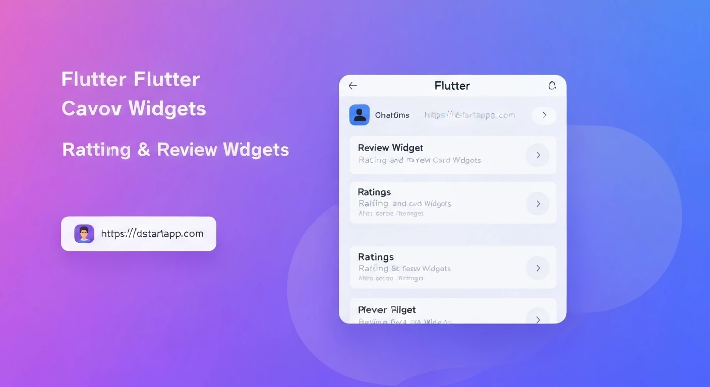

Building a Rating & Review Card Widget in Flutter
In modern applications, displaying user feedback like ratings and reviews is crucial for building trust and guiding potential users. A well-designed rating and review card not only presents this information clearly but also enhances the overall user experience. This article will guide you through creating a reusable and professional rating and review card widget in Flutter.
Understanding the Core Components
A typical rating and review card consists of several key elements:
- User Information: Avatar (optional), name of the reviewer.
- Rating: A visual representation of the rating, typically using stars.
- Review Text: The actual written feedback from the user.
- Timestamp: When the review was submitted.
- Card Container: A visually distinct container to hold all these elements, often with elevation.
Step-by-Step Implementation in Flutter
1. Defining the Review Data Model
First, let's create a simple Dart class to represent our review data. This makes it easier to pass review information around your application.
class Review {
  final String reviewerName;
  final double rating;
  final String reviewText;
  final DateTime timestamp;
  final String? reviewerAvatarUrl; // Optional

  Review({
    required this.reviewerName,
    required this.rating,
    required this.reviewText,
    required this.timestamp,
    this.reviewerAvatarUrl,
  });
}
2. Creating a Star Rating Widget
Next, we'll build a dedicated widget to display the star rating. This widget will take a double value (e.g., 4.5) and render corresponding filled and half-filled stars.
import 'package:flutter/material.dart';

class StarRating extends StatelessWidget {
  final double rating;
  final int starCount;
  final double starSize;
  final Color color;

  const StarRating({
    Key? key,
    this.rating = 0.0,
    this.starCount = 5,
    this.starSize = 20.0,
    this.color = Colors.amber,
  }) : assert(rating >= 0 && rating <= starCount), super(key: key);

  Widget buildStar(BuildContext context, int index) {
    Icon icon;
    if (index >= rating) {
      icon = Icon(
        Icons.star_border,
        color: color,
        size: starSize,
      );
    } else if (index > rating - 1 && index < rating) {
      icon = Icon(
        Icons.star_half,
        color: color,
        size: starSize,
      );
    } else {
      icon = Icon(
        Icons.star,
        color: color,
        size: starSize,
      );
    }
    return icon;
  }

  @override
  Widget build(BuildContext context) {
    return Row(
      mainAxisSize: MainAxisSize.min,
      children: List.generate(
        starCount,
        (index) => buildStar(context, index),
      ),
    );
  }
}
3. Building the Review Card Widget
Now, let's combine all the components into our main ReviewCard widget. We'll use Flutter's Card, Column, and Row widgets for layout.
import 'package:flutter/material.dart';
import 'package:intl/intl.dart'; // For date formatting, add intl to pubspec.yaml

// Ensure your StarRating and Review model are imported or defined in the same file.
// import 'star_rating.dart';
// import 'review_model.dart';

class ReviewCard extends StatelessWidget {
  final Review review;
  final EdgeInsetsGeometry padding;
  final double cardElevation;
  final Color? cardColor;
  final BorderRadiusGeometry? borderRadius;

  const ReviewCard({
    Key? key,
    required this.review,
    this.padding = const EdgeInsets.all(16.0),
    this.cardElevation = 2.0,
    this.cardColor,
    this.borderRadius,
  }) : super(key: key);

  @override
  Widget build(BuildContext context) {
    final dateFormat = DateFormat('MMM dd, yyyy'); // Example format

    return Card(
      elevation: cardElevation,
      color: cardColor,
      shape: RoundedRectangleBorder(
        borderRadius: borderRadius ?? BorderRadius.circular(8.0),
      ),
      margin: const EdgeInsets.symmetric(vertical: 8.0),
      child: Padding(
        padding: padding,
        child: Column(
          crossAxisAlignment: CrossAxisAlignment.start,
          children: [
            Row(
              children: [
                if (review.reviewerAvatarUrl != null)
                  Padding(
                    padding: const EdgeInsets.only(right: 8.0),
                    child: CircleAvatar(
                      backgroundImage: NetworkImage(review.reviewerAvatarUrl!),
                      radius: 20,
                    ),
                  )
                else
                  Padding(
                    padding: const EdgeInsets.only(right: 8.0),
                    child: CircleAvatar(
                      backgroundColor: Theme.of(context).primaryColor,
                      child: Text(
                        review.reviewerName[0].toUpperCase(),
                        style: const TextStyle(color: Colors.white),
                      ),
                      radius: 20,
                    ),
                  ),
                Expanded(
                  child: Column(
                    crossAxisAlignment: CrossAxisAlignment.start,
                    children: [
                      Text(
                        review.reviewerName,
                        style: Theme.of(context).textTheme.titleMedium,
                        overflow: TextOverflow.ellipsis,
                      ),
                      Text(
                        dateFormat.format(review.timestamp),
                        style: Theme.of(context).textTheme.bodySmall,
                      ),
                    ],
                  ),
                ),
                StarRating(
                  rating: review.rating,
                  starSize: 18.0,
                ),
              ],
            ),
            const SizedBox(height: 12.0),
            Text(
              review.reviewText,
              style: Theme.of(context).textTheme.bodyMedium,
            ),
          ],
        ),
      ),
    );
  }
}
Note: To use DateFormat, add the intl package to your pubspec.yaml:
dependencies:
  flutter:
    sdk: flutter
  intl: ^0.18.0 # Use the latest version
4. Integrating and Displaying the Widget
Finally, let's see how to use our ReviewCard widget in a Flutter application. You can display a single card or a list of cards.
import 'package:flutter/material.dart';
// Make sure to import your Review and ReviewCard classes
// import 'review_model.dart';
// import 'review_card.dart';

class ReviewListPage extends StatelessWidget {
  final List<Review> sampleReviews = [
    Review(
      reviewerName: 'Alice Johnson',
      rating: 4.5,
      reviewText: 'Great product! Very satisfied with the quality and delivery time.',
      timestamp: DateTime(2023, 10, 26, 14, 30),
      reviewerAvatarUrl: 'https://picsum.photos/id/1005/200/200',
    ),
    Review(
      reviewerName: 'Bob Williams',
      rating: 5.0,
      reviewText: 'Absolutely fantastic! Exceeded my expectations. Highly recommend.',
      timestamp: DateTime(2023, 10, 25, 10, 00),
      reviewerAvatarUrl: 'https://picsum.photos/id/1025/200/200',
    ),
    Review(
      reviewerName: 'Charlie Brown',
      rating: 3.0,
      reviewText: 'It\'s okay, could be better. The instructions were a bit unclear.',
      timestamp: DateTime(2023, 10, 24, 18, 15),
    ),
  ];

  @override
  Widget build(BuildContext context) {
    return Scaffold(
      appBar: AppBar(
        title: const Text('Product Reviews'),
      ),
      body: ListView.builder(
        padding: const EdgeInsets.all(8.0),
        itemCount: sampleReviews.length,
        itemBuilder: (context, index) {
          return ReviewCard(review: sampleReviews[index]);
        },
      ),
    );
  }
}

// To run this example, typically in your main.dart:
// void main() {
//   runApp(MaterialApp(
//     home: ReviewListPage(),
//   ));
// }
Customization and Best Practices
- Theming: Leverage Flutter's theming capabilities (
Theme.of(context)) for text styles, colors, and other design elements to ensure consistency across your app. - Responsiveness: Use
Expanded,Flexible, and appropriate paddings to ensure your card looks good on different screen sizes. The current design is fairly responsive. - Dynamic Data: In a real application, you would fetch review data from an API or local database. Your
ReviewListPagewould then use aFutureBuilderor a state management solution (like Provider, Riverpod, BLoC) to display the data dynamically. - Accessibility: Ensure sufficient contrast for text and consider providing semantic labels if complex interactions are added later.
- Error Handling: For avatar URLs, implement a fallback mechanism (e.g., a default user icon) in case the image fails to load.
- Interaction: You might want to add functionality like "report review" or "like review" which can be implemented by adding buttons or gestures within the card.
Conclusion
You have now successfully created a robust and reusable Rating & Review Card widget in Flutter. By separating concerns into a data model, a star rating widget, and the main review card, you've built a modular and maintainable component. This widget can be easily integrated into any part of your application to display valuable user feedback, significantly enhancing the credibility and user engagement of your product.


