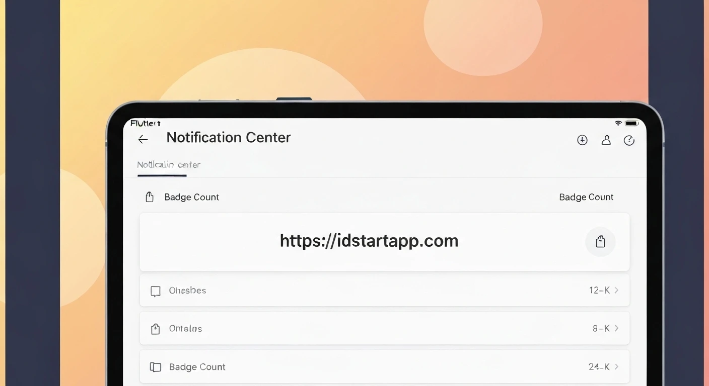

Creating a Notification Center Widget with Badge Count in Flutter
Introduction
In modern mobile applications, a notification center with an unread badge count is a ubiquitous feature. It serves as a crucial mechanism to keep users informed about new activities, messages, or updates, enhancing engagement and providing a clear call to action. Implementing such a feature in Flutter involves combining UI elements, state management, and an understanding of how to dynamically update visual components.
This article will guide you through the process of building a robust and customizable Notification Center widget in Flutter, complete with a dynamic badge count that reflects the number of unread notifications.
Core Components and Challenges
A typical notification badge comprises two main visual elements: a base icon (e.g., a bell or an envelope) and a small overlay (the badge) displaying a number or an indicator. The primary challenges in building this widget efficiently include:
- Visual Overlay: Precisely positioning the badge over the main icon.
- Dynamic Count: Updating the number displayed on the badge in real-time.
- State Management: Managing the global or local state of unread notifications to trigger UI updates.
- Edge Cases: Handling zero notifications (hiding the badge), large counts (e.g., "99+"), and styling consistency.
Step-by-Step Implementation
1. Basic Notification Icon
First, let's start with a simple icon that will serve as the base for our notification widget.
import 'package:flutter/material.dart';

class BasicNotificationIcon extends StatelessWidget {
  @override
  Widget build(BuildContext context) {
    return Icon(
      Icons.notifications,
      size: 24.0,
      color: Colors.white,
    );
  }
}
This widget simply displays a bell icon. Now, we need to add the badge on top of it.
2. Adding the Badge Count
To place the badge count on top of our icon, we'll use Flutter's Stack widget. The Stack widget allows us to layer multiple widgets on top of each other. We'll use a Positioned widget to accurately place the badge.
import 'package:flutter/material.dart';

class NotificationBadge extends StatelessWidget {
  final int notificationCount;
  final Color badgeColor;
  final Color textColor;
  final double badgeSize;
  final double iconSize;

  const NotificationBadge({
    Key? key,
    required this.notificationCount,
    this.badgeColor = Colors.red,
    this.textColor = Colors.white,
    this.badgeSize = 18.0,
    this.iconSize = 24.0,
  }) : super(key: key);

  @override
  Widget build(BuildContext context) {
    return Stack(
      children: [
        Icon(
          Icons.notifications,
          size: iconSize,
          color: Colors.white, // Or a dynamic color based on context
        ),
        if (notificationCount > 0)
          Positioned(
            right: 0,
            top: 0,
            child: Container(
              padding: EdgeInsets.all(notificationCount > 9 ? 1 : 3), // Adjust padding for double/triple digits
              decoration: BoxDecoration(
                color: badgeColor,
                borderRadius: BorderRadius.circular(badgeSize / 2),
                border: Border.all(color: Colors.white, width: 1), // Optional: border for better visibility
              ),
              constraints: BoxConstraints(
                minWidth: badgeSize,
                minHeight: badgeSize,
              ),
              child: Text(
                notificationCount > 99 ? '99+' : notificationCount.toString(),
                style: TextStyle(
                  color: textColor,
                  fontSize: badgeSize * 0.6, // Adjust font size relative to badge
                  fontWeight: FontWeight.bold,
                ),
                textAlign: TextAlign.center,
              ),
            ),
          )
      ],
    );
  }
}
In this enhanced NotificationBadge widget:
- We use
Stackto layer the icon and the badge. Positionedplaces the badge at the top-right corner of the icon.- The badge itself is a
Containerwith a circularBorderRadius, a background color, and padding. - We check
if (notificationCount > 0)to only display the badge when there are unread notifications. - For counts over 99, we display "99+" to keep the badge compact.
- Customization options for colors and sizes are added for flexibility.
3. Managing Notification State
To make the badge count dynamic, we need a way to manage the state of unread notifications across our application. For this, we'll use a state management solution. While various options exist (Provider, Riverpod, BLoC, GetX), we'll demonstrate using Provider, a widely adopted solution based on ChangeNotifier.
First, define a ChangeNotifier class to hold and manage the notification count:
import 'package:flutter/material.dart';

class NotificationService extends ChangeNotifier {
  int _unreadNotifications = 0;

  int get unreadNotifications => _unreadNotifications;

  void incrementNotificationCount() {
    _unreadNotifications++;
    notifyListeners(); // Notifies listeners that the state has changed
  }

  void decrementNotificationCount() {
    if (_unreadNotifications > 0) {
      _unreadNotifications--;
      notifyListeners();
    }
  }

  void resetNotificationCount() {
    _unreadNotifications = 0;
    notifyListeners();
  }

  // In a real application, this might be called after fetching notifications from an API
  void setNotificationCount(int count) {
    if (count >= 0) {
      _unreadNotifications = count;
      notifyListeners();
    }
  }
}
The NotificationService holds the _unreadNotifications count and provides methods to modify it. Crucially, notifyListeners() is called whenever the count changes, which tells any listening widgets to rebuild.
4. Integrating with Provider
Now, we'll integrate the NotificationService into our Flutter app using Provider. This involves making the service available to the widget tree and then consuming it in our NotificationBadge.
import 'package:flutter/material.dart';
import 'package:provider/provider.dart';

// Assume NotificationBadge and NotificationService classes are defined above

void main() {
  runApp(
    // Wrap the entire app with ChangeNotifierProvider to make NotificationService available
    ChangeNotifierProvider(
      create: (context) => NotificationService(),
      child: MyApp(),
    ),
  );
}

class MyApp extends StatelessWidget {
  @override
  Widget build(BuildContext context) {
    return MaterialApp(
      title: 'Notification Center Demo',
      theme: ThemeData(
        primarySwatch: Colors.blue,
        visualDensity: VisualDensity.adaptivePlatformDensity,
      ),
      home: HomePage(),
    );
  }
}

class HomePage extends StatelessWidget {
  @override
  Widget build(BuildContext context) {
    // We can directly access the service for actions
    final notificationService = Provider.of(context, listen: false);

    return Scaffold(
      appBar: AppBar(
        title: Text('Notification Demo'),
        actions: [
          Padding(
            padding: const EdgeInsets.only(right: 16.0, top: 8.0),
            child: GestureDetector(
              onTap: () {
                print('Notification icon tapped!');
                // Example: When the icon is tapped, reset the notification count
                notificationService.resetNotificationCount();
                // In a real app, this would navigate to a detailed notification list
              },
              child: Consumer(
                builder: (context, service, child) {
                  // Consumer listens for changes in NotificationService
                  return NotificationBadge(
                    notificationCount: service.unreadNotifications,
                  );
                },
              ),
            ),
          ),
        ],
      ),
      body: Center(
        child: Column(
          mainAxisAlignment: MainAxisAlignment.center,
          children: [
            // Display the current count
            Consumer(
              builder: (context, service, child) {
                return Text(
                  'Unread Notifications: ${service.unreadNotifications}',
                  style: TextStyle(fontSize: 20, fontWeight: FontWeight.bold),
                );
              },
            ),
            SizedBox(height: 30),
            ElevatedButton(
              onPressed: () {
                notificationService.incrementNotificationCount();
              },
              child: Text('Add New Notification'),
            ),
            SizedBox(height: 10),
            ElevatedButton(
              onPressed: () {
                notificationService.decrementNotificationCount();
              },
              child: Text('Mark One as Read'),
            ),
            SizedBox(height: 10),
            ElevatedButton(
              onPressed: () {
                notificationService.setNotificationCount(5); // Example: Set specific count
              },
              child: Text('Set Count to 5'),
            ),
          ],
        ),
      ),
    );
  }
}
Explanation of the integration:
- The
main()function wraps theMyAppwithChangeNotifierProvider, making an instance ofNotificationServiceavailable to all widgets below it. - In
HomePage, we useConsumerto listen for changes in theNotificationService. WhennotifyListeners()is called, theConsumer's builder function rebuilds, updating theNotificationBadgeand the text display. Provider.ofis used when we only need to call methods on the service (e.g.,(context, listen: false) incrementNotificationCount()) and do not need the widget to rebuild when the state changes.- We've added some buttons to easily test the notification count updates.
- A
GestureDetectoris wrapped around the badge to allow for tap interactions, such as navigating to a notification list and clearing the badge.
Best Practices and Considerations
- Accessibility: Ensure that the badge count is readable and that the notification icon has an appropriate semantic label for screen readers.
- Performance: Using
Consumerorcontext.select(with Provider) ensures that only the relevant parts of the widget tree rebuild when the notification count changes, preventing unnecessary UI updates. - Backend Integration: In a real-world application, the
NotificationServicewould typically fetch the unread count from a backend API (e.g., via WebSockets for real-time updates or polling at intervals) and then callsetNotificationCount(). - User Experience: Consider adding subtle animations when the badge count changes or appears/disappears to make the UI more engaging. Ensure the badge is visually distinct but doesn't obscure the main icon.
- Customization: Offer various styling options (colors, shapes, sizes) to match your app's design language.
- Thresholds: Decide on a maximum displayed number (e.g., "99+") to prevent the badge from becoming too wide for very large counts.
Conclusion
Building a Notification Center widget with a badge count in Flutter is a straightforward process when broken down into its core components: a UI layer (using Stack and Positioned), and a state management layer (like Provider with ChangeNotifier) to handle dynamic updates. By following these steps, you can create a flexible, efficient, and user-friendly notification system that significantly improves the overall experience of your Flutter application.


