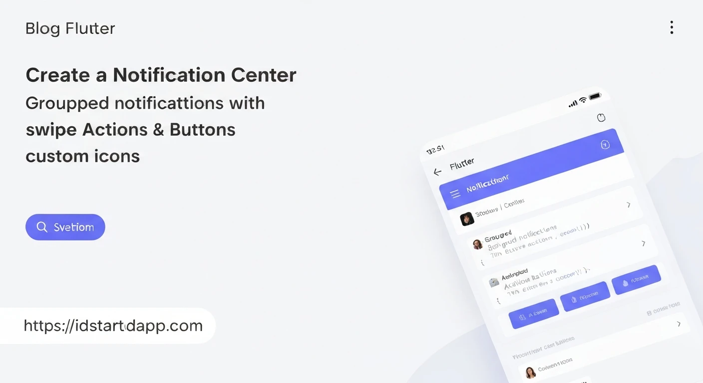

Crafting Notification Center Widgets with Grouped, Swipe, Action Buttons, and Custom Icons in Flutter
Introduction
Modern mobile applications rely heavily on effective notification systems to keep users engaged and informed. A robust notification center widget in Flutter not only displays alerts but also provides interactive features like grouping, swipe actions, and quick action buttons, all enhanced with custom iconography. This article delves into building such a sophisticated notification center widget, empowering developers to create intuitive and highly functional user interfaces.
The Core Notification Widget Structure
Before implementing advanced features, let's establish a basic structure for a single notification item. This will serve as the foundation upon which we add grouping, swipe gestures, and action buttons.
import 'package:flutter/material.dart';

class NotificationItem extends StatelessWidget {
  final String title;
  final String message;
  final String? iconAssetPath;
  final VoidCallback? onTap;

  const NotificationItem({
    Key? key,
    required this.title,
    required this.message,
    this.iconAssetPath,
    this.onTap,
  }) : super(key: key);

  @override
  Widget build(BuildContext context) {
    return Card(
      margin: const EdgeInsets.symmetric(horizontal: 16.0, vertical: 4.0),
      elevation: 2,
      child: InkWell(
        onTap: onTap,
        child: Padding(
          padding: const EdgeInsets.all(12.0),
          child: Row(
            crossAxisAlignment: CrossAxisAlignment.start,
            children: [
              if (iconAssetPath != null)
                Padding(
                  padding: const EdgeInsets.only(right: 12.0),
                  child: Image.asset(
                    iconAssetPath!,
                    width: 32,
                    height: 32,
                  ),
                )
              else
                const Padding(
                  padding: EdgeInsets.only(right: 12.0),
                  child: Icon(Icons.notifications, size: 32),
                ),
              Expanded(
                child: Column(
                  crossAxisAlignment: CrossAxisAlignment.start,
                  children: [
                    Text(
                      title,
                      style: const TextStyle(
                        fontWeight: FontWeight.bold,
                        fontSize: 16,
                      ),
                    ),
                    const SizedBox(height: 4),
                    Text(
                      message,
                      style: const TextStyle(fontSize: 14),
                    ),
                  ],
                ),
              ),
            ],
          ),
        ),
      ),
    );
  }
}
Implementing Grouped Notifications
Grouped notifications consolidate multiple related alerts under a single heading, reducing clutter and improving readability. This can be achieved by structuring your data and then rendering a header followed by individual notification items, often within a common container to visually reinforce the grouping.
First, define a data structure for a notification group:
class NotificationGroupData {
  final String groupTitle;
  final List notifications;

  NotificationGroupData({
    required this.groupTitle,
    required this.notifications,
  });
}

class NotificationData {
  final String id;
  final String title;
  final String message;
  final String? iconAssetPath;
  final List? actions;

  NotificationData({
    required this.id,
    required this.title,
    required this.message,
    this.iconAssetPath,
    this.actions,
  });
}

class NotificationAction {
  final String label;
  final VoidCallback onPressed;

  NotificationAction({
    required this.label,
    required this.onPressed,
  });
}
Now, let's create a widget that displays a group:
import 'package:flutter/material.dart';

// Assuming NotificationItem, NotificationData, NotificationAction are defined

class NotificationGroupWidget extends StatelessWidget {
  final NotificationGroupData groupData;
  final Function(String notificationId)? onNotificationDismissed;

  const NotificationGroupWidget({
    Key? key,
    required this.groupData,
    this.onNotificationDismissed,
  }) : super(key: key);

  @override
  Widget build(BuildContext context) {
    return Column(
      crossAxisAlignment: CrossAxisAlignment.start,
      children: [
        Padding(
          padding: const EdgeInsets.fromLTRB(20.0, 16.0, 16.0, 8.0),
          child: Text(
            groupData.groupTitle,
            style: const TextStyle(
              fontSize: 18,
              fontWeight: FontWeight.bold,
              color: Colors.blueGrey,
            ),
          ),
        ),
        ...groupData.notifications.map((notification) {
          return NotificationItemWithActions(
            key: ValueKey(notification.id), // Key for Dismissible
            notification: notification,
            onDismissed: onNotificationDismissed,
          );
        }).toList(),
      ],
    );
  }
}
Adding Swipe-to-Dismiss and Swipe Actions
The Dismissible widget in Flutter provides a powerful way to implement swipe-to-dismiss functionality and reveal background actions. It requires a unique Key for each item.
import 'package:flutter/material.dart';

// Assuming NotificationItem and NotificationData are defined

class NotificationItemWithActions extends StatelessWidget {
  final NotificationData notification;
  final Function(String notificationId)? onDismissed;
  final VoidCallback? onTap;

  const NotificationItemWithActions({
    Key? key,
    required this.notification,
    this.onDismissed,
    this.onTap,
  }) : super(key: key);

  @override
  Widget build(BuildContext context) {
    return Dismissible(
      key: Key(notification.id), // Unique key is crucial
      direction: DismissDirection.horizontal,
      onDismissed: (direction) {
        onDismissed?.call(notification.id);
        // Optionally show a SnackBar or perform undo action
        ScaffoldMessenger.of(context).showSnackBar(
          SnackBar(
            content: Text('${notification.title} dismissed'),
            action: SnackBarAction(
              label: 'UNDO',
              onPressed: () {
                // Implement undo logic here
              },
            ),
          ),
        );
      },
      background: Container(
        color: Colors.red,
        alignment: Alignment.centerLeft,
        padding: const EdgeInsets.only(left: 20.0),
        child: const Icon(Icons.delete, color: Colors.white),
      ),
      secondaryBackground: Container(
        color: Colors.green,
        alignment: Alignment.centerRight,
        padding: const EdgeInsets.only(right: 20.0),
        child: const Icon(Icons.archive, color: Colors.white),
      ),
      child: NotificationItem(
        title: notification.title,
        message: notification.message,
        iconAssetPath: notification.iconAssetPath,
        onTap: onTap,
      ),
    );
  }
}
Integrating Action Buttons
Action buttons provide immediate interaction options directly within the notification item. These buttons are typically placed at the bottom of the notification, allowing users to take quick actions without navigating away.
Let's modify the NotificationItem to include a row of action buttons. For this, we'll create a dedicated widget that combines the base notification UI with optional action buttons.
import 'package:flutter/material.dart';

// Assuming NotificationData and NotificationAction are defined
// The base NotificationItem widget should remain for display purposes

class InteractiveNotificationCard extends StatelessWidget {
  final NotificationData notification;
  final VoidCallback? onNotificationTap;

  const InteractiveNotificationCard({
    Key? key,
    required this.notification,
    this.onNotificationTap,
  }) : super(key: key);

  @override
  Widget build(BuildContext context) {
    return Card(
      margin: const EdgeInsets.symmetric(horizontal: 16.0, vertical: 4.0),
      elevation: 2,
      child: Column(
        children: [
          InkWell(
            onTap: onNotificationTap,
            child: Padding(
              padding: const EdgeInsets.all(12.0),
              child: Row(
                crossAxisAlignment: CrossAxisAlignment.start,
                children: [
                  if (notification.iconAssetPath != null)
                    Padding(
                      padding: const EdgeInsets.only(right: 12.0),
                      child: Image.asset(
                        notification.iconAssetPath!,
                        width: 32,
                        height: 32,
                      ),
                    )
                  else
                    const Padding(
                      padding: EdgeInsets.only(right: 12.0),
                      child: Icon(Icons.notifications, size: 32),
                    ),
                  Expanded(
                    child: Column(
                      crossAxisAlignment: CrossAxisAlignment.start,
                      children: [
                        Text(
                          notification.title,
                          style: const TextStyle(
                            fontWeight: FontWeight.bold,
                            fontSize: 16,
                          ),
                        ),
                        const SizedBox(height: 4),
                        Text(
                          notification.message,
                          style: const TextStyle(fontSize: 14),
                        ),
                      ],
                    ),
                  ),
                ],
              ),
            ),
          ),
          if (notification.actions != null && notification.actions!.isNotEmpty)
            Container(
              padding: const EdgeInsets.symmetric(horizontal: 8.0, vertical: 4.0),
              decoration: BoxDecoration(
                border: Border(top: BorderSide(color: Colors.grey.shade200, width: 1.0)),
              ),
              child: Row(
                mainAxisAlignment: MainAxisAlignment.end,
                children: notification.actions!.map((action) {
                  return Padding(
                    padding: const EdgeInsets.symmetric(horizontal: 4.0),
                    child: TextButton(
                      onPressed: action.onPressed,
                      child: Text(action.label),
                    ),
                  );
                }).toList(),
              ),
            ),
        ],
      ),
    );
  }
}
Now, update NotificationItemWithActions to use InteractiveNotificationCard instead of NotificationItem:
import 'package:flutter/material.dart';

// Assuming NotificationData, NotificationAction, InteractiveNotificationCard are defined

class NotificationItemWithActions extends StatelessWidget {
  final NotificationData notification;
  final Function(String notificationId)? onDismissed;
  final VoidCallback? onNotificationTap; // Renamed to avoid confusion

  const NotificationItemWithActions({
    Key? key,
    required this.notification,
    this.onDismissed,
    this.onNotificationTap,
  }) : super(key: key);

  @override
  Widget build(BuildContext context) {
    return Dismissible(
      key: Key(notification.id),
      direction: DismissDirection.horizontal,
      onDismissed: (direction) {
        onDismissed?.call(notification.id);
        ScaffoldMessenger.of(context).showSnackBar(
          SnackBar(
            content: Text('${notification.title} dismissed'),
            action: SnackBarAction(
              label: 'UNDO',
              onPressed: () {
                // Implement undo logic here
              },
            ),
          ),
        );
      },
      background: Container(
        color: Colors.red,
        alignment: Alignment.centerLeft,
        padding: const EdgeInsets.only(left: 20.0),
        child: const Icon(Icons.delete, color: Colors.white),
      ),
      secondaryBackground: Container(
        color: Colors.green,
        alignment: Alignment.centerRight,
        padding: const EdgeInsets.only(right: 20.0),
        child: const Icon(Icons.archive, color: Colors.white),
      ),
      child: InteractiveNotificationCard(
        notification: notification,
        onNotificationTap: onNotificationTap,
      ),
    );
  }
}
Utilizing Custom Icons
Custom icons personalize the look and feel of your notification center. You can use asset images (PNG, SVG) or custom font icons. For asset images, ensure they are declared in your pubspec.yaml:
flutter:
  uses-material-design: true
  assets:
    - assets/icons/
Then, simply pass the path to your NotificationData and our widgets will render them:
// Example usage with custom icon
NotificationData notificationWithCustomIcon = NotificationData(
  id: '3',
  title: 'New Message',
  message: 'You have a new message from John Doe.',
  iconAssetPath: 'assets/icons/chat_icon.png', // This will be used
  actions: [
    NotificationAction(label: 'Reply', onPressed: () => print('Reply')),
  ],
);
If you prefer custom font icons, you would define your `IconData` and use the `Icon` widget directly, replacing `Image.asset` where appropriate.
Putting It All Together: The Notification Center Widget
Finally, let's assemble a complete notification center widget that uses all the components we've built. This widget would typically fetch and manage a list of NotificationGroupData.
import 'package:flutter/material.dart';

// Assuming NotificationGroupData, NotificationData, NotificationAction,
// NotificationGroupWidget, NotificationItemWithActions, InteractiveNotificationCard
// are all defined in your project.

class NotificationCenterScreen extends StatefulWidget {
  const NotificationCenterScreen({Key? key}) : super(key: key);

  @override
  _NotificationCenterScreenState createState() => _NotificationCenterScreenState();
}

class _NotificationCenterScreenState extends State {
  List _notificationGroups = [];

  @override
  void initState() {
    super.initState();
    _loadNotifications();
  }

  void _loadNotifications() {
    setState(() {
      _notificationGroups = [
        NotificationGroupData(
          groupTitle: 'Today',
          notifications: [
            NotificationData(
              id: '1',
              title: 'Welcome!',
              message: 'Thanks for joining our app. Explore new features.',
              iconAssetPath: 'assets/icons/welcome_icon.png',
              actions: [
                NotificationAction(label: 'Get Started', onPressed: () => print('Get Started')),
              ],
            ),
            NotificationData(
              id: '2',
              title: 'Promotion Alert',
              message: 'Don\'t miss out on our special discount!',
              iconAssetPath: 'assets/icons/promotion_icon.png',
              actions: [
                NotificationAction(label: 'View Offer', onPressed: () => print('View Offer')),
                NotificationAction(label: 'Later', onPressed: () => print('Later')),
              ],
            ),
          ],
        ),
        NotificationGroupData(
          groupTitle: 'Yesterday',
          notifications: [
            NotificationData(
              id: '3',
              title: 'Order Delivered',
              message: 'Your order #12345 has been delivered successfully.',
              iconAssetPath: 'assets/icons/delivery_icon.png',
              actions: [
                NotificationAction(label: 'Review', onPressed: () => print('Review Order')),
              ],
            ),
            NotificationData(
              id: '4',
              title: 'Security Alert',
              message: 'Unusual login activity detected.',
              iconAssetPath: 'assets/icons/security_icon.png',
              actions: [
                NotificationAction(label: 'Check Activity', onPressed: () => print('Check Security')),
              ],
            ),
          ],
        ),
      ];
    });
  }

  void _onNotificationDismissed(String notificationId) {
    setState(() {
      // Find and remove the notification from the list
      for (var group in _notificationGroups) {
        group.notifications.removeWhere((n) => n.id == notificationId);
      }
      // Optionally remove empty groups
      _notificationGroups.removeWhere((group) => group.notifications.isEmpty);
    });
    print('Notification $notificationId dismissed.');
    // Further backend calls can be made here
  }

  void _onNotificationTap(NotificationData notification) {
    print('Notification tapped: ${notification.title}');
    // Navigate to a detail screen or perform specific action
  }

  @override
  Widget build(BuildContext context) {
    return Scaffold(
      appBar: AppBar(
        title: const Text('Notification Center'),
        backgroundColor: Colors.blueAccent,
      ),
      body: _notificationGroups.isEmpty
          ? const Center(
              child: Text(
                'No new notifications',
                style: TextStyle(fontSize: 18, color: Colors.grey),
              ),
            )
          : ListView.builder(
              itemCount: _notificationGroups.length,
              itemBuilder: (context, groupIndex) {
                final group = _notificationGroups[groupIndex];
                return NotificationGroupWidget(
                  groupData: group,
                  onNotificationDismissed: _onNotificationDismissed,
                );
              },
            ),
    );
  }
}
To use this NotificationCenterScreen, you would place it in your `main.dart` or navigate to it from another part of your application.
Conclusion
Building an interactive notification center in Flutter involves a combination of well-structured data and thoughtful UI components. By leveraging widgets like Card, Dismissible, and flexible layout options, you can create a highly engaging and intuitive user experience. The modular approach of separating concerns into individual notification items, groups, and action handling makes the system scalable and easy to maintain. Incorporating custom icons further elevates the visual appeal, ensuring your app's notification system is not just functional but also visually cohesive with your brand.


