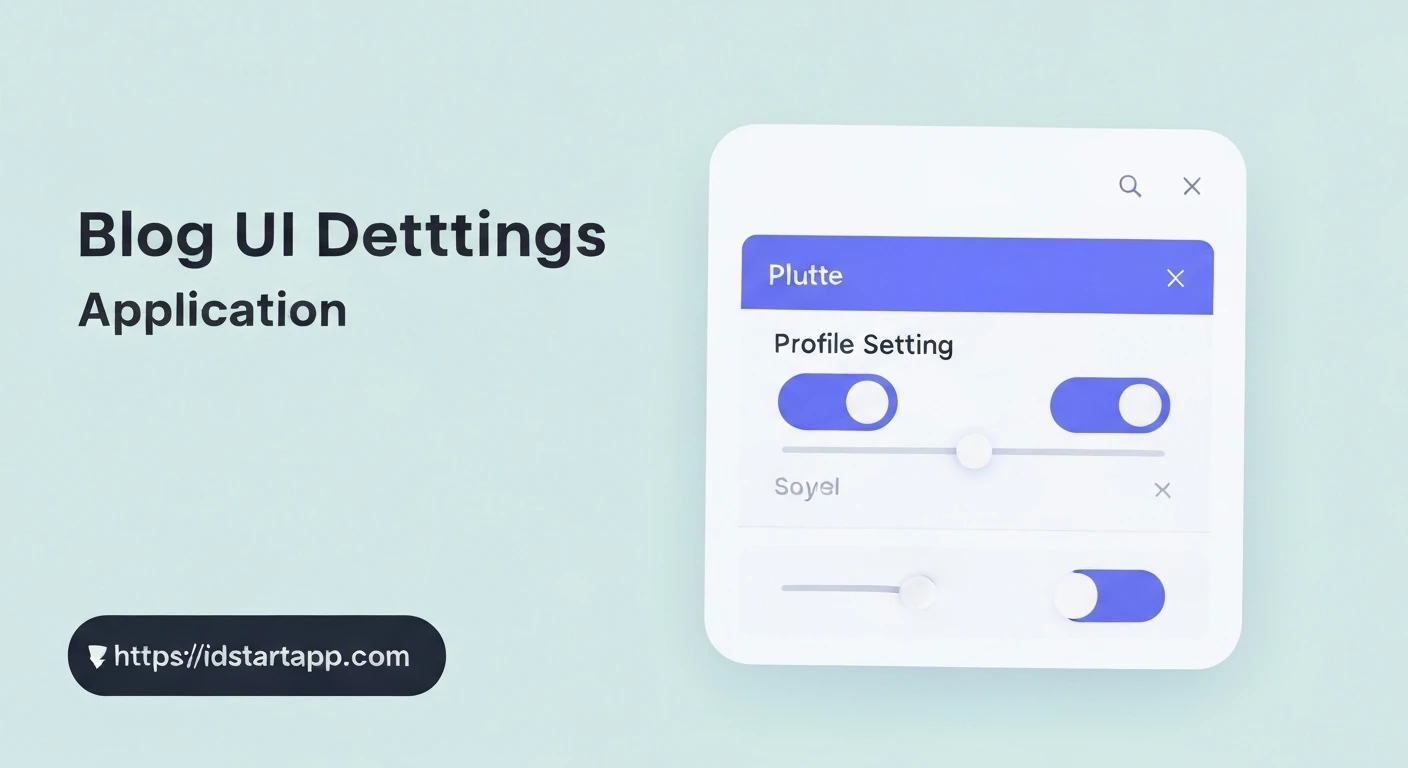

Crafting Dynamic Profile Settings: Integrating Switches and Sliders in Flutter
User profiles often require configurable settings, ranging from simple on/off toggles to granular numerical adjustments. Flutter provides intuitive and visually appealing widgets to handle these scenarios efficiently. This article will guide you through creating a dynamic profile settings widget in Flutter, leveraging the Switch and Slider widgets for a professional and user-friendly experience.
Understanding the Core Widgets
Before diving into implementation, let's briefly understand the two primary widgets we'll be using:
1. The Switch Widget
The Switch widget is used to toggle a boolean value (true/false) on or off. It's ideal for settings like "Enable Notifications," "Dark Mode," or "Auto-Login."
Switch(
  value: true, // Current state of the switch
  onChanged: (bool newValue) {
    // Handle state change here
  },
)
2. The Slider Widget
The Slider widget allows users to select a value from a continuous or discrete range of numbers. Common use cases include adjusting font size, volume levels, brightness, or specific thresholds.
Slider(
  value: 50.0, // Current value of the slider
  min: 0.0,    // Minimum selectable value
  max: 100.0,  // Maximum selectable value
  onChanged: (double newValue) {
    // Handle state change here
  },
)
Building the Profile Settings Widget
To manage the dynamic state of our switches and sliders, we'll need a StatefulWidget. This widget will hold the current values for each setting and update the UI accordingly when a change occurs.
1. Initial Setup: The StatefulWidget
Start by creating a new StatefulWidget. We'll define a few state variables to store the current status of our profile settings.
import 'package:flutter/material.dart';

class ProfileSettingsPage extends StatefulWidget {
  @override
  _ProfileSettingsPageState createState() => _ProfileSettingsPageState();
}

class _ProfileSettingsPageState extends State<ProfileSettingsPage> {
  // State variables for our settings
  bool _isNotificationsEnabled = true;
  double _fontSize = 16.0;
  double _volumeLevel = 0.5; // Represents 50%
  bool _isDarkModeEnabled = false;

  @override
  Widget build(BuildContext context) {
    return Scaffold(
      appBar: AppBar(
        title: const Text('Profile Settings'),
      ),
      body: ListView(
        padding: const EdgeInsets.all(16.0),
        children: <Widget>[
          // Settings items will go here
        ],
      ),
    );
  }
}
2. Adding a Switch for Notification Settings
We'll use SwitchListTile for a clean and standard presentation. It combines a ListTile with a Switch, handling the layout for us.
// ... inside ListView children ...
SwitchListTile(
  title: const Text('Enable Notifications'),
  subtitle: const Text('Receive alerts for new messages and updates'),
  value: _isNotificationsEnabled,
  onChanged: (bool newValue) {
    setState(() {
      _isNotificationsEnabled = newValue;
      // In a real app, you would save this preference (e.g., SharedPreferences)
      print('Notifications enabled: $_isNotificationsEnabled');
    });
  },
),
const Divider(), // Adds a visual separator
3. Integrating a Slider for Font Size Adjustment
For font size, we'll use a ListTile with the Slider as its subtitle, providing a visual cue of the current value. We'll use divisions to make the slider discrete, allowing selection of specific font sizes.
// ... inside ListView children ...
ListTile(
  title: const Text('Font Size'),
  subtitle: Slider(
    value: _fontSize,
    min: 12.0,
    max: 20.0,
    divisions: 4, // Allows selection of 12, 14, 16, 18, 20
    label: _fontSize.round().toString(),
    onChanged: (double newValue) {
      setState(() {
        _fontSize = newValue;
        print('Font size: $_fontSize');
      });
    },
  ),
  trailing: Text('${_fontSize.round()}px'),
),
const Divider(),
4. Another Slider for Volume Level
This slider will demonstrate a continuous range, useful for settings like media volume.
// ... inside ListView children ...
ListTile(
  title: const Text('Volume Level'),
  subtitle: Slider(
    value: _volumeLevel,
    min: 0.0,
    max: 1.0, // Represents 0% to 100%
    divisions: 10, // Allows selection of 0.0, 0.1, ..., 1.0
    label: (_volumeLevel * 100).round().toString() + '%',
    onChanged: (double newValue) {
      setState(() {
        _volumeLevel = newValue;
        print('Volume level: ${(_volumeLevel * 100).round()}%');
      });
    },
  ),
  trailing: Text('${(_volumeLevel * 100).round()}%'),
),
const Divider(),
5. Adding another Switch for Dark Mode
A simple on/off toggle for dark mode preference.
// ... inside ListView children ...
SwitchListTile(
  title: const Text('Dark Mode'),
  subtitle: const Text('Toggle between light and dark themes'),
  value: _isDarkModeEnabled,
  onChanged: (bool newValue) {
    setState(() {
      _isDarkModeEnabled = newValue;
      print('Dark mode enabled: $_isDarkModeEnabled');
      // A real app would update the overall ThemeMode here
    });
  },
),
Full Example Code
Here's the complete ProfileSettingsPage widget incorporating all the elements discussed:
import 'package:flutter/material.dart';

void main() {
  runApp(MyApp());
}

class MyApp extends StatelessWidget {
  @override
  Widget build(BuildContext context) {
    return MaterialApp(
      title: 'Profile Settings Demo',
      theme: ThemeData(
        primarySwatch: Colors.blue,
        visualDensity: VisualDensity.adaptivePlatformDensity,
      ),
      home: ProfileSettingsPage(),
    );
  }
}

class ProfileSettingsPage extends StatefulWidget {
  @override
  _ProfileSettingsPageState createState() => _ProfileSettingsPageState();
}

class _ProfileSettingsPageState extends State<ProfileSettingsPage> {
  bool _isNotificationsEnabled = true;
  double _fontSize = 16.0;
  double _volumeLevel = 0.5;
  bool _isDarkModeEnabled = false;

  @override
  Widget build(BuildContext context) {
    return Scaffold(
      appBar: AppBar(
        title: const Text('Profile Settings'),
      ),
      body: ListView(
        padding: const EdgeInsets.all(16.0),
        children: <Widget>[
          // Notifications Switch
          SwitchListTile(
            title: const Text('Enable Notifications'),
            subtitle: const Text('Receive alerts for new messages and updates'),
            value: _isNotificationsEnabled,
            onChanged: (bool newValue) {
              setState(() {
                _isNotificationsEnabled = newValue;
                // Typically, you'd save this preference to persistent storage
                print('Notifications enabled: $_isNotificationsEnabled');
              });
            },
          ),
          const Divider(),

          // Font Size Slider
          ListTile(
            title: const Text('Font Size'),
            subtitle: Slider(
              value: _fontSize,
              min: 12.0,
              max: 20.0,
              divisions: 4, // 12, 14, 16, 18, 20
              label: _fontSize.round().toString(),
              onChanged: (double newValue) {
                setState(() {
                  _fontSize = newValue;
                  print('Font size: ${_fontSize.round()}px');
                });
              },
            ),
            trailing: Text('${_fontSize.round()}px'),
          ),
          const Divider(),

          // Volume Level Slider
          ListTile(
            title: const Text('Volume Level'),
            subtitle: Slider(
              value: _volumeLevel,
              min: 0.0,
              max: 1.0,
              divisions: 10, // 0.0, 0.1, ..., 1.0
              label: (_volumeLevel * 100).round().toString() + '%',
              onChanged: (double newValue) {
                setState(() {
                  _volumeLevel = newValue;
                  print('Volume level: ${(_volumeLevel * 100).round()}%');
                });
              },
            ),
            trailing: Text('${(_volumeLevel * 100).round()}%'),
          ),
          const Divider(),

          // Dark Mode Switch
          SwitchListTile(
            title: const Text('Dark Mode'),
            subtitle: const Text('Toggle between light and dark themes'),
            value: _isDarkModeEnabled,
            onChanged: (bool newValue) {
              setState(() {
                _isDarkModeEnabled = newValue;
                print('Dark mode enabled: $_isDarkModeEnabled');
                // A real application would typically update the overall ThemeMode here
              });
            },
          ),
        ],
      ),
    );
  }
}
Further Enhancements and Best Practices
- Persistence: In a real-world application, these settings should be saved persistently using packages like
shared_preferencesfor simple key-value pairs or a database solution for more complex structures. - State Management: For larger applications, consider state management solutions like Provider, Riverpod, BLoC, or GetX to manage settings across different parts of your app more effectively.
- Theming: Settings like dark mode should ideally trigger a theme change across the entire application. This can be achieved by updating the
ThemeDataof yourMaterialApp. - Accessibility: Ensure your widgets are accessible. Flutter widgets generally handle this well, but consider adding semantic labels if your UI is highly custom.
- Validation/Constraints: For sliders, if certain values are invalid or require specific conditions, implement logic within the
onChangedcallback.
Conclusion
Flutter's Switch and Slider widgets provide powerful and flexible ways to build interactive profile settings. By combining them within a StatefulWidget and leveraging layouts like SwitchListTile and ListTile, you can create clean, functional, and user-friendly settings pages with minimal effort. Remember to consider persistence and state management for robust production applications.


