
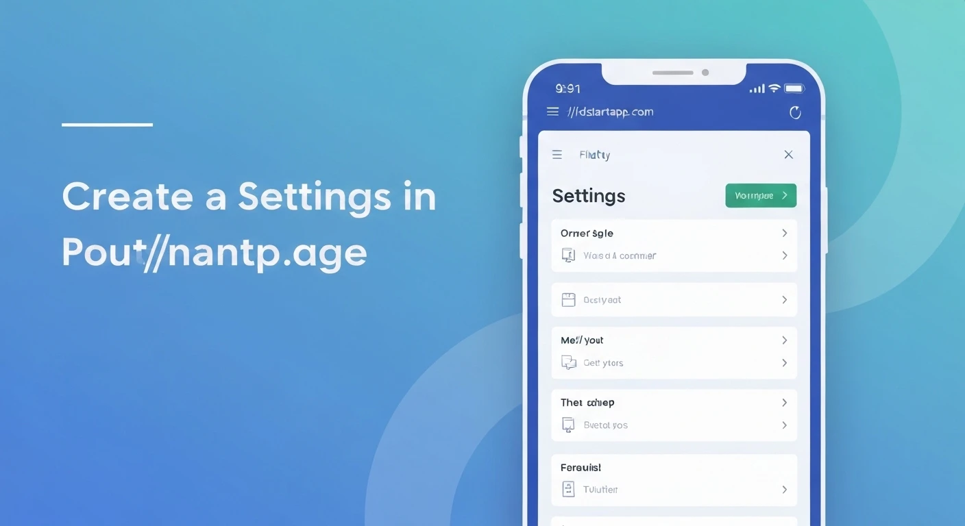

Creating a Settings Page in Flutter
A well-designed settings page is crucial for any mobile application, allowing users to customize their experience, manage preferences, and control various aspects of the app. In Flutter, building a robust and user-friendly settings interface is straightforward, leveraging its rich widget set and state management capabilities. This article guides you through the process of creating a professional settings page in your Flutter application.
Core Concepts and Prerequisites
Before diving into the implementation, it's helpful to understand a few core concepts:
- State Management: Settings often involve dynamic values that change the UI or app behavior. You'll need a way to manage this state, whether it's simple
setState, Provider, Riverpod, BLoC, or another solution. - Persistence: User settings need to persist across app sessions. For this, you'll typically use local storage solutions like
shared_preferencesor Hive. - Widgets: Flutter's declarative UI makes building settings easy with widgets like
Scaffold,AppBar,ListView,SwitchListTile,CheckboxListTile,ListTile, and various input fields.
Basic Settings Page Structure
A settings page usually resides within a Scaffold, featuring an AppBar and a scrollable body, typically a ListView. The ListView is ideal for displaying a list of settings options.
import 'package:flutter/material.dart';

class SettingsPage extends StatefulWidget {
  const SettingsPage({Key? key}) : super(key: key);

  @override
  State<SettingsPage> createState() => _SettingsPageState();
}

class _SettingsPageState extends State<SettingsPage> {
  @override
  Widget build(BuildContext context) {
    return Scaffold(
      appBar: AppBar(
        title: const Text('Settings'),
      ),
      body: ListView(
        children: const [
          // Settings items will go here
          ListTile(
            title: Text('General Settings'),
            subtitle: Text('Manage app preferences'),
            leading: Icon(Icons.settings),
          ),
          Divider(),
          ListTile(
            title: Text('Account Settings'),
            subtitle: Text('Edit profile and account info'),
            leading: Icon(Icons.person),
          ),
        ],
      ),
    );
  }
}
Implementing Different Setting Types
Settings pages often feature various types of controls. Let's explore some common ones.
Switch (Toggle) Setting
For binary options (on/off), SwitchListTile is perfect. It combines a title, subtitle, and a switch toggle.
// Inside _SettingsPageState class
bool _notificationsEnabled = true;

@override
Widget build(BuildContext context) {
  return Scaffold(
    appBar: AppBar(
      title: const Text('Settings'),
    ),
    body: ListView(
      children: [
        SwitchListTile(
          title: const Text('Enable Notifications'),
          subtitle: const Text('Receive push notifications'),
          value: _notificationsEnabled,
          onChanged: (bool value) {
            setState(() {
              _notificationsEnabled = value;
              // Save to preferences here
            });
          },
          secondary: const Icon(Icons.notifications),
        ),
        // Other settings...
      ],
    ),
  );
}
Text Input Setting
For settings that require text input, like a username or a custom message, you can use a ListTile that navigates to a new screen or displays a dialog with a TextField.
// Inside _SettingsPageState class
String _username = "John Doe";

// ... Inside ListView children ...
ListTile(
  title: const Text('Username'),
  subtitle: Text(_username),
  leading: const Icon(Icons.account_circle),
  trailing: const Icon(Icons.edit),
  onTap: () async {
    final newUsername = await showDialog<String>(
      context: context,
      builder: (BuildContext context) {
        String tempUsername = _username;
        return AlertDialog(
          title: const Text('Edit Username'),
          content: TextField(
            controller: TextEditingController(text: _username),
            onChanged: (value) {
              tempUsername = value;
            },
            decoration: const InputDecoration(hintText: 'Enter new username'),
          ),
          actions: [
            TextButton(
              onPressed: () => Navigator.of(context).pop(),
              child: const Text('Cancel'),
            ),
            TextButton(
              onPressed: () => Navigator.of(context).pop(tempUsername),
              child: const Text('Save'),
            ),
          ],
        );
      },
    );
    if (newUsername != null && newUsername.isNotEmpty) {
      setState(() {
        _username = newUsername;
        // Save to preferences
      });
    }
  },
),
Dropdown/List Setting
For selecting an option from a predefined list, a DropdownButton or navigating to a selection screen is suitable. Here's an example using a DropdownButton within a ListTile.
// Inside _SettingsPageState class
String _selectedTheme = 'System Default';
List<String> _themes = ['Light', 'Dark', 'System Default'];

// ... Inside ListView children ...
ListTile(
  title: const Text('App Theme'),
  leading: const Icon(Icons.color_lens),
  trailing: DropdownButton<String>(
    value: _selectedTheme,
    onChanged: (String? newValue) {
      setState(() {
        _selectedTheme = newValue!;
        // Apply theme and save to preferences
      });
    },
    items: _themes.map<DropdownMenuItem<String>>((String value) {
      return DropdownMenuItem<String>(
        value: value,
        child: Text(value),
      );
    }).toList(),
  ),
),
Navigation to Sub-Settings
For more complex settings, it's often best to organize them into sub-pages. A ListTile can be used to navigate to another SettingsPage variant.
// Example sub-settings page (e.g., AccountSettingsPage)
class AccountSettingsPage extends StatelessWidget {
  const AccountSettingsPage({Key? key}) : super(key: key);

  @override
  Widget build(BuildContext context) {
    return Scaffold(
      appBar: AppBar(
        title: const Text('Account Settings'),
      ),
      body: ListView(
        children: const [
          ListTile(
            title: Text('Change Password'),
            leading: Icon(Icons.lock),
          ),
          ListTile(
            title: Text('Delete Account'),
            leading: Icon(Icons.delete_forever),
          ),
        ],
      ),
    );
  }
}

// ... Inside SettingsPage ListView children ...
ListTile(
  title: const Text('Account Settings'),
  subtitle: const Text('Manage your profile and security'),
  leading: const Icon(Icons.person),
  trailing: const Icon(Icons.arrow_forward_ios),
  onTap: () {
    Navigator.push(
      context,
      MaterialPageRoute(builder: (context) => const AccountSettingsPage()),
    );
  },
),
Persisting Settings with shared_preferences
To ensure settings are saved across app launches, we use a persistence package. shared_preferences is a popular choice for simple key-value storage. First, add it to your pubspec.yaml:
dependencies:
  flutter:
    sdk: flutter
  shared_preferences: ^2.0.15
Then, initialize SharedPreferences and use it to save and load values.
import 'package:flutter/material.dart';
import 'package:shared_preferences/shared_preferences.dart';

class SettingsPage extends StatefulWidget {
  const SettingsPage({Key? key}) : super(key: key);

  @override
  State<SettingsPage> createState() => _SettingsPageState();
}

class _SettingsPageState extends State<SettingsPage> {
  late SharedPreferences _prefs;
  bool _notificationsEnabled = true;
  String _username = "John Doe";
  String _selectedTheme = 'System Default';

  @override
  void initState() {
    super.initState();
    _loadSettings();
  }

  Future<void> _loadSettings() async {
    _prefs = await SharedPreferences.getInstance();
    setState(() {
      _notificationsEnabled = _prefs.getBool('notificationsEnabled') ?? true;
      _username = _prefs.getString('username') ?? "John Doe";
      _selectedTheme = _prefs.getString('selectedTheme') ?? 'System Default';
    });
  }

  Future<void> _saveBoolSetting(String key, bool value) async {
    await _prefs.setBool(key, value);
  }

  Future<void> _saveStringSetting(String key, String value) async {
    await _prefs.setString(key, value);
  }

  @override
  Widget build(BuildContext context) {
    return Scaffold(
      appBar: AppBar(
        title: const Text('Settings'),
      ),
      body: ListView(
        children: [
          SwitchListTile(
            title: const Text('Enable Notifications'),
            subtitle: const Text('Receive push notifications'),
            value: _notificationsEnabled,
            onChanged: (bool value) {
              setState(() {
                _notificationsEnabled = value;
                _saveBoolSetting('notificationsEnabled', value);
              });
            },
            secondary: const Icon(Icons.notifications),
          ),
          ListTile(
            title: const Text('Username'),
            subtitle: Text(_username),
            leading: const Icon(Icons.account_circle),
            trailing: const Icon(Icons.edit),
            onTap: () async {
              final newUsername = await showDialog<String>(
                context: context,
                builder: (BuildContext context) {
                  String tempUsername = _username;
                  return AlertDialog(
                    title: const Text('Edit Username'),
                    content: TextField(
                      controller: TextEditingController(text: _username),
                      onChanged: (value) {
                        tempUsername = value;
                      },
                      decoration: const InputDecoration(hintText: 'Enter new username'),
                    ),
                    actions: [
                      TextButton(
                        onPressed: () => Navigator.of(context).pop(),
                        child: const Text('Cancel'),
                      ),
                      TextButton(
                        onPressed: () => Navigator.of(context).pop(tempUsername),
                        child: const Text('Save'),
                      ),
                    ],
                  );
                },
              );
              if (newUsername != null && newUsername.isNotEmpty) {
                setState(() {
                  _username = newUsername;
                  _saveStringSetting('username', newUsername);
                });
              }
            },
          ),
          ListTile(
            title: const Text('App Theme'),
            leading: const Icon(Icons.color_lens),
            trailing: DropdownButton<String>(
              value: _selectedTheme,
              onChanged: (String? newValue) {
                setState(() {
                  _selectedTheme = newValue!;
                  _saveStringSetting('selectedTheme', newValue);
                  // You might need to trigger a theme change in your app here
                });
              },
              items: <String>['Light', 'Dark', 'System Default']
                  .map<DropdownMenuItem<String>>((String value) {
                return DropdownMenuItem<String>(
                  value: value,
                  child: Text(value),
                );
              }).toList(),
            ),
          ),
          ListTile(
            title: const Text('Account Settings'),
            subtitle: const Text('Manage your profile and security'),
            leading: const Icon(Icons.person),
            trailing: const Icon(Icons.arrow_forward_ios),
            onTap: () {
              // Navigator.push(context, MaterialPageRoute(builder: (context) => const AccountSettingsPage()));
              // For brevity, AccountSettingsPage is not fully implemented here
            },
          ),
        ],
      ),
    );
  }
}
Best Practices and Further Considerations
- Organize with Sections: For many settings, use
ExpansionTileor create custom section headers (e.g.,PaddingwithText) to group related settings. - Accessibility: Ensure all interactive elements have proper semantic labels. Flutter widgets generally handle this well, but always test with accessibility tools.
- Theming: Settings pages should respect the app's overall theme (light/dark mode, primary colors). The selected theme setting should ideally update the app's theme dynamically.
- Internationalization (i18n): If your app supports multiple languages, ensure all strings on the settings page are localized.
- Error Handling: While
shared_preferencesis robust, for more complex persistence (e.g., network settings), consider adding error handling. - State Management for Global State: For settings that affect the entire application (like theme or language), consider using a global state management solution (Provider, Riverpod, BLoC) to notify other parts of the app about changes.
- Testing: Write widget tests for your settings page to ensure interactions and state changes work as expected.
Conclusion
Building a functional and aesthetically pleasing settings page in Flutter is an essential step towards a complete and user-friendly application. By combining Flutter's declarative UI, appropriate state management, and reliable persistence solutions like shared_preferences, you can empower users to personalize their app experience effectively. Remember to consider best practices for organization, accessibility, and theming to create a truly professional settings interface.