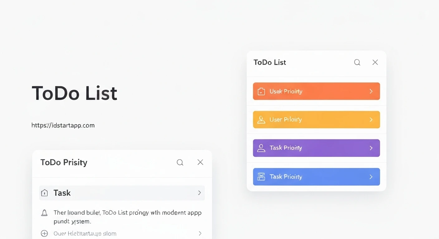

Building a ToDo List Widget with Color-Coded Priorities in Flutter
A well-organized to-do list is an essential tool for productivity. Enhancing a basic to-do list with a priority system, visually represented by distinct colors, can significantly improve task management by allowing users to quickly identify and focus on the most critical items. This article will guide you through building a Flutter widget for a to-do list that incorporates color-coded priorities.
1. Defining the Data Model
First, let's establish the data structures for our priority levels and individual to-do items. We'll use an enum for priorities to ensure type safety and associate each priority with a specific color.
Priority Enum with Colors
The Priority enum will define our task urgency levels (Low, Medium, High) and provide a corresponding color for each.
import 'package:flutter/material.dart';

enum Priority {
  low(Colors.green),
  medium(Colors.orange),
  high(Colors.red);

  final Color color;
  const Priority(this.color);

  @override
  String toString() {
    return name[0].toUpperCase() + name.substring(1);
  }
}
ToDoItem Class
The ToDoItem class will encapsulate all necessary information for a single task: a unique ID, title, description (optional), priority, and completion status.
import 'package:uuid/uuid.dart';
import 'priority.dart';

class ToDoItem {
  final String id;
  String title;
  String? description;
  Priority priority;
  bool isCompleted;

  ToDoItem({
    String? id,
    required this.title,
    this.description,
    this.priority = Priority.medium,
    this.isCompleted = false,
  }) : id = id ?? const Uuid().v4();

  // For simplicity, we'll assume equality based on ID for now.
  @override
  bool operator ==(Object other) =>
      identical(this, other) ||
      other is ToDoItem && runtimeType == other.runtimeType && id == other.id;

  @override
  int get hashCode => id.hashCode;
}
Remember to add the uuid package to your pubspec.yaml for unique IDs:
dependencies:
  flutter:
    sdk: flutter
  uuid: ^4.2.2
2. Setting Up the Main Application Structure
Our main application will consist of a MaterialApp containing a ToDoListScreen, which will be a StatefulWidget to manage the list of tasks.
import 'package:flutter/material.dart';
import 'models/priority.dart';
import 'models/todo_item.dart';

void main() {
  runApp(const MyApp());
}

class MyApp extends StatelessWidget {
  const MyApp({super.key});

  @override
  Widget build(BuildContext context) {
    return MaterialApp(
      title: 'Flutter ToDo App',
      theme: ThemeData(
        primarySwatch: Colors.blue,
        visualDensity: VisualDensity.adaptivePlatformDensity,
      ),
      home: const ToDoListScreen(),
    );
  }
}

class ToDoListScreen extends StatefulWidget {
  const ToDoListScreen({super.key});

  @override
  State createState() => _ToDoListScreenState();
}

class _ToDoListScreenState extends State {
  final List<ToDoItem> _toDoItems = [
    ToDoItem(title: 'Buy groceries', priority: Priority.high, description: 'Milk, Eggs, Bread'),
    ToDoItem(title: 'Workout', priority: Priority.medium),
    ToDoItem(title: 'Read a book', priority: Priority.low, isCompleted: true),
  ];

  @override
  Widget build(BuildContext context) {
    return Scaffold(
      appBar: AppBar(
        title: const Text('My ToDo List'),
      ),
      body: ListView.builder(
        itemCount: _toDoItems.length,
        itemBuilder: (context, index) {
          final item = _toDoItems[index];
          // We'll implement ToDoItemWidget in the next section
          return ToDoItemWidget(
            item: item,
            onToggleCompletion: _toggleToDoStatus,
            onDeleteItem: _deleteToDoItem,
          );
        },
      ),
      floatingActionButton: FloatingActionButton(
        onPressed: _addNewToDo,
        child: const Icon(Icons.add),
      ),
    );
  }

  void _toggleToDoStatus(ToDoItem item) {
    setState(() {
      item.isCompleted = !item.isCompleted;
    });
  }

  void _deleteToDoItem(ToDoItem item) {
    setState(() {
      _toDoItems.removeWhere((i) => i.id == item.id);
    });
  }

  Future<void> _addNewToDo() async {
    final newItem = await showDialog<ToDoItem>(
      context: context,
      builder: (context) => AddToDoDialog(), // To be implemented
    );

    if (newItem != null) {
      setState(() {
        _toDoItems.add(newItem);
      });
    }
  }
}
3. Creating the ToDo Item Widget
This ToDoItemWidget will be responsible for displaying a single to-do item, including its title, description, a checkbox for completion, and the priority color indicator.
import 'package:flutter/material.dart';
import 'package:todo_app/models/todo_item.dart';

class ToDoItemWidget extends StatelessWidget {
  final ToDoItem item;
  final Function(ToDoItem) onToggleCompletion;
  final Function(ToDoItem) onDeleteItem;

  const ToDoItemWidget({
    super.key,
    required this.item,
    required this.onToggleCompletion,
    required this.onDeleteItem,
  });

  @override
  Widget build(BuildContext context) {
    return Card(
      margin: const EdgeInsets.symmetric(vertical: 8.0, horizontal: 16.0),
      elevation: 3,
      child: Stack(
        children: [
          ListTile(
            leading: Checkbox(
              value: item.isCompleted,
              onChanged: (bool? newValue) {
                if (newValue != null) {
                  onToggleCompletion(item);
                }
              },
            ),
            title: Text(
              item.title,
              style: TextStyle(
                decoration: item.isCompleted ? TextDecoration.lineThrough : null,
                fontWeight: FontWeight.bold,
              ),
            ),
            subtitle: item.description != null && item.description!.isNotEmpty
                ? Text(
                    item.description!,
                    style: TextStyle(
                      decoration: item.isCompleted ? TextDecoration.lineThrough : null,
                      color: Colors.grey[600],
                    ),
                  )
                : null,
            trailing: IconButton(
              icon: const Icon(Icons.delete, color: Colors.grey),
              onPressed: () => onDeleteItem(item),
            ),
            onTap: () {
              // Optionally add navigation to an edit screen or more details
              print('Tapped on ${item.title}');
            },
          ),
          Positioned(
            left: 0,
            top: 0,
            bottom: 0,
            child: Container(
              width: 8,
              decoration: BoxDecoration(
                color: item.priority.color,
                borderRadius: const BorderRadius.only(
                  topLeft: Radius.circular(4),
                  bottomLeft: Radius.circular(4),
                ),
              ),
            ),
          ),
        ],
      ),
    );
  }
}
4. Implementing the Add ToDo Dialog
To add new tasks, we'll create a simple dialog. This dialog will allow users to input a title, an optional description, and select a priority level using a DropdownButton.
import 'package:flutter/material.dart';
import 'package:todo_app/models/priority.dart';
import 'package:todo_app/models/todo_item.dart';

class AddToDoDialog extends StatefulWidget {
  const AddToDoDialog({super.key});

  @override
  State createState() => _AddToDoDialogState();
}

class _AddToDoDialogState extends State {
  final TextEditingController _titleController = TextEditingController();
  final TextEditingController _descriptionController = TextEditingController();
  Priority _selectedPriority = Priority.medium;

  @override
  void dispose() {
    _titleController.dispose();
    _descriptionController.dispose();
    super.dispose();
  }

  @override
  Widget build(BuildContext context) {
    return AlertDialog(
      title: const Text('Add New ToDo'),
      content: SingleChildScrollView(
        child: Column(
          mainAxisSize: MainAxisSize.min,
          children: [
            TextField(
              controller: _titleController,
              decoration: const InputDecoration(labelText: 'Title'),
            ),
            TextField(
              controller: _descriptionController,
              decoration: const InputDecoration(labelText: 'Description (Optional)'),
              maxLines: 3,
            ),
            const SizedBox(height: 16),
            Row(
              children: [
                const Text('Priority:'),
                const SizedBox(width: 16),
                DropdownButton<Priority>(
                  value: _selectedPriority,
                  onChanged: (Priority? newValue) {
                    if (newValue != null) {
                      setState(() {
                        _selectedPriority = newValue;
                      });
                    }
                  },
                  items: Priority.values.map<DropdownMenuItem<Priority>>((Priority priority) {
                    return DropdownMenuItem<Priority>(
                      value: priority,
                      child: Row(
                        children: [
                          Container(
                            width: 12,
                            height: 12,
                            decoration: BoxDecoration(
                              color: priority.color,
                              shape: BoxShape.circle,
                            ),
                          ),
                          const SizedBox(width: 8),
                          Text(priority.toString()),
                        ],
                      ),
                    );
                  }).toList(),
                ),
              ],
            ),
          ],
        ),
      ),
      actions: [
        TextButton(
          onPressed: () => Navigator.of(context).pop(), // Cancel
          child: const Text('Cancel'),
        ),
        ElevatedButton(
          onPressed: () {
            if (_titleController.text.isNotEmpty) {
              final newToDo = ToDoItem(
                title: _titleController.text,
                description: _descriptionController.text.isEmpty ? null : _descriptionController.text,
                priority: _selectedPriority,
              );
              Navigator.of(context).pop(newToDo); // Add and pop
            }
          },
          child: const Text('Add ToDo'),
        ),
      ],
    );
  }
}
5. Putting It All Together
With all the components defined, ensure your file structure matches the imports (e.g., models/priority.dart, models/todo_item.dart, widgets/todo_item_widget.dart, widgets/add_todo_dialog.dart). The main.dart file now uses these widgets to present a fully functional ToDo list.
Your file structure could look like this:
lib/
├── main.dart
├── models/
│   ├── priority.dart
│   └── todo_item.dart
└── widgets/
    ├── add_todo_dialog.dart
    └── todo_item_widget.dart
After running the application, you will see a list of to-do items. Each item will have a colored bar on its left side indicating its priority (red for high, orange for medium, green for low). You can mark items as complete, delete them, and add new tasks using the floating action button, which will open the priority selection dialog.
Conclusion
By following these steps, you have successfully built a Flutter ToDo list widget with a clear, color-coded priority system. This not only makes the list more visually appealing but also significantly enhances usability by allowing users to quickly gauge the urgency of tasks.
Further enhancements could include:
- **Persistence:** Saving tasks to local storage (e.g., SharedPreferences, Hive, SQLite) or a cloud database.
- **Editing:** Allowing users to modify existing task details.
- **Filtering/Sorting:** Adding options to filter tasks by priority or completion status, or sort them by various criteria.
- **Animations:** Incorporating subtle animations for adding, deleting, or completing tasks.
This foundation provides a robust starting point for developing more complex and feature-rich task management applications in Flutter.


