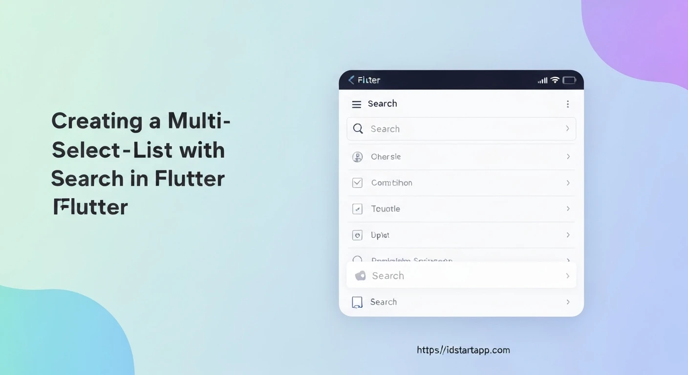

Building a Multi-Select List Widget with Search in Flutter
In modern applications, users often need to select multiple items from a list, especially when dealing with large datasets. A simple list of checkboxes can become cumbersome and inefficient if the list contains many items. Adding a search capability significantly enhances the user experience, allowing users to quickly find and select specific items. This article will guide you through creating a professional, reusable multi-select list widget with integrated search functionality in Flutter.
Why a Custom Multi-Select Widget?
- Improved UX for Large Lists: A search bar prevents endless scrolling and allows immediate access to desired items.
- Reusability: Encapsulate complex logic and UI into a single widget that can be used across different parts of your application.
- Customization: Tailor the appearance and behavior precisely to your application's design system.
- Performance: Efficiently filter items without re-rendering the entire list.
Core Components and Approach
Our custom widget will be a StatefulWidget to manage its internal state, including the search query, the filtered list of items, and the set of currently selected items. It will consist of:
- A
TextFieldfor the search input. - An
ExpandedListView.builderto efficiently display the filtered items. CheckboxListTilefor each item to handle selection.- A callback mechanism to notify the parent widget about changes in the selected items.
Step-by-Step Implementation
1. Define the Data Model
First, let's define a simple data model for the items we want to display and select. For our example, each item will have a unique ID and a name.
class MyItem {
  final String id;
  final String name;

  MyItem({required this.id, required this.name});

  @override
  bool operator ==(Object other) =>
      identical(this, other) ||
      other is MyItem && runtimeType == other.runtimeType && id == other.id;

  @override
  int get hashCode => id.hashCode;
}
Note the overridden operator == and hashCode. This is crucial when storing MyItem objects in a Set, ensuring that items with the same ID are considered equal, which is fundamental for correctly managing selections.
2. Create the MultiSelectSearchList Widget
This will be our main reusable widget. It takes the full list of items, initially selected items, and a callback function for when selections change.
import 'package:flutter/material.dart';

// Assume MyItem class is defined above or imported

class MultiSelectSearchList extends StatefulWidget {
  final List items;
  final Set initialSelectedItems;
  final ValueChanged> onSelectionChanged;
  final String title;

  const MultiSelectSearchList({
    Key? key,
    required this.items,
    this.initialSelectedItems = const {},
    required this.onSelectionChanged,
    this.title = 'Select Items',
  }) : super(key: key);

  @override
  _MultiSelectSearchListState createState() => _MultiSelectSearchListState();
}

class _MultiSelectSearchListState extends State {
  late List _filteredItems;
  late Set _selectedItems;
  final TextEditingController _searchController = TextEditingController();

  @override
  void initState() {
    super.initState();
    // Initialize filtered items with all available items
    _filteredItems = List.from(widget.items);
    // Initialize selected items from the initial list provided by the parent
    _selectedItems = Set.from(widget.initialSelectedItems);
    // Add a listener to the search controller to filter items as the user types
    _searchController.addListener(_onSearchChanged);
  }

  @override
  void dispose() {
    _searchController.removeListener(_onSearchChanged);
    _searchController.dispose();
    super.dispose();
  }

  // This method is called whenever the search text changes
  void _onSearchChanged() {
    setState(() {
      final query = _searchController.text.toLowerCase();
      _filteredItems = widget.items.where((item) {
        return item.name.toLowerCase().contains(query);
      }).toList();
    });
  }

  // Toggles the selection status of an item
  void _toggleSelection(MyItem item) {
    setState(() {
      if (_selectedItems.contains(item)) {
        _selectedItems.remove(item);
      } else {
        _selectedItems.add(item);
      }
    });
    // Notify the parent widget about the selection change
    widget.onSelectionChanged(_selectedItems);
  }

  @override
  Widget build(BuildContext context) {
    return Column(
      children: [
        // Search TextField
        Padding(
          padding: const EdgeInsets.all(8.0),
          child: TextField(
            controller: _searchController,
            decoration: InputDecoration(
              labelText: 'Search',
              hintText: 'Search items...',
              prefixIcon: Icon(Icons.search),
              border: OutlineInputBorder(
                borderRadius: BorderRadius.circular(10),
              ),
            ),
          ),
        ),
        // Expanded list of items
        Expanded(
          child: ListView.builder(
            itemCount: _filteredItems.length,
            itemBuilder: (context, index) {
              final item = _filteredItems[index];
              return CheckboxListTile(
                title: Text(item.name),
                value: _selectedItems.contains(item), // Check if item is selected
                onChanged: (bool? isSelected) {
                  _toggleSelection(item); // Toggle selection on tap
                },
              );
            },
          ),
        ),
      ],
    );
  }
}
3. Example Usage in a Parent Widget
To demonstrate how to use this widget, let's integrate it into a simple Flutter application. The parent widget will hold the master list of all available items and the current set of selected items, updating its state when the multi-select widget notifies it.
import 'package:flutter/material.dart';

// Assuming MyItem and MultiSelectSearchList are defined above or imported

void main() {
  runApp(MyApp());
}

class MyApp extends StatelessWidget {
  @override
  Widget build(BuildContext context) {
    return MaterialApp(
      title: 'Multi-Select Search Demo',
      theme: ThemeData(
        primarySwatch: Colors.blue,
      ),
      home: MyHomePage(),
    );
  }
}

class MyHomePage extends StatefulWidget {
  @override
  _MyHomePageState createState() => _MyHomePageState();
}

class _MyHomePageState extends State {
  // A list of all items that can be selected
  final List _allAvailableItems = List.generate(
    50, // Generate 50 dummy items
    (index) => MyItem(id: 'id_$index', name: 'Item ${index + 1}'),
  );

  // The set of items currently selected by the user
  Set _currentlySelectedItems = {};

  @override
  Widget build(BuildContext context) {
    return Scaffold(
      appBar: AppBar(
        title: Text('Multi-Select List Demo'),
      ),
      body: Column(
        children: [
          // Display currently selected items
          Padding(
            padding: const EdgeInsets.all(16.0),
            child: Column(
              crossAxisAlignment: CrossAxisAlignment.start,
              children: [
                Text(
                  'Selected Items:',
                  style: Theme.of(context).textTheme.headline6,
                ),
                SizedBox(height: 8),
                Wrap(
                  spacing: 8.0,
                  children: _currentlySelectedItems
                      .map((item) => Chip(label: Text(item.name)))
                      .toList(),
                ),
                SizedBox(height: 20),
              ],
            ),
          ),
          // Our MultiSelectSearchList widget
          Expanded(
            child: MultiSelectSearchList(
              items: _allAvailableItems,
              initialSelectedItems: _currentlySelectedItems,
              onSelectionChanged: (selectedItems) {
                // Update the parent's state with the new selections
                setState(() {
                  _currentlySelectedItems = selectedItems;
                });
                // Optional: Print selected items to console
                print('Selected items updated: ${_currentlySelectedItems.map((e) => e.name).join(', ')}');
              },
            ),
          ),
        ],
      ),
    );
  }
}
Conclusion
You have successfully built a powerful and reusable Multi-Select List Widget with search functionality in Flutter. This widget significantly enhances the user experience when dealing with extensive lists, providing quick navigation and clear selection feedback. By encapsulating this logic and UI, you create a component that can be easily integrated and customized across your application.
Further enhancements could include:
- Adding custom styling options for the search bar, list tiles, and selection indicators.
- Implementing asynchronous data loading or pagination for extremely large datasets.
- Integrating with more advanced state management solutions like Provider or Bloc for complex application architectures.
- Adding "Select All" / "Deselect All" options.


