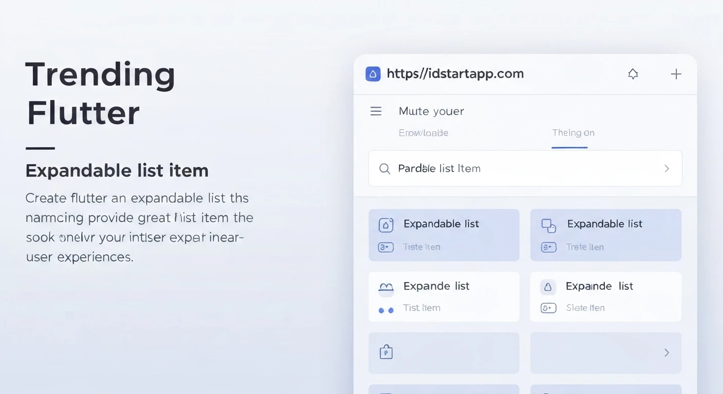

Creating Expandable List Items in Flutter
Introduction
Expandable list items are a common UI pattern used to present information concisely and manage screen real estate effectively. They allow users to reveal or hide detailed content by tapping a header, creating a clean and interactive user interface. This article will guide you through the process of implementing expandable list items in Flutter, focusing on the built-in ExpansionTile widget and demonstrating how to build dynamic lists with customizable expansion behavior.
Understanding the ExpansionTile Widget
Flutter provides a highly convenient widget called ExpansionTile specifically designed for creating expandable list items. It's a Material Design widget that encapsulates the title, children, and expansion/collapse logic.
Key properties of ExpansionTile include:
title: The widget displayed in the header of the tile.children: A list of widgets that are shown when the tile is expanded.onExpansionChanged: A callback function that is invoked when the tile's expansion state changes. It takes a boolean argument indicating whether the tile is currently expanded.initiallyExpanded: A boolean property to determine if the tile should be expanded by default.leading,trailing: Widgets to display before and after the title, respectively. The default trailing icon is a chevron.backgroundColor,collapsedBackgroundColor: Colors for the tile when expanded and collapsed.
A Simple ExpansionTile Example
Let's start with a basic example demonstrating a single ExpansionTile:
import 'package:flutter/material.dart';

void main() {
  runApp(MyApp());
}

class MyApp extends StatelessWidget {
  @override
  Widget build(BuildContext context) {
    return MaterialApp(
      title: 'Expandable List Demo',
      theme: ThemeData(
        primarySwatch: Colors.blue,
      ),
      home: Scaffold(
        appBar: AppBar(
          title: Text('Simple ExpansionTile'),
        ),
        body: Center(
          child: ExpansionTile(
            title: Text('Tap to expand'),
            leading: Icon(Icons.info),
            children: [
              ListTile(title: Text('This is the detailed content.')),
              ListTile(title: Text('More information can go here.')),
            ],
            onExpansionChanged: (bool expanded) {
              print('Expansion state changed to: $expanded');
            },
          ),
        ),
      ),
    );
  }
}
In this example, we create a simple ExpansionTile with a title and two ListTile widgets as its children. The onExpansionChanged callback prints the current expansion state to the console.
Building a Dynamic List of Expandable Items
For most applications, you'll need a list of multiple expandable items, often populated from a dynamic data source. We can achieve this using ListView.builder in conjunction with ExpansionTile.
First, let's define a simple data model for our items:
class Item {
  Item({
    required this.headerText,
    required this.bodyText,
    this.isExpanded = false,
  });

  String headerText;
  String bodyText;
  bool isExpanded;
}
Now, let's create a StatefulWidget to manage our list of items and their expansion states:
import 'package:flutter/material.dart';
void main() {
runApp(MyApp());
}
class Item {
Item({
required this.headerText,
required this.bodyText,
this.isExpanded = false,
});
String headerText;
String bodyText;
bool isExpanded;
}
class MyApp extends StatelessWidget {
@override
Widget build(BuildContext context) {
return MaterialApp(
title: 'Dynamic Expandable List',
theme: ThemeData(
primarySwatch: Colors.teal,
),
home: DynamicExpansionListScreen(),
);
}
}
class DynamicExpansionListScreen extends StatefulWidget {
@override
_DynamicExpansionListScreenState createState() =>
_DynamicExpansionListScreenState();
}
class _DynamicExpansionListScreenState extends State {
final List- _data = List.generate(10, (index) => Item(
headerText: 'Item ${index + 1}',
bodyText: 'This is the detailed content for item ${index + 1}. You can put any widget here.',
));
@override
Widget build(BuildContext context) {
return Scaffold(
appBar: AppBar(
title: Text('Dynamic Expandable List'),
),
body: ListView.builder(
itemCount: _data.length,
itemBuilder: (BuildContext context, int index) {
return ExpansionTile(
key: PageStorageKey
- (_data[index]), // Important for maintaining state
title: Text(_data[index].headerText),
initiallyExpanded: _data[index].isExpanded,
onExpansionChanged: (bool expanded) {
setState(() {
// Update the expansion state in our data model
_data[index].isExpanded = expanded;
// Optional: To make it an accordion (only one expanded at a time)
// if (expanded) {
// for (int i = 0; i < _data.length; i++) {
// if (i != index) {
// _data[i].isExpanded = false;
// }
// }
// }
});
},
children:
[
Padding(
padding: const EdgeInsets.all(16.0),
child: Text(
_data[index].bodyText,
textAlign: TextAlign.justify,
),
),
],
);
},
),
);
}
}
In this dynamic example:
- We define an
Itemclass to hold our data. TheisExpandedfield is crucial for managing the state of each tile if you need to control it externally or persist it. - A
StatefulWidget,DynamicExpansionListScreen, holds the list of_data. ListView.builderefficiently createsExpansionTilewidgets for each item in the_datalist.- The
key: PageStorageKeyis important. Without a unique key, Flutter might rebuild widgets inefficiently, potentially losing the expansion state when items are reordered or updated.- (_data[index])
PageStorageKeyhelps in preserving the state across widget rebuilds. - The
onExpansionChangedcallback updates theisExpandedproperty of the correspondingItemin our_datalist, ensuring that the UI reflects the correct state upon rebuilds or navigation. - The commented-out section within
onExpansionChangeddemonstrates how you could implement an "accordion" behavior where only one tile can be expanded at any given time.
Best Practices for Expandable Lists
- Use
keywithExpansionTilein dynamic lists: As shown in the dynamic example, using aPageStorageKeyor aValueKeyis vital forExpansionTilewidgets within dynamic lists (likeListView.builder) to correctly preserve their expansion state when the list changes. - Optimize children widgets: The children of an
ExpansionTileare built when the tile expands. For very complex or resource-intensive content, consider lazy loading or optimizing these widgets to ensure smooth animation and performance. - Provide clear indicators:
ExpansionTilecomes with a default chevron icon, but if you customize it, ensure there's a clear visual cue for users to understand that an item is expandable. - Consider accessibility: Ensure your expandable items are navigable and usable for all users, including those using screen readers. Flutter's Material widgets generally handle this well.
- Manage state efficiently: For complex state management (e.g., global state, multiple accordion groups), consider using state management solutions like Provider, Riverpod, BLoC, or GetX to handle the
isExpandedstate.
Conclusion
Expandable list items are a powerful tool for creating organized and user-friendly interfaces in Flutter. The ExpansionTile widget provides a straightforward and elegant way to implement this pattern, abstracting away much of the complex animation and state management. By understanding its properties and how to integrate it into dynamic lists, you can significantly enhance the user experience of your Flutter applications, presenting information efficiently and interactively.


