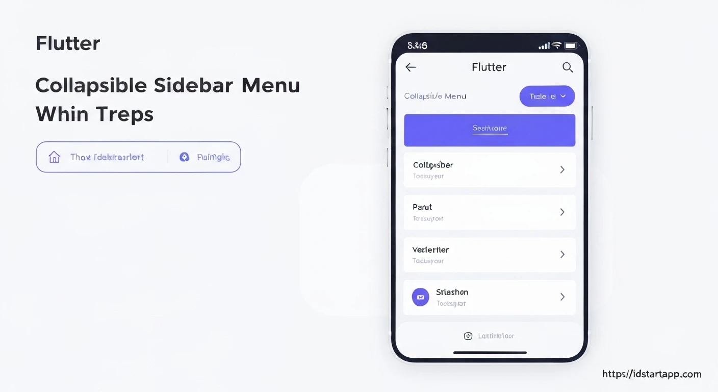

Building a Collapsible Sidebar Menu Widget in Flutter
A collapsible sidebar menu is a common UI pattern in modern applications, providing efficient navigation while conserving screen real estate. It allows users to expand or collapse sections of menu items, keeping the interface clean and organized. In Flutter, building such a widget is straightforward thanks to its rich set of UI components and animation capabilities.
This article will guide you through the process of creating a professional and functional collapsible sidebar menu widget in your Flutter application.
Understanding the Core Components
Before diving into the code, let's outline the key Flutter widgets we'll utilize:
Scaffold: Provides the basic visual structure for the material design app, includingAppBarandDrawer.Drawer: A material design panel that slides in from the edge of theScaffold. This is where our sidebar content will reside.ListView: Essential for displaying a scrollable list of widgets, which will be our menu items.ListTile: A single fixed-height row that typically contains some text as well as a leading or trailing icon. Perfect for individual menu items.StatefulWidget: Necessary for managing the expanded/collapsed state of our menu sections.AnimatedSize: A widget that animates its size when the child's size changes. This will provide a smooth expansion/collapse effect.RotationTransition: For animating the rotation of an icon (e.g., an arrow) to indicate the expanded state.
Project Setup
First, create a new Flutter project or open an existing one. We'll modify the main.dart file to include our sidebar menu.
main.dart - Initial Setup
Here's a basic main.dart to get started:
import 'package:flutter/material.dart';

void main() {
  runApp(const MyApp());
}

class MyApp extends StatelessWidget {
  const MyApp({super.key});

  @override
  Widget build(BuildContext context) {
    return MaterialApp(
      title: 'Collapsible Sidebar Demo',
      theme: ThemeData(
        primarySwatch: Colors.blue,
        visualDensity: VisualDensity.adaptivePlatformDensity,
      ),
      home: const HomePage(),
    );
  }
}

class HomePage extends StatefulWidget {
  const HomePage({super.key});

  @override
  State<HomePage> createState() => _HomePageState();
}

class _HomePageState extends State<HomePage> {
  @override
  Widget build(BuildContext context) {
    return Scaffold(
      appBar: AppBar(
        title: const Text('Home Page'),
      ),
      drawer: const CollapsibleSidebarMenu(), // Our custom sidebar widget
      body: const Center(
        child: Text('Welcome to the main content!'),
      ),
    );
  }
}
Building the Collapsible Sidebar Menu
Now, let's create the CollapsibleSidebarMenu widget and its sub-components.
1. CollapsibleSidebarMenu Widget
This will be the main Drawer content, holding a ListView of our menu items and collapsible sections.
class CollapsibleSidebarMenu extends StatelessWidget {
  const CollapsibleSidebarMenu({super.key});

  @override
  Widget build(BuildContext context) {
    return Drawer(
      child: ListView(
        padding: EdgeInsets.zero,
        children: <Widget>[
          const DrawerHeader(
            decoration: BoxDecoration(
              color: Colors.blue,
            ),
            child: Text(
              'App Menu',
              style: TextStyle(
                color: Colors.white,
                fontSize: 24,
              ),
            ),
          ),
          // Non-collapsible menu item
          ListTile(
            leading: const Icon(Icons.home),
            title: const Text('Home'),
            onTap: () {
              // Handle tap
              Navigator.pop(context); // Close the drawer
            },
          ),
          // Collapsible section
          CollapsibleMenuSection(
            title: 'Categories',
            icon: Icons.category,
            children: <Widget>[
              ListTile(
                title: const Text('Electronics'),
                onTap: () {
                  // Handle tap
                  Navigator.pop(context);
                },
              ),
              ListTile(
                title: const Text('Books'),
                onTap: () {
                  // Handle tap
                  Navigator.pop(context);
                },
              ),
              ListTile(
                title: const Text('Clothing'),
                onTap: () {
                  // Handle tap
                  Navigator.pop(context);
                },
              ),
            ],
          ),
          // Another non-collapsible item
          ListTile(
            leading: const Icon(Icons.settings),
            title: const Text('Settings'),
            onTap: () {
              // Handle tap
              Navigator.pop(context);
            },
          ),
          // Another collapsible section
          CollapsibleMenuSection(
            title: 'About Us',
            icon: Icons.info,
            children: <Widget>[
              ListTile(
                title: const Text('Company Profile'),
                onTap: () {
                  // Handle tap
                  Navigator.pop(context);
                },
              ),
              ListTile(
                title: const Text('Contact Info'),
                onTap: () {
                  // Handle tap
                  Navigator.pop(context);
                },
              ),
            ],
          ),
        ],
      ),
    );
  }
}
2. CollapsibleMenuSection Widget
This is the core widget responsible for the collapsible behavior. It will be a StatefulWidget to manage its expansion state and use AnimatedSize for smooth transitions.
class CollapsibleMenuSection extends StatefulWidget {
  final String title;
  final IconData icon;
  final List<Widget> children;

  const CollapsibleMenuSection({
    super.key,
    required this.title,
    required this.icon,
    required this.children,
  });

  @override
  State<CollapsibleMenuSection> createState() => _CollapsibleMenuSectionState();
}

class _CollapsibleMenuSectionState extends State<CollapsibleMenuSection>
    with SingleTickerProviderStateMixin {
  bool _isExpanded = false;
  late AnimationController _controller;
  late Animation<double> _iconTurns;

  @override
  void initState() {
    super.initState();
    _controller = AnimationController(
      duration: const Duration(milliseconds: 200),
      vsync: this,
    );
    _iconTurns = Tween<double>(begin: 0.0, end: 0.5).animate(_controller);
  }

  @override
  void dispose() {
    _controller.dispose();
    super.dispose();
  }

  void _handleTap() {
    setState(() {
      _isExpanded = !_isExpanded;
      if (_isExpanded) {
        _controller.forward();
      } else {
        _controller.reverse();
      }
    });
  }

  @override
  Widget build(BuildContext context) {
    return Column(
      children: <Widget>[
        ListTile(
          leading: Icon(widget.icon),
          title: Text(widget.title),
          trailing: RotationTransition(
            turns: _iconTurns,
            child: const Icon(Icons.expand_more),
          ),
          onTap: _handleTap,
        ),
        // Use AnimatedSize to smoothly animate the height of the children
        AnimatedSize(
          duration: const Duration(milliseconds: 200),
          curve: Curves.easeInOut,
          child: SizedBox(
            height: _isExpanded ? null : 0.0, // Set height to 0 when collapsed
            child: Column(
              children: widget.children.map((child) {
                // Add padding to sub-items for visual hierarchy
                return Padding(
                  padding: const EdgeInsets.only(left: 16.0),
                  child: child,
                );
              }).toList(),
            ),
          ),
        ),
        const Divider(height: 1), // Optional: separator for sections
      ],
    );
  }
}
Explanation of the Code
-
HomePage: This widget contains aScaffoldwith anAppBarand sets ourCollapsibleSidebarMenuas thedrawer. When the drawer icon in the app bar is tapped, theCollapsibleSidebarMenuslides in. -
CollapsibleSidebarMenu:- It's a
StatelessWidgetbecause its own state (the overall menu content) doesn't change, only the state of its children. - It uses a
Draweras its root widget. - A
ListViewholds all the menu items and sections, allowing them to scroll if the content exceeds the screen height. DrawerHeaderprovides a prominent area at the top of the drawer.- Regular
ListTilewidgets are used for non-collapsible items like "Home" or "Settings". CollapsibleMenuSectionwidgets are used for expandable groups like "Categories" and "About Us".
- It's a
-
CollapsibleMenuSection: This is the most important part for the collapsible functionality.- It's a
StatefulWidgetbecause it needs to manage its own internal state (_isExpanded). _isExpanded: A boolean variable that determines if the section's children are visible.AnimationControllerandAnimation<double>: Used to smoothly rotate the trailing icon (expand_more) when the section expands or collapses, providing visual feedback. TheSingleTickerProviderStateMixinis required forAnimationController._handleTap(): Toggles_isExpandedand triggers the animation controller to eitherforward()orreverse(), causing the icon to rotate.- The main section header is a
ListTilewhich contains thetitle,icon, and aRotationTransitionwrappedexpand_moreicon. AnimatedSize: This widget is crucial. It wraps aSizedBoxwhich in turn wraps aColumncontaining all the childListTiles.- When
_isExpandedistrue,SizedBox'sheightisnull, allowing the children to determine its natural height. - When
_isExpandedisfalse,SizedBox'sheightis set to0.0, effectively hiding the children. AnimatedSizethen smoothly animates between these height values.
- When
- The child
ListTiles within a collapsible section havePaddingapplied to their left side to create a visual indentation, indicating they are sub-items.
- It's a
Customization and Enhancements
You can further customize and enhance this collapsible sidebar menu:
- Colors and Themes: Adjust colors, text styles, and icons to match your app's branding.
- Deep Nesting: To create multi-level collapsible menus, you can nest
CollapsibleMenuSectionwidgets within thechildrenof anotherCollapsibleMenuSection. Be mindful of excessive nesting, as it can complicate navigation. - Navigation: Implement robust navigation logic using
Navigator.push()or a routing package like GoRouter to move to different screens when menu items are tapped. Remember to callNavigator.pop(context)to close the drawer after selection. - State Management: For more complex applications, consider using a state management solution (Provider, BLoC, Riverpod) to manage the expansion state, especially if menu states need to be persisted or shared across different parts of the app.
- Custom Animations: Experiment with different
curveproperties forAnimatedSizeandAnimationControllerdurations to fine-tune the animation feel.
Conclusion
By leveraging Flutter's powerful widget tree and animation capabilities, creating a professional collapsible sidebar menu is both efficient and flexible. This structured approach allows you to build a clean, navigable, and user-friendly interface that enhances the overall user experience of your application. The CollapsibleMenuSection widget provides a reusable pattern for any section of your app that requires expandable content, not just for sidebars.


