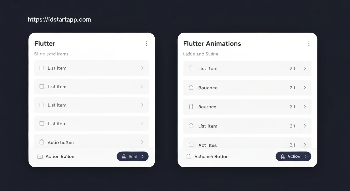

Mastering Flutter Slide and Bounce Animations for List Item Swipes and Action Buttons
Animations are crucial for creating intuitive and engaging user experiences. They provide visual feedback, guide users through interactions, and make an application feel more polished and responsive. Flutter, with its declarative UI and powerful animation framework, makes it incredibly straightforward to implement complex animations.
This article will delve into creating captivating slide and bounce animations specifically tailored for list item swipes and action buttons. We'll explore the core Flutter animation concepts and provide practical code examples to bring these dynamic effects to your applications.
Core Concepts of Flutter Animations
Before diving into specific examples, let's briefly review the fundamental building blocks of Flutter's animation system:
-
AnimationController: The most basic class for managing an animation. It controls the animation's state (playing, stopping, reversing), duration, and values. -
Tween: Defines a range of values over which an animation should occur. For instance, aTweenfrom 0.0 to 1.0, or aColorTweenfrom red to blue. -
Animation: Represents the current value of an animation. ATweencan be animated by anAnimationControllerto produce anAnimationobject that yields values within the defined range. -
Curves: Predefined motion curves that define the non-linear progression of an animation. Examples includeCurves.easeOut,Curves.bounceOut, orCurves.elasticIn. -
AnimatedBuilder: A widget that rebuilds its child when anAnimationobject changes value. It's an efficient way to animate a widget without callingsetStatein the widget itself. -
Transition Widgets: Widgets likeSlideTransition,ScaleTransition,FadeTransition, etc., which take anAnimationobject and apply a transformation to their child.
Slide Animation for List Item Swipes
A slide animation for list items provides an elegant way to reveal hidden actions (like delete or archive) or dismiss an item. While Flutter's Dismissible widget offers basic swipe-to-dismiss functionality, a custom approach gives more control over the animation and revealed actions.
Implementing a Custom Slide-to-Reveal Animation
We'll create a custom widget that uses a GestureDetector to detect horizontal swipes and an AnimationController with SlideTransition to animate the item's position.
import 'package:flutter/material.dart';

class SlideableListItem extends StatefulWidget {
  final Widget child;
  final Widget background;
  final double swipeThreshold;
  final Duration animationDuration;
  final VoidCallback? onSwipeLeft;
  final VoidCallback? onSwipeRight;

  const SlideableListItem({
    Key? key,
    required this.child,
    required this.background,
    this.swipeThreshold = 0.25, // Percentage of width to trigger swipe
    this.animationDuration = const Duration(milliseconds: 300),
    this.onSwipeLeft,
    this.onSwipeRight,
  }) : super(key: key);

  @override
  _SlideableListItemState createState() => _SlideableListItemState();
}

class _SlideableListItemState extends State
    with SingleTickerProviderStateMixin {
  late AnimationController _controller;
  late Animation _offsetAnimation;

  @override
  void initState() {
    super.initState();
    _controller = AnimationController(
      vsync: this,
      duration: widget.animationDuration,
    );
    _offsetAnimation = Tween(
      begin: Offset.zero,
      end: Offset.zero, // Will be updated dynamically
    ).animate(_controller);
  }

  @override
  void dispose() {
    _controller.dispose();
    super.dispose();
  }

  void _handleHorizontalDragUpdate(DragUpdateDetails details) {
    setState(() {
      final newOffset = _offsetAnimation.value.dx + details.primaryDelta! / context.size!.width;
      _offsetAnimation = Tween(
        begin: Offset.zero,
        end: Offset(newOffset.clamp(-1.0, 1.0), 0.0),
      ).animate(_controller);
    });
  }

  void _handleHorizontalDragEnd(DragEndDetails details) {
    final double currentOffset = _offsetAnimation.value.dx;
    if (currentOffset.abs() > widget.swipeThreshold) {
      // Trigger action
      if (currentOffset > widget.swipeThreshold && widget.onSwipeRight != null) {
        _controller.animateTo(1.0, curve: Curves.easeOutCubic).then((_) => widget.onSwipeRight!());
      } else if (currentOffset < -widget.swipeThreshold && widget.onSwipeLeft != null) {
        _controller.animateTo(-1.0, curve: Curves.easeOutCubic).then((_) => widget.onSwipeLeft!());
      } else {
        _controller.animateTo(0.0, curve: Curves.easeOut); // Snap back
      }
    } else {
      _controller.animateTo(0.0, curve: Curves.easeOut); // Snap back
    }
  }

  void _resetPosition() {
    _controller.animateTo(0.0, curve: Curves.easeOut);
  }

  @override
  Widget build(BuildContext context) {
    return GestureDetector(
      onHorizontalDragUpdate: _handleHorizontalDragUpdate,
      onHorizontalDragEnd: _handleHorizontalDragEnd,
      child: Stack(
        children: [
          Positioned.fill(child: widget.background), // Background for actions
          SlideTransition(
            position: _offsetAnimation,
            child: widget.child,
          ),
        ],
      ),
    );
  }
}

// Example usage:
// ListView.builder(
//   itemCount: 10,
//   itemBuilder: (context, index) {
//     return SlideableListItem(
//       background: Container(
//         color: Colors.red,
//         alignment: Alignment.centerRight,
//         padding: EdgeInsets.symmetric(horizontal: 20),
//         child: Icon(Icons.delete, color: Colors.white),
//       ),
//       onSwipeLeft: () {
//         print("Item $index swiped left (delete)");
//         // Perform delete action, then rebuild or remove item
//       },
//       child: Card(
//         margin: EdgeInsets.symmetric(vertical: 4, horizontal: 8),
//         child: ListTile(
//           title: Text('Item $index'),
//           subtitle: Text('Swipe me!'),
//         ),
//       ),
//     );
//   },
// )
This implementation allows for a smooth slide, where the background (containing action buttons) is revealed as the foreground child slides away. The _handleHorizontalDragUpdate and _handleHorizontalDragEnd methods control the animation's progress based on user gestures.
Bounce Animation for Action Buttons
Bounce animations add a delightful and noticeable feedback mechanism when a user interacts with a button. Instead of a flat visual state change, a button that slightly 'bounces' upon press feels more tactile and responsive.
Implementing a Custom Bounce Button
We'll create a BounceButton widget that uses an AnimationController and Transform.scale to achieve a bounce effect on tap down and tap up events.
import 'package:flutter/material.dart';

class BounceButton extends StatefulWidget {
  final Widget child;
  final VoidCallback? onPressed;
  final Duration animationDuration;
  final double scaleFactor;
  final Curve bounceCurve;

  const BounceButton({
    Key? key,
    required this.child,
    this.onPressed,
    this.animationDuration = const Duration(milliseconds: 150),
    this.scaleFactor = 0.9, // How much the button shrinks
    this.bounceCurve = Curves.elasticOut, // The bounce effect
  }) : super(key: key);

  @override
  _BounceButtonState createState() => _BounceButtonState();
}

class _BounceButtonState extends State
    with SingleTickerProviderStateMixin {
  late AnimationController _controller;
  late Animation _scaleAnimation;

  @override
  void initState() {
    super.initState();
    _controller = AnimationController(
      vsync: this,
      duration: widget.animationDuration,
      lowerBound: 0.0,
      upperBound: 1.0,
    );

    _scaleAnimation = Tween(
      begin: 1.0,
      end: widget.scaleFactor,
    ).animate(
      CurvedAnimation(parent: _controller, curve: Curves.easeIn),
    );
  }

  @override
  void dispose() {
    _controller.dispose();
    super.dispose();
  }

  void _handleTapDown(TapDownDetails details) {
    _controller.reverse(); // Animate to scaleFactor
  }

  void _handleTapUp(TapUpDetails details) {
    _controller.forward(from: 0.0); // Animate back to 1.0 with bounce
  }

  void _handleTapCancel() {
    _controller.forward(from: 0.0); // Animate back if tap is cancelled
  }

  @override
  Widget build(BuildContext context) {
    return GestureDetector(
      onTapDown: widget.onPressed != null ? _handleTapDown : null,
      onTapUp: widget.onPressed != null ? _handleTapUp : null,
      onTapCancel: widget.onPressed != null ? _handleTapCancel : null,
      onTap: widget.onPressed,
      child: AnimatedBuilder(
        animation: _controller,
        builder: (context, child) {
          return Transform.scale(
            scale: _scaleAnimation.value,
            child: child,
          );
        },
        child: widget.child,
      ),
    );
  }
}

// Example usage:
// BounceButton(
//   onPressed: () {
//     print("Button tapped!");
//   },
//   child: Container(
//     padding: EdgeInsets.all(16),
//     decoration: BoxDecoration(
//       color: Colors.blue,
//       borderRadius: BorderRadius.circular(10),
//     ),
//     child: Text(
//       'Press Me',
//       style: TextStyle(color: Colors.white, fontSize: 20),
//     ),
//   ),
// )
In this BounceButton, the _controller.reverse() shrinks the button, and _controller.forward(from: 0.0) quickly brings it back to its original size, leveraging `Curves.elasticOut` for that satisfying bounce effect. The `GestureDetector` handles the tap events, ensuring the animation plays at the correct times.
Best Practices for Animations
- Keep it Purposeful: Animations should serve a clear purpose, such as providing feedback, indicating state changes, or guiding user attention, not just for aesthetic fluff.
-
Optimize Performance: While Flutter animations are performant, avoid animating widgets that trigger frequent layout recalculations. Prefer transformations like
Transform.scale,Transform.translate, orOpacitywhich are more efficient. - Use Appropriate Curves: The choice of `Curve` significantly impacts the feel of an animation. Experiment with different curves to find the most suitable one for your interaction.
- Moderate Duration: Most UI animations should be brief (150ms-500ms). Longer animations can feel sluggish, while too short ones might be missed.
- Accessibility: Be mindful of users who might be sensitive to motion. Flutter offers ways to reduce or disable animations globally, which should be respected.
Conclusion
Flutter's rich animation framework empowers developers to craft highly interactive and visually appealing applications. By mastering fundamental concepts like AnimationController, Tween, and Curves, you can implement sophisticated effects such as slide animations for list item swipes and bounce animations for action buttons with relative ease. Incorporating these dynamic elements not only enhances the aesthetics of your app but also significantly improves the overall user experience, making your applications feel more alive and responsive.


