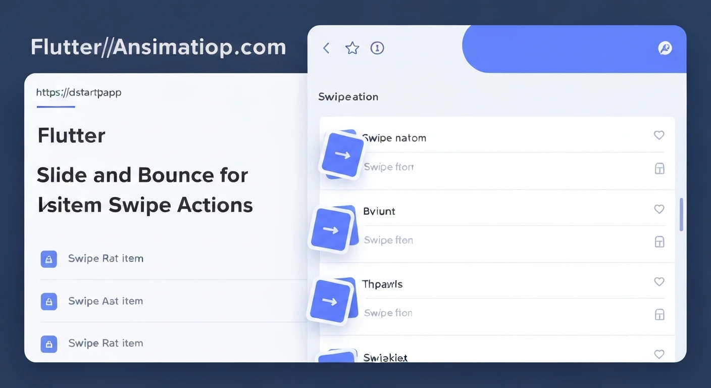

Flutter Slide & Bounce Animations for List Item Swipe Actions Extended
Enhancing user experience in mobile applications often comes down to delightful micro-interactions. In Flutter, list item swipe actions are a common pattern for interacting with data, such as deleting an item, archiving it, or marking it as read. While Flutter's built-in Dismissible widget provides basic swipe functionality, extending these actions with custom slide and bounce animations can significantly elevate the application's polish and user engagement.
This article explores how to implement custom slide and bounce animations for list item swipe actions, going beyond the standard Dismissible behavior to provide more dynamic and responsive feedback, especially for "extended" actions that might require revealing multiple options.
The Power of Dynamic Swipe Feedback
Standard swipe actions often result in an item simply sliding away or snapping back. While functional, this can feel abrupt. Introducing a "bounce" effect provides a more natural, tactile response, simulating a physical spring. When combined with a controlled slide, it can guide the user's attention, signal the state of the interaction, and make the app feel more alive.
For "extended" swipe actions, where swiping an item reveals a set of secondary options (e.g., "Edit," "Share," "Delete" buttons) instead of directly dismissing it, custom animations are crucial. They allow us to:
- Provide clear visual feedback during the drag.
- Animate the item to a "partially open" state when a threshold is met.
- Introduce a satisfying bounce when the item settles into this new state or returns to its original position.
- Smoothly transition between states, making the interface feel more responsive.
Core Animation Concepts
To achieve the desired slide and bounce effect, we'll primarily use:
AnimationController: Manages the animation's state, starting, stopping, and reversing it.Tween: Defines the range of values for the item's position (e.g., fromOffset.zeroto a specific horizontal offset).CurvedAnimation: Applies a non-linear curve to the animation, such asCurves.elasticOutfor a bouncy effect.AnimatedBuilder: Rebuilds its child whenever the animation value changes, applying transformations likeTransform.translate.GestureDetector: Detects horizontal drag gestures to control the animation based on user input.
Implementing the Custom Swipeable Item
Let's build a custom SwipeableListItem widget that incorporates these concepts.
1. Basic Widget Structure and Animation Setup
We start by creating a StatefulWidget that will manage the animation controller and the current drag state.
import 'package:flutter/material.dart';

class SwipeableListItem extends StatefulWidget {
  final Widget child;
  final Widget background;
  final ValueChanged onSwipeUpdate;
  final VoidCallback onSwipeEnd;

  const SwipeableListItem({
    Key? key,
    required this.child,
    required this.background,
    required this.onSwipeUpdate,
    required this.onSwipeEnd,
  }) : super(key: key);

  @override
  _SwipeableListItemState createState() => _SwipeableListItemState();
}

class _SwipeableListItemState extends State with SingleTickerProviderStateMixin {
  late AnimationController _controller;
  late Animation _offsetAnimation;
  double _currentDragOffset = 0.0;

  @override
  void initState() {
    super.initState();
    _controller = AnimationController(
      vsync: this,
      duration: const Duration(milliseconds: 300),
    );
    _offsetAnimation = Tween(
      begin: Offset.zero,
      end: Offset.zero,
    ).animate(
      CurvedAnimation(
        parent: _controller,
        curve: Curves.elasticOut, // Add a bounce effect
      ),
    );
  }

  @override
  void dispose() {
    _controller.dispose();
    super.dispose();
  }

  void _animateTo(double targetX) {
    _offsetAnimation = Tween(
      begin: Offset(_currentDragOffset, 0.0),
      end: Offset(targetX, 0.0),
    ).animate(
      CurvedAnimation(
        parent: _controller,
        curve: Curves.elasticOut,
      ),
    );
    _controller.reset();
    _controller.forward().then((_) {
      _currentDragOffset = targetX;
      widget.onSwipeEnd(); // Notify parent when animation ends
    });
  }

  // ... (Gesture detection and build method will go here)
}
2. Gesture Detection and Live Slide
We'll use a GestureDetector to capture horizontal drag events. During onHorizontalDragUpdate, we directly update the item's position, providing immediate visual feedback. In onHorizontalDragEnd, we decide whether to animate the item back to its original position, to an "extended open" state, or off-screen.
// ... inside _SwipeableListItemState

  void _onHorizontalDragUpdate(DragUpdateDetails details) {
    setState(() {
      _currentDragOffset += details.primaryDelta!;
      widget.onSwipeUpdate(_currentDragOffset); // Notify parent of live drag
    });
  }

  void _onHorizontalDragEnd(DragEndDetails details) {
    // Define a threshold for extended actions, e.g., 100 pixels
    const double extendedActionThreshold = 100.0;
    const double snapBackThreshold = 50.0;

    if (_currentDragOffset.abs() > extendedActionThreshold) {
      // Animate to an 'extended open' state (e.g., -100 for left swipe, +100 for right swipe)
      _animateTo(_currentDragOffset > 0 ? extendedActionThreshold : -extendedActionThreshold);
    } else if (_currentDragOffset.abs() > snapBackThreshold) {
      // If dragged slightly, but not past extended threshold, animate back
      _animateTo(0.0);
    } else {
      // Default: animate back to original position
      _animateTo(0.0);
    }
  }

  @override
  Widget build(BuildContext context) {
    return GestureDetector(
      onHorizontalDragUpdate: _onHorizontalDragUpdate,
      onHorizontalDragEnd: _onHorizontalDragEnd,
      child: AnimatedBuilder(
        animation: _offsetAnimation,
        builder: (context, child) {
          double translationX = _controller.isAnimating ? _offsetAnimation.value.dx : _currentDragOffset;
          return Stack(
            children: [
              // Background actions (revealed as item slides)
              Positioned.fill(
                child: widget.background,
              ),
              // The main list item, translated based on swipe
              Transform.translate(
                offset: Offset(translationX, 0.0),
                child: widget.child,
              ),
            ],
          );
        },
      ),
    );
  }
3. Integrating Extended Actions and Bounce Effect
The _animateTo method, combined with Curves.elasticOut, provides the bounce effect. The key is in how we handle _onHorizontalDragEnd:
- If the drag extent crosses
extendedActionThreshold, we animate to that specificOffset(e.g.,Offset(100.0, 0.0)), and the item settles there with a bounce, revealing background actions. - Otherwise, if the drag is not significant enough, we animate back to
Offset.zerowith a bounce.
The Stack widget in the build method is crucial. It allows us to place the widget.background (containing our extended actions) underneath the Transform.translate wrapped widget.child. As the child slides, the background is revealed.
Here's a simplified example of how you might use this SwipeableListItem in a ListView, with custom background actions:
class MyHomeScreen extends StatefulWidget {
  const MyHomeScreen({Key? key}) : super(key: key);

  @override
  State createState() => _MyHomeScreenState();
}

class _MyHomeScreenState extends State {
  final List _items = List.generate(10, (index) => 'Item ${index + 1}');

  @override
  Widget build(BuildContext context) {
    return Scaffold(
      appBar: AppBar(title: const Text('Swipeable List')),
      body: ListView.builder(
        itemCount: _items.length,
        itemBuilder: (context, index) {
          final String item = _items[index];
          return SwipeableListItem(
            key: ValueKey(item), // Important for lists
            onSwipeUpdate: (offset) {
              // Can update state based on live swipe for more complex UIs
              // print('Swiping item: $item, offset: $offset');
            },
            onSwipeEnd: () {
              // Item finished animating, handle logic if it's in an extended state
              // print('Swipe animation ended for item: $item');
            },
            background: Container(
              color: Colors.blueGrey[100],
              padding: const EdgeInsets.symmetric(horizontal: 20),
              alignment: Alignment.centerLeft,
              child: Row(
                mainAxisAlignment: MainAxisAlignment.end,
                children: [
                  TextButton(
                    onPressed: () {
                      ScaffoldMessenger.of(context).showSnackBar(SnackBar(content: Text('Archived $item')));
                      // Handle archive action
                    },
                    child: const Text('Archive', style: TextStyle(color: Colors.black)),
                  ),
                  const SizedBox(width: 10),
                  TextButton(
                    onPressed: () {
                      ScaffoldMessenger.of(context).showSnackBar(SnackBar(content: Text('Deleted $item')));
                      setState(() {
                        _items.removeAt(index);
                      });
                    },
                    child: const Text('Delete', style: TextStyle(color: Colors.red)),
                  ),
                ],
              ),
            ),
            child: Container(
              color: Colors.white,
              child: ListTile(
                title: Text(item),
                subtitle: const Text('Swipe me for actions!'),
              ),
            ),
          );
        },
      ),
    );
  }
}
Key Takeaways and Best Practices
AnimationControllerper Item: For optimal performance and independent animation, each swipeable item should manage its ownAnimationController.- CurvedAnimation for Bounce:
Curves.elasticOutis excellent for a natural-looking bounce. Experiment with other curves for different effects. AnimatedBuildervs.setState: UseAnimatedBuilderfor applying transformations based on animation values. It rebuilds only the necessary part of the widget tree, improving performance over callingsetStatedirectly within the animation listener.- Thresholds are Key: Carefully define drag thresholds for triggering different actions (e.g., full dismissal, extended action reveal, or snapping back).
- Accessibility: Consider how users without fine motor control or those using screen readers might interact with these extended swipe actions. Provide alternative ways to access these functions if critical.
- State Management: When an item settles into an "extended open" state, ensure your application's state reflects this. You might need to track which item is currently "open" to close others or handle further interactions.
Conclusion
Implementing custom slide and bounce animations for list item swipe actions in Flutter, especially for extended functionalities, provides a superior user experience. By leveraging AnimationController, Tween, CurvedAnimation, and GestureDetector, developers can create highly interactive and visually appealing interfaces that go beyond basic interactions. This approach not only makes the application feel more premium but also enhances clarity and user satisfaction during common list interactions.
While this article provides a solid foundation, further enhancements could include multi-directional swipes, dynamic background actions that change based on swipe direction, and more complex gesture recognition for specific actions.


