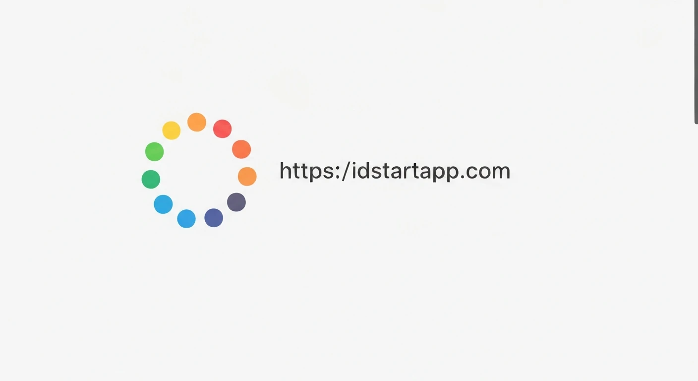

Creating a Dotted Circle Loading Indicator with Rotation and Bounce in Flutter
Loading indicators are crucial for user experience, providing visual feedback during asynchronous operations. While Flutter offers default indicators, crafting custom animations can significantly enhance your app's aesthetic and brand identity. This article guides you through building a unique Flutter loading indicator: a dotted circle that elegantly rotates and bounces, captivating users while they wait.
Core Concepts
Our custom loading indicator will combine several Flutter animation fundamentals:
CustomPainter: To draw the series of dots forming our circle. This gives us pixel-level control over the indicator's appearance.AnimationControllerandTween: To manage the continuous rotation and the periodic bouncing motion.AnimatedBuilder: To efficiently rebuild only the animated parts of our widget, ensuring smooth performance without rebuilding the entire widget tree.Transform.rotateandTransform.translate: To apply the rotational and translational (bouncing) effects based on our animation values.
Step-by-Step Implementation
1. Setup the Stateful Widget
We'll start by creating a StatefulWidget, as we need to manage the lifecycle of our AnimationControllers.
import 'dart:math' as math;
import 'package:flutter/material.dart';

class DottedLoadingIndicator extends StatefulWidget {
  final double dotRadius;
  final double circleRadius;
  final Color dotColor;
  final int numberOfDots;
  final Duration rotationDuration;
  final Duration bounceDuration;
  final double bounceHeight;

  const DottedLoadingIndicator({
    Key? key,
    this.dotRadius = 3.0,
    this.circleRadius = 30.0,
    this.dotColor = Colors.blue,
    this.numberOfDots = 12,
    this.rotationDuration = const Duration(seconds: 2),
    this.bounceDuration = const Duration(milliseconds: 600),
    this.bounceHeight = 10.0,
  }) : assert(numberOfDots > 0),
       super(key: key);

  @override
  _DottedLoadingIndicatorState createState() => _DottedLoadingIndicatorState();
}

class _DottedLoadingIndicatorState extends State with TickerProviderStateMixin {
  late AnimationController _rotationController;
  late AnimationController _bounceController;
  late Animation _bounceAnimation;

  @override
  void initState() {
    super.initState();

    _rotationController = AnimationController(
      vsync: this,
      duration: widget.rotationDuration,
    )..repeat(); // Repeat indefinitely for continuous rotation

    _bounceController = AnimationController(
      vsync: this,
      duration: widget.bounceDuration,
    )..repeat(reverse: true); // Repeat and reverse for up-and-down bounce

    _bounceAnimation = Tween(begin: 0.0, end: widget.bounceHeight).animate(
      CurvedAnimation(
        parent: _bounceController,
        curve: Curves.easeInOutSine, // Smooth bounce curve
      ),
    );
  }

  @override
  void dispose() {
    _rotationController.dispose();
    _bounceController.dispose();
    super.dispose();
  }

  // ... build method will go here
}
2. Implement the CustomPainter for Dotted Circle
The _DottedCirclePainter is responsible for drawing our dots in a circular pattern. It calculates the position for each dot based on the circle's radius and the number of dots.
class _DottedCirclePainter extends CustomPainter {
  final double dotRadius;
  final double circleRadius;
  final Color dotColor;
  final int numberOfDots;

  _DottedCirclePainter({
    required this.dotRadius,
    required this.circleRadius,
    required this.dotColor,
    required this.numberOfDots,
  });

  @override
  void paint(Canvas canvas, Size size) {
    final Paint paint = Paint()..color = dotColor;
    final Offset center = Offset(size.width / 2, size.height / 2);

    for (int i = 0; i < numberOfDots; i++) {
      final double angle = 2 * math.pi * (i / numberOfDots);
      final double x = center.dx + circleRadius * math.cos(angle);
      final double y = center.dy + circleRadius * math.sin(angle);
      canvas.drawCircle(Offset(x, y), dotRadius, paint);
    }
  }

  @override
  bool shouldRepaint(covariant _DottedCirclePainter oldDelegate) {
    return oldDelegate.dotRadius != dotRadius ||
           oldDelegate.circleRadius != circleRadius ||
           oldDelegate.dotColor != dotColor ||
           oldDelegate.numberOfDots != numberOfDots;
  }
}
3. Combine Animations with AnimatedBuilder
In the build method, we'll use an AnimatedBuilder to listen to our AnimationControllers. We'll wrap our CustomPaint widget with Transform.rotate for rotation and Transform.translate for the bouncing effect.
  @override
  Widget build(BuildContext context) {
    return AnimatedBuilder(
      animation: Listenable.merge([_rotationController, _bounceController]),
      builder: (context, child) {
        final double rotationAngle = _rotationController.value * 2 * math.pi;
        final double bounceOffset = -_bounceAnimation.value; // Negative for upward bounce

        return Transform.translate(
          offset: Offset(0.0, bounceOffset),
          child: Transform.rotate(
            angle: rotationAngle,
            child: CustomPaint(
              size: Size(
                (widget.circleRadius + widget.dotRadius) * 2,
                (widget.circleRadius + widget.dotRadius) * 2,
              ),
              painter: _DottedCirclePainter(
                dotRadius: widget.dotRadius,
                circleRadius: widget.circleRadius,
                dotColor: widget.dotColor,
                numberOfDots: widget.numberOfDots,
              ),
            ),
          ),
        );
      },
    );
  }
Full Code Example
Here's the complete code for the DottedLoadingIndicator:
import 'dart:math' as math;
import 'package:flutter/material.dart';

class DottedLoadingIndicator extends StatefulWidget {
  final double dotRadius;
  final double circleRadius;
  final Color dotColor;
  final int numberOfDots;
  final Duration rotationDuration;
  final Duration bounceDuration;
  final double bounceHeight;

  const DottedLoadingIndicator({
    Key? key,
    this.dotRadius = 3.0,
    this.circleRadius = 30.0,
    this.dotColor = Colors.blue,
    this.numberOfDots = 12,
    this.rotationDuration = const Duration(seconds: 2),
    this.bounceDuration = const Duration(milliseconds: 600),
    this.bounceHeight = 10.0,
  }) : assert(numberOfDots > 0),
       super(key: key);

  @override
  _DottedLoadingIndicatorState createState() => _DottedLoadingIndicatorState();
}

class _DottedLoadingIndicatorState extends State with TickerProviderStateMixin {
  late AnimationController _rotationController;
  late AnimationController _bounceController;
  late Animation _bounceAnimation;

  @override
  void initState() {
    super.initState();

    _rotationController = AnimationController(
      vsync: this,
      duration: widget.rotationDuration,
    )..repeat();

    _bounceController = AnimationController(
      vsync: this,
      duration: widget.bounceDuration,
    )..repeat(reverse: true);

    _bounceAnimation = Tween(begin: 0.0, end: widget.bounceHeight).animate(
      CurvedAnimation(
        parent: _bounceController,
        curve: Curves.easeInOutSine,
      ),
    );
  }

  @override
  void dispose() {
    _rotationController.dispose();
    _bounceController.dispose();
    super.dispose();
  }

  @override
  Widget build(BuildContext context) {
    return AnimatedBuilder(
      animation: Listenable.merge([_rotationController, _bounceController]),
      builder: (context, child) {
        final double rotationAngle = _rotationController.value * 2 * math.pi;
        final double bounceOffset = -_bounceAnimation.value;

        return Transform.translate(
          offset: Offset(0.0, bounceOffset),
          child: Transform.rotate(
            angle: rotationAngle,
            child: CustomPaint(
              size: Size(
                (widget.circleRadius + widget.dotRadius) * 2,
                (widget.circleRadius + widget.dotRadius) * 2,
              ),
              painter: _DottedCirclePainter(
                dotRadius: widget.dotRadius,
                circleRadius: widget.circleRadius,
                dotColor: widget.dotColor,
                numberOfDots: widget.numberOfDots,
              ),
            ),
          ),
        );
      },
    );
  }
}

class _DottedCirclePainter extends CustomPainter {
  final double dotRadius;
  final double circleRadius;
  final Color dotColor;
  final int numberOfDots;

  _DottedCirclePainter({
    required this.dotRadius,
    required this.circleRadius,
    required this.dotColor,
    required this.numberOfDots,
  });

  @override
  void paint(Canvas canvas, Size size) {
    final Paint paint = Paint()..color = dotColor;
    final Offset center = Offset(size.width / 2, size.height / 2);

    for (int i = 0; i < numberOfDots; i++) {
      final double angle = 2 * math.pi * (i / numberOfDots);
      final double x = center.dx + circleRadius * math.cos(angle);
      final double y = center.dy + circleRadius * math.sin(angle);
      canvas.drawCircle(Offset(x, y), dotRadius, paint);
    }
  }

  @override
  bool shouldRepaint(covariant _DottedCirclePainter oldDelegate) {
    return oldDelegate.dotRadius != dotRadius ||
           oldDelegate.circleRadius != circleRadius ||
           oldDelegate.dotColor != dotColor ||
           oldDelegate.numberOfDots != numberOfDots;
  }
}
Explanation of Key Parts
_DottedCirclePainter: This custom painter drawsnumberOfDotssmall circles (dots) evenly distributed along the circumference of a larger circle defined bycircleRadius. It's static, meaning its appearance doesn't change unless its properties are updated._rotationController: AnAnimationControllerthat runs indefinitely (.repeat()) from 0.0 to 1.0 overrotationDuration. Itsvalueis multiplied by2 * math.pito get an angle in radians for a full 360-degree rotation._bounceControllerand_bounceAnimation: The_bounceControllerruns from 0.0 to 1.0 and then reverses (.repeat(reverse: true)). The_bounceAnimationuses aTweento map this 0.0-1.0 range to a vertical offset (0 tobounceHeight) with a smoothCurves.easeInOutSinefor a natural bounce feel.AnimatedBuilder: This widget rebuilds its child whenever any of the animations it's listening to change value. We merge both_rotationControllerand_bounceControllerinto a singleListenable.mergeto efficiently update the UI.Transform.translateandTransform.rotate: These widgets apply the calculated bounce and rotation transformations. TheTransform.translateis applied first for the bouncing effect, and thenTransform.rotaterotates the entire dotted circle. The order matters for how transformations are perceived.
Conclusion
By leveraging Flutter's powerful animation framework and CustomPainter, we've successfully created a dynamic and visually engaging loading indicator. This dotted circle with rotation and bounce not only signals activity but also adds a polished touch to your application's user interface. You can further customize this indicator by experimenting with different dot shapes, colors, animation curves, or by adding more complex chained animations to truly make it your own.


