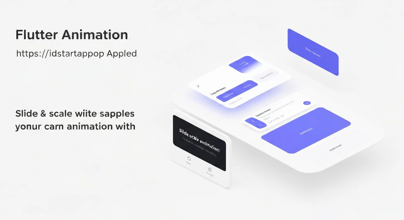

Flutter Slide & Scale Animations for Modals, Cards, and Page Transitions
Animations are a cornerstone of modern user interface design, providing visual cues, enhancing user experience, and making applications feel more intuitive and delightful. In Flutter, powerful and flexible animation APIs allow developers to create stunning, performant animations with relative ease. Among the myriad of animation techniques, "Slide & Scale" stands out as a versatile and impactful combination, commonly used for bringing content into view—be it a modal, a dynamic card, or an entire new page.
This article explores how to implement Slide & Scale animations effectively across these key UI elements in Flutter, providing practical code examples and highlighting the underlying principles.
Core Animation Concepts in Flutter
Before diving into specific examples, it's beneficial to briefly recap the core components of Flutter's animation system:
AnimationController: Manages the animation's progress (forward, reverse, stop). It requires avsyncto prevent animations from consuming unnecessary resources when off-screen.Animation: Represents a value over time. AnAnimationControlleris itself anAnimation.Tween: Defines the start and end values of an animation. It interpolates values between the begin and end points.CurvedAnimation: Applies a non-linear curve to an animation, enhancing its natural feel (e.g.,Curves.easeOutBack,Curves.bounceOut).- Animated Widgets (e.g.,
SlideTransition,ScaleTransition): These widgets take anAnimationand automatically rebuild their children based on the animation's current value.
Slide & Scale for Modals (Dialogs & Bottom Sheets)
Modals, such as dialogs or bottom sheets, are excellent candidates for Slide & Scale animations. A common pattern is for the modal to slide in from a direction (e.g., bottom, top, center) while simultaneously scaling up, providing a dynamic and engaging entrance.
For custom modal animations, showGeneralDialog is the go-to function, offering a transitionBuilder callback where you can define how the dialog's child widget animates.
Here’s an example demonstrating a dialog that slides in from the bottom and scales up:
import 'package:flutter/material.dart';

void main() => runApp(const MyApp());

class MyApp extends StatelessWidget {
  const MyApp({Key? key}) : super(key: key);

  @override
  Widget build(BuildContext context) {
    return MaterialApp(
      title: 'Flutter Slide & Scale Modals',
      theme: ThemeData(primarySwatch: Colors.blue),
      home: Scaffold(
        appBar: AppBar(title: const Text('Modal Animation Demo')),
        body: Center(
          child: ElevatedButton(
            onPressed: () => _showAnimatedDialog(context),
            child: const Text('Show Animated Dialog'),
          ),
        ),
      ),
    );
  }

  void _showAnimatedDialog(BuildContext context) {
    showGeneralDialog(
      context: context,
      barrierDismissible: true,
      barrierLabel: MaterialLocalizations.of(context).modalBarrierDismissLabel,
      barrierColor: Colors.black54,
      transitionDuration: const Duration(milliseconds: 500),
      pageBuilder: (context, anim1, anim2) {
        return Center(
          child: Container(
            width: MediaQuery.of(context).size.width * 0.7,
            height: MediaQuery.of(context).size.height * 0.4,
            decoration: BoxDecoration(
              color: Colors.white,
              borderRadius: BorderRadius.circular(16),
            ),
            child: const Column(
              mainAxisAlignment: MainAxisAlignment.center,
              children: [
                Text(
                  'Hello!',
                  style: TextStyle(fontSize: 24, fontWeight: FontWeight.bold),
                ),
                SizedBox(height: 16),
                Text('This is an animated dialog.'),
              ],
            ),
          ),
        );
      },
      transitionBuilder: (context, anim1, anim2, child) {
        return ScaleTransition(
          scale: CurvedAnimation(
            parent: anim1,
            curve: Curves.easeOutBack,
          ),
          child: SlideTransition(
            position: Tween(
              begin: const Offset(0.0, 1.0), // Starts from bottom
              end: Offset.zero, // Ends at center
            ).animate(CurvedAnimation(
              parent: anim1,
              curve: Curves.easeOutCubic,
            )),
            child: child,
          ),
        );
      },
    );
  }
}
In this example, ScaleTransition and SlideTransition are nested. The dialog scales up with an easeOutBack curve, giving it a slight overshoot effect, and simultaneously slides into place from the bottom using an easeOutCubic curve for a smooth acceleration and deceleration.
Slide & Scale for Cards and Custom Widgets
Applying Slide & Scale animations to individual cards or custom widgets can make them appear more engaging when they are first loaded, become visible, or respond to user interaction. This typically involves managing an AnimationController within a StatefulWidget.
Below is a reusable AnimatedCard widget that demonstrates a slide-in from the bottom and scale-up animation upon its initialization:
import 'package:flutter/material.dart';

void main() => runApp(const MyApp());

class MyApp extends StatelessWidget {
  const MyApp({Key? key}) : super(key: key);

  @override
  Widget build(BuildContext context) {
    return MaterialApp(
      title: 'Flutter Slide & Scale Cards',
      theme: ThemeData(primarySwatch: Colors.blue),
      home: Scaffold(
        appBar: AppBar(title: const Text('Card Animation Demo')),
        body: ListView.builder(
          itemCount: 10,
          itemBuilder: (context, index) {
            return Padding(
              padding: const EdgeInsets.symmetric(vertical: 8.0, horizontal: 16.0),
              child: AnimatedCard(
                delay: Duration(milliseconds: index * 100), // Staggered animation
                child: Card(
                  elevation: 5,
                  child: Padding(
                    padding: const EdgeInsets.all(20.0),
                    child: Text(
                      'Card Item $index',
                      style: const TextStyle(fontSize: 18),
                    ),
                  ),
                ),
              ),
            );
          },
        ),
      ),
    );
  }
}

class AnimatedCard extends StatefulWidget {
  final Widget child;
  final Duration delay;

  const AnimatedCard({Key? key, required this.child, this.delay = Duration.zero}) : super(key: key);

  @override
  _AnimatedCardState createState() => _AnimatedCardState();
}

class _AnimatedCardState extends State with SingleTickerProviderStateMixin {
  late AnimationController _controller;
  late Animation _slideAnimation;
  late Animation _scaleAnimation;

  @override
  void initState() {
    super.initState();
    _controller = AnimationController(
      vsync: this,
      duration: const Duration(milliseconds: 700),
    );

    _slideAnimation = Tween(
      begin: const Offset(0.0, 0.5), // Starts from slightly below
      end: Offset.zero, // Ends at its original position
    ).animate(CurvedAnimation(
      parent: _controller,
      curve: Curves.easeOutCubic,
    ));

    _scaleAnimation = Tween(
      begin: 0.7, // Starts scaled down
      end: 1.0, // Ends at original size
    ).animate(CurvedAnimation(
      parent: _controller,
      curve: Curves.elasticOut, // Gives a nice bouncy effect
    ));

    // Start animation after a delay, useful for staggered lists
    Future.delayed(widget.delay, () {
      if (mounted) {
        _controller.forward();
      }
    });
  }

  @override
  void dispose() {
    _controller.dispose();
    super.dispose();
  }

  @override
  Widget build(BuildContext context) {
    return SlideTransition(
      position: _slideAnimation,
      child: ScaleTransition(
        scale: _scaleAnimation,
        child: FadeTransition( // Often combined with FadeTransition for smooth appearance
          opacity: _controller, // Use the controller directly for opacity from 0 to 1
          child: widget.child,
        ),
      ),
    );
  }
}
In this card example, an additional FadeTransition is included, which is a common practice to make the card fade in as it slides and scales. The delay parameter allows for staggered animations in a list, making the overall presentation more dynamic and visually appealing.
Slide & Scale for Page Transitions
Customizing page transitions with Slide & Scale can significantly elevate the navigation experience within your app. Flutter provides PageRouteBuilder to define completely custom route transitions.
Here’s how you can implement a page transition where the new page slides in from the right and scales up:
import 'package:flutter/material.dart';

void main() => runApp(const MyApp());

class MyApp extends StatelessWidget {
  const MyApp({Key? key}) : super(key: key);

  @override
  Widget build(BuildContext context) {
    return MaterialApp(
      title: 'Flutter Page Transitions',
      theme: ThemeData(primarySwatch: Colors.teal),
      home: const HomePage(),
    );
  }
}

class HomePage extends StatelessWidget {
  const HomePage({Key? key}) : super(key: key);

  @override
  Widget build(BuildContext context) {
    return Scaffold(
      appBar: AppBar(title: const Text('Home Page')),
      body: Center(
        child: ElevatedButton(
          onPressed: () {
            Navigator.of(context).push(_createRoute());
          },
          child: const Text('Go to Detail Page'),
        ),
      ),
    );
  }

  Route _createRoute() {
    return PageRouteBuilder(
      pageBuilder: (context, animation, secondaryAnimation) => const DetailPage(),
      transitionsBuilder: (context, animation, secondaryAnimation, child) {
        const begin = Offset(1.0, 0.0); // Start from the right
        const end = Offset.zero; // End at its original position
        const curve = Curves.easeOutCubic;

        var tween = Tween(begin: begin, end: end).chain(CurveTween(curve: curve));
        var offsetAnimation = animation.drive(tween);

        return SlideTransition(
          position: offsetAnimation,
          child: ScaleTransition(
            scale: CurvedAnimation(
              parent: animation,
              curve: Curves.easeOutBack, // A bouncy scale effect
            ),
            child: child,
          ),
        );
      },
      transitionDuration: const Duration(milliseconds: 600),
    );
  }
}

class DetailPage extends StatelessWidget {
  const DetailPage({Key? key}) : super(key: key);

  @override
  Widget build(BuildContext context) {
    return Scaffold(
      appBar: AppBar(title: const Text('Detail Page')),
      body: Center(
        child: Column(
          mainAxisAlignment: MainAxisAlignment.center,
          children: [
            const Text(
              'Welcome to the Detail Page!',
              style: TextStyle(fontSize: 22),
            ),
            const SizedBox(height: 20),
            ElevatedButton(
              onPressed: () {
                Navigator.of(context).pop();
              },
              child: const Text('Go Back'),
            ),
          ],
        ),
      ),
    );
  }
}
In this PageRouteBuilder example, the transitionsBuilder applies both a SlideTransition and a ScaleTransition to the child page. The Tween for the slide is chained with a CurveTween for a smooth animation, and the scale uses a distinct easeOutBack curve for an engaging "pop" effect as the page appears.
Conclusion
Slide & Scale animations are powerful tools in a Flutter developer's arsenal for creating dynamic, intuitive, and visually pleasing user interfaces. By intelligently combining SlideTransition and ScaleTransition with various Curves, you can achieve a wide range of engaging entrance and exit effects for modals, individual widgets like cards, and entire page transitions.
Experiment with different Tween values for begin and end, as well as various Curves, to find the perfect feel for your application's unique design language. Thoughtful use of animations not only makes your app look good but also significantly enhances the overall user experience.


