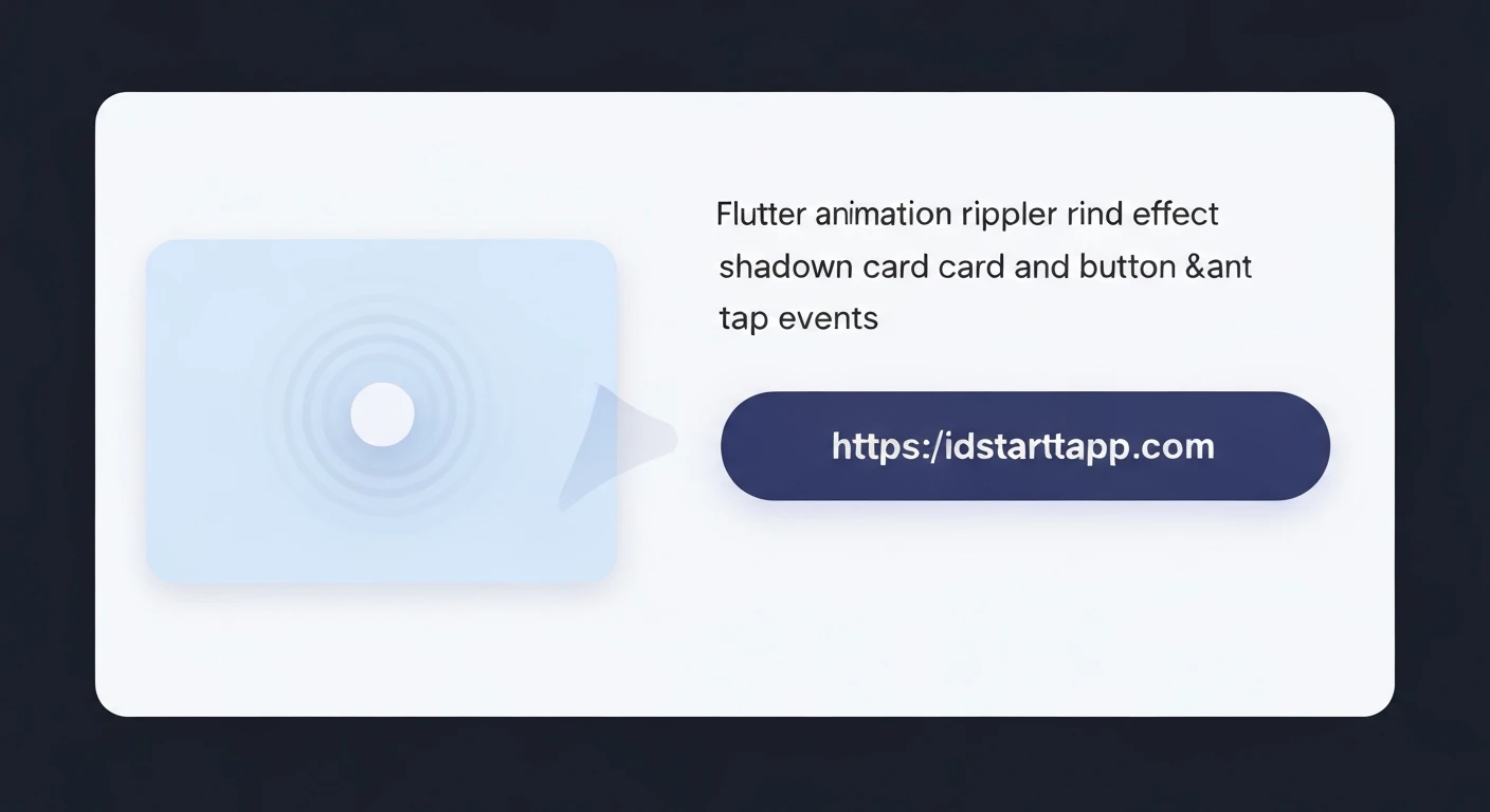

Implementing Ripple Effect and Dynamic Shadows in Flutter for Card and Button Taps
Introduction
In modern user interface design, subtle yet effective visual feedback is crucial for enhancing user experience. Flutter, with its powerful declarative UI framework, makes it incredibly easy to implement sophisticated animations like the ripple effect and dynamic shadows. These elements provide visual cues that a user's interaction has been registered, making an application feel more responsive and intuitive.
This article will guide you through the process of adding Material Design's iconic ripple effect and customizable shadows to your Flutter Cards and Buttons, creating professional-looking, interactive components.
Understanding Ripple Effects
The ripple effect is a visual animation that emanates from the point of a user's touch or click, mimicking the effect of dropping an object into water. It's a cornerstone of Material Design, providing immediate feedback that an interactive element has been engaged.
Material Design Principles
According to Material Design guidelines, ripples should originate from the touch point and expand outwards, fading away as they reach their maximum extent. Flutter provides built-in widgets to achieve this effect effortlessly.
Implementing Ripple Effects in Flutter
Flutter offers a few ways to implement ripple effects, with InkWell being the most straightforward for general purpose touch feedback.
Using InkWell
The InkWell widget provides a Material Design ink ripple effect when tapped. It must be a descendant of a Material widget to correctly display the ink splash. Typically, you wrap the widget you want to be tappable with InkWell.
import 'package:flutter/material.dart';

class RippleExample extends StatelessWidget {
  @override
  Widget build(BuildContext context) {
    return Material( // InkWell needs a Material ancestor
      child: Center(
        child: InkWell(
          onTap: () {
            print('Card tapped!');
          },
          splashColor: Colors.blue.withOpacity(0.5), // Custom splash color
          highlightColor: Colors.blue.withOpacity(0.2), // Color when held down
          borderRadius: BorderRadius.circular(12.0), // Match border radius of child if applicable
          child: Container(
            width: 200,
            height: 100,
            alignment: Alignment.center,
            decoration: BoxDecoration(
              color: Colors.white,
              borderRadius: BorderRadius.circular(12.0),
              border: Border.all(color: Colors.grey.shade300),
            ),
            child: Text(
              'Tap Me (InkWell)',
              style: TextStyle(fontSize: 18),
            ),
          ),
        ),
      ),
    );
  }
}
Using Material Widget Directly
For more control or when creating custom button-like widgets, you can use the Material widget itself and configure its child to react to gestures, allowing the Material widget to render ink features.
import 'package:flutter/material.dart';

class MaterialRippleExample extends StatelessWidget {
  @override
  Widget build(BuildContext context) {
    return Center(
      child: Material(
        color: Colors.white, // Background color of the Material
        borderRadius: BorderRadius.circular(12.0),
        child: InkWell( // InkWell handles the tap and ripple effect
          onTap: () {
            print('Custom Material Card tapped!');
          },
          splashColor: Colors.green.withOpacity(0.5),
          highlightColor: Colors.green.withOpacity(0.2),
          borderRadius: BorderRadius.circular(12.0),
          child: Container(
            width: 200,
            height: 100,
            alignment: Alignment.center,
            child: Text(
              'Tap Me (Material + InkWell)',
              style: TextStyle(fontSize: 18),
            ),
          ),
        ),
      ),
    );
  }
}
Mastering Shadows in Flutter
Shadows add depth and hierarchy to UI elements, indicating their elevation relative to other components and the background. Flutter provides flexible ways to implement shadows.
BoxDecoration and BoxShadow
The most common way to add shadows to a Container or any widget using BoxDecoration is through its boxShadow property. You can define multiple shadows with different offsets, blur radii, spread radii, and colors.
import 'package:flutter/material.dart';

class CustomShadowExample extends StatelessWidget {
  @override
  Widget build(BuildContext context) {
    return Center(
      child: Container(
        width: 200,
        height: 100,
        alignment: Alignment.center,
        decoration: BoxDecoration(
          color: Colors.white,
          borderRadius: BorderRadius.circular(8.0),
          boxShadow: [
            BoxShadow(
              color: Colors.grey.withOpacity(0.5),
              spreadRadius: 2, // Controls how much the shadow 'spreads'
              blurRadius: 7, // Controls the softness of the shadow
              offset: Offset(0, 3), // Changes position of shadow (x, y)
            ),
          ],
        ),
        child: Text(
          'Shadowed Container',
          style: TextStyle(fontSize: 18),
        ),
      ),
    );
  }
}
Material Widget for Consistent Elevation
For elements that adhere to Material Design, using the Material widget's elevation property is often preferred. This automatically generates a shadow that scales with the elevation value, maintaining visual consistency across your application.
import 'package:flutter/material.dart';

class MaterialElevationExample extends StatelessWidget {
  @override
  Widget build(BuildContext context) {
    return Center(
      child: Material(
        color: Colors.white,
        elevation: 8.0, // Controls the intensity of the shadow
        borderRadius: BorderRadius.circular(8.0),
        child: Container(
          width: 200,
          height: 100,
          alignment: Alignment.center,
          child: Text(
            'Material Elevated',
            style: TextStyle(fontSize: 18),
          ),
        ),
      ),
    );
  }
}
Combining Ripple and Shadow for Interactive Elements
The real power comes from combining these effects to create truly engaging interactive elements. We'll look at Cards and Buttons.
For Cards
Cards are perfect candidates for dynamic ripple and shadow effects. When a user taps a card, it should not only show a ripple but potentially also lift slightly (increase elevation) to indicate interaction. For simplicity, we'll demonstrate a static shadow with a ripple, but you can animate the elevation using a StatefulWidget and AnimationController for a "lift" effect.
import 'package:flutter/material.dart';

class InteractiveCard extends StatelessWidget {
  @override
  Widget build(BuildContext context) {
    return Center(
      child: Card( // Card widget automatically uses Material for elevation
        elevation: 6.0,
        shape: RoundedRectangleBorder(
          borderRadius: BorderRadius.circular(12.0),
        ),
        margin: EdgeInsets.all(16.0),
        child: InkWell( // Provides the ripple effect
          onTap: () {
            print('Card with ripple and shadow tapped!');
          },
          splashColor: Colors.purple.withOpacity(0.5),
          borderRadius: BorderRadius.circular(12.0), // Match Card's border radius
          child: Container(
            width: 300,
            height: 150,
            padding: EdgeInsets.all(16.0),
            child: Column(
              mainAxisAlignment: MainAxisAlignment.center,
              children: [
                Icon(Icons.lightbulb_outline, size: 40, color: Colors.purple),
                SizedBox(height: 8.0),
                Text(
                  'Explore Ideas',
                  style: TextStyle(fontSize: 20, fontWeight: FontWeight.bold),
                ),
                Text(
                  'Tap to discover more content.',
                  style: TextStyle(fontSize: 14, color: Colors.grey.shade600),
                ),
              ],
            ),
          ),
        ),
      ),
    );
  }
}
For Buttons
While Flutter's built-in buttons like ElevatedButton already provide excellent ripple and shadow effects, you might want to create custom buttons. Here's how to integrate these effects into a custom button-like widget, including a dynamic shadow change on tap.
import 'package:flutter/material.dart';

class CustomInteractiveButton extends StatefulWidget {
  @override
  _CustomInteractiveButtonState createState() => _CustomInteractiveButtonState();
}

class _CustomInteractiveButtonState extends State {
  double _elevation = 4.0; // Initial elevation
  Color _buttonColor = Colors.blue;

  void _onTapDown(TapDownDetails details) {
    setState(() {
      _elevation = 8.0; // Increase elevation on tap down
      _buttonColor = Colors.blue.shade700;
    });
  }

  void _onTapUp(TapUpDetails details) {
    setState(() {
      _elevation = 4.0; // Restore elevation on tap up
      _buttonColor = Colors.blue;
    });
  }

  void _onTapCancel() {
    setState(() {
      _elevation = 4.0; // Restore elevation if tap is cancelled
      _buttonColor = Colors.blue;
    });
  }

  void _onTap() {
    print('Custom Button tapped!');
    // Perform button action
  }

  @override
  Widget build(BuildContext context) {
    return Center(
      child: Material(
        color: _buttonColor,
        elevation: _elevation,
        borderRadius: BorderRadius.circular(24.0),
        shadowColor: Colors.grey.shade800,
        child: InkWell(
          onTap: _onTap,
          onTapDown: _onTapDown,
          onTapUp: _onTapUp,
          onTapCancel: _onTapCancel,
          splashColor: Colors.white.withOpacity(0.4),
          highlightColor: Colors.white.withOpacity(0.2),
          borderRadius: BorderRadius.circular(24.0),
          child: Container(
            width: 250,
            height: 60,
            alignment: Alignment.center,
            child: Text(
              'Press Me',
              style: TextStyle(
                color: Colors.white,
                fontSize: 20,
                fontWeight: FontWeight.bold,
              ),
            ),
          ),
        ),
      ),
    );
  }
}
Conclusion
Integrating ripple effects and dynamic shadows into your Flutter applications significantly elevates the user experience. By leveraging widgets like InkWell, Material, and BoxDecoration, developers can create visually rich and highly interactive UIs that adhere to Material Design principles. Whether it's a simple tap on a card or a press of a button, providing clear visual feedback makes your app feel more polished, responsive, and enjoyable to use.


