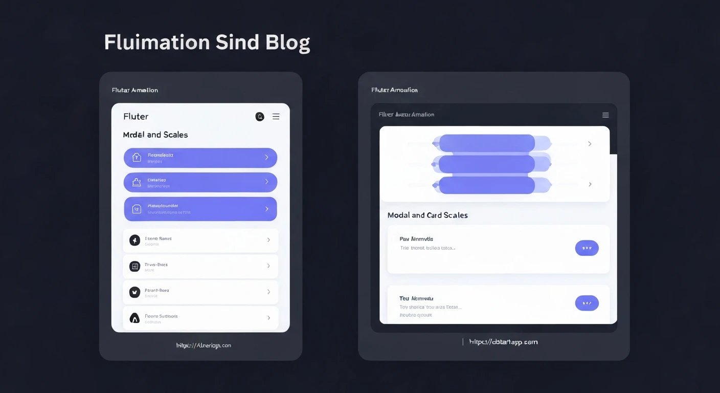

Flutter's Dynamic Duo: Slide & Scale Animations for Seamless Modals and Card Transitions
In the realm of modern user interfaces, animations are not just an aesthetic luxury; they are a fundamental component for enhancing user experience, providing visual feedback, and guiding user attention. Flutter, with its declarative UI and powerful animation framework, empowers developers to craft fluid and engaging transitions with remarkable ease. Among the myriad of animation possibilities, SlideTransition and ScaleTransition stand out as versatile tools for creating elegant and impactful interactions, especially for modal dialogs and card-to-detail page transitions.
The Importance of Animation in UI
Smooth transitions between states help users understand the flow of an application. When a modal appears with a subtle slide-up or a card expands to fill the screen, it feels more natural and intuitive than an abrupt pop-in. This article delves into how to leverage Flutter's animation system to implement sophisticated slide and scale effects for these common UI patterns, elevating your app's visual appeal and usability.
Core Concepts of Flutter Animations
Before diving into examples, let's briefly recap the fundamental building blocks of Flutter animations:
AnimationController: Manages the animation's state, including starting, stopping, forwarding, and reversing. It produces values that range from 0.0 to 1.0 over a given duration.Tween: Defines the range of values an animation can interpolate between. For example, aTweenfor `SlideTransition` or aTweenfor `ScaleTransition`.CurvedAnimation: Applies a non-linear curve to an animation, making it accelerate or decelerate more naturally (e.g.,Curves.easeOut,Curves.bounceIn).AnimatedWidget/AnimatedBuilder: Widgets that automatically rebuild themselves when the animation value changes. Transition widgets likeSlideTransitionandScaleTransitionare themselves `AnimatedWidget`s.
Slide & Scale for Modal Dialogs
Standard Flutter dialogs like showDialog offer basic transitions. However, for fully customizable entry and exit animations, showGeneralDialog is the go-to function. It allows you to define your own pageBuilder (the content of the dialog) and a transitionBuilder (how the dialog animates).
Here’s how to implement a modal that slides up from the bottom and scales in simultaneously:
Example: Custom Modal Animation
import 'package:flutter/material.dart';

class CustomModalPage extends StatefulWidget {
  const CustomModalPage({super.key});

  @override
  State createState() => _CustomModalPageState();
}

class _CustomModalPageState extends State with SingleTickerProviderStateMixin {
  late AnimationController _controller;
  late Animation _slideAnimation;
  late Animation _scaleAnimation;
  late Animation _fadeAnimation; // Often combined for better effect

  @override
  void initState() {
    super.initState();
    _controller = AnimationController(
      vsync: this,
      duration: const Duration(milliseconds: 600),
    );

    _slideAnimation = Tween(
      begin: const Offset(0, 1), // Starts off-screen below
      end: Offset.zero,           // Ends at its normal position
    ).animate(CurvedAnimation(parent: _controller, curve: Curves.easeOutBack));

    _scaleAnimation = Tween(
      begin: 0.7, // Starts smaller
      end: 1.0,   // Ends at normal size
    ).animate(CurvedAnimation(parent: _controller, curve: Curves.easeOutBack));

    _fadeAnimation = Tween(
      begin: 0.0, // Starts fully transparent
      end: 1.0,   // Ends fully opaque
    ).animate(CurvedAnimation(parent: _controller, curve: Curves.easeOut));
  }

  @override
  void dispose() {
    _controller.dispose();
    super.dispose();
  }

  void _showAnimatedModal(BuildContext context) {
    showGeneralDialog(
      context: context,
      barrierDismissible: true,
      barrierLabel: MaterialLocalizations.of(context).modalBarrierDismissLabel,
      barrierColor: Colors.black54,
      transitionDuration: const Duration(milliseconds: 600),
      pageBuilder: (context, animation, secondaryAnimation) {
        return Center(
          child: Container(
            width: 300,
            height: 200,
            decoration: BoxDecoration(
              color: Colors.white,
              borderRadius: BorderRadius.circular(16),
            ),
            child: const Column(
              mainAxisAlignment: MainAxisAlignment.center,
              children: [
                Text(
                  'Animated Modal!',
                  style: TextStyle(fontSize: 20, fontWeight: FontWeight.bold),
                ),
                SizedBox(height: 10),
                Text('This appeared with a slide and scale effect.'),
              ],
            ),
          ),
        );
      },
      transitionBuilder: (context, animation, secondaryAnimation, child) {
        return SlideTransition(
          position: Tween(
            begin: const Offset(0, 1), // Starts from bottom
            end: Offset.zero,
          ).animate(CurvedAnimation(
            parent: animation,
            curve: Curves.easeOutBack, // Playful entrance curve
          )),
          child: ScaleTransition(
            scale: Tween(
              begin: 0.8, // Starts a bit smaller
              end: 1.0,
            ).animate(CurvedAnimation(
              parent: animation,
              curve: Curves.elasticOut, // Bouncy scale effect
            )),
            child: FadeTransition(
              opacity: Tween(
                begin: 0.0, // Starts transparent
                end: 1.0,
              ).animate(CurvedAnimation(
                parent: animation,
                curve: Curves.easeOutCubic, // Smooth fade in
              )),
              child: child,
            ),
          ),
        );
      },
    );
  }

  @override
  Widget build(BuildContext context) {
    return Scaffold(
      appBar: AppBar(title: const Text('Modal Slide & Scale')),
      body: Center(
        child: ElevatedButton(
          onPressed: () => _showAnimatedModal(context),
          child: const Text('Show Animated Modal'),
        ),
      ),
    );
  }
}
In this example, the transitionBuilder uses the animation provided by showGeneralDialog directly. We combine SlideTransition, ScaleTransition, and FadeTransition to create a rich, multi-dimensional effect where the modal slides up, scales in, and fades into view.
Slide & Scale for Card Transitions (List to Detail)
When navigating from a list of cards to a detail page, a smooth transition can significantly improve the user experience. While Flutter's Hero widget is excellent for animating a single widget between routes, for a full-page transition that slides and scales, a custom PageRouteBuilder is more appropriate.
Example: Card to Detail Page Transition
import 'package:flutter/material.dart';

class CardItem {
  final String title;
  final String description;
  final Color color;

  CardItem(this.title, this.description, this.color);
}

class CardListPage extends StatelessWidget {
  final List cards = [
    CardItem('Item 1', 'Detail for item 1', Colors.blue),
    CardItem('Item 2', 'Detail for item 2', Colors.green),
    CardItem('Item 3', 'Detail for item 3', Colors.orange),
  ];

  CardListPage({super.key});

  @override
  Widget build(BuildContext context) {
    return Scaffold(
      appBar: AppBar(title: const Text('Card List')),
      body: ListView.builder(
        itemCount: cards.length,
        itemBuilder: (context, index) {
          final card = cards[index];
          return Card(
            margin: const EdgeInsets.all(8.0),
            color: card.color.withOpacity(0.7),
            child: InkWell(
              onTap: () {
                Navigator.of(context).push(
                  PageRouteBuilder(
                    transitionDuration: const Duration(milliseconds: 700),
                    pageBuilder: (context, animation, secondaryAnimation) =>
                        DetailPage(card: card),
                    transitionsBuilder:
                        (context, animation, secondaryAnimation, child) {
                      const begin = Offset(1.0, 0.0); // Starts from right
                      const end = Offset.zero;
                      final tween = Tween(begin: begin, end: end);
                      final offsetAnimation = animation.drive(tween);

                      return SlideTransition(
                        position: offsetAnimation.animate(CurvedAnimation(
                          parent: animation,
                          curve: Curves.easeInOutQuart, // Smooth slide
                        )),
                        child: ScaleTransition(
                          scale: Tween(
                            begin: 0.8, // Starts a bit smaller
                            end: 1.0,
                          ).animate(CurvedAnimation(
                            parent: animation,
                            curve: Curves.easeOutCubic, // Smooth scale up
                          )),
                          child: FadeTransition(
                            opacity: Tween(
                              begin: 0.0, // Starts transparent
                              end: 1.0,
                            ).animate(CurvedAnimation(
                              parent: animation,
                              curve: Curves.easeIn, // Fade in
                            )),
                            child: child,
                          ),
                        ),
                      );
                    },
                  ),
                );
              },
              child: Padding(
                padding: const EdgeInsets.all(16.0),
                child: Text(
                  card.title,
                  style: const TextStyle(
                    fontSize: 24,
                    fontWeight: FontWeight.bold,
                    color: Colors.white,
                  ),
                ),
              ),
            ),
          );
        },
      ),
    );
  }
}

class DetailPage extends StatelessWidget {
  final CardItem card;

  const DetailPage({super.key, required this.card});

  @override
  Widget build(BuildContext context) {
    return Scaffold(
      appBar: AppBar(
        title: Text(card.title),
        backgroundColor: card.color,
      ),
      body: Center(
        child: Padding(
          padding: const EdgeInsets.all(20.0),
          child: Column(
            mainAxisAlignment: MainAxisAlignment.center,
            children: [
              Text(
                card.title,
                style: TextStyle(
                  fontSize: 36,
                  fontWeight: FontWeight.bold,
                  color: card.color,
                ),
              ),
              const SizedBox(height: 20),
              Text(
                card.description,
                textAlign: TextAlign.center,
                style: const TextStyle(fontSize: 18),
              ),
            ],
          ),
        ),
      ),
    );
  }
}
In this example, when a card is tapped, a PageRouteBuilder is used to navigate to the DetailPage. The transitionsBuilder applies a combination of `SlideTransition` (from right to left), `ScaleTransition` (scaling up), and `FadeTransition` (fading in) to the new page. The CurvedAnimation with Curves.easeInOutQuart ensures a smooth, graceful entry.
Best Practices and Tips
- Choose Appropriate Curves: The
Curvesclass offers a wide range of predefined curves. Experiment with them to find the most fitting one for your animation's feel (e.g.,Curves.easeOutBackfor a bouncy entrance,Curves.deceleratefor a quick start and slow end). - Keep Durations Reasonable: Most UI animations should be between 300ms to 700ms. Too short and they might be missed; too long and they can feel slow and cumbersome.
- Combine Transitions: Don't hesitate to layer multiple transition widgets (
FadeTransition,SlideTransition,ScaleTransition,RotationTransition) to create more complex and visually appealing effects. - Performance: Flutter's animation engine is highly optimized. However, be mindful of animating very complex widgets or large numbers of widgets simultaneously, as this can still impact performance on lower-end devices.
- Dispose Controllers: Always remember to call
_controller.dispose()in thedispose()method of yourStatefulWidgetto prevent memory leaks.
Conclusion
SlideTransition and ScaleTransition are incredibly powerful and flexible widgets in Flutter's animation toolkit. By understanding their mechanics and combining them with AnimationController, Tween, and CurvedAnimation, you can create a vast array of engaging and intuitive user experiences for modals, card transitions, and beyond. Investing time in well-crafted animations pays dividends in user satisfaction and the overall perceived quality of your Flutter applications.


