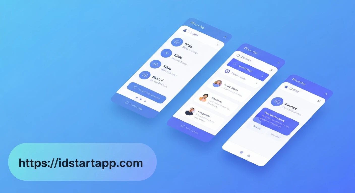

Flutter's Dynamic Duo: Crafting Engaging Slide & Bounce Animations for Modal Dialogs and Card Transitions
In the realm of mobile application development, user experience (UX) is paramount. A crucial aspect of a delightful UX is the seamless and intuitive interaction provided by animations. Flutter, with its declarative UI and powerful animation framework, empowers developers to create visually stunning and highly responsive interfaces. This article delves into the art of implementing engaging slide and bounce animations, specifically tailored for modal dialogs and card transitions, transforming ordinary interactions into memorable experiences.
The Power of Animation in Flutter
Flutter's animation system is built on a simple yet robust foundation, allowing for fine-grained control over various animation properties. At its core are:
AnimationController: Manages the animation's state, duration, and playback.Animation: Represents the animated value (e.g., anOffsetfor position, adoublefor opacity).Tween: Defines the start and end values of an animation.CurvedAnimation: Applies a non-linear curve to an animation, likeCurves.easeOut,Curves.bounceOut, orCurves.elasticOut.
By combining these elements, we can orchestrate complex movements and effects that elevate the perceived quality of an application.
Slide & Bounce Animations for Modal Dialogs
Default modal dialogs in Flutter typically appear and disappear instantly, which can sometimes feel abrupt. Introducing a slide-in-and-bounce effect can make dialogs feel more natural and responsive, as if they are "popping" into view.
Implementation Strategy for Dialogs
Instead of showDialog, we'll use showGeneralDialog, which provides a transitionBuilder to customize the entry and exit animations. We'll animate the dialog's position (slide) and apply a bounce curve.
Code Example: Animated Modal Dialog
Here's how you can create a custom animated dialog:
import 'package:flutter/material.dart';

void main() => runApp(MyApp());

class MyApp extends StatelessWidget {
  @override
  Widget build(BuildContext context) {
    return MaterialApp(
      title: 'Flutter Animated Dialogs & Cards',
      theme: ThemeData(primarySwatch: Colors.blue),
      home: HomePage(),
    );
  }
}

class HomePage extends StatelessWidget {
  @override
  Widget build(BuildContext context) {
    return Scaffold(
      appBar: AppBar(title: Text('Animations Demo')),
      body: Center(
        child: Column(
          mainAxisAlignment: MainAxisAlignment.center,
          children: [
            ElevatedButton(
              onPressed: () => _showAnimatedDialog(context),
              child: Text('Show Animated Dialog'),
            ),
            SizedBox(height: 20),
            ElevatedButton(
              onPressed: () {
                Navigator.of(context).push(
                  _createCardTransitionRoute(),
                );
              },
              child: Text('Go to Animated Card Page'),
            ),
          ],
        ),
      ),
    );
  }

  void _showAnimatedDialog(BuildContext context) {
    showGeneralDialog(
      context: context,
      barrierDismissible: true,
      barrierLabel: MaterialLocalizations.of(context).modalBarrierDismissLabel,
      barrierColor: Colors.black.withOpacity(0.5),
      transitionDuration: const Duration(milliseconds: 700),
      pageBuilder: (BuildContext buildContext, Animation animation, Animation secondaryAnimation) {
        return Center(
          child: Material(
            type: MaterialType.transparency,
            child: Container(
              padding: const EdgeInsets.all(20),
              margin: const EdgeInsets.all(20),
              decoration: BoxDecoration(
                color: Colors.white,
                borderRadius: BorderRadius.circular(10),
              ),
              child: Column(
                mainAxisSize: MainAxisSize.min,
                children: [
                  Text(
                    'Welcome!',
                    style: TextStyle(fontSize: 24, fontWeight: FontWeight.bold),
                  ),
                  SizedBox(height: 10),
                  Text('This is an animated modal dialog with a slide and bounce effect.'),
                  SizedBox(height: 20),
                  ElevatedButton(
                    onPressed: () => Navigator.of(buildContext).pop(),
                    child: Text('Close'),
                  ),
                ],
              ),
            ),
          ),
        );
      },
      transitionBuilder: (context, animation, secondaryAnimation, child) {
        // Apply a slide from bottom effect with a bounce curve
        final curvedAnimation = CurvedAnimation(
          parent: animation,
          curve: Curves.easeOutBack, // Provides a nice overshoot and bounce
        );

        return SlideTransition(
          position: Tween(
            begin: const Offset(0.0, 1.0), // Start from bottom
            end: Offset.zero, // End at original position
          ).animate(curvedAnimation),
          child: FadeTransition( // Optional: Add a fade effect as well
            opacity: animation,
            child: child,
          ),
        );
      },
    );
  }

  PageRouteBuilder _createCardTransitionRoute() {
    return PageRouteBuilder(
      pageBuilder: (context, animation, secondaryAnimation) => DetailPage(),
      transitionsBuilder: (context, animation, secondaryAnimation, child) {
        final curvedAnimation = CurvedAnimation(
          parent: animation,
          curve: Curves.easeOutBack, // Or Curves.bounceOut, Curves.elasticOut
        );

        return SlideTransition(
          position: Tween(
            begin: const Offset(1.0, 0.0), // Slide from right
            end: Offset.zero,
          ).animate(curvedAnimation),
          child: FadeTransition(
            opacity: animation,
            child: child,
          ),
        );
      },
      transitionDuration: const Duration(milliseconds: 700),
    );
  }
}

class DetailPage extends StatelessWidget {
  @override
  Widget build(BuildContext context) {
    return Scaffold(
      appBar: AppBar(title: Text('Detail Page')),
      body: Center(
        child: Column(
          mainAxisAlignment: MainAxisAlignment.center,
          children: [
            Hero(
              tag: 'cardImage', // Shared tag for hero animation
              child: Card(
                elevation: 8,
                margin: const EdgeInsets.all(20),
                child: Padding(
                  padding: const EdgeInsets.all(20),
                  child: Column(
                    children: [
                      FlutterLogo(size: 100),
                      SizedBox(height: 10),
                      Text(
                        'This is a detailed view!',
                        style: TextStyle(fontSize: 20, fontWeight: FontWeight.bold),
                      ),
                      Text('More content about the card goes here.'),
                    ],
                  ),
                ),
              ),
            ),
            SizedBox(height: 20),
            ElevatedButton(
              onPressed: () => Navigator.of(context).pop(),
              child: Text('Go Back'),
            ),
          ],
        ),
      ),
    );
  }
}
In this example, the transitionBuilder uses a SlideTransition combined with a FadeTransition. The CurvedAnimation with Curves.easeOutBack makes the dialog slide in from the bottom, slightly overshoot its final position, and then settle with a subtle bounce.
Slide & Bounce for Card Transitions
When navigating between screens, especially from a list view to a detail view represented by a card, a custom transition can significantly improve the user's perception of flow. We can make a new screen (or a card on it) slide in with a bounce effect.
Implementation Strategy for Card Transitions
For custom page transitions, Flutter provides PageRouteBuilder. This allows us to define how a new route enters and how the old route exits. We'll use SlideTransition within its transitionsBuilder, again leveraging bounce curves.
Code Example: Animated Card Transition
The _createCardTransitionRoute method in the previous HomePage code demonstrates this:
  PageRouteBuilder _createCardTransitionRoute() {
    return PageRouteBuilder(
      pageBuilder: (context, animation, secondaryAnimation) => DetailPage(),
      transitionsBuilder: (context, animation, secondaryAnimation, child) {
        final curvedAnimation = CurvedAnimation(
          parent: animation,
          curve: Curves.easeOutBack, // Or Curves.bounceOut, Curves.elasticOut
        );

        return SlideTransition(
          position: Tween(
            begin: const Offset(1.0, 0.0), // Slide from right
            end: Offset.zero,
          ).animate(curvedAnimation),
          child: FadeTransition( // Optional: Add a fade effect
            opacity: animation,
            child: child,
          ),
        );
      },
      transitionDuration: const Duration(milliseconds: 700),
    );
  }
In this transition, the DetailPage slides in from the right (Offset(1.0, 0.0) meaning 100% of the screen width to the right) to its final position (Offset.zero). The Curves.easeOutBack provides the characteristic "pull-back" effect, giving it a dynamic and engaging feel. You could also experiment with Curves.bounceOut for a more pronounced bounce or Curves.elasticOut for a rubber-band-like effect.
Choosing the Right Bounce Curve
Flutter offers a variety of built-in curves that can dramatically change the feel of your animations:
Curves.easeOutBack: Provides an overshoot, making the animation slightly exceed its target before settling back. Excellent for a "pop" effect.Curves.bounceOut: Simulates a physical bounce, where the object bounces multiple times with decreasing amplitude.Curves.elasticOut: Creates an elastic, rubber-band-like effect, stretching and contracting before settling.
The choice of curve depends on the desired aesthetic and the context of the animation. Experimentation is key to finding the perfect fit for your application's personality.
Conclusion
Implementing slide and bounce animations for modal dialogs and card transitions in Flutter is a powerful way to enhance user engagement and elevate the overall polish of your application. By leveraging showGeneralDialog and PageRouteBuilder along with Flutter's flexible animation system, developers can move beyond static UIs to create truly dynamic and memorable user experiences. Remember that subtle, well-timed animations can make a profound difference in how users perceive and interact with your app.


