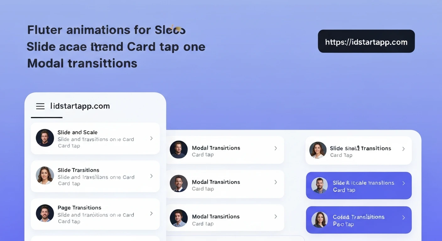

Flutter Slide & Scale Animations: Elevating User Experience
Animations are crucial for creating engaging and intuitive user interfaces. In Flutter, the rich animation framework empowers developers to build delightful and fluid transitions with relative ease. This article explores how to implement captivating slide and scale animations in three common scenarios: on card tap, for modal transitions, and during page navigation. Mastering these techniques will significantly enhance the perceived quality and responsiveness of your Flutter applications.
1. Slide & Scale on Card Tap
Animating a card on tap, making it slide or scale, provides immediate visual feedback to the user and can signify a change in state or an impending action. This creates a dynamic and interactive experience.
Concept:
When a user taps a card, we want it to subtly scale up or slide slightly to indicate selection or a preview action. This can be achieved using an AnimationController to manage the animation's lifecycle and Tween objects to define the range of the scale or offset.
Implementation Example:
We'll create a simple card that scales up when tapped and returns to its original size on a second tap.
import 'package:flutter/material.dart';

class AnimatedCard extends StatefulWidget {
  final String title;

  const AnimatedCard({Key? key, required this.title}) : super(key: key);

  @override
  _AnimatedCardState createState() => _AnimatedCardState();
}

class _AnimatedCardState extends State<AnimatedCard>
    with SingleTickerProviderStateMixin {
  late AnimationController _controller;
  late Animation<double> _scaleAnimation;

  @override
  void initState() {
    super.initState();
    _controller = AnimationController(
      vsync: this,
      duration: const Duration(milliseconds: 200),
    );
    _scaleAnimation = Tween<double>(begin: 1.0, end: 1.05).animate(
      CurvedAnimation(
        parent: _controller,
        curve: Curves.easeOut,
      ),
    );
  }

  @override
  void dispose() {
    _controller.dispose();
    super.dispose();
  }

  void _handleTap() {
    if (_controller.isCompleted) {
      _controller.reverse();
    } else {
      _controller.forward();
    }
  }

  @override
  Widget build(BuildContext context) {
    return GestureDetector(
      onTap: _handleTap,
      child: ScaleTransition(
        scale: _scaleAnimation,
        child: Card(
          elevation: 4.0,
          margin: const EdgeInsets.all(16.0),
          child: Padding(
            padding: const EdgeInsets.all(20.0),
            child: Column(
              mainAxisSize: MainAxisSize.min,
              children: [
                Text(
                  widget.title,
                  style: const TextStyle(fontSize: 20, fontWeight: FontWeight.bold),
                ),
                const SizedBox(height: 10),
                const Text(
                  'Tap me to see the scale animation!',
                  textAlign: TextAlign.center,
                ),
              ],
            ),
          ),
        ),
      ),
    );
  }
}

// To use it:
// class HomePage extends StatelessWidget {
//   const HomePage({Key? key}) : super(key: key);
//
//   @override
//   Widget build(BuildContext context) {
//     return Scaffold(
//       appBar: AppBar(title: const Text('Animated Card Example')),
//       body: Center(
//         child: AnimatedCard(title: 'My Awesome Card'),
//       ),
//     );
//   }
// }
2. Modal Transition (Slide & Scale)
Customizing modal transitions, such as dialogs or bottom sheets, with slide and scale effects can make them feel more integrated and less jarring. Instead of an abrupt appearance, the modal gracefully emerges into view.
Concept:
For custom modal transitions, showGeneralDialog is the ideal function. It allows you to specify a transitionBuilder that takes an Animation object and builds the widget's transition. Here, we can combine SlideTransition and ScaleTransition to achieve the desired effect.
Implementation Example:
We'll create a button that, when pressed, displays a modal dialog that slides in from the bottom and scales up simultaneously.
import 'package:flutter/material.dart';

void showAnimatedModal(BuildContext context) {
  showGeneralDialog(
    context: context,
    pageBuilder: (context, animation, secondaryAnimation) {
      // This is the content of your dialog
      return Center(
        child: Container(
          width: MediaQuery.of(context).size.width * 0.8,
          height: MediaQuery.of(context).size.height * 0.4,
          decoration: BoxDecoration(
            color: Colors.white,
            borderRadius: BorderRadius.circular(16),
            boxShadow: const [
              BoxShadow(color: Colors.black26, blurRadius: 10),
            ],
          ),
          child: Material( // Use Material to prevent issues with text styling inside dialog
            color: Colors.transparent,
            child: Column(
              mainAxisAlignment: MainAxisAlignment.center,
              children: [
                const Text(
                  'Hello, Animated Modal!',
                  style: TextStyle(fontSize: 22, fontWeight: FontWeight.bold, color: Colors.black87),
                  textAlign: TextAlign.center,
                ),
                const SizedBox(height: 20),
                ElevatedButton(
                  onPressed: () => Navigator.of(context).pop(),
                  child: const Text('Close'),
                ),
              ],
            ),
          ),
        ),
      );
    },
    transitionBuilder: (context, animation, secondaryAnimation, child) {
      // Create a slide transition from bottom
      final slideAnimation = Tween<Offset>(
        begin: const Offset(0, 1), // Start from bottom
        end: Offset.zero,
      ).animate(
        CurvedAnimation(
          parent: animation,
          curve: Curves.easeOutBack, // A nice bouncy effect
        ),
      );

      // Create a scale transition
      final scaleAnimation = Tween<double>(
        begin: 0.5, // Start smaller
        end: 1.0,
      ).animate(
        CurvedAnimation(
          parent: animation,
          curve: Curves.easeOutBack,
        ),
      );

      return SlideTransition(
        position: slideAnimation,
        child: ScaleTransition(
          scale: scaleAnimation,
          child: child,
        ),
      );
    },
    transitionDuration: const Duration(milliseconds: 500),
    barrierDismissible: true,
    barrierLabel: 'Modal',
    barrierColor: Colors.black54,
  );
}

// To use it:
// class HomePage extends StatelessWidget {
//   const HomePage({Key? key}) : super(key: key);
//
//   @override
//   Widget build(BuildContext context) {
//     return Scaffold(
//       appBar: AppBar(title: const Text('Animated Modal Example')),
//       body: Center(
//         child: ElevatedButton(
//           onPressed: () => showAnimatedModal(context),
//           child: const Text('Show Animated Modal'),
//         ),
//       ),
//     );
//   }
// }
3. Page Transition (Slide & Scale)
Navigating between pages is a fundamental part of any app. Custom page transitions, especially with slide and scale, can significantly improve user perception of flow and responsiveness, making the app feel premium and polished.
Concept:
Flutter's PageRouteBuilder is the key to creating custom page transitions. It allows you to define a transitionBuilder that uses the animation provided to animate the incoming and outgoing routes. We can combine SlideTransition and ScaleTransition here, similar to the modal example.
Implementation Example:
We'll create two pages and define a custom transition where the new page slides in from the right and scales up, while the old page optionally fades out.
import 'package:flutter/material.dart';

// --- First Page ---
class FirstPage extends StatelessWidget {
  const FirstPage({Key? key}) : super(key: key);

  @override
  Widget build(BuildContext context) {
    return Scaffold(
      appBar: AppBar(title: const Text('First Page')),
      body: Center(
        child: ElevatedButton(
          onPressed: () {
            Navigator.of(context).push(_createRoute());
          },
          child: const Text('Go to Second Page'),
        ),
      ),
    );
  }

  // Define the custom page route
  Route _createRoute() {
    return PageRouteBuilder(
      pageBuilder: (context, animation, secondaryAnimation) => const SecondPage(),
      transitionsBuilder: (context, animation, secondaryAnimation, child) {
        // Slide transition: new page slides in from the right
        const begin = Offset(1.0, 0.0); // Start from right
        const end = Offset.zero;
        const curve = Curves.easeOutCubic;

        final tween = Tween(begin: begin, end: end);
        final curvedAnimation = CurvedAnimation(
          parent: animation,
          curve: curve,
        );

        // Scale transition: new page scales up
        final scaleAnimation = Tween<double>(begin: 0.8, end: 1.0).animate(
          CurvedAnimation(
            parent: animation,
            curve: Curves.elasticOut, // A fun bouncy scale
          ),
        );

        return SlideTransition(
          position: tween.animate(curvedAnimation),
          child: ScaleTransition(
            scale: scaleAnimation,
            child: child,
          ),
        );
      },
      transitionDuration: const Duration(milliseconds: 700), // Adjust duration
    );
  }
}

// --- Second Page ---
class SecondPage extends StatelessWidget {
  const SecondPage({Key? key}) : super(key: key);

  @override
  Widget build(BuildContext context) {
    return Scaffold(
      appBar: AppBar(title: const Text('Second Page')),
      body: Center(
        child: Column(
          mainAxisAlignment: MainAxisAlignment.center,
          children: [
            const Text(
              'Welcome to the Second Page!',
              style: TextStyle(fontSize: 24, fontWeight: FontWeight.bold),
            ),
            const SizedBox(height: 20),
            ElevatedButton(
              onPressed: () {
                Navigator.of(context).pop();
              },
              child: const Text('Go Back'),
            ),
          ],
        ),
      ),
    );
  }
}

// To run this example:
// class MyApp extends StatelessWidget {
//   const MyApp({Key? key}) : super(key: key);
//
//   @override
//   Widget build(BuildContext context) {
//     return MaterialApp(
//       title: 'Page Transition Demo',
//       theme: ThemeData(primarySwatch: Colors.blue),
//       home: const FirstPage(),
//     );
//   }
// }
Conclusion
Flutter's declarative UI and powerful animation framework make it remarkably straightforward to implement complex and visually appealing transitions. By leveraging AnimationController, Tween, and dedicated transition widgets like SlideTransition and ScaleTransition, you can create delightful user experiences for card interactions, modal dialogues, and page navigations. These slide and scale animations not only make your app look more professional but also enhance usability by providing clear visual cues, guiding users through their journey within the application. Experiment with different Curves and combinations to find the perfect animation style for your app.


