Flutter Slide & Scale Animation on Card Tap and Smooth Modal Transitions
Introduction
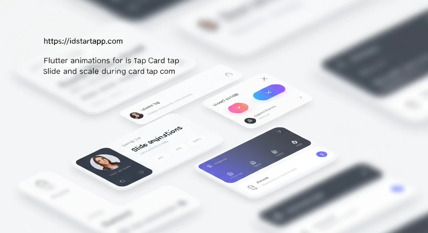
This article explores how to implement engaging slide and scale animations on card taps and create seamless modal transitions in Flutter applications. These animation techniques significantly enhance user experience by providing visual feedback and guiding the user's attention, making the application feel more polished and intuitive.
1. Slide & Scale Animation on Card Tap
Implementing a subtle slide and scale animation when a user taps on a card provides immediate visual feedback, making the UI feel more interactive and responsive. We'll use an AnimationController along with ScaleTransition and SlideTransition widgets to achieve this effect.
Card Animation Example
First, define a stateful widget that manages the animation controller and applies the transformations. This widget will wrap any child widget (e.g., a Card widget) and animate it on tap gestures.
import 'package:flutter/material.dart';

class AnimatedCard extends StatefulWidget {
  final Widget child;
  final VoidCallback onTap;
  const AnimatedCard({Key? key, required this.child, required this.onTap}) : super(key: key);

  @override
  _AnimatedCardState createState() => _AnimatedCardState();
}

class _AnimatedCardState extends State with SingleTickerProviderStateMixin {
  late AnimationController _controller;
  late Animation _scaleAnimation;
  late Animation _slideAnimation;

  @override
  void initState() {
    super.initState();
    _controller = AnimationController(
      duration: const Duration(milliseconds: 150),
      vsync: this,
    );
    _scaleAnimation = Tween(begin: 1.0, end: 0.95).animate(
      CurvedAnimation(parent: _controller, curve: Curves.easeOut)
    );
    _slideAnimation = Tween(begin: Offset.zero, end: const Offset(0, 0.02)).animate(
      CurvedAnimation(parent: _controller, curve: Curves.easeOut)
    );
  }

  @override
  void dispose() {
    _controller.dispose();
    super.dispose();
  }

  void _onTapDown(_) {
    _controller.forward();
  }

  void _onTapUp(_) {
    _controller.reverse();
    widget.onTap();
  }

  void _onTapCancel() {
    _controller.reverse();
  }

  @override
  Widget build(BuildContext context) {
    return GestureDetector(
      onTapDown: _onTapDown,
      onTapUp: _onTapUp,
      onTapCancel: _onTapCancel,
      onTap: () {}, // Handled by onTapUp after animation completes
      child: ScaleTransition(
        scale: _scaleAnimation,
        child: SlideTransition(
          position: _slideAnimation,
          child: widget.child,
        ),
      ),
    );
  }
}
To use this AnimatedCard widget, simply wrap your existing Card widget with it:
// Inside a StatefulWidget or StatelessWidget's build method
AnimatedCard(
  onTap: () {
    print('Card tapped!');
    // This is where you might navigate to a detail screen
    // Navigator.push(context, MaterialPageRoute(builder: (context) => DetailScreen()));
  },
  child: Card(
    elevation: 4.0,
    shape: RoundedRectangleBorder(borderRadius: BorderRadius.circular(12.0)),
    child: Padding(
      padding: const EdgeInsets.all(16.0),
      child: Column(
        mainAxisSize: MainAxisSize.min,
        children: const [
          Text('Hello Flutter!', style: TextStyle(fontSize: 20, fontWeight: FontWeight.bold)),
          SizedBox(height: 8),
          Text('Tap me for an animation!'),
        ],
      ),
    ),
  ),
)
2. Smooth Modal Transition with Hero Animation
For a truly seamless user experience, a tapped card should visually transition into a full-screen modal or detail view. Flutter's Hero widget is perfect for this, enabling shared element transitions between screens.
Source Card (Home Screen)
Wrap the element you want to animate (e.g., an image or the entire card content) in a Hero widget. Ensure it has a unique tag property.
// In your home screen or list of cards
AnimatedCard(
  onTap: () {
    Navigator.push(
      context,
      MaterialPageRoute(
        builder: (context) => DetailScreen(heroTag: 'myHeroTag', title: 'Flutter Animation Example'),
      ),
    );
  },
  child: Hero(
    tag: 'myHeroTag', // Must be unique across all Hero widgets on both routes
    child: Card(
      elevation: 4.0,
      shape: RoundedRectangleBorder(borderRadius: BorderRadius.circular(12.0)),
      child: Padding(
        padding: const EdgeInsets.all(16.0),
        child: Column(
          mainAxisSize: MainAxisSize.min,
          children: const [
            // Hero needs a Material ancestor if it wraps Text to correctly inherit styles
            Material(
              color: Colors.transparent,
              child: Text('Flutter Animation Example', style: TextStyle(fontSize: 20, fontWeight: FontWeight.bold)),
            ),
            SizedBox(height: 8),
            Material(
              color: Colors.transparent,
              child: Text('Tap to see the detail screen with Hero transition.'),
            ),
          ],
        ),
      ),
    ),
  ),
)
Destination Screen (Detail View)
On the detail screen, place a Hero widget with the *same* tag property around the corresponding element. Flutter will automatically animate the element's transition between the two screens.
import 'package:flutter/material.dart';

class DetailScreen extends StatelessWidget {
  final String heroTag;
  final String title;

  const DetailScreen({Key? key, required this.heroTag, required this.title}) : super(key: key);

  @override
  Widget build(BuildContext context) {
    return Scaffold(
      appBar: AppBar(
        title: const Text('Detail View'),
      ),
      body: Center(
        child: Column(
          mainAxisAlignment: MainAxisAlignment.center,
          children: [
            Hero(
              tag: heroTag,
              child: Material(
                color: Colors.transparent, // Important for Hero wrapping Text to avoid default Material background
                child: Text(
                  title,
                  style: const TextStyle(fontSize: 28, fontWeight: FontWeight.bold),
                ),
              ),
            ),
            const SizedBox(height: 20),
            const Padding(
              padding: EdgeInsets.symmetric(horizontal: 24.0),
              child: Text(
                'This is the detail content of the card. The title smoothly transitioned from the previous screen using a Hero animation.',
                textAlign: TextAlign.center,
                style: TextStyle(fontSize: 16),
              ),
            ),
          ],
        ),
      ),
    );
  }
}
For Hero widgets containing Text or other widgets that rely on theming, it's often necessary to wrap the content of the Hero in a Material widget with color: Colors.transparent. This ensures the text styles are correctly inherited and the animation appears as expected.
Conclusion
By combining subtle interactive animations on card taps with powerful shared element transitions like Hero widgets, you can create highly polished and intuitive Flutter applications. These techniques not only make your app look professional but also significantly improve the overall user experience by providing clear visual cues and delightful interactions.